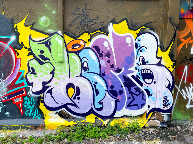
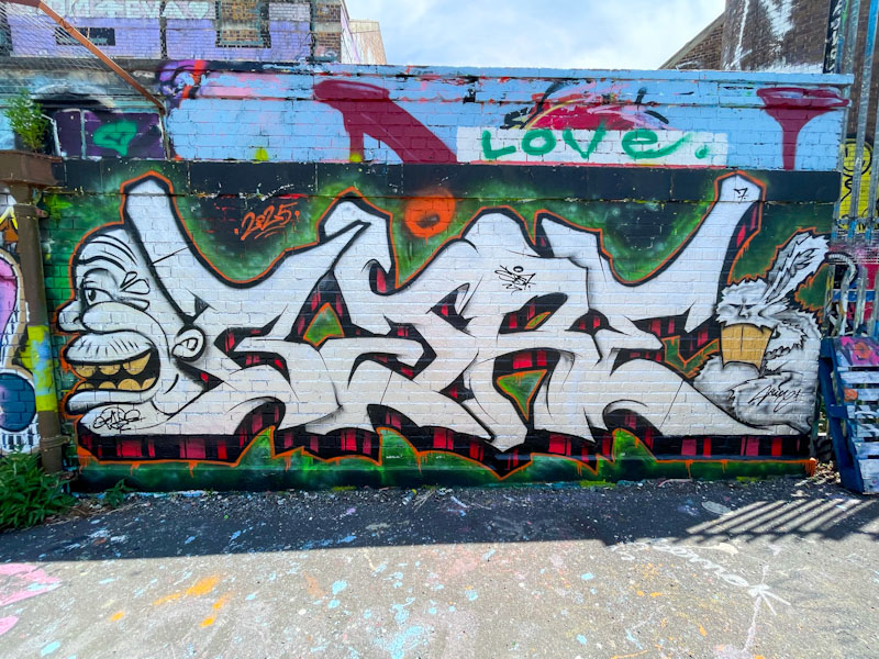
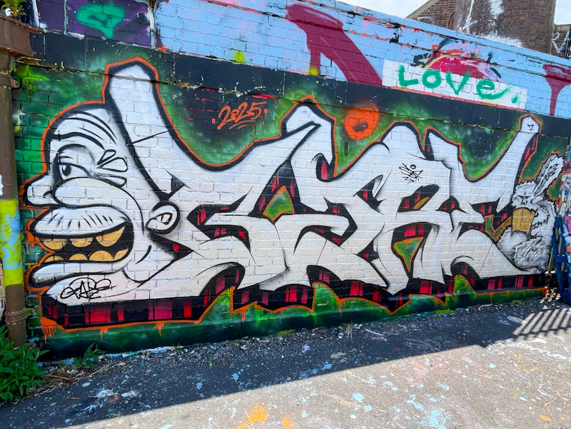
Hemper has had an interesting year so far, at one point there was no stopping him, producing multiple pieces in multiple styles, after which he went a little quiet, but recently he has returned with another burst of energy and a short-form theme to his lettering, of which this piece is typical.
Hemper, Dean Lane, Bristol, July 2025
The cartoon-style letters, spelling HEMS, are made rather more cartoony with the inclusion of character features in the ‘E’ and ‘S’. What sets this apart from other similar pieces of writing is that it oozes class, confidence and experience, from the yellow spiky splash background to the sharp black and white borders. There are only a few artists who can carry off small pieces like this with such perfection.
Wow! This colourful piece by Dirtygypo is difficult not to notice. The letters are splashed with so many colours and great shapes, accompanied by lightening bolts and crowns. The piece is a single-handed festival. I would describe it as a combination piece, as the character at the start is rather well-developed, and adds fun and mischief to the whole piece.
Dirtygypo, Dean Lane, Bristol, July 2025
I have pretty much given up trying to work out what the letters spell, despite many attempts. I can see so many letters and words, but would need to confirm with the artist, who I haven’t yet met. Today I am going for the obvious and guess that it says DIRTY.
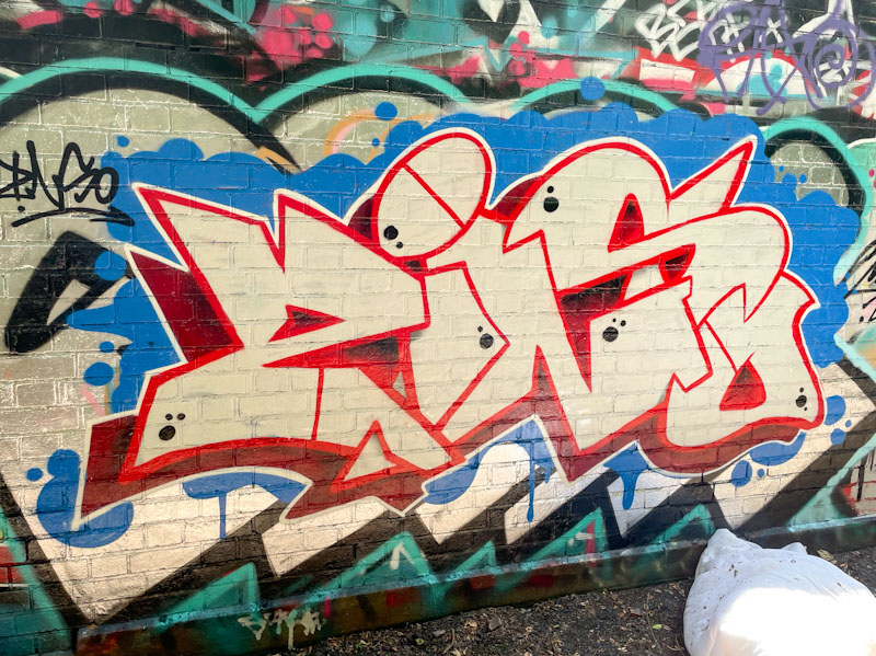
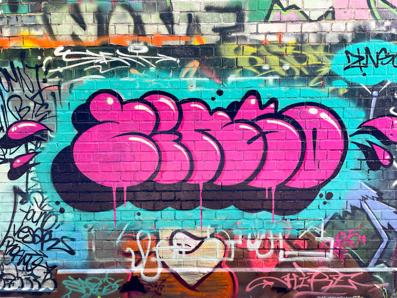
It is always a great pleasure for people like me, who spend a bit of time looking for and critiquing street art, when an artist floods the streets with their work, and Zinso has certainly done that in June and July this year.
Zinso, Dean Lane, Bristol, July 2025
This is a really nice piece of graffiti writing set on a great splash of blue, masking the underlying graffiti. The light cream letters are nicely shaped with a red border and deeper red drop shadow. The colour combinations are superb. Although I posted a couple of pieces by Zinso a few years ago, his new lease of life has been a revelation.
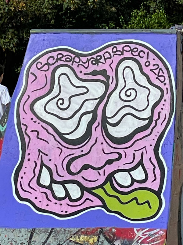
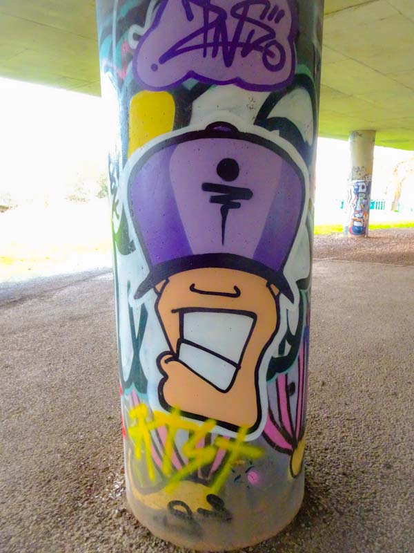
I get the feeling that Scrapyardspec might have moved to or near Bristol, or he is visiting more often these days, because barely a week goes by when I don’t discover a new piece by him.
Scrapyardspec, Dean Lane, Bristol, July 2025
This googly-eyed character is nestled neatly on the side of one of the ramps in the Dean Lane skate park, known locally as The Deaner. Perhaps the most notable thing about this piece is the green wibbly tongue, which I would estimate appears in about half of all his character pieces.
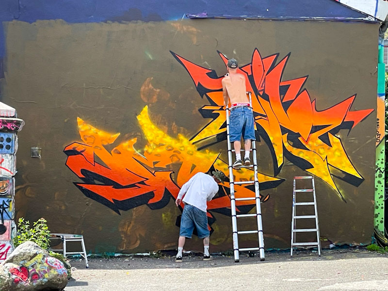
I was lucky enough to come across Dibz and Fade while they were painting this beautiful collaboration and was given a small insight into some of their colour choices over the last year. It turns out that they are only now finishing off the paint that they were given by Goldie for his wall of fame at Ikea last year. Amazing really that he gave them so much and that it has lasted this long.
Dibz and Fade, Dean Lane, Bristol, July 2025
This stacked collaboration required quite a lot of ladder work, and seeing the work in progress gives some sense of scale. Fade is working on his letters, bottom left and Dibz is up the latter. I guess I’ll have top forgive them for the brown background, which works well with the flame colours used in the letters, although an extra coat might have helped in one or two spots.
Dibz and Fade, Dean Lane, Bristol, July 2025
Overall, the twin collaboration is yet another demonstration of their extraordinary talent. I particularly like the green splats, giving the whole thing a bit of vibrancy and movement.
I can’t think how many times Dibz and Fade have teamed up in the last couple of years, but it must be into dozens, and this piece shows the true nature of total collaboration, where both artists created this incredible work together, and it isn’t possible to know who painted what. Lots of crew shout-outs are scattered around the outside of the piece in pink. Wildstyle writing at its best.
The piece spells out, rather appropriately, ‘Wild Style Addicts’ which probably sums up these two rather well. The gold and purple colours complement one another well, and it all looks very neat and tidy on the black wall.
I will have mentioned that Zinso has been rather busy of late, and also that he appears to be relatively new to Bristol. How wrong am I? I was looking through archives and noticed that I have posted pieces by the artist way back in 2019 and 2020, but those were character pieces and not writing. I can’t believe that in the intervening years I haven’t noticed his work, so have to assume that he has found a new burst of energy and time recently
Zinso, Dean Lane, Bristol, June 2025
This is a rather neat piece of bubble writing with a really deep 3D drop shadow, lifting the piece nicely off the wall. The piece is really nicely finished and greatly superior to most bubble writing that I see, that is usually associated with quick throw ups. Loads more to come soon, and below are a couple of his pieces from a few years ago.
Zinso, Brunel Way bridge, Bristol, January 2020Zinso, M32 Spot, Bristol, November 2019
This piece from Hire had me raising my eyebrows, in a good way, because it is quite unlike anything I have seen from him before. I would normally associate his work with quite intricate, spiky, angular letters, but here he has gone for something altogether softer and more fluid – to be honest I hind it a little disorientating. (Update – I am being particularly dense, the writing is, of course, by Sait Bare, which is why it is so different in style. I couldn’t see the wood for the trees.
Hire, Dean Lane, Bristol, July 2025
The combination of letters and two characters works well, with a face on the left and one of his trademark rabbits (see, it is spiky) to the right. The letters have a traditional 3D drop shadow with black and red stripes. This whole thing looks like Hire is experimenting a bit, departing from his customary style, and that has to be applauded.
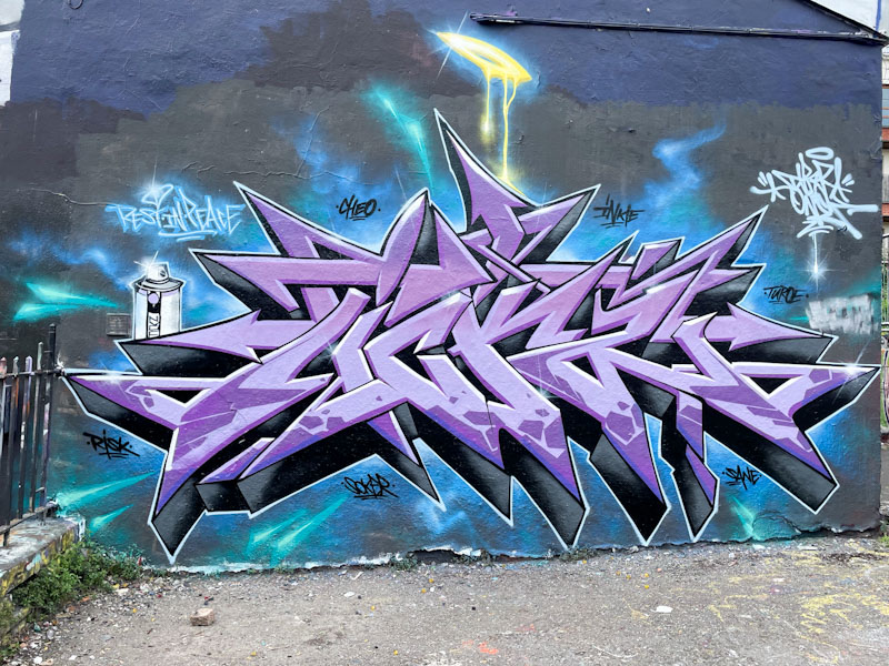
If ever you wanted an example of contemporary wildstyle writing at its best, you wouldn’t need to go any further than this exquisite piece by Dibz. The subtle tones and dark background are in harmony with this piece being a tribute to the late Tickz, hence the ‘rest in peace’ writing to the top left.
Dibz, Dean Lane, Bristol, June 2025
Everything about this piece is near-perfect. All the lines are sharp and clean, the fills tidy and unfussy, the white highlights consistent and bringing about a uniform 3D effect across the whole piece, and of course the halo in contrasting yellow. As tribute pieces go, this is about as good as it gets.
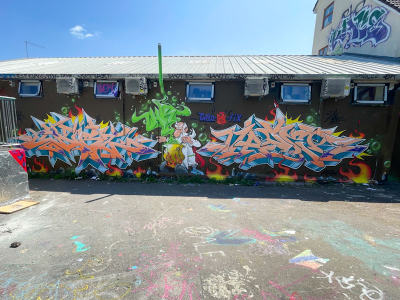
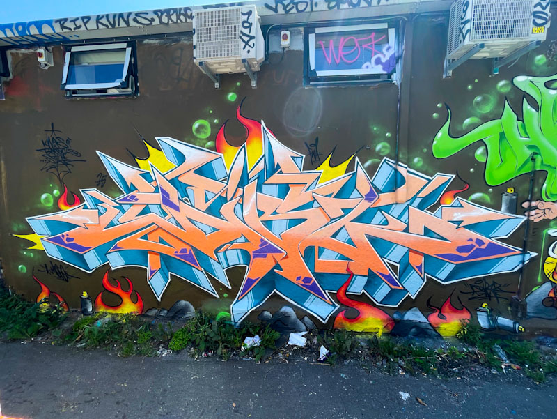
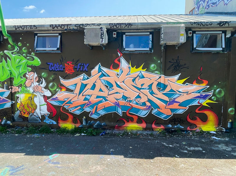
I think I was about five or six years old when I was given my first Asterix book. My mother was having her hair done and bought me ‘Asterix the Gaul’, to keep me occupied for the very boring two hour hair appointment. Not only did the distraction technique work, but it began a love affair I have had with these cartoon adventure books ever since. I still buy (in hardback) every new edition that is published, even though both the original author and illustrator (Goscinny and Uderzo) have now died. Imagine my excitement when I came across Dibz and Fade while they were painting this epic piece in Dean Lane.
Fade and Dibz, Dean Lane, Bristol, June 2025
I can’t really add much commentary about the artists that is new, and I have run out of superlatives to describe their work. The writing on the left, by Dibz is about as tight and sharp as you can get with wildstyle graffiti writing. The orange letters with a deep 3D drop shadow, which has a metallic sheen to it, spell DIBZ.
Fade and Dibz, Dean Lane, Bristol, June 2025
To the right hand side of the collaboration, Fade has adopted the colour selection for his piece, but, although subtle, his letters and style are a tad softer than Dibz’. A notable change in this collaboration is that the artists have swapped sides from their usual preference, which must feel a little bit like sleeping on the wrong side of bed. Maybe?
Fade and Dibz, Dean Lane, Bristol, June 2025
The centrepiece of this production is a near-perfect rendition of the druid Getafix, who makes the secret magic potion that gives our protagonists, Asterix and Obelix, their strength. The artists have been so true to the original artwork, Uderzo himself would have been impressed. This really is a remarkable collaboration and shows off Dibz and Fade at their very best. I’ll forgive them for the ‘Geta-graf-fix pun.