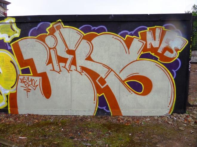
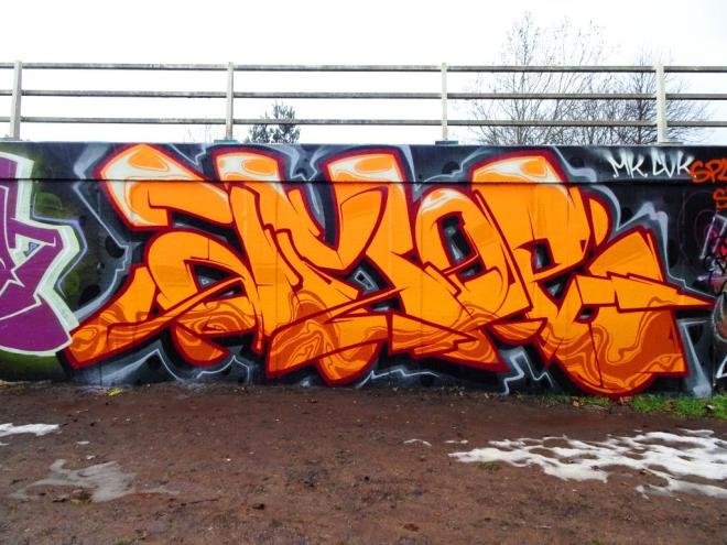
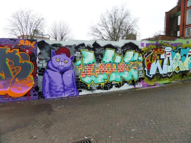
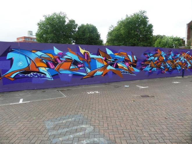
A fine trio of artists, Soker, Cheo and Hemper came together in 2016 and painted this fine collaboration. All three are at the top of their game and this formula – wildstyle, character, wildstyle – is one that works well. There is a balance and symmetry to the whole thing.
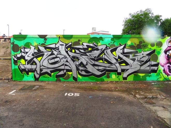
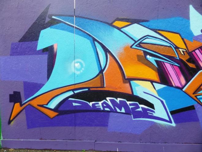
The chrome writing on the left is by Soker, and the letters SOKEM are easy to pick out. The lines are very clean and sharp and a careful look at the detail reveals incredible attention in each and every intricate shape. Magnificent.

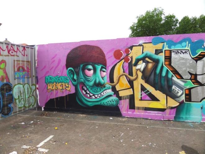
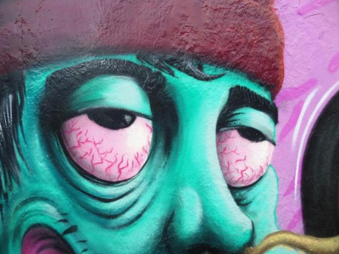
In the middle, the character piece is by Cheo, who else, and looks like a man who enjoys his music. I love the way his glasses change the colour of everything behind them, and the same with the goggles. beautifully done.
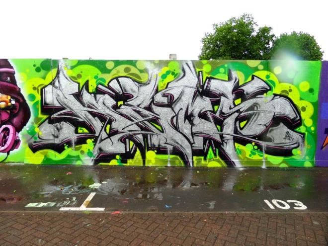
Finally on the right some more writing in chrome, this time from Hemper. Of the three, he is the one I know least about. I think that these days, he is not as active as the others. The letters spell ‘HEMP’ and they have a slightly more forgiving and organic feel to them than those of Soker.

The whole thing is utterly lovely and I am puzzled why it hasn’t made it out of my archives until now. Some mistake surely. Damn that water droplet.