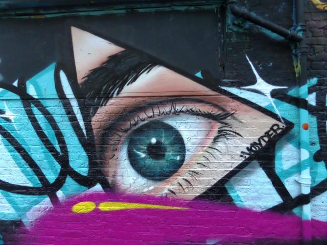
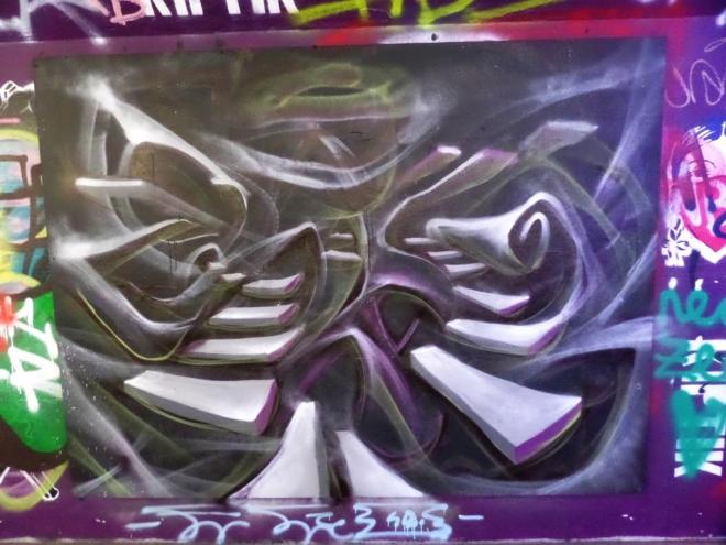
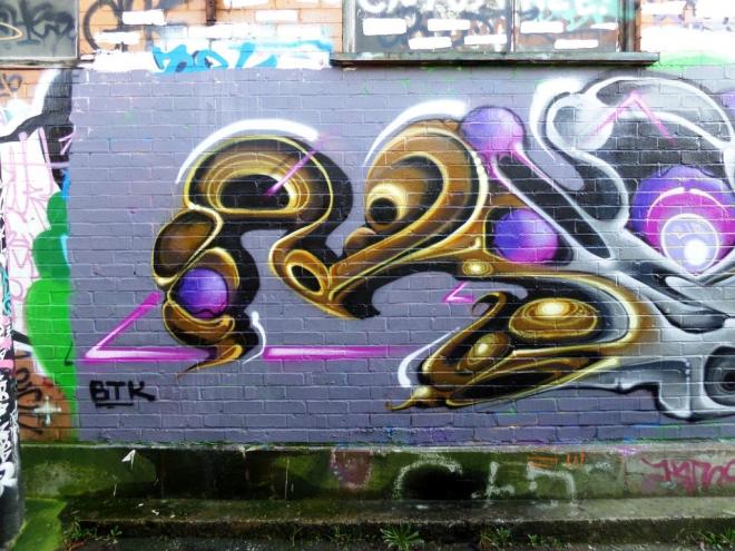
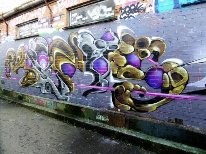
In my wanderings through the streets and alleyways of Shoreditch it was comforting to come across a familiar sight. So much of the artwork was unknown to me and then this…a piece by Bristol graffiti artist Voyder. All of a sudden I felt quite at home and rather pleased with myself that I could identify an artist in the heart of London’s graffitiland.
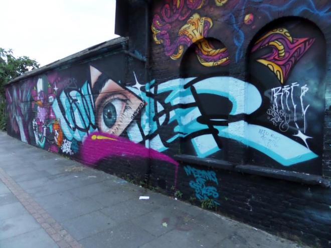
I have to say though that I don’t think it is his best work, and not a patch on the stuff he has bee producing in the last few months (in my view). This wall was produced for the Meeting of Styles festival June, 2016. The photographs are a bit dodgy because the daylight was fading, and my crappy little camera was fussing about the light levels. I think I just about got away with it.