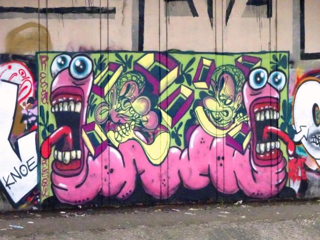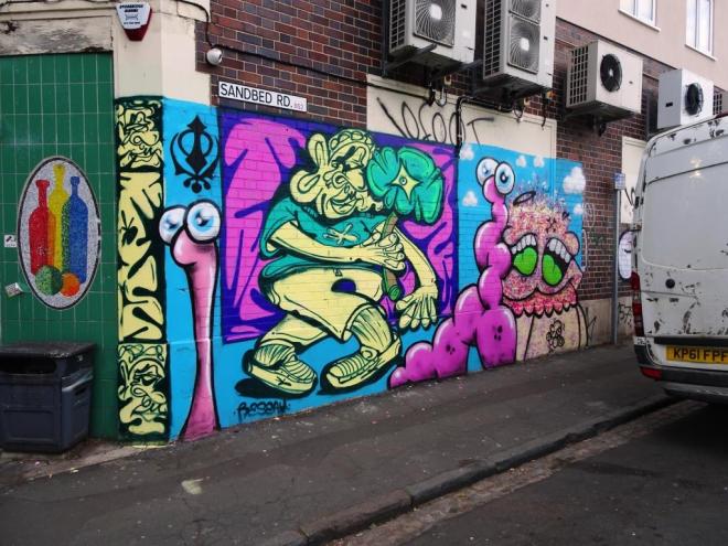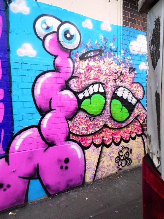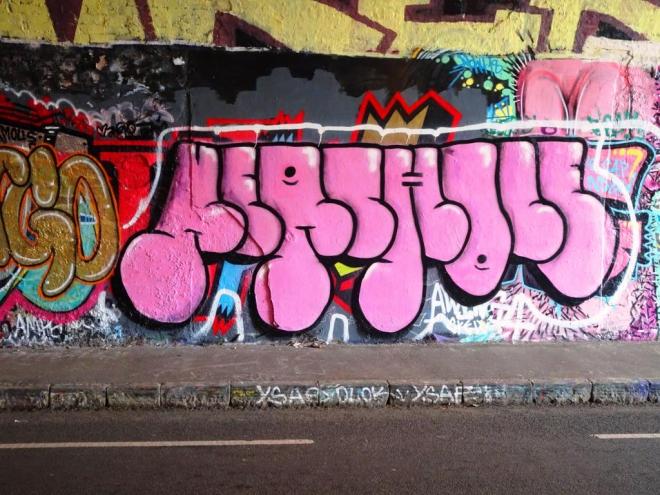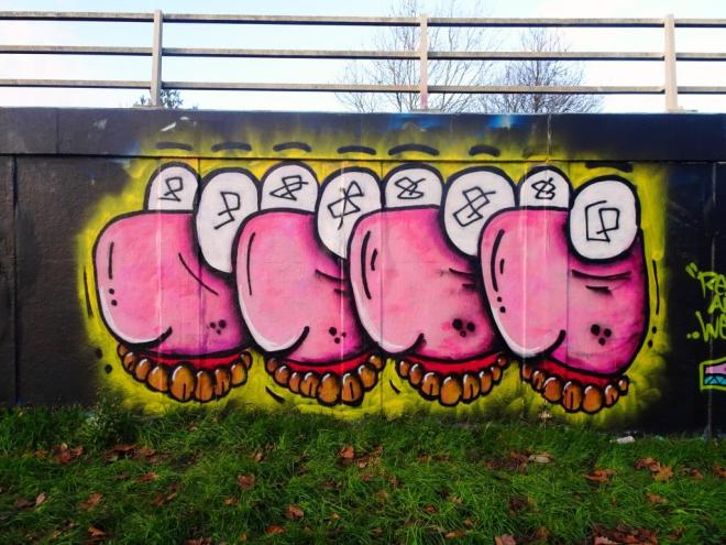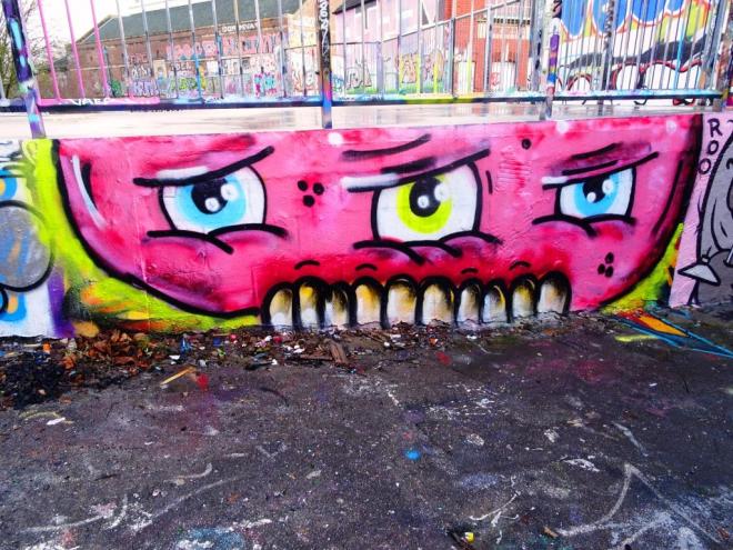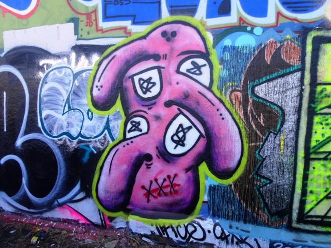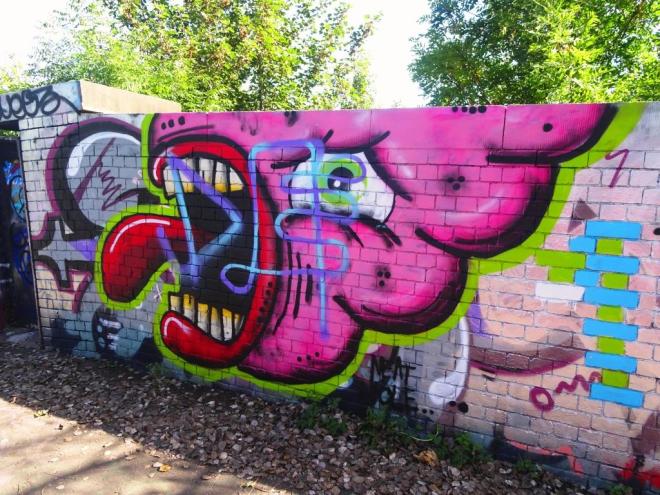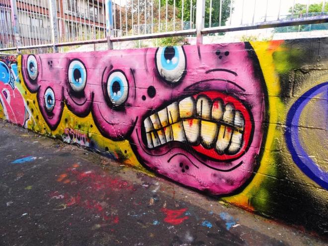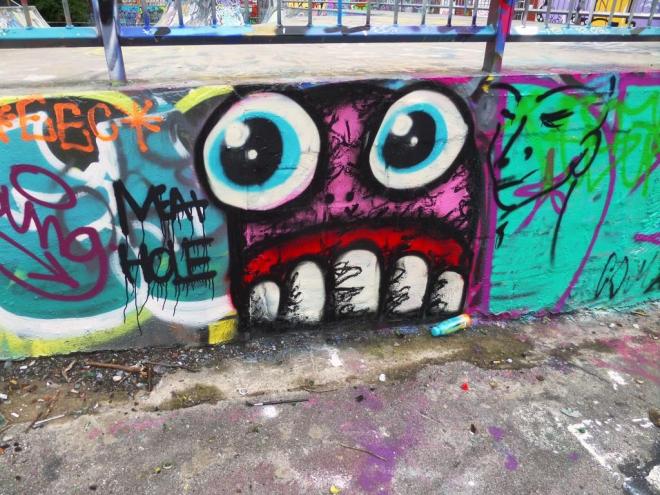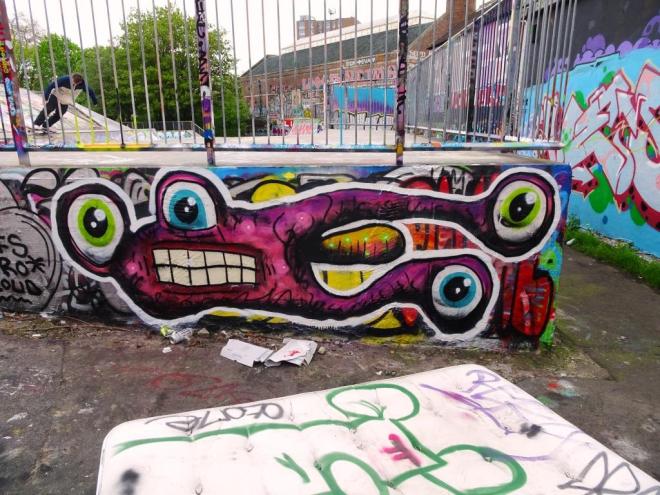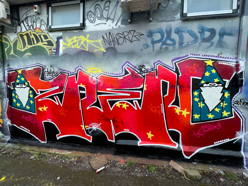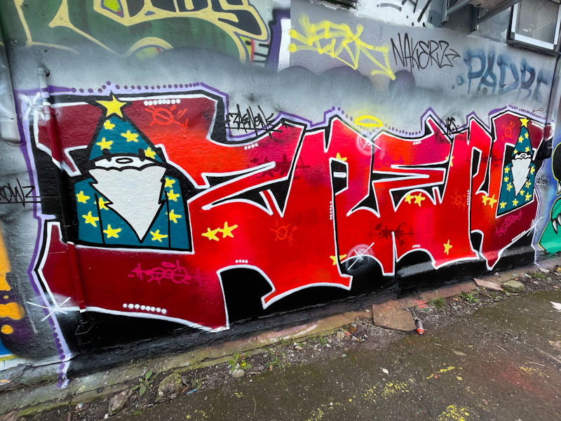
There has been no stopping Biers and his WD40 pieces this year, each one a real pleasure to find and photograph. His tried and tested formula of writing his letters and incorporating a character in the ‘0’ continues to delight and keeps his inspiration fresh. The idea is one adopted by other writing/character combination artists such as Zaenone, and builds a series of ‘collectible’ works.
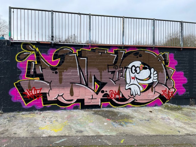
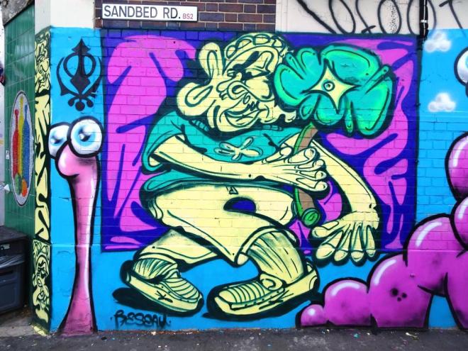
It looks like Biers spent plenty of time with this one… it is neat and tidy with plenty of clean sharp lines and borders. Although the letters are generally fairly static from piece to piece, the two elements that give Biers scope for inspiration are the colour scheme and the character. Although these colours are not my personal favourite, he has worked them superbly into the horizontal layers with some drift shapes between them. The character is a treat, although I don’t know what popular culture cartoon he comes from. Altogether an awesome piece from Biers.