.
Beneath cooling leaves
we have time to chew the fat
tell me your stories
.
by Scooj
.
Beneath cooling leaves
we have time to chew the fat
tell me your stories
.
by Scooj
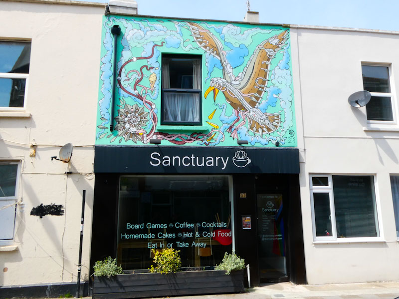
I remember being rather annoyed with myself that I hadn’t found this wonderful piece by Andy Council painted for Weston Wallz, when I visited last year, but patience is a virtue, we are told, and finding it this year felt like an extra special prize.
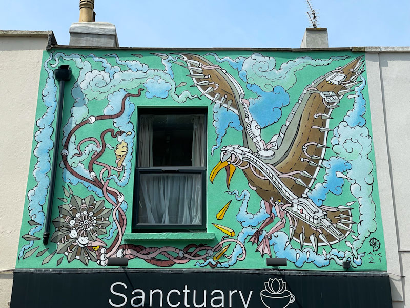
The seagull scene is painted in Andy Council’s distinctive component style, where the whole image is made up of component parts, that on their own don’t much look like anything we recognise, but when stitched together present a remarkable form. The gull is eating chips (quelle surprise) and on the other side a trademark ammonite is holding an ice cream in its tentacles. Superb seaside fare from Andy Council.
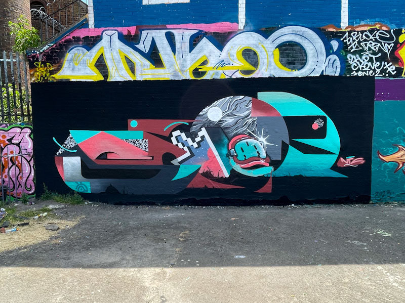
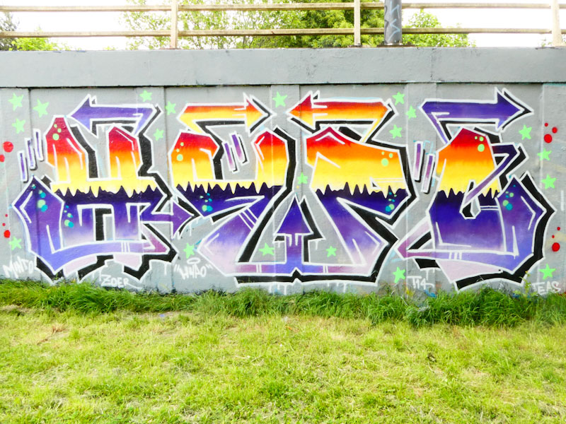
We see a lot of collaborations in Bristol, but most tend to be collaborative walls in which some elements of colour or design are shared by the artists. Occasionally, artists paint a piece that is what I would call a true collaboration, where the single piece is a fusion of their work. This piece by Mudra and Saor, or is it Saor and Mudra, is a perfect example of a fusion collaboration.
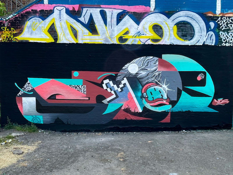
The overall writing spells out SAOR, and at first glance I thought it was a Saor piece, but look a little closer, and you see the Mudra elements emerge, for example the @ symbol, the pixelated arrow and mask. The whole piece is sh sharp and tidy, and Saor has incorporated some fascinating textures, like the granite effect and night sky with a full moon. A superb piece of work from the NTS friends.

I fell in love with this piece the moment I saw it. Of course, I am an admirer of Laic217’s work, and this piece brings together so many of his themes and his talent into one place. No skeleton this time, but a flesh and blood human character holding a spray can.
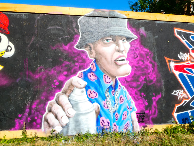
I will focus on two or three elements of this outstanding piece; The flesh tones and shading on the face and hand are exceptional, demonstrating that he is not a skeleton one-trick pony. The chain around the character’s neck is really well done and there is a sense of weight, and that it doesn’t hang perfectly shows that Laic217 is thinking one step ahead. It is the shirt, though, that really thrills me. From time to time, Laic217 dresses his characters in patterned shirts, and somehow he manages to paint in the creases and folds, with disruption tom the pattern, in this case pink smiley faces. I have seen him use this technique before to great effect, and I think it is one of the things he does that sets him apart from others. This is a truly exceptional piece on a rather nice new hoarding.


.
With her Wallace grin
charmless home secretary
plays to gallery.
.
by Scooj
Suella Braverman seems to have a rather inflated impression of her own capabilities and wit, and came out with this toxic ‘tongue-in-cheek’ drivel, and was all the while appealing to her fellow Tories, smirking and grinning. Caroline Lucas has class, capability, competence and compassion that Braverman could never, ever achieve.
Braverman appears to be interested only in power, driven by hatred (an element of self-loathing I suspect too)
Lucas appears to be interested in justice (social, economic and environmental) and fairness, driven by compassion.
The two are polar opposites.
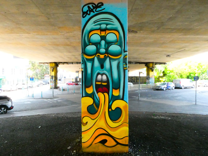
I have a feeling that Zake might be slowing down a little, having had an incredible start to the year with an increase in both quality and quantity of his original character pieces. This incredible piece is painted on one of the columns (if not, a different face of the same column) where I first encountered Zake’s work back in July 2018, so it feels like a bit of a full circle, and my goodness, how he has developed over that time.
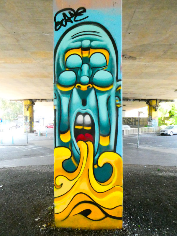
The long face (an inevitability on columns) has a double set of eyes, which are thankfully closed, and is spewing fiery water from the mouth. The colour selection works beautifully, and as ever Zake’s work is so full of depth, afforded by clever use of light and shade. This is a really striking piece, noticeable from quite some distance.
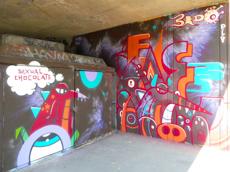
I don’t quite understand why, but I have posted very few pieces by 3rdeye on this blog, perhaps because he only paints occasionally, but I’m sure I have more in my archives somewhere. 3rdeye pieces are a rare thing, especially outside of festivals, so it was a considerable surprise and delight when I stumbled across this piece a little while back.

Painted on a utility box and wall at the top end of the M32 Spot, underneath the motorway, 3rdeye has split the piece into two parts. On the utility box is one of his imaginary characters, perched on top of an eye with a thought cloud saying “sexual chocolate”. I have no idea what this means and won’t be asking.
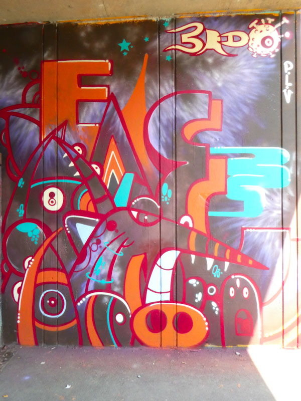
On the adjacent wall, there are several cleverly concealed characters, painted in 3rdeye’s distinctive style, together with some letters, but I can’t quite make out what they are… it looks like E A E, but that doesn’t seem right. The piece is nicely signed at the top and demonstrates the strength in depth of talent in Bristol.
This outstanding piece by Dibz was painted alongside Werm and Veeez, both of whom are edging towards the ‘top table’ when it comes to collaborations. I have genuinely run out of things to say about Dibz and the quality and creativity of his work, and am tempted to not write too much more but simply let you enjoy this piece, which is so easy on the eye.
Dibz’ confidence and talent allow the viewer to wonder at the detail of the piece in the knowledge that absolutely everything is perfectly finished. The addition of pixels and stars embroiders, what is already an outstanding piece of graffiti writing.
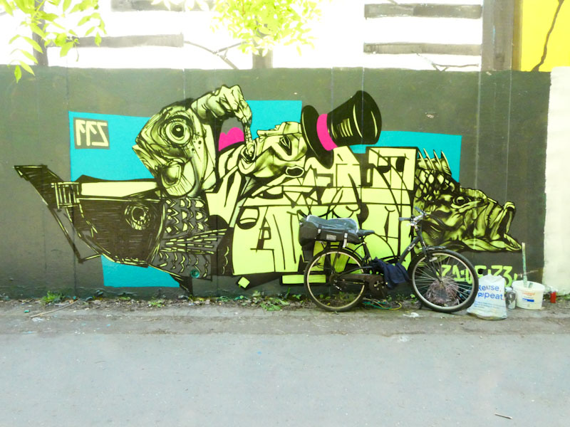
It took me two visits to get a clean picture of this piece by Kid Krishna, because his bike was parked in front of it the first time (while he was painting an adjacent piece). What is interesting is that the light conditions were different on each occasion, which affects the colours in the images.
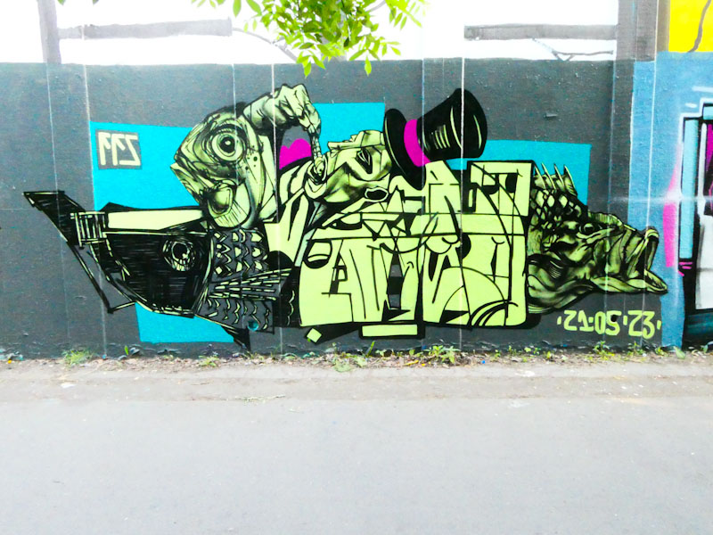
Kid Krishna is smashing it everywhere he paints at the moment, and in a very short space of time has become a dominant force in the city. In this fascinating piece the writing, CRIE, is compressed into the central part of the work and is surrounded by fish designs, some realistic and some abstract. The piece demonstrates a strong artistic bent and creative mind. The explosion of ideas in his work is sometimes difficult to interpret, for example what is the man in the top hat, eating a sardine, all about? His work continues to surprise and delight… regularly.
Tick-tock, regular as clockwork, Hypo keeps turning out new pieces, each of which is a welcome addition to his expanding and improving portfolio. I have definitely seen an improvement in his work in recent months, and although he has been around for a long time, I think he is reaching a new level.

Hypo continues to produce pieces with an element of symmetry to them, achieved through shapes and colour schemes. I have seen him use this kind of fill pattern in the past (Upfest 2017), producing what looks like a horizon on a landscape. Another great piece from Hypo.


