
.
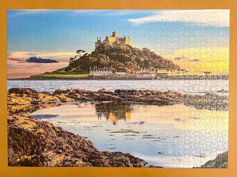
St Michael’s Mount done
place of happy memories
tricky skies and sea
.
by Scooj
.
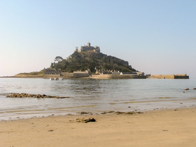
St Michael’s Mount done
place of happy memories
tricky skies and sea
.
by Scooj
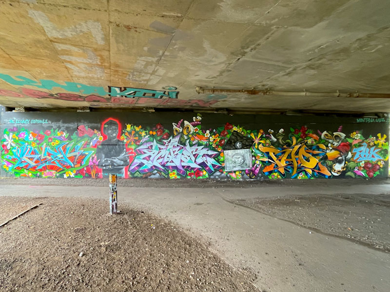
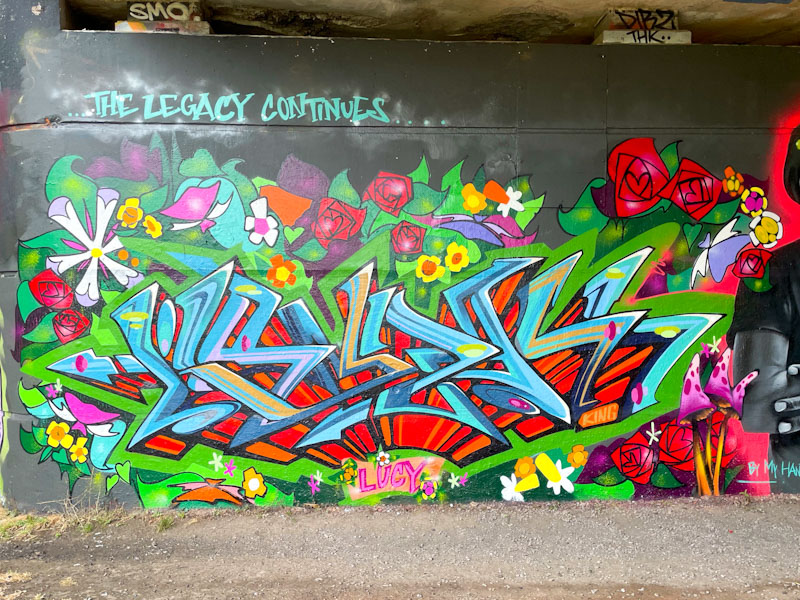
This piece is difficult to describe in its entirety. It is an epic piece to celebrate one year on from the Goldie inspired Ikea wall, and also to honour DJ Randall, and this particular spot has been used by the THK crew for a few years now to pay tribute to the departed musician. The paint jam included work from Goldie, Jody, Dibz, Posea, Zuke, Soker, Cheo and Fade. It is worth noting that this piece hasn’t been touched since it was painted in August.
From the left, the collaboration begins with a piece of graffiti writing by Goldie and some flowers by Zuke. Some bright and rather beautiful work here to get things going.
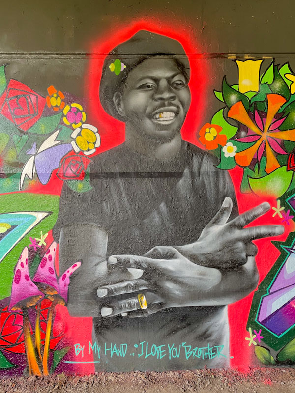
Next up is a portrait of DJ Randall by Jody, one of many renditions of the artist that has graced this spot. Once again, the portrait piece is embroidered by some flowers by Zuke. The greyscale piece is punctuated only by a gold tooth and gold ring.
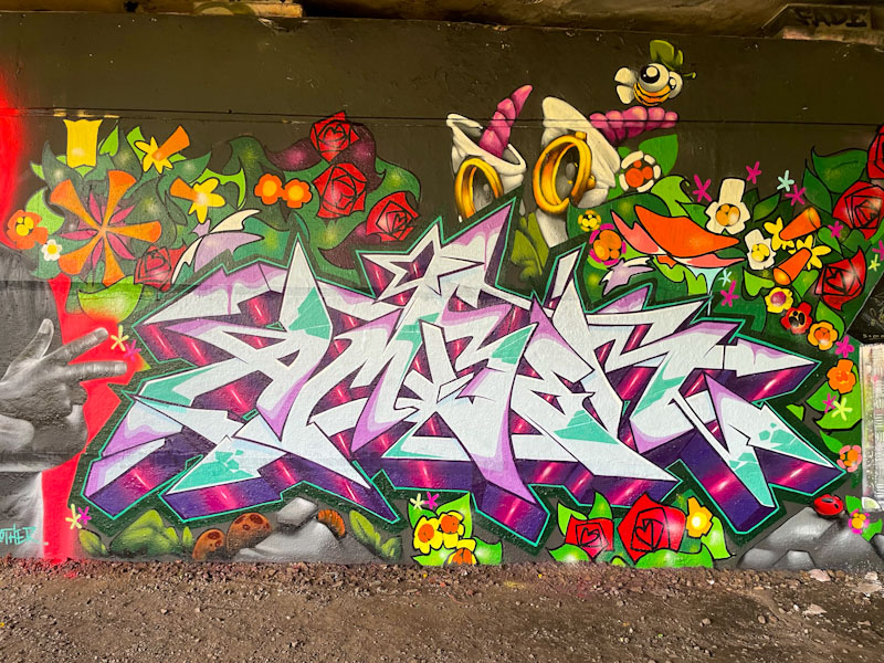
Dibz is up next, with the letters AMBER (I think), and of course, there are some more flowers surrounding the letters, and a trademark Bee by Cheo. The letters are beautifully filled, and the drop shadow has a wonderful pulsating effect.
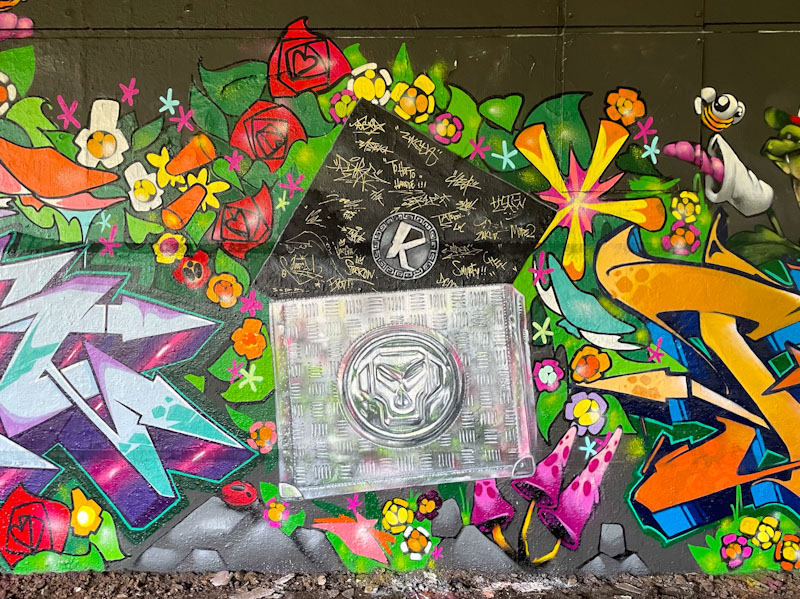
The steel case with the Metalheadz logo and record sleeve are by Posea and each of the contributing artists has signed the sleeve, almost as if it were a tangible object.
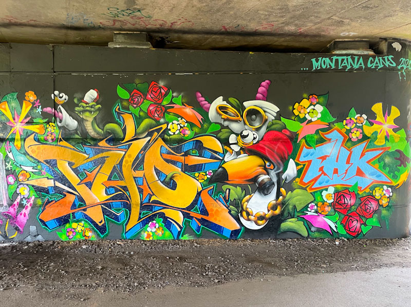
Finally, the epic wall is rounded off with writing from Soker, a toucan smoking a cigar and a python by Cheo and the letters THK by Fade, once more festooned with Zuke’s flowers. The whole wall is a bit of a masterpiece, that has been enjoyed by many this year.
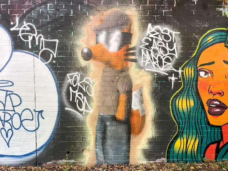
I don’t think that I post enough of Foksymoron’s work, certainly there are a lot of his pieces sitting in my files and this one was one I overlooked back in July this year, which was part of the very long Paroe tribute wall.
This time, a respectful fox, with his trademark sunglasses, flat cap and casual clothes suggests that Paroe should ‘rest easy’, which is completely in character. There is an ethereal quality to this piece, softening up the edges. An absence of a hard border is, in my view, a real bonus. Not every piece needs a border. This is a really nice piece from Foksymoron.
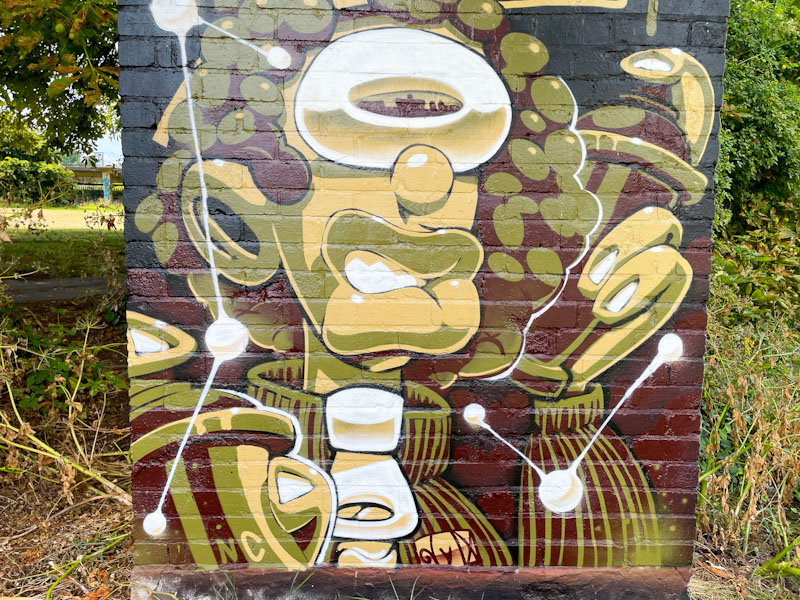
I am very fond of this little wall beside the river. It is all that remains of a small disused pump house or something, linked to the water company pumping station nearby. This piece, by Guimeujoven, has remained in my archive since July, because I couldn’t identify the artist. Thanks to Paul H, who did the detective work on this one, I now know the artist and am free to post the piece.
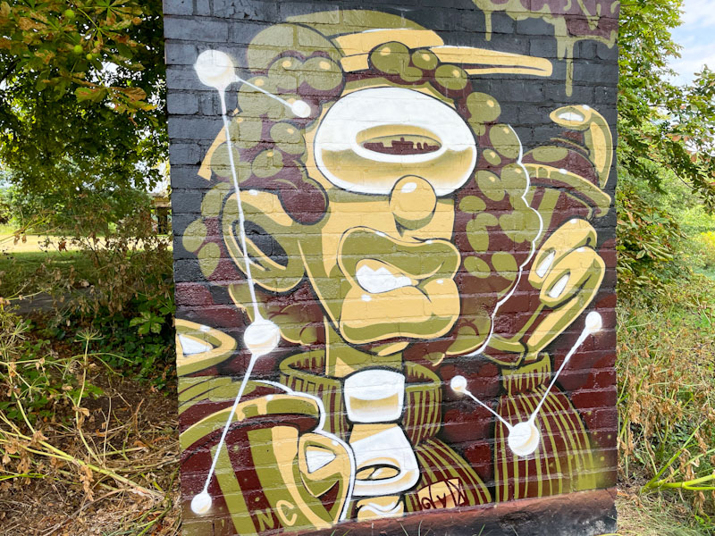
This is a really nice character piece worked up in four autumnal colours and so different from the kind of character pieces we are used to seeing in Bristol. The Brazilian artist is based in Exeter and I am somewhat surprised that we haven’t seen more of his work here, and a little saddened, because it is absolutely amazing… a quick glance at his Instagram feed is highly recommended. A mystery solved.
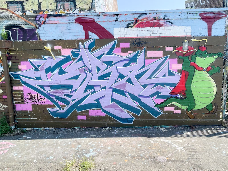
Continuing with my end-of-year trawl through my archive, I found this piece by Dibz from June. I can’t for the life of me think how I missed posting this one, other than at that time Dibz nd Fade were churning out so many superb pieces, it was difficult to keep up.

The combination piece features the cartoon character Captain Crocodile from Disney’s Robin Hood, a film I don’t think I have ever seen. The letters spelling DIBZ are somewhat eclipsed by the character holding a cushion upon which sits a spray can. A great fun piece in the Deaner.
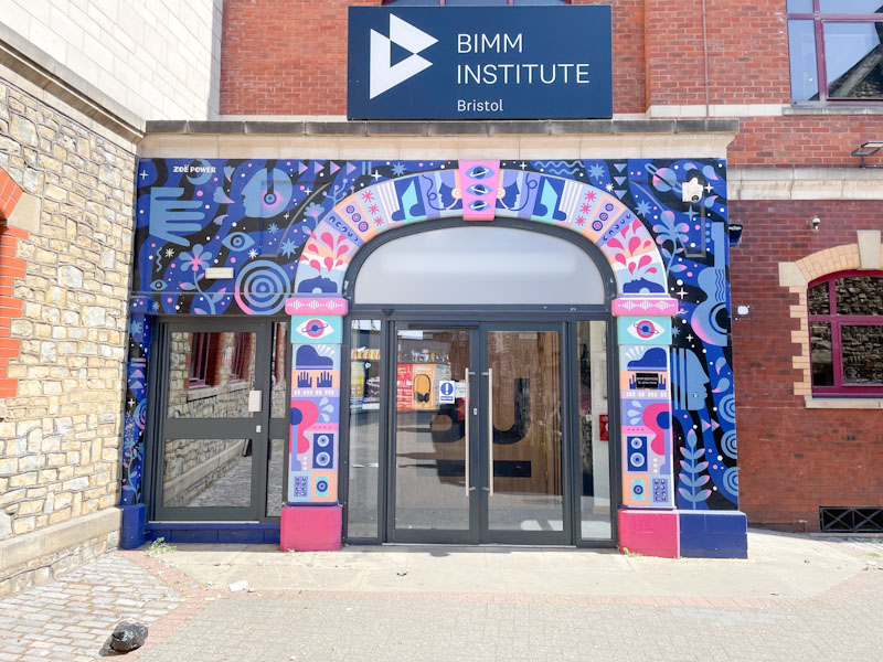
Although I photographed this piece by Zoe Power back in April, it had been painted some considerable time before that, years, I think. This entrance to the Bimm Institute is tucked away behind the Full Moon pub in Stokes Croft.
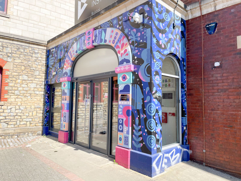
The busy and bright mural is beautifully designed around the archway and surround to the entrance of the building, with the emphasis being on the arch. Full of colour and optimism, the piece adds so much to an otherwise rather ordinary building.
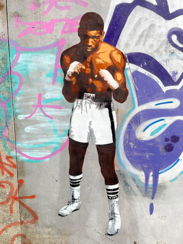
Looking back again over 2025, we were privileged to have another visit by French wheatpaster Tian, in the spring, around the East Street, Dean Lane and North Street areas of Bedminster.
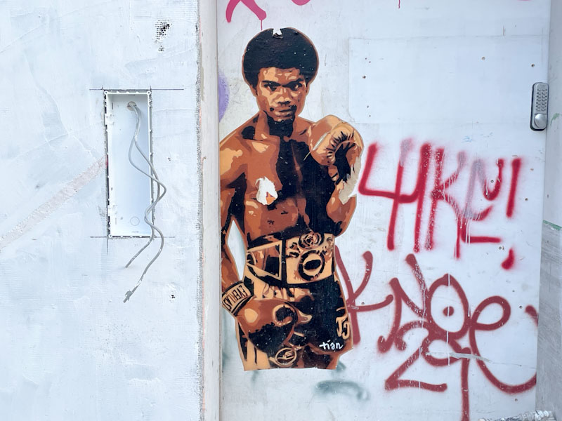
Although I posted several of these wonderful wheatpastes at the time, on going back through my archive I found these three that I had not previously posted.
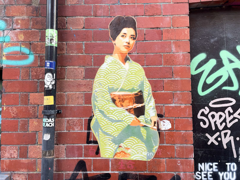
I have always liked Tian’s work, it is so different from most of the street art we see in Bristol. His themes and ideas are interesting and his execution always suitable. Wheatpastes may not be to everyone’s taste, and often the owners of the walls on which they are posted get pretty fed up, but they are ephemeral and prone to becoming dislodged in our damp climate. I look forward to his next visit to the city.
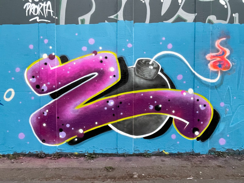
This is rather a nice tidy piece from Zbomb painted as part of a collaborative wall with Hemper and Hypo, I seem to recollect, although it was from way back in March and my memory is not what it used to be.

His name is n appropriate description of his work, a letter Z and a cartoon style bomb. His work is often less polished than this one, which demonstrates that when he takes the time he is more than capable of turning out something rather good. A fun piece from Zbomb.
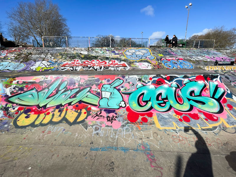
I’m off to a football match this morning and will shortly be catching a train to London, so today’s posts are likely to be fairly swift. The next few posts are ones from earlier this year that somehow got left behind in my archives. This was a nice collaboration from Hire and Ceus back in February.
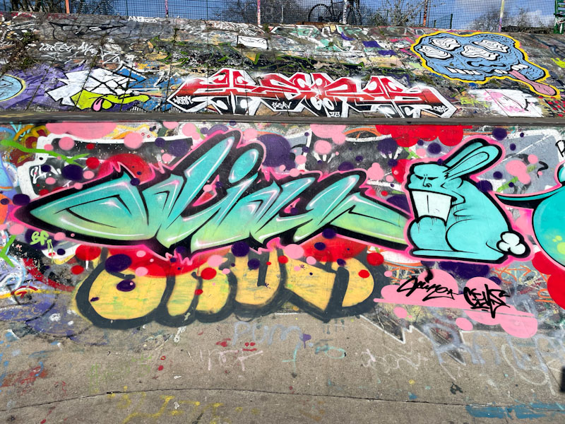
Some unusual writing, spelling out Odiah, one of the words Hire likes to use, and his trademark rabbit. All looking rather smooth in the winter sunshine.
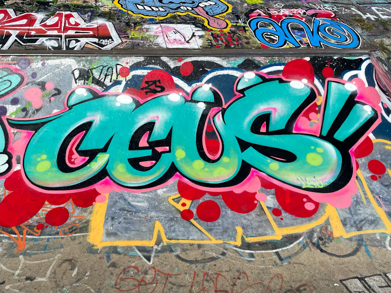
Ceus appears to have left these shores now, and I think that this might have been amongst the last ones he painted in Bristol. A fine collaboration.

Before Christmas, I had a little jaunt through my archives and managed to pull out a few wonderful pieces that I missed first time round. This is a gorgeously colourful and upbeat piece by Esme Lower from January this year.
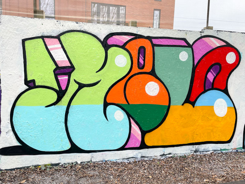
The simple letters filled with great colours spell out MELO, the central letters of her name combined. The 3D drop shadows are unruly, drifting off in all sorts of directions, but it kind of works. I particularly like the white dot highlights, which are an unconventional take on creating depth to the piece. Nice, clean work from Esme Lower, and part of her exploration and improvement.


