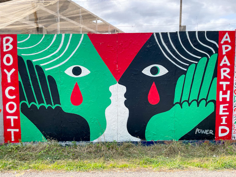
I have mentioned many times before on Natural Adventures how much I love the way street artists capture the moment or the mood of the city or country as a whole. In saying that, I would reflect that most, not all, street artists are aligned with progressive or left leaning sympathies. It is rare to see right-wing or fascist street art that evolves beyond slogan tags. This potent piece by Zoe Power is one of many painted during a paint jam organised by the Bristol Mural Collective up a Greenbank a couple of weeks ago.
Zoe Power, Greenbank, Bristol, August 2025
Zoe Power has kept her message and artwork simple and unambiguous. The captivating piece features two faces looking at one another with tears, symbolising sadness and tragedy, painted in the colours of the Palestinian flag, with the words ‘Boycott Apartheid’ book ending the work. Who, in their right mind, could support the slaughter of innocent civilians on such a mass scale? Has the Israeli leadership learned nothing about attempted eradication of a people? Zoe Power and her collaborators are keeping the tragedy unfolding in front of our eyes out there and protesting through their art.
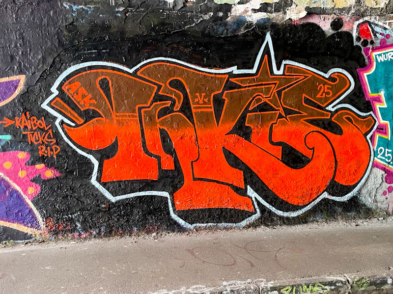
Inkie is back in town and has been painting a little. This is a rather nice little piece of classic Art Nouveau/funky graffiti writing, and what makes it a little unusual is that he appears to have painted it alone.
Inkie, St Werburghs, Bristol, August 2025
when you see a quick piece like this, you know just by looking at it that you are in safe hands and looking at the work of a master craftsman. The red fills of the letters are brought to life with the application of a thin white border. Classy.
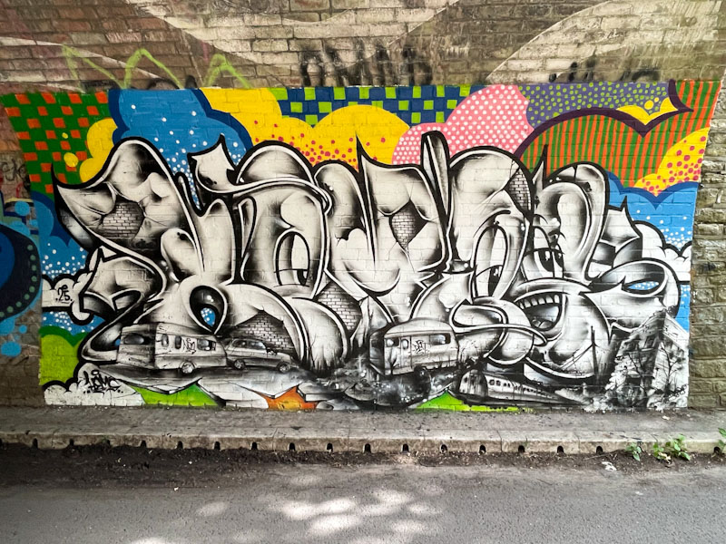
The tunnel, under the railway, at Boiling Wells Lane is usually pretty useless for graffiti, more commonly used for throw ups and tagging than serious artworks, but some new pieces from Hemper and friends have rather upgraded this spot, and I wonder if it will encourage others to paint there a little more.
Hemper, Boiling Wells Lane, Bristol, August 2025
Hemper has arisen from his mini-slumber for the last month or so and started producing these slimline ‘Hems’ pieces of which this is an absolute cracker. The black and white letters, portraying local scenes of trains and caravans, and full of mischievous characters, contrast superbly with the quilt-like patchwork of colourful patterns surrounding the piece. This is masterful work from one of the very best writers in the country.
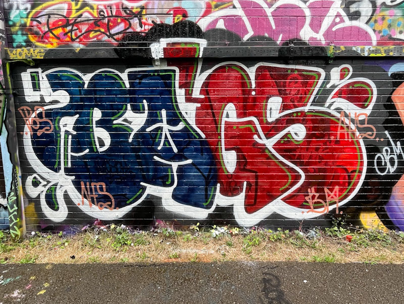
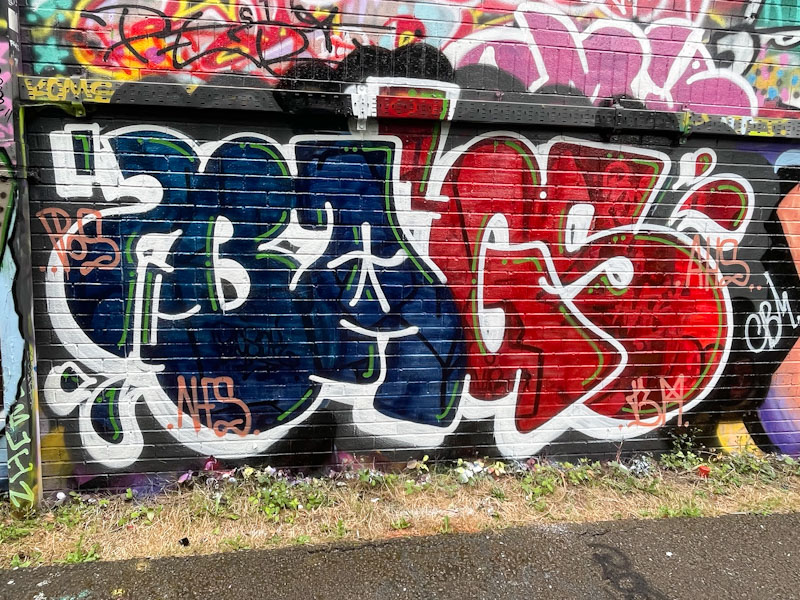
I have a great many pieces by Bags in my archives, but have only posted a fraction of them. I keep meaning to post more from this stalwart of the No Frills crew, but somehow never seem to do it. This is a recent piece, one of several, in which he has played with bilaterally splitting his letters into two colour sections, with the BA in one colour and the GS in another.
Bags, River Avon, Bristol, August 2025
He has painted so many of these, that his letters must come very easily, and he tends to keep the general shape of his letters consistent from piece to piece. The dark blue and red colours work well, and I rather like the half-and-half appearance. I’ll try to post more of his pieces in the future.
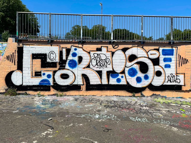
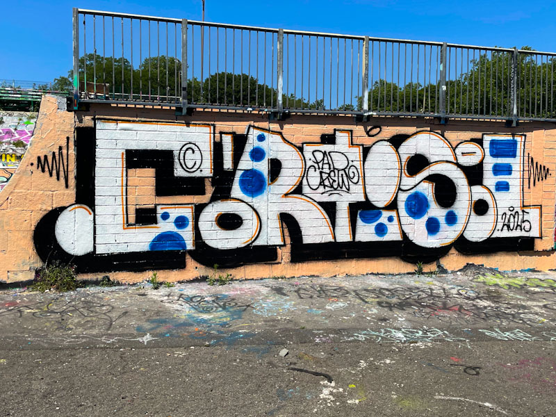
Cort is an elusive artist, painting as part of the PAD crew which includes Laic217 (what has happened to him?) and Trafficity amongst others in the Polish street art community. His style is really distinctive, and at times his work is exceptional.
Cort, Dean Lane, Bristol, June 2025
This is a rather tidy piece that looks like a bit of a sketch, painted or drawn with black and red biros (ball point pens) and a blue fountain pen. The letters are irregular in shape and size, but the whole word conforms to a specific height throughout. Set on a creamy background, the lettering looks rather good to me. I like this piece.
The two most prominent conflicts (although there are countless others) of our time that have mobilised public attitudes in the UK are the Israeli occupation of Gaza and The West Bank, and the Russian invasion of Ukraine, both of which are barely out of the news at the moment. The Nobel Peace Prize nominee-in-waiting, Donald Trump has appeased the aggressors and most powerful forces in both conflicts and achieved absolutely no progress towards peace since he took office. Shame on him. Siding with bullies and looking for a favourable deal (for him and his cronies) is all he appears to care about.
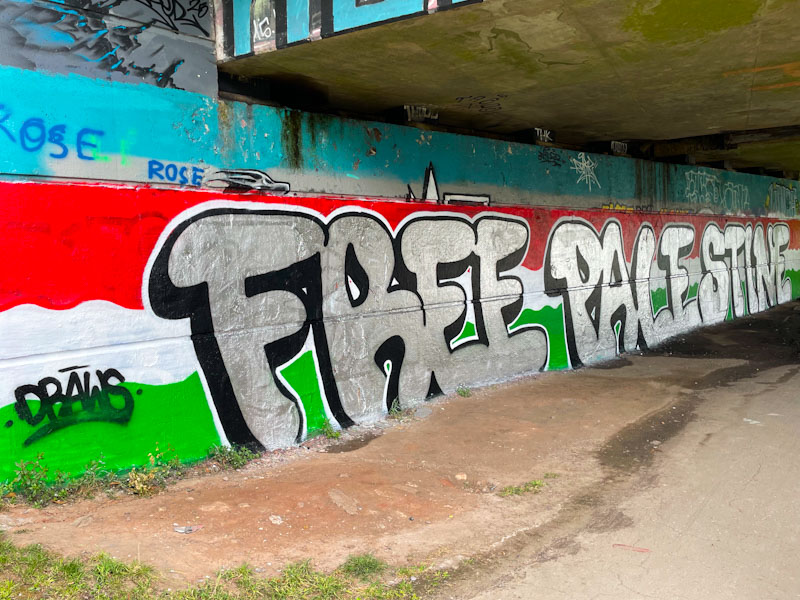
Mr Draws, Brunel Way, Bristol, June 2025
Meanwhile, protests continue and are powerfully expressed through graffiti art, which has a capability to commentate on the injustices of the world in a way that has a lasting impact. Mr Draws has done himself proud with this huge ‘Free Palestine’ piece in chrome, sitting on the red white and green colours of the Palestinian flag. I guess the black drop shadow makes up the black from the flag. (Note to self – prepare some protest galleries).
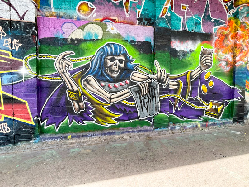
I have continued to dig out Tera pieces that I failed to post at the time they were painted, so this one from June is a little out of sequence, but demonstrates really well his development, which has been so rapid.
Tera, M32 Cycle path, Bristol, June 2025
I’m not quite sure what the overall message here is, but when I see skeletons and gold coins, I think about avarice and comeuppance. A message that I am always mindful of, and one that reinforces my dislike of selfish billionaires, is that ‘you can’t take it with you’. This piece says that to me. It is a well-painted piece that, in part, reflects his accelerated progress, and highlights some of the areas he can sharpen up on, which, in fairness, he has been doing since painting this a couple of months back.
It has been quite difficult trying to keep up with Tera’s incredible output this summer, and I have had to do a little trawl through my summer archive to find some of his pieces that I haven’t yet posted, including this one painted alongside Kid Crayon, back in May this year.
Tera, M32 roundabout, Bristol, May 2025
This is one of Tera’s earliest pieces (he touched the ground running), and demonstrates a certain amount of experimentation. It is an interesting piece of writing spelling out his name, but definitely feels like something that hasn’t yet formed an identity. The technique is good throughout, with some nicely graded fills and some good interlocking letters. Given some of his more recent large character pieces, this one looks like a stepping stone towards improvement.
Fade, Jody, Dibz, Cheo and Acid Face with a Brace, Cumberland Basin, Bristol, May 2025
In Bristol, we are really lucky and get to see a lot of collaborations and paint jams about the place, bringing together local artists who are often joined by visitors, invited or passing through. We get to see all sorts of different styles and levels, and then occasionally a top drawer special production like this one from Fade, Jody, Dibz, Cheo and Acid Face with a Brace.
Fade, Cumberland Basin, Bristol, May 2025
Photographing this production in its entirety was something of a challenge due to its sheer length and some difficult light conditions, with so much open sky above the wall. To start us off on this wall we have a semi-submerged piece by Fade, with the water level cleverly portrayed using different shades of colour above and below the water line, a theme continued by each artist through the production. Some dramatic skies round off Fade’s section nicely.
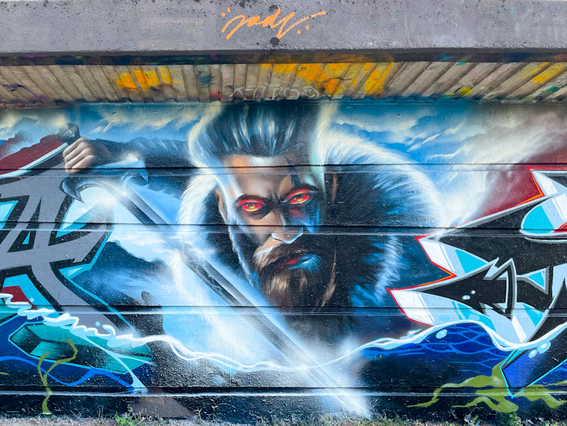
Jody, Cumberland Basin, Bristol, May 2025
Next up is a portrait piece by Jody featuring a warrior with a deep fur collar and long sword, so I am imagining a Viking theme going on, although I can’t help feeling that the hairdo doesn’t quite match the machismo of the character.
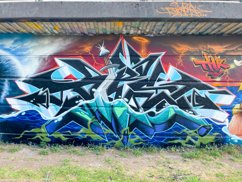
Dibz, Cumberland Basin, Bristol, May 2025
In the centre and holding the whole production together is a piece of typically brilliant writing from Dibz, again, with the water line running through it and incorporating a wonky long sword. The dramatic skies also continue through this story.
Cheo, Cumberland Basin, Bristol, May 2025
Cheo brings a whole different style to the piece, while faithfully following the Viking idea. His cartoon warrior, wading through the water, is festooned with long blonde hair tied up with red bands. His snarling face is made rather comical with the tilt of his helmet. Of course, a trademark bee, also with a helmet, is in attendance.
Acid Face with a Brace, Cumberland Basin, Bristol, May 2025
Rounding off the production is some more writing from Acid Face with a Brace, whose collaboration with Dibz and Fade in Dean Lane from earlier in the summer is still very much intact. The theme is beautifully embraced by Acid Face with a Brace, and he has included a wave breaking over his letters, mirroring the Fade piece at the other end. Awesomeness all round.
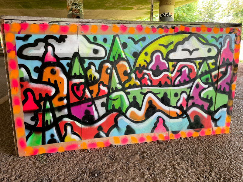
I was very happy to see that Creamylines dropped two pieces under Brunel Way recently, probably in the same session, one of which I posted a week or so ago, and this is the other, which was painted low to the ground on the end of a wooden skate ramp.
Creamylines, Brunel Way, Bristol, July 2025
Once again, Creamylines has presented a colourful landscape view, with fields and hills leading up to a sky dotted with clouds and a large yellow sun. There are plenty of figures or sentinels throughout the piece, which is given a serene and natural look, courtesy of the birds in flight. A calming piece in a crazy world.