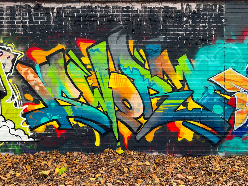
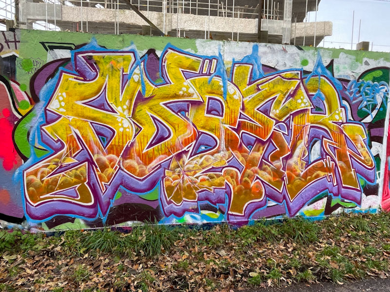
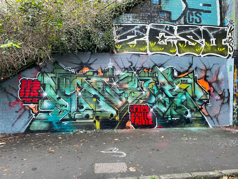
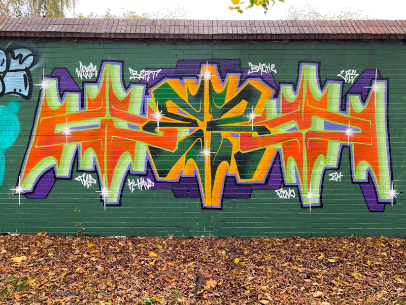
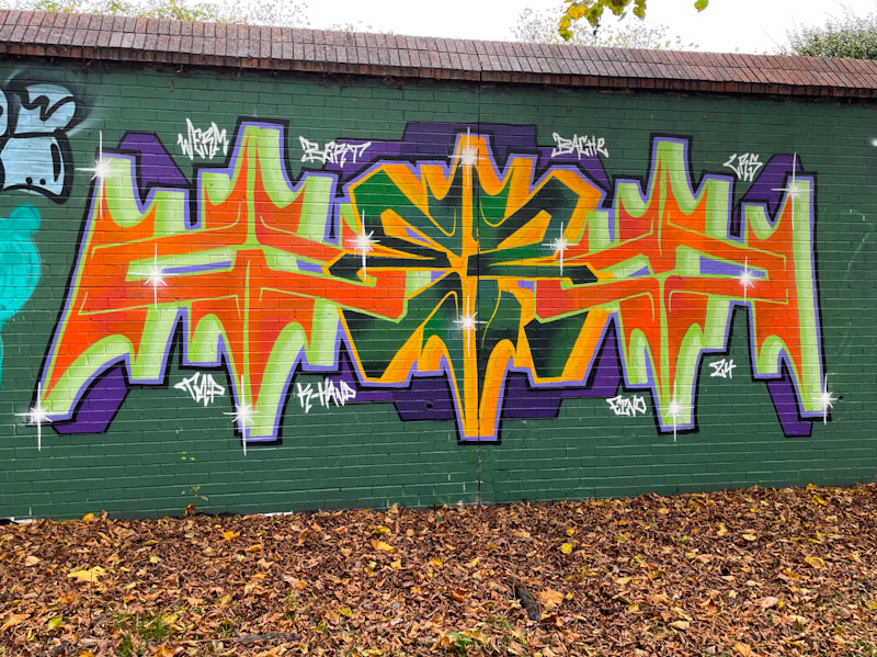
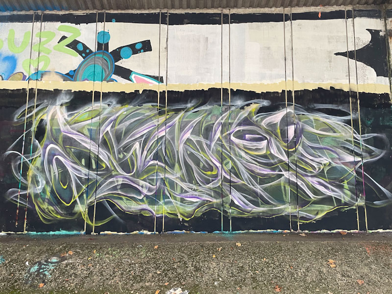
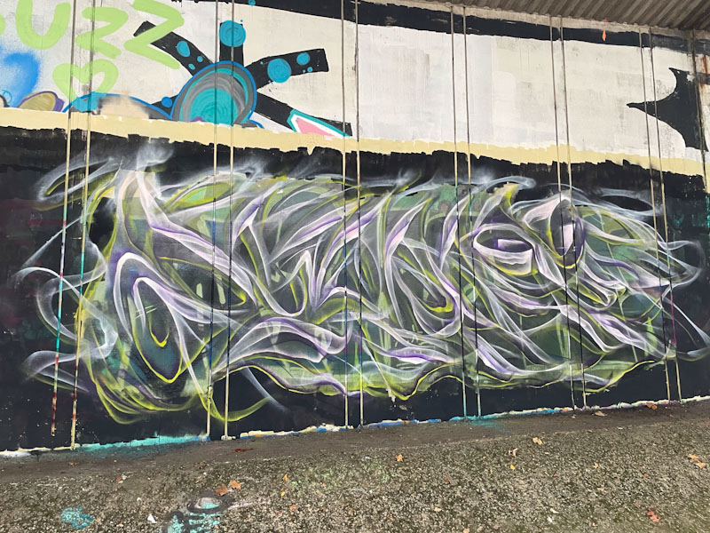
This is the second piece by Sworm that I have posted from this wall in the last couple of weeks, and although they were painted several months apart, I photographed both at the same time. While his first piece concentrated on the most extraordinary explosion of colour, this one turned the attention to the form of the letters.
Sworm paints only occasionally in Bristol, but it is great to see his work, because it is, in my view, really classy. The letters here are not uniform, but instead they blend in well together, filling all the gaps between them. The mid-line running through the letters and the subtle contrast in shades of cream create a lovely 3D effect. This is a really neat and tidy piece from a talented graffiti writer.