
.
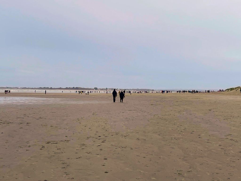
A New Year’s Day stroll
a sense of optimism
while dogs simply play
.
by Scooj

.
A New Year’s Day stroll
a sense of optimism
while dogs simply play
.
by Scooj
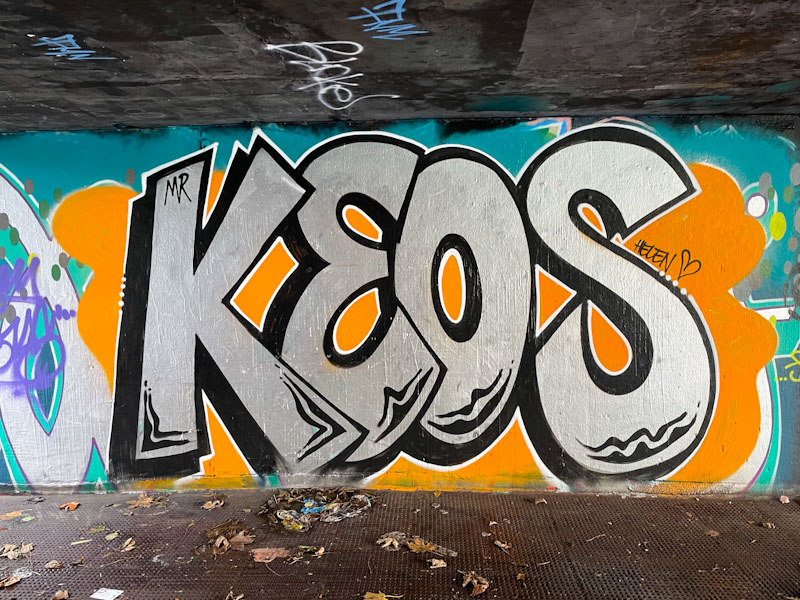
This piece by Mr Keos, was definitely worthy of inclusion in Natural Adventures, as it is rather different from any writing that we usually see in the city. Looking at his Instagram feed, it looks like Mr Keos paints all over the country and was simply passing through Bristol in December nd dropped a couple of pieces.
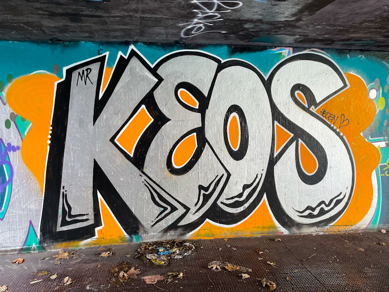
His letters are big, bold and distinctive, no chance of any confusion here. The work oozes experience from an artist who appears to be very prolific. The chrome letters stand out nicely on the orange background and the subtle black feature patterns at the base of the letters turn this from a good piece of graffiti writing into something rather better. I’ll be looking out for at least one other piece he painted in Bristol.
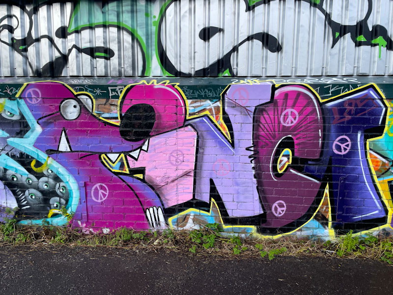
I walked past this piece by The Mole, when I first saw it, thinking that it was an old one that I had posted before, but I did a double-take and returned to it, because although it was similar to another piece by the artist, it was new and in a different location. It was one that nearly got away.

The writing says INCA, referring to the artist’s full name Inca the Mole. Painted in colours that he often uses, the letters are supported by the mole character. The Mole generally paints three forms of his work, The mole alone, the letters INCA or, as in this case, a writing/character combination. The piece is nicely rounded off with peace symbols, which usually accompany The Mole’s work. A fine and rather unexpected piece, from the frequent visitor to Bristol.
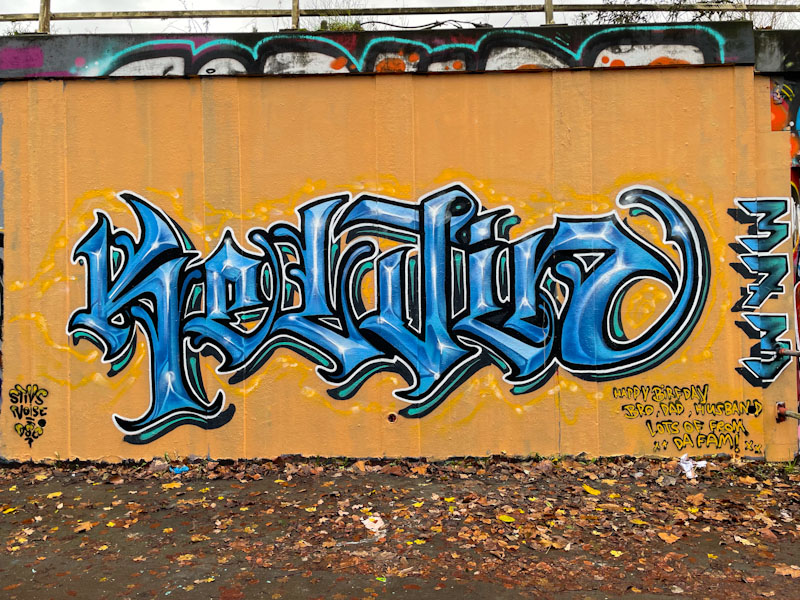
I would say that we haven’t seen nearly enough of Stivs’ work in the latter half of this year, so it was particularly gratifying to find this piece on the M32 roundabout, and even though it didn’t last very long, it was noticed.
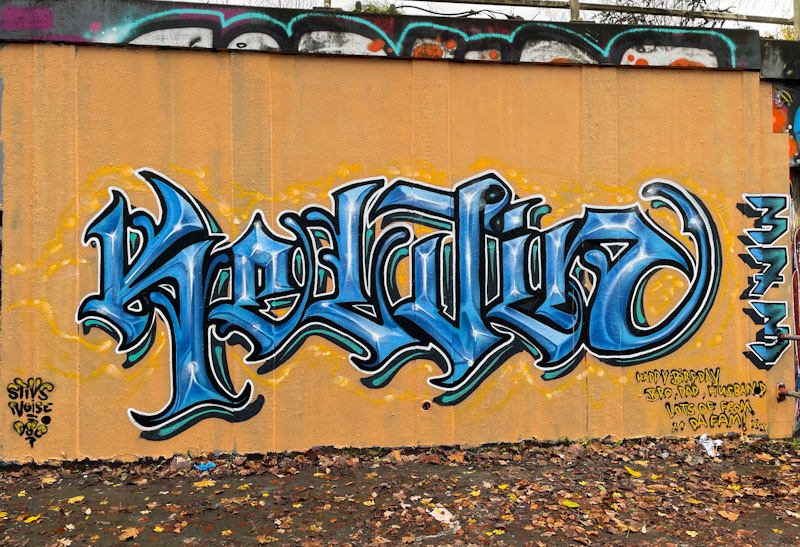
The calligraffiti writing was painted as a birthday piece for his brother Kelvin, and I can’t really think of a better present than a tribute piece of artwork like this, I know I’d be made up by such a gesture. The beautifully proportioned letters are given an extra lift from the wall by the clever use of the green drop shadow, which itself has a black border. Care and attention was given to the piece, as demonstrated by the sand coloured background and subtle wisps of paint around the letters. Great work from Stivs.
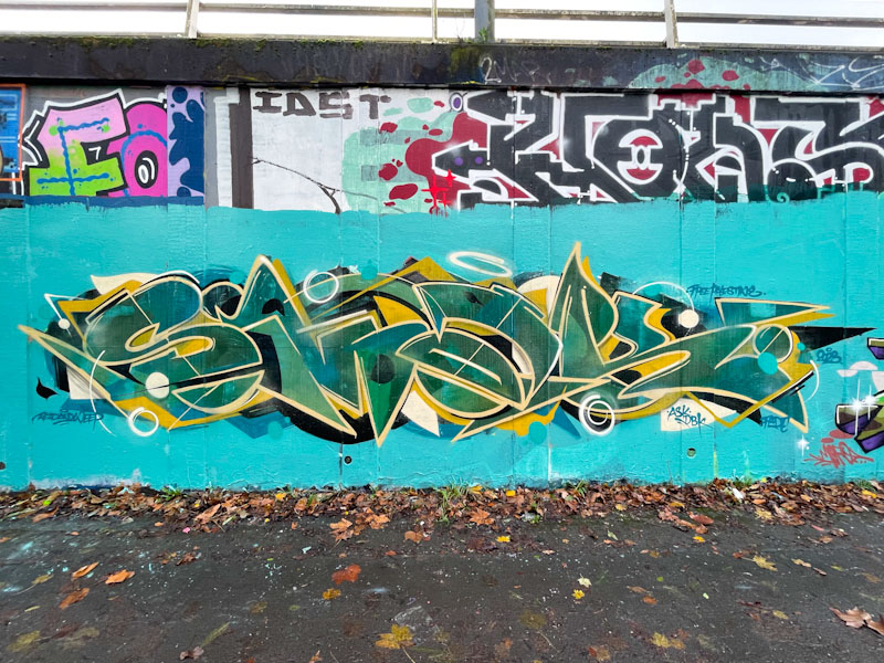
Smak has rounded off his year with some style, producing a string of outstanding pieces over the last six months or so, with this one, a paint jam piece for Pekoe’s birthday being the latest. This is an absolute classic, written in Smak’s distinctive style, where each letter is afforded plenty of space for elaboration.
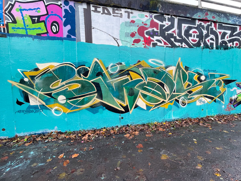
The letters are painted in greens and yellows, which is usually a winning combination of colours. The letters SMAK can clearly be seen, and have been stunningly designed. When I see a complex piece of graffiti writing like this, I am left utterly awestruck by the artist’s ability to create such a thing of beauty with spray cans. A triumphant piece from Smak.

Two more pieces from the incredible RBF Rugrats paint jam in November celebrating Bnie’s birthday and Vozie’s baby. Here the two combine to give us a glimpse of their awesome artwork. As a combination, these two paint really well together and seem to get the best out of each other.
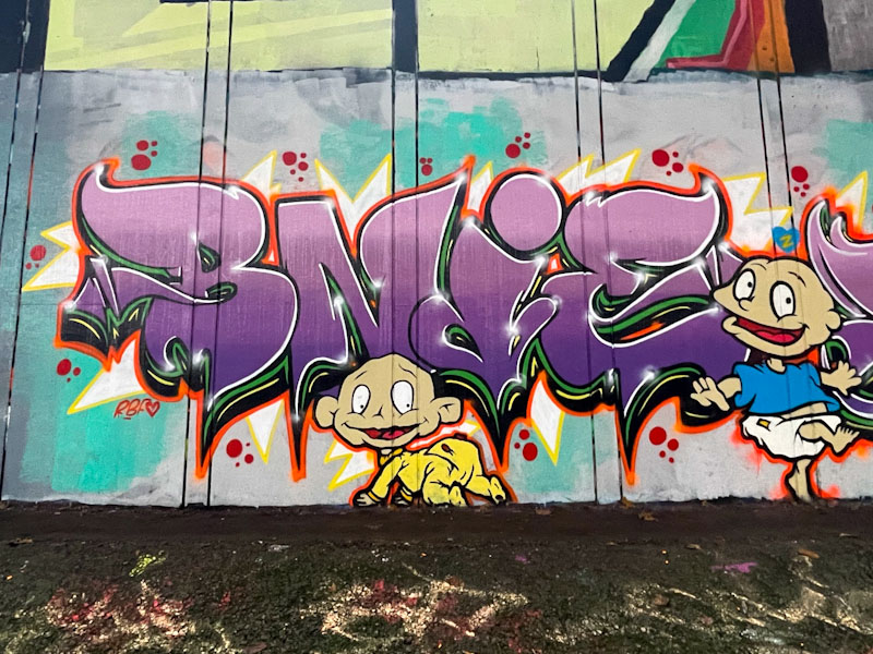
Both artists have adopted the colour palette used for the paint jam and both have included characters from the to cartoon show, Dil and Tommy Pickles. I was just a little too old to enjoy the show, but my kids used to watch it when they were little. The accomplished piece of writing from Bnie is filled with four horizontal shades of pink/purple, creating depth and interest in the work.
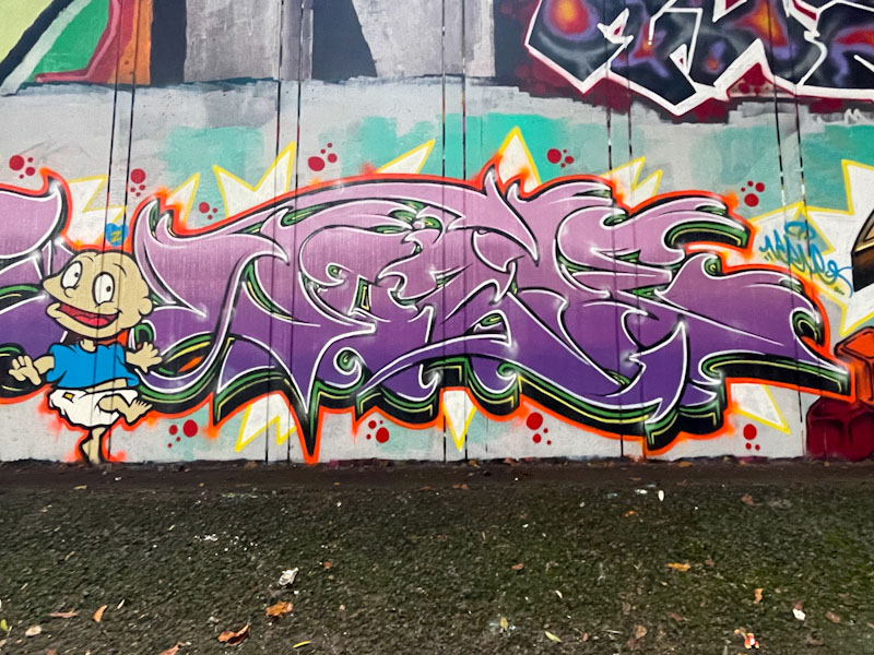
To the right of Bnie’s letters, Vozie has reflected the fills in her own distinct lettering. Both have also created a complex letter border of green with white and yellow highlights, a black drop shadow, completed with an orange outline finishing the piece off beautifully. Great work from this talented duo.
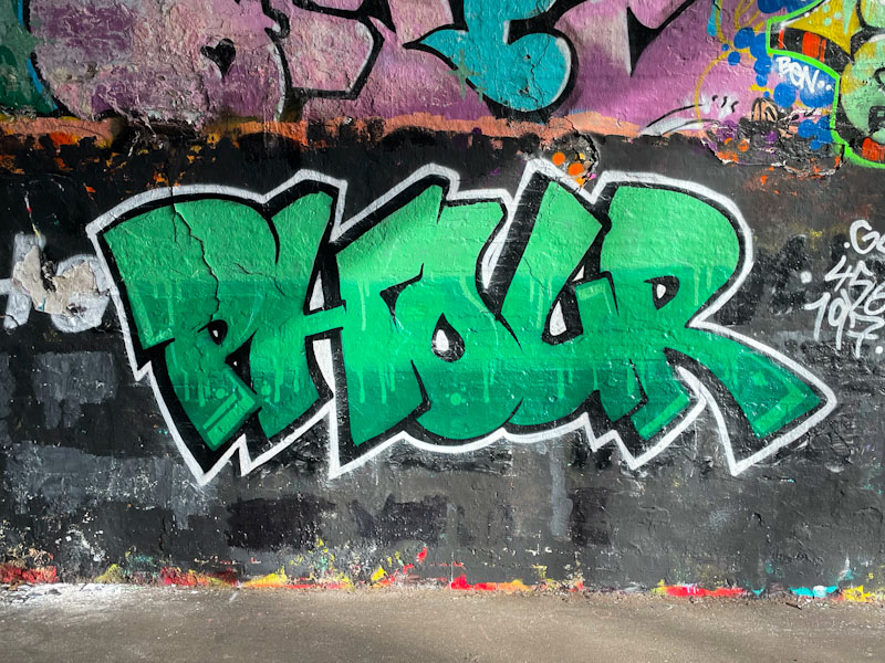
Phour is one of those graffiti writers whose work either lasts for only a day or two in the more popular spots, but because he paints in some unusual places, some of his work stays visible for months and months. This piece, in the tunnel didn’t last very long at all (I think, but I am now starting to doubt myself).
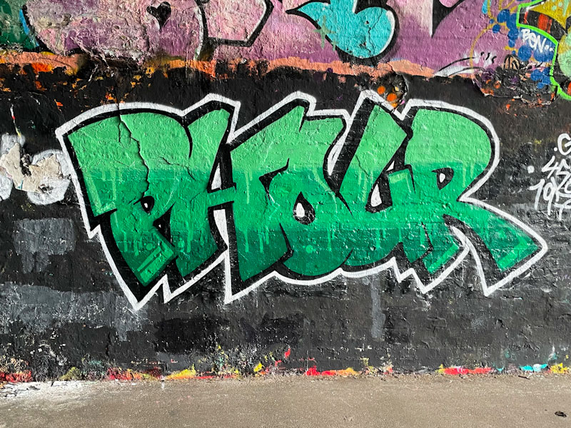
His strong letters and colour selections always draw attention. This one is perhaps a little more sophisticated than it might look at first glance. There are three layers of green, very nicely presented with drips falling from one to another layer. A black drop shadow and white border round the piece off very nicely.
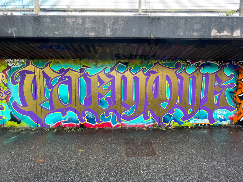
I haven’t seen many pieces by Todoaciem this year, and I hope that his lack of painting on the streets is because he has other important things happening in his life, such as employment or family etc. The rarity makes each piece even more enjoyable to find, and this piece of calligraffiti alongside the M32 motorway is an absolute belter.
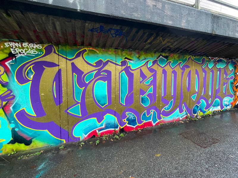
The writing spells out CIEM ONE in rich gold and purple tones, the colours of royalty. A light dusting of light blue serves to lift the letters a little. Todoaciem is a master of calligraffiti, and his letter proportions and shapes are outstanding, to leave us with a superb example of this style of writing.
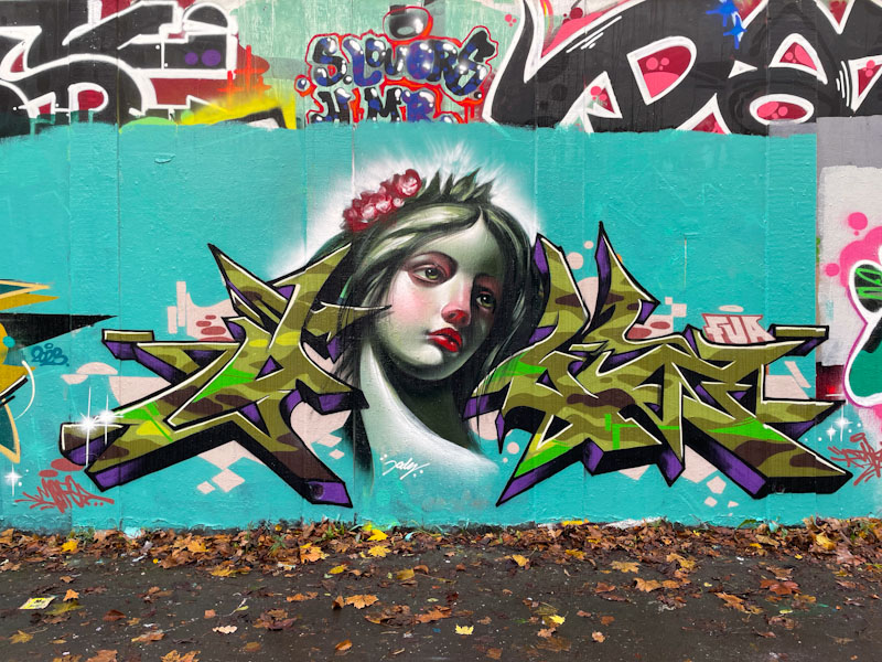
There is just enough time to squeeze one more utterly awesome piece from Dibz and Jody before the year is out. Although not overtly Christmassy, this piece does have a sense of celebration and festival about it.
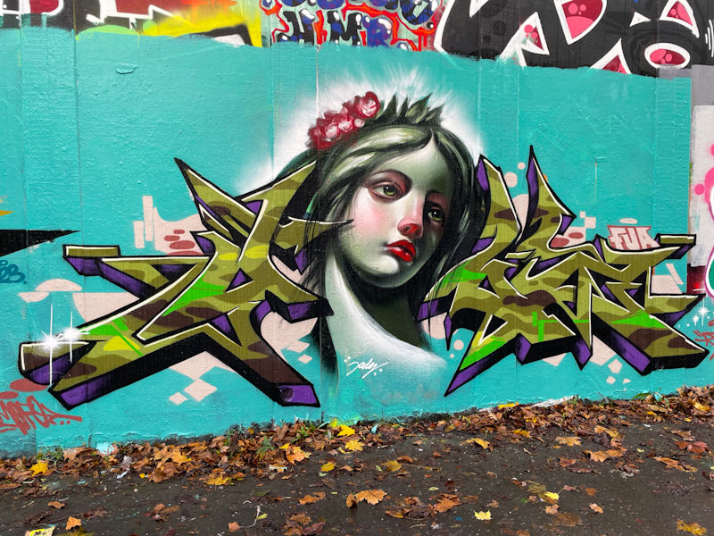
The wildstyle writing is from Dibz, and has a camouflage influenced design, offset perfectly with dark purple drop shadows. The letters, which of course are perfectly sharp and well finished, create a wonderful frame for the central portrait by Jody.
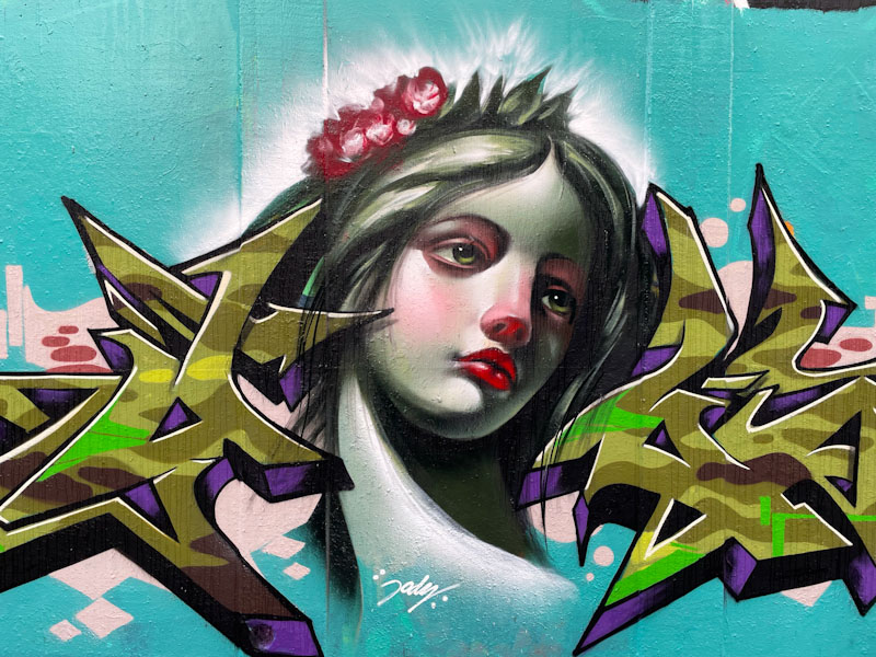
Jody has actually painted a lot on the streets this year, which has been a huge bonus, and he has definitely saved one of his best for this end-of-year collaboration. There is a sadness and calm in the portrait, and it feels religious or spiritual in nature. Simply stunning.
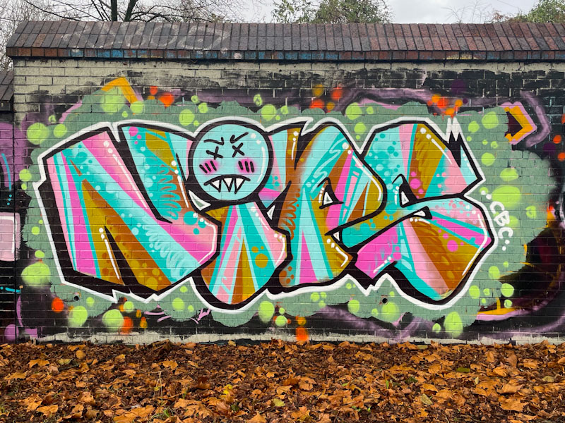
Counterintuitively, now that I have a little bit more time on my hands during the Christmas break, I am finding it harder to make time to write my blog. Perhaps it is the disruption to my routines – and I am a grumpy old man who has become rather fond of routine, which makes me a good companion for the dog. Regular patterns work for both of us. Today’s piece is a piece by Nips in Sparke Evans Park.
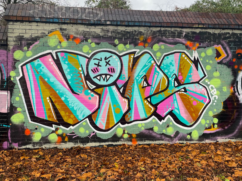
I haven’t posted all of Nips’ pieces, that I have seen, but will try to remedy this in the New Year, because I rather like her straightforward no-nonsense approach to graffiti writing. There is a lack of pretentiousness in her work, that is refreshing. The most notable thing about this piece is the outstanding fill design and execution. Modest and yet impactful, this is a really enjoyable piece from an artist I know little about.


