
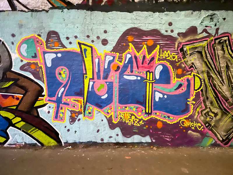
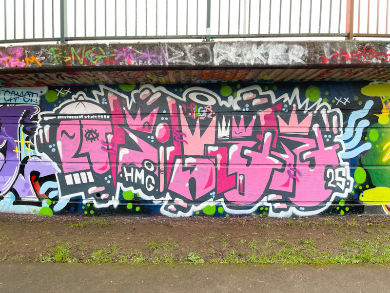
A gallery of intricate, colourful and disguised graffiti writing from Bristol’s Dirtygypo.
Instagram: @dirtygypo
All photographs by Scooj
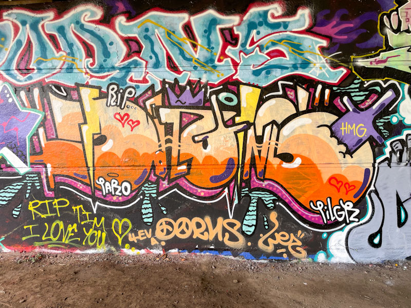


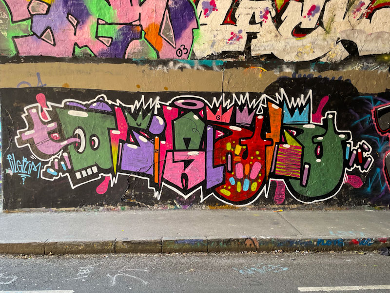


A gallery of intricate, colourful and disguised graffiti writing from Bristol’s Dirtygypo.
Instagram: @dirtygypo
All photographs by Scooj
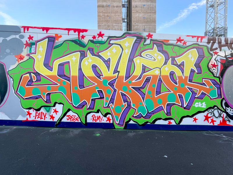
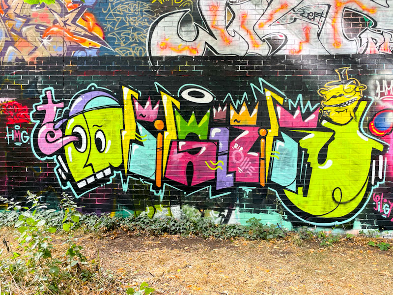
Haka is another of those artists who is at the very heart of the Bristol graffiti art scene. His authentic and good-natured style, and occasionally, although less so in recent years, politically motivated work has been replaced in the last three or so years with lighthearted children’s picture book combinations. This piece is just a straightforward piece of graffiti writing.
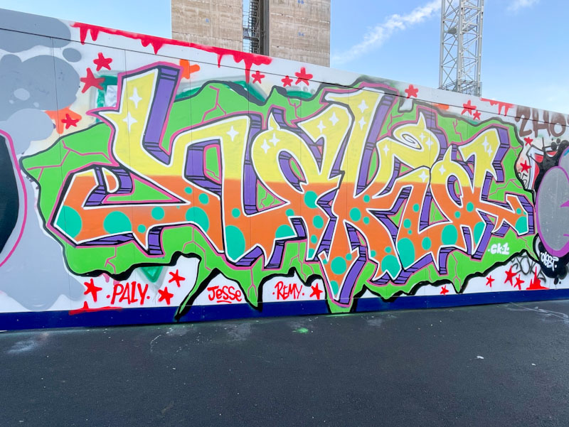
This bright and optimistic piece is painted on some relatively new hoardings alongside the River Avon, surrounding a new development – you can see the initial concrete pillars, which I am guessing will be lift shafts for the new building. Haka has produced a lovely clean piece with great yellow and orange colour separation and plenty of fill decorations. A drop shadow veers off to the right, and the whole thing is contained in a green background splat with orange crack lines. A really nice piece of graffiti writing.
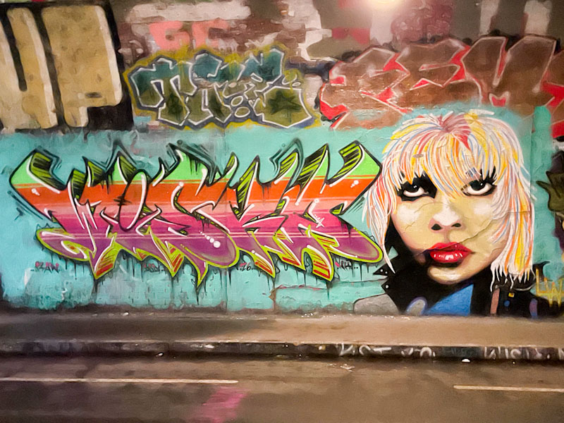
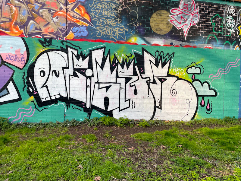
It has been really hard work finding new pieces so far this year. The near constant rain has kept most artists at home. I am expecting a deluge of work once the sun returns, and my files for March and April to be overflowing. At least St Werburghs tunnel seems to offer refuge for those brave enough to venture out, like Neddy Ned Ned and Jest Soubriquet.
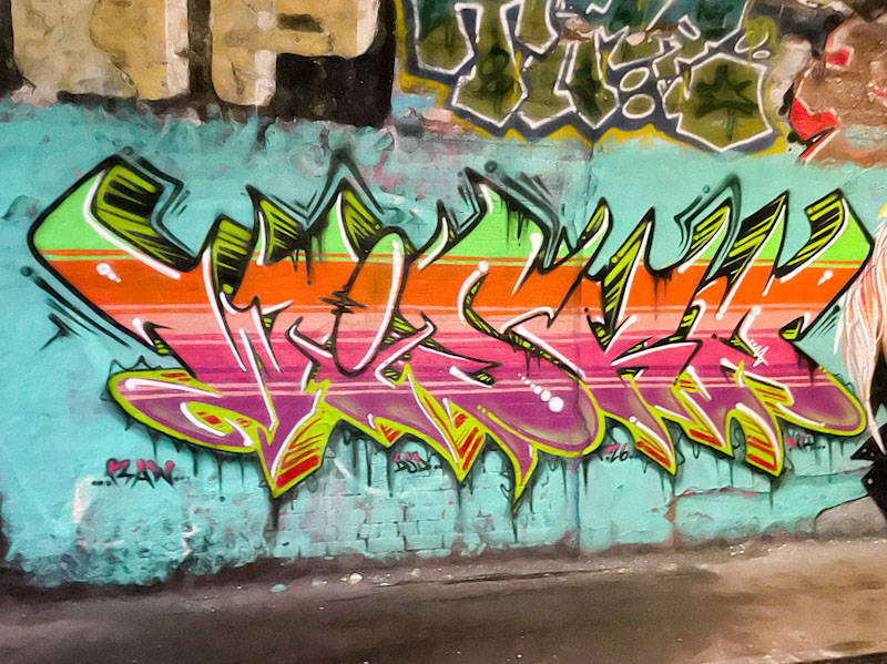
I really wasn’t expecting this piece, so it definitely came as a pleasant surprise. The letters, spelling out WISKA are by Neddy Ned Ned, and are full of colour, with delineated horizontal stripes running through the letters in colour sequences. The drop shadow has a disappearing point in the middle of the piece, and the upper half colours are black and green and the lower half, red and green. A nicely thought out piece.
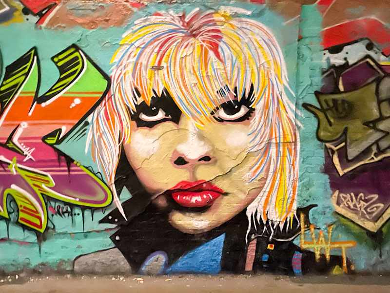
The portrait piece by Jest Soubriquet is really striking, especially the lips and eyes. I feel that the top half of the head needs to be higher, as the proportions don’t quite work. I like the mix of a realistic face with stylised hair, it works for me. Nice to see these two painting together.
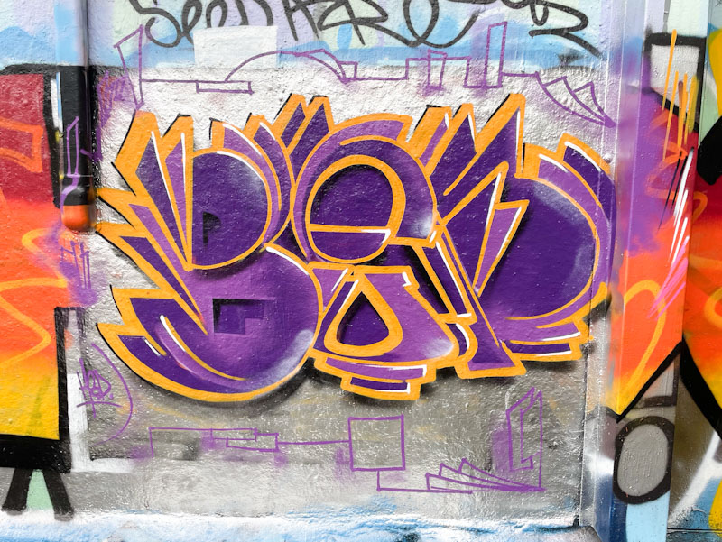
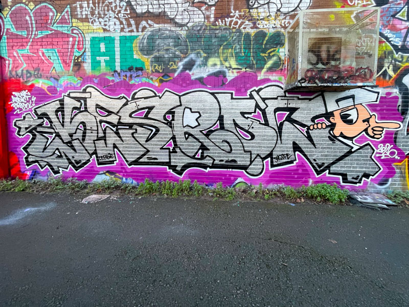
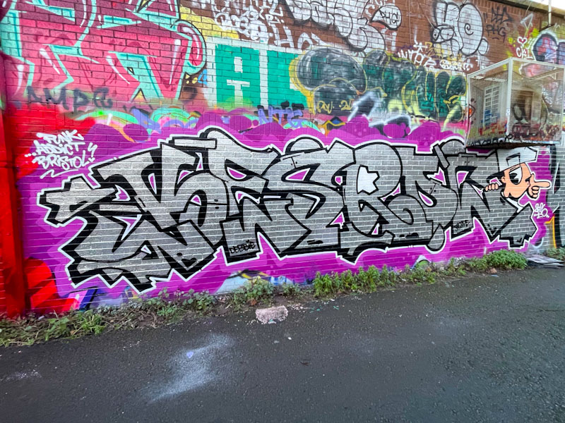
It has been a while since I last saw Benjimagnetic paint the letters BEN, as he appears to have preferred the letters GRO lately. The colour selection for this piece is absolutely fabulous, and the two tones of purple add to the splendour.
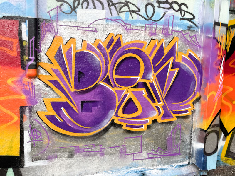
The whole thing is much more contiguous than some of his pieces, which can be rather more deconstructed. There is a really subtle, but effective, thin black drop shadow to the left of the letters, offering some definition. The letters are set on a chrome background which includes a little line drawing sketch around the outside. A classy piece from Benjimagnetic.
I have decided to stick to the name J9449j for this artist. It was the first Instagram handle that I came across when posting his artwork, but which has changed several times since. It just makes sense to use the one name, even if it is the wrong one, for consistency’s sake.
There is so much mystery surrounding J9449j, and I wonder if in this piece there are some heavily disguised letters, because those shapes and the length of the piece would suggest so. The colours and shapes are absolutely wonderful, with the customary nod to nature. I also feel there is a bit of an Orla Kiely look going on, which, I might add, is a good thing.
Many times I go out to photograph street art, I come away empty-handed, especially when it has been raining a lot, but every once in a while I get lucky, not only with finding new pieces but also meeting the artists who paint them. This trip to the River Avon was particularly fruitful.
I caught Malibueb while he was finishing this piece off, and chatted with him, because I wasn’t familiar with his work, and guessed he was visiting. It turns out he is a Swiss musician and was doing a set in Bristol that evening, but he also paints a bit – well he was just being modest I think, because this is a fine chrome combination piece with an excellent old school character rounding it off. It is always good to welcome visiting artists to Bristol.
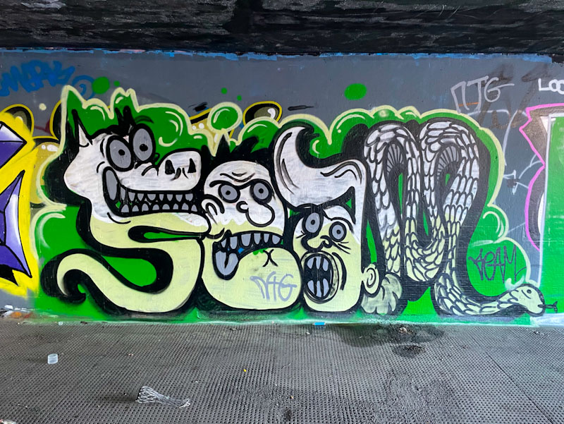
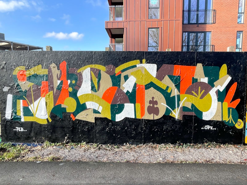
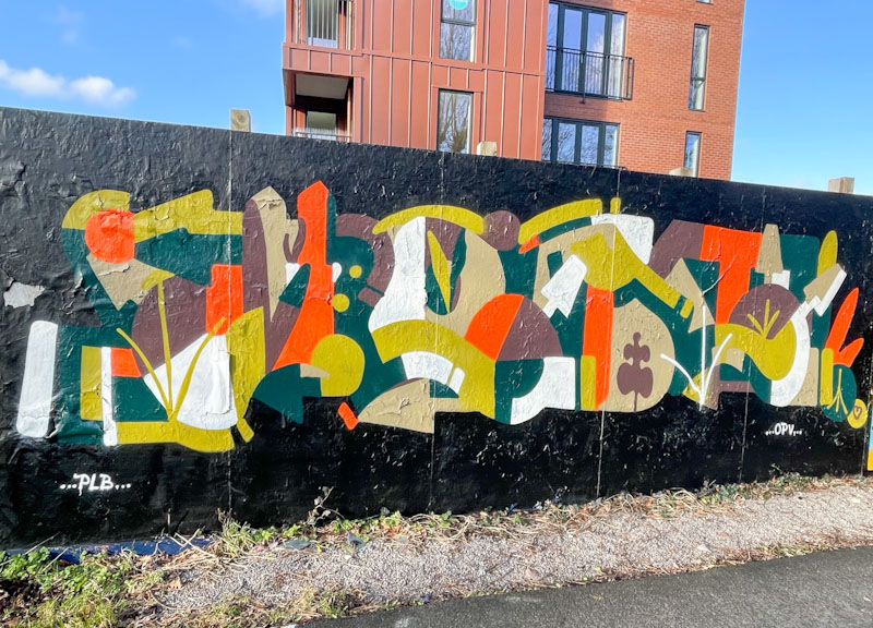
I believe this to be the first time I have posted a piece by Seam, and I know little of the artist other than that he paints with Seed and Bugz, with encouragement from Zinso and Asre.
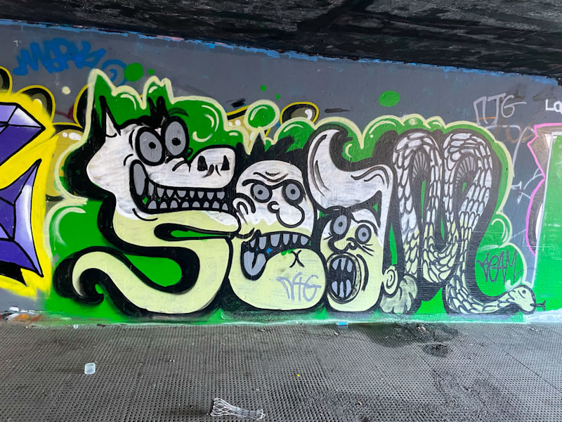
This piece is a nice combination of letters and characters spelling out Seam, where each letter is rather an animal or a face. That the whole thing is painted in grey tones with a green background is both adventurous and inspired. A fun piece – I look forward to more.
What a fun-packed weekend. Yesterday I drove back from Cornwall to Bristol after my workshop and then on from Bristol to London to stay with my wife’s brother and family before heading off to a football match this afternoon. Arsenal v Sunderland in case you are interested. It has left very little time for me to write blog posts, and this one was composed last night in Bristol between journeys.
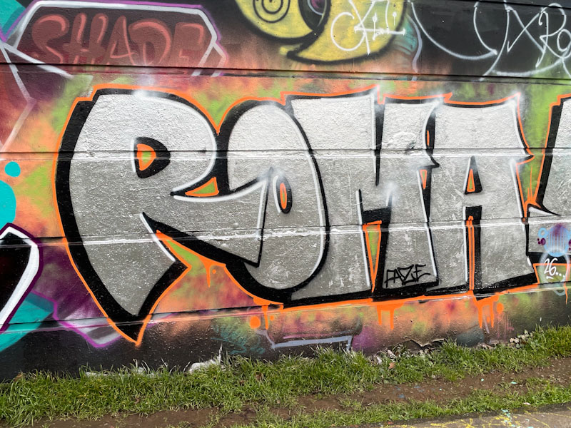
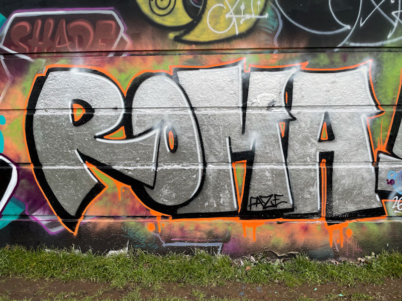
Roma is another artist who writes in a simple and authentic manner using four letters. This is a wonderful chrome piece, set on a dusting of orange. I am seeing more and more of her pieces about the place, which can only be a good thing.
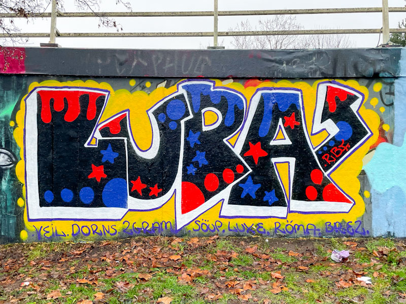
There is a simplicity and a joy in Lupa’s work, which makes me very happy. Often her pieces can be slightly untidy, but this one is really nicely finished, but maintains that grounded charm she achieves.
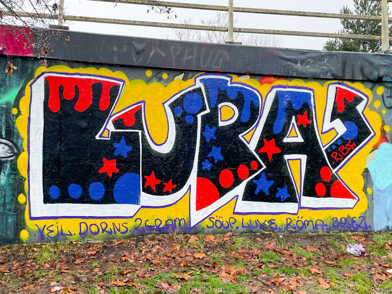
Her letter shapes are great and the fills have a wonderful 1970s vibe to them, especially set on the contrasting yellow background. I love this piece… can you tell?
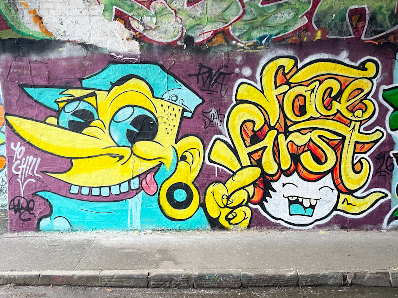
A super quick post today, written last night because I’ll be running a workshop all day today. What a brilliant thing to see PWA faithfuls Zake and Face 1st meeting in Bristol together and creating this collaboration, especially as both have moved away from the city.
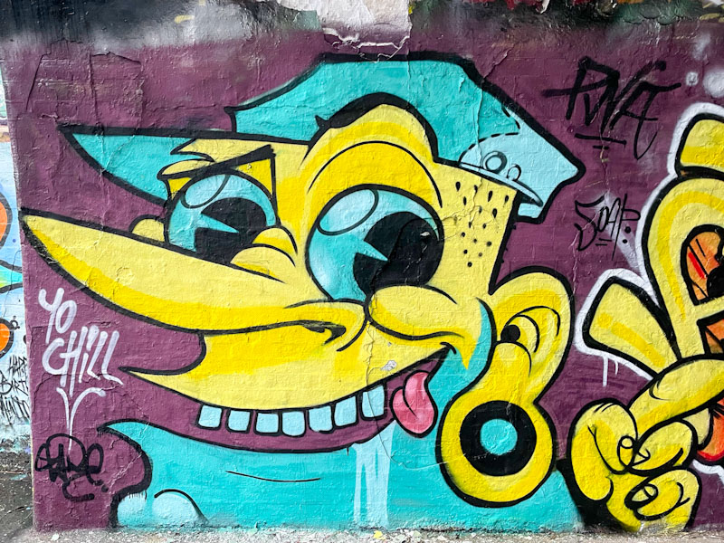
Chill doing what Chill does with some superb colours. Although, had I looked a little more closely I would have seen that it is a piece by Zake in the style of Chill. So cool.
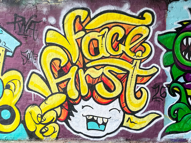
Face 1st with one of his classic laughing girls with big hair spelling out his name. A superb and quite unexpected collaboration.


