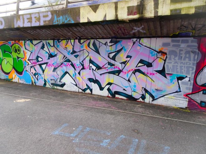
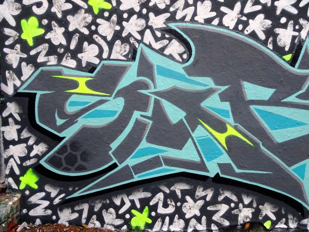
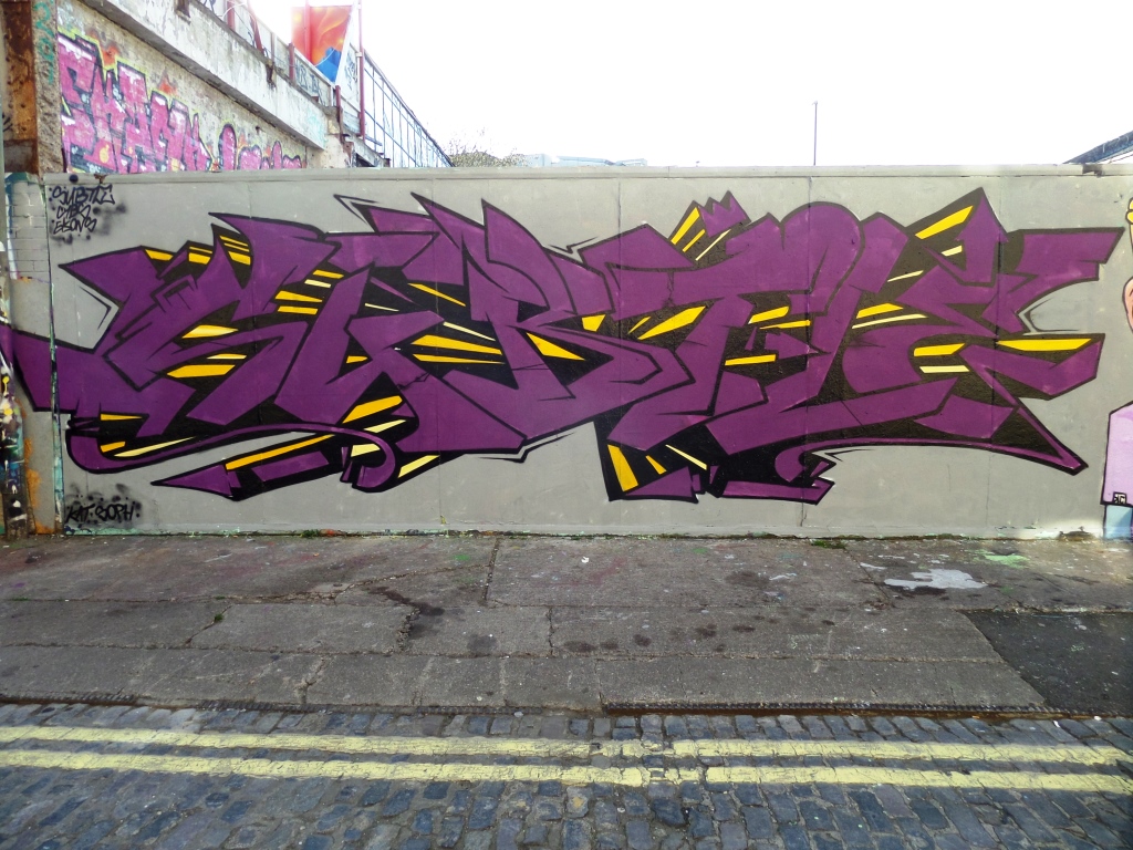
Ryder has stamped his moniker all over Bristol, either with the letters RYDER or with his ‘R’ character. Because his work is everywhere, it is sometimes difficult to know whether you have already photographed a piece or not, and that was the case with this one on the M32 cycle path. While I might have photographed it, I haven’t posted it until now.
Ryder, M32 cycle path, Bristol, March 2020
The obvious thing to comment upon is the dynamic and free-form fill that Ryder has used – not solid, but rather more organic, like the kind of fills you might see from Ugar (what’s happend to him recently?). The whole thing is unusually subtle from Ryder, but look closely and you’ll see that it is a real gem.
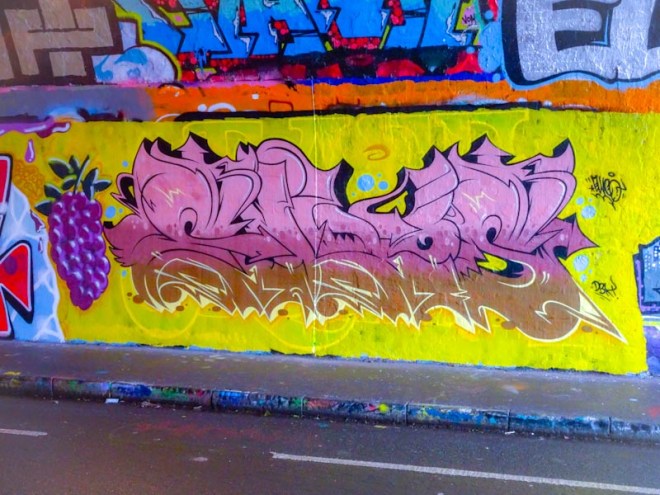
Elvs has spend a lot of productive time in St Werburghs tunnel this winter and created a crop of stunning pieces. I’m not sure about the significance of the bunch of grapes, but the leaves are more like those of an olive tree rather than a grape vine (#onlysaying).
Elvs, St Werburghs, Bristol, March 2020
Set on a yellow background, and sticking to his tried and tested formula of letter font and shapes, Elvs has a horizontal grading through the piece from pink to dark pink to brown. He has cleverly incorporated black 3D shading on the top half of the piece and yellow outlines at the bottom. This is another fine piece, but I have to say that I don’t think the yellow background does the whole thing any favours.
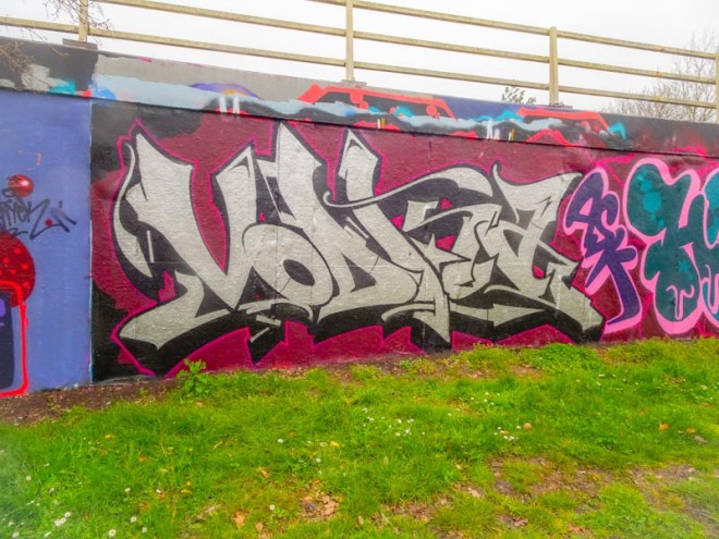
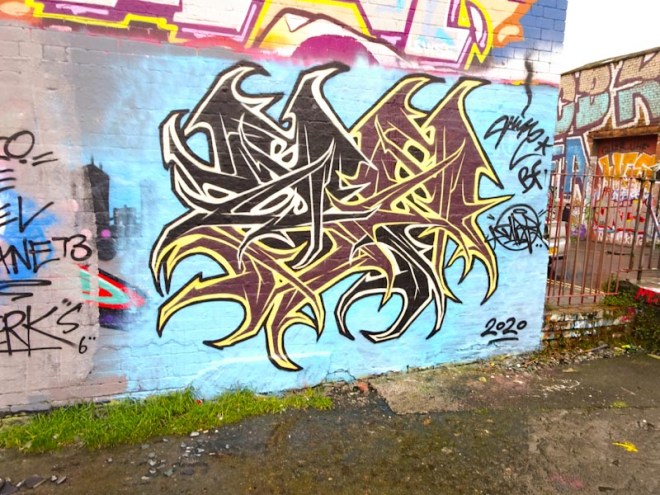
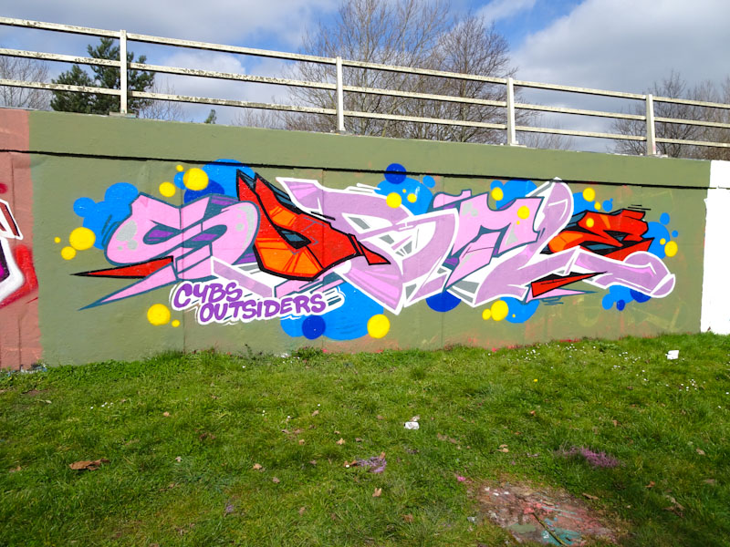
Figuring this one out might be a challenge for those unfamiliar with Bristol artists, because the word VODKA might have little meaning and certainly isn’t a name we see here. Regular readers will all have seen an awful lot of work by this artist in Natural Adventures and so might be familiar with the letter shapes and style.
Soker, M32 roundabout, Bristol, March 2020
It is of course by Soker and a gentle nod to artist Vodka (@ren_jeffys). It is a beautifully conceived and executed piece down on the M32 roundabout. Soker has been on fire over the last month or so – it will be interesting to see if he continues as the Coronavirus restrictions grow.
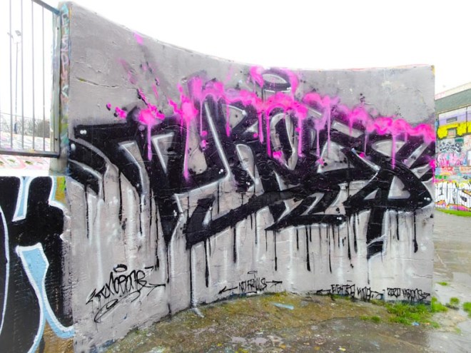
Another triumph for Turow One on the famous curved wall in Dean Lane skate park. There is something rather pleasing about the greyscale graffiti writing topped with a vibrant pink and lilac drippy splodginess. The writing is deliberately made to look kind of messy and drippy, but all the elements of skillful work are there.
Turoe One, Dean Lane, Bristol, March 2020
I think that Turoe One might be topping the chart in Bristol as being the most productive astist in town just at the moment, with perhaps the exception of Face 1st who is in a league of his own. Since the weather has improved a little, the turnover in Dean Lane has increased, and this wall in particular has seen a fair amount of action. This is a classy piece of graffiti writing from a confident and accomplished artist.
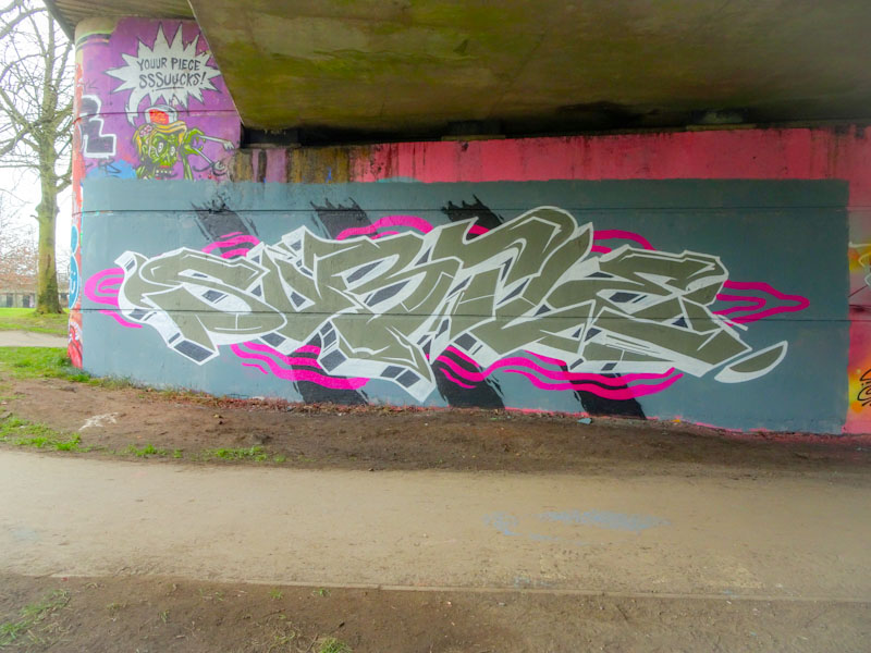
Definitely Hire has come out of hibernation with this, his second piece in a week in Dean Lane, coming so quickly after his rabbits that I wrote about in Natural Adventures last saturday. I always describe Hire;s writing as having a Gothic look, and this piece typifies that.
Hire, Dean Lane, Bristol, March 2020
The rather compact writing is very well disguised and I can only guess that it says HIRE as most of his pieces do, but I can’t quite see it here. When you look carefully at the piece you may notice that the writing is in two colour combinations. One is black and white, the ther brown and yellow. The more you know this, the more discrete the two sections become, it is almost like an optical illlusion. Another fine technical piece from Hire.
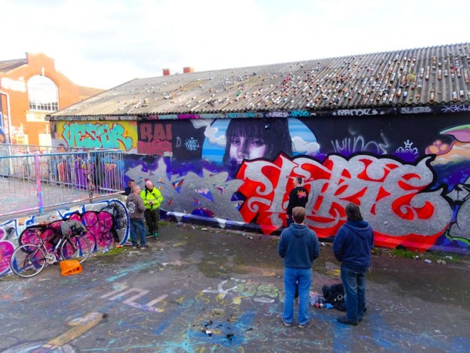
From the feature image it is difficult to gauge the significance of this collaborative wall from little more than a week ago in Dean Lane skate park. I gave you a little hint earlier this week with a piece by Rusk which is on the left hand side of this wall behind the fence and which can’t be viewed from this vantage point.
Soker, Inkie and Hemper, Dean Lane, Bristol, March 2020
I had decided to take the dog for a walk to Dean Lane and talk about being in the right place at the right time… this was it, and so utterly random that I had chosen to go down there. Not only were Soker, Inkie and Hemper busy doing their thing, but Rusk was also there and watching on were The Agent, Angus, DJ Perks and Tes (Slim Pickings).
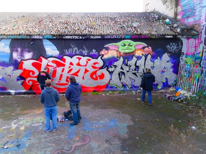
Soker and Inkie, Dean Lane, Bristol, March 2020
It was a little bit like I had died and gone to graffiti heaven. To see these established writers all at work simultaneously was a rare treat indeed, and that other artists who had been tipped-off were watching on made the whole thing feel extra special.
Inkie and Hemper, Dean Lane, Bristol, March 2020
I had met all the artists before with the exception of Hemper who seems to have had something of a renaissance of late, but this wasn’t really the right time to introduce myself, more an opportunity to watch how these guys go about their businness.
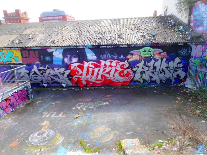
Soker, Dean Lane, Bristol, March 2020
Soker’s chrome piece on the left is near perfect and spells out Sokem (the R and M are interchangeable in his name). The photographs of the finished pieces were taken a day or two later.
Inkie, Dean Lane, Bristol, March 2020
Inkie’s central panel is classic Inkie and whilst also in chrome stands out due to the deep 3D shading in a striking scarlet colour. This is the third Inkie I have seen so far this year which is not bad going especially as there haven’t been any festivals in that time.
Hemper, Dean Lane, Bristol, March 2020
I am less well acquainted with Hemper’s work simply because he hasn’t painted as much as the others until relatively recently. Again in chrome, this third panel of the triptych mirrors the colours of Soker’s piece on the left to give some symmetry to the collaborative work. A landmark wall and a red letter day.
Soker, Inkie and Hemper, Dean Lane, Bristol, March 2020
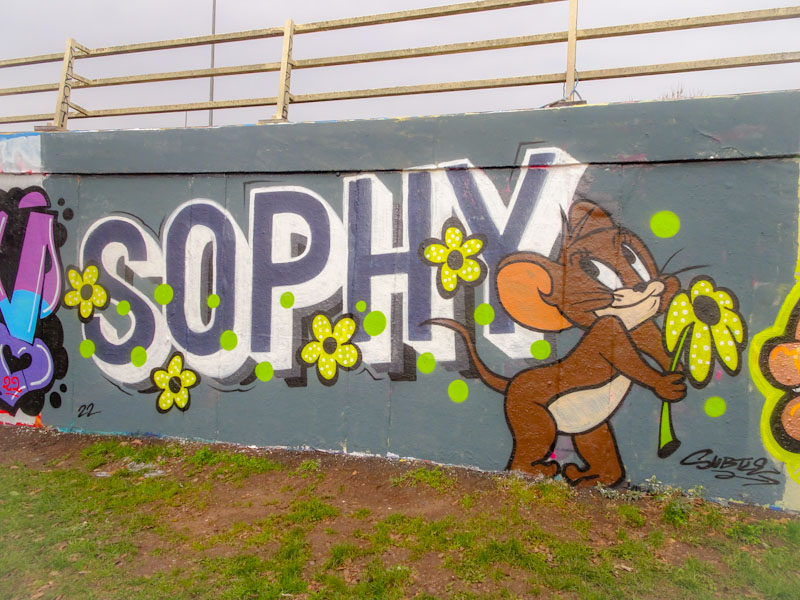
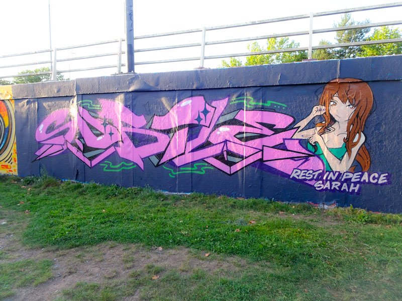
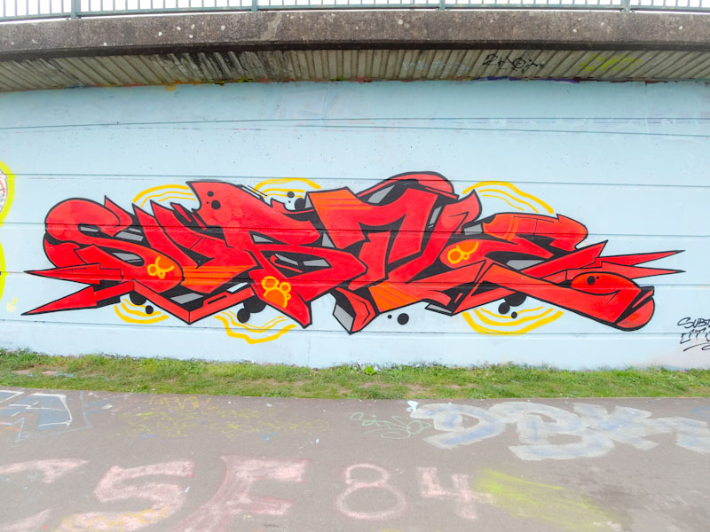
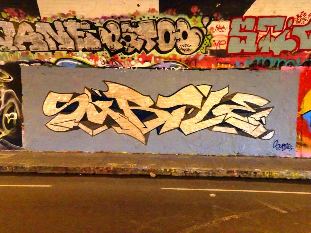
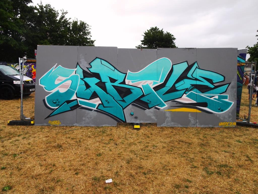
A gallery of brilliant graffiti writing from Bristol’s Subtle.
All photographs by Scooj
Subtle, Greenbank, Bristol, November 2024Subtle, M32 roundabout, Bristol, March 2022Subtle, M32 roundabout, Bristol, March 2022Subtle, M32 roundabout, Bristol, September 2021Subtle, M32 roundabout, Bristol, September 2021Subtle, Cumberland Basin, Bristol, April 2021Subtle, M32 roundabout, Bristol, March 2021Subtle, Brunel Way, Bristol, March 2021Subtle, M32 cycle path, Bristol, March 2021Subtle, M32 roundabout, Bristol, October2020Subtle, M32 roundabout, Bristol, June 2020Subtle, Brunel Way, Bristol, March 2020Subtle, Brunel Way, Bristol, March 2020Subtle, Dean Lane, Bristol, January 2020Subtle, St Werburghs, Bristol, January 2020Subtle, Dean Lane, Bristol, July 2019Subtle, Dean Lane, Bristol, July 2019Subtle, Dean Lane, Bristol, July 2019Subtle, St Werburghs, Bristol, March 2019Subtle, St Werburghs, Bristol, January 2019Subtle, St Werburghs, Bristol, January 2019Rezwonk and Subtle, Dean Lane, Bristol, September 2018Rezwonk and Subtle, Dean Lane, Bristol, September 2018Subtle, Upfest, Bristol, July 2018Subtle, Moon Street, Bristol, November 2017Subtle, Armada Place, Bristol, November 2017Subtle, Armada Place, Bristol, January 2016Subtle, Moon Street, Bristol, April 2016
Now, I rather like this piece by an artist I know nothing about and have drawn a complete blank on using the Interweb. I think the artist goes under the moniker ‘Dtok’ but it could be any number of variants. I will try to find out more.
Dtor, Dean Lane, Bristol, March 2020
It appears on the famous curved wall in Dean Lane skate park and is a nicely done piece of writing and character accompaniment. I have seen this character, Marvin the Martian, before on Hill Street painted by Deamze. Although Deamze has left us for Hobart, his Marvin piece is still there for all to see. When you compare the two works, you can see that Dtok is on a journey and that practice will pay dividends in the long run. I like this piece a lot but it didn’t last very long unfortunately.
I should know by now that finding pieces by Rezwonk shouldn’t come as a surprise. He is a busy artist and will spray his work pretty much anywhere in the North Bristol spots, but finding this one really was a surprise as I didn’t know it was here and hadn’t seen it appear on social media… it is always nice when that happens, it somehow feels like a more genuine find.
Rezwonk, M32 cycle path, Bristol, March 2020
The REZER writing incorporates a character Pinocchio with a rather long nose. I am not too sure what this might be referring to and it is difficult to make any assumptions because it seems we are surrounded by overt liars more now than ever before.
Rezwonk, M32 cycle path, Bristol, March 2020
It might be some sub-cultural reference that I am not aware of, or it might simply be a bit of fun. As ever though, Rezwonk has turned out yet another immaculate piece. We are lucky in Bristol to have him and so many other accomplished graffiti writers.
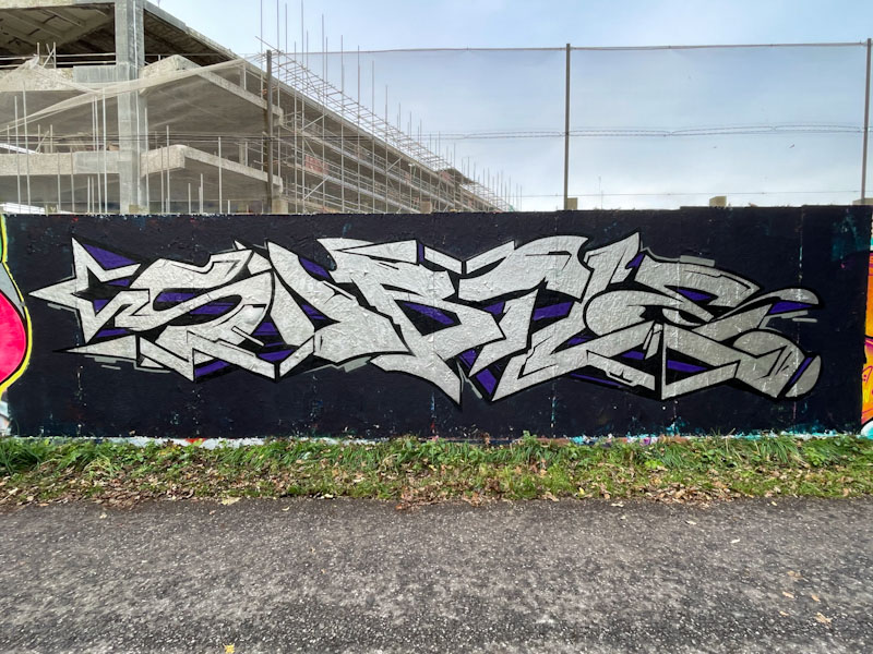
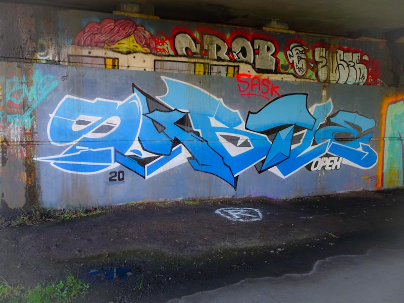
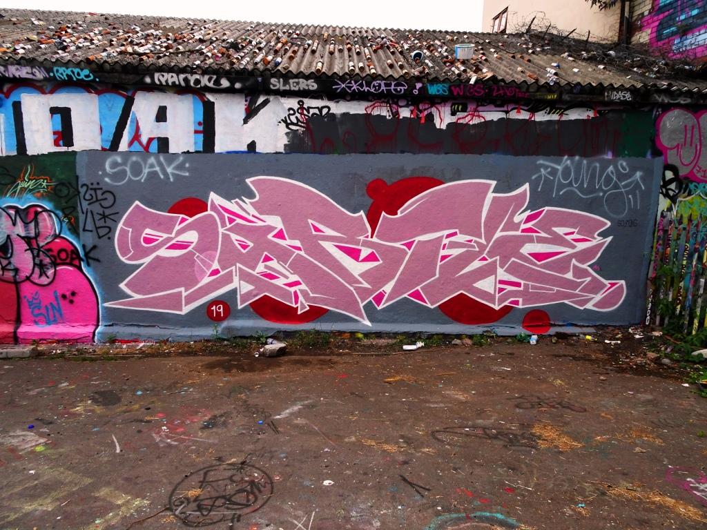
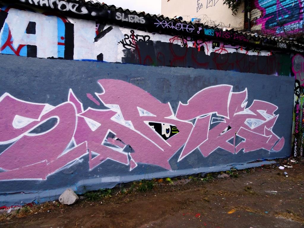
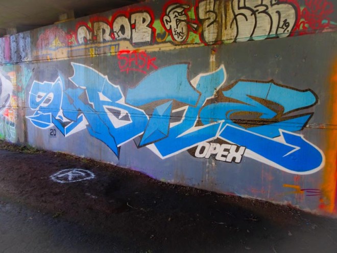
In the rather damp environment under Brunel Way and immediately next to the River Avon, Subtle has painted another splendid piece in one of his favourite spots. There is no need ever to wonder who the artist is with his pieces, because his letters are always legible, clear and bold.
Subtle, Brunel Way, Bristol, March 2020
I like his colours used here and the alternation of outline from black to white on each of the letters. I am not too sure what OPEX refers to… time for a quick Google search… OK it is operational expenditure, but I don’t think that is what Subtle is referring to here. I think it is definitely time for a Subtle gallery, don’t you?