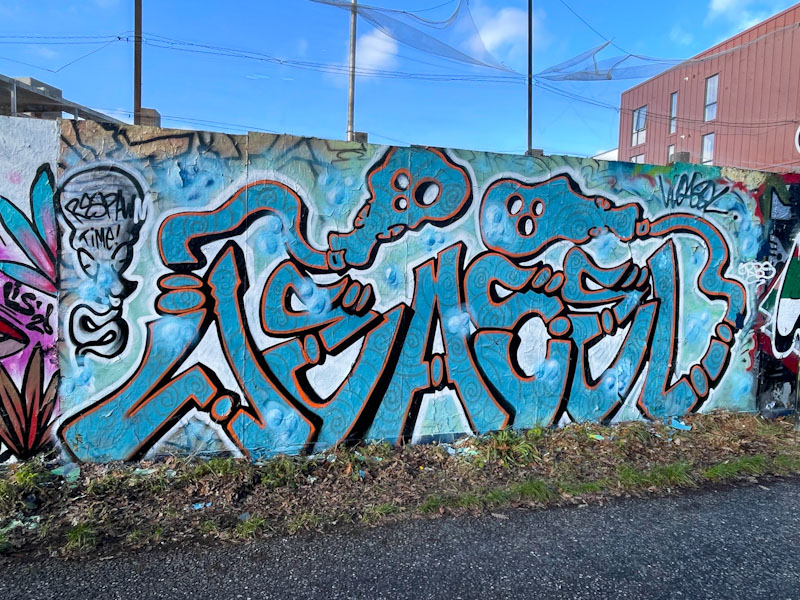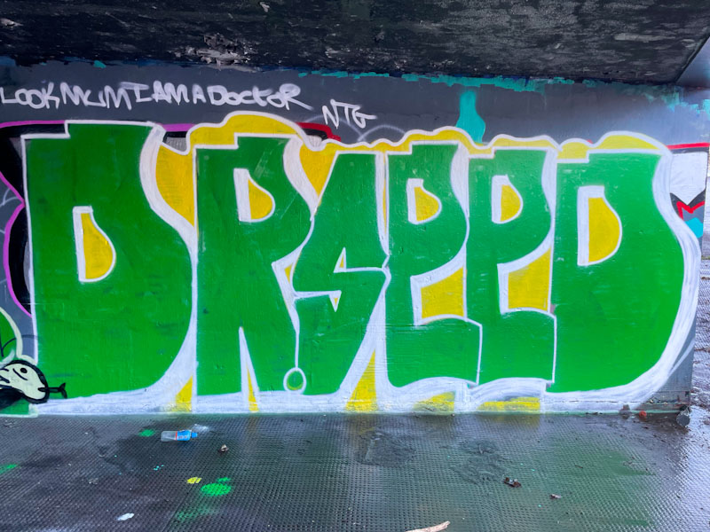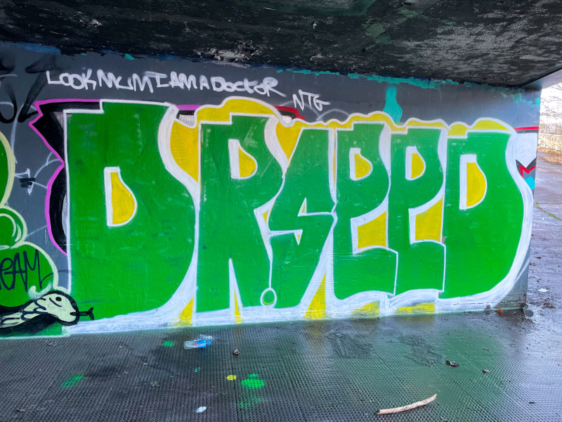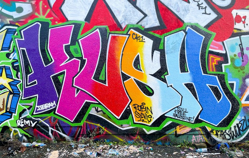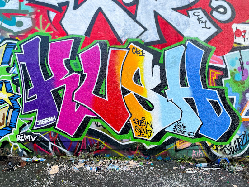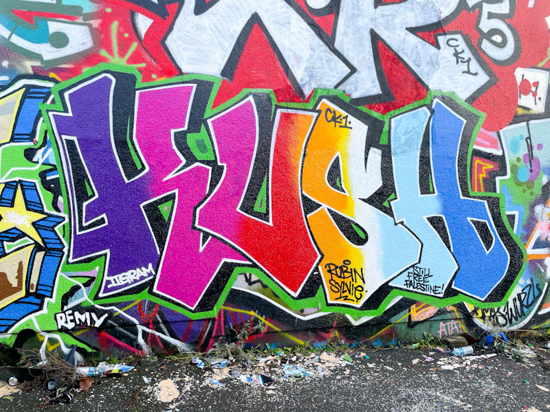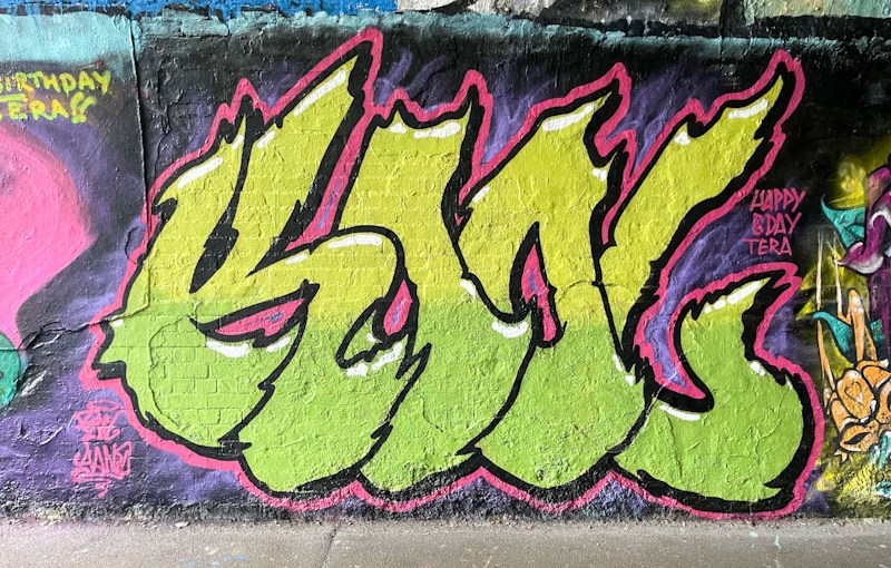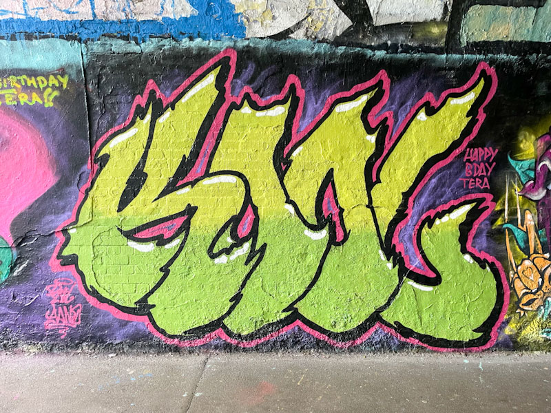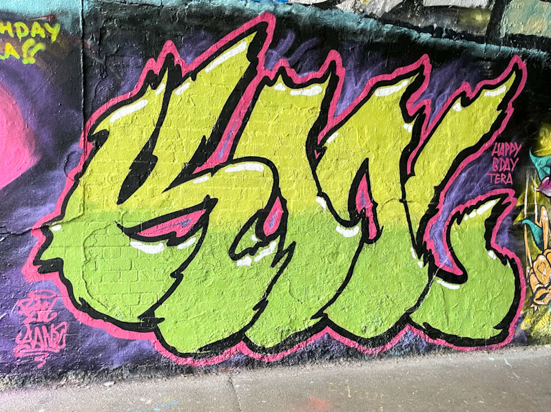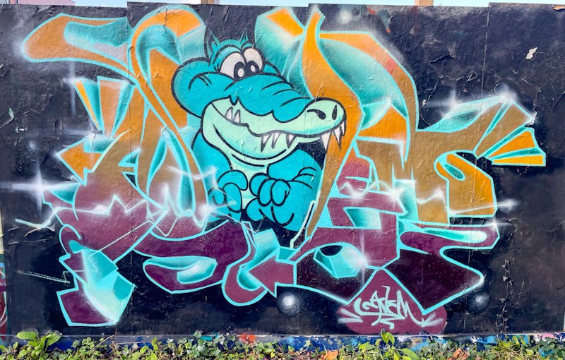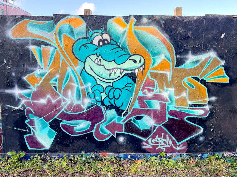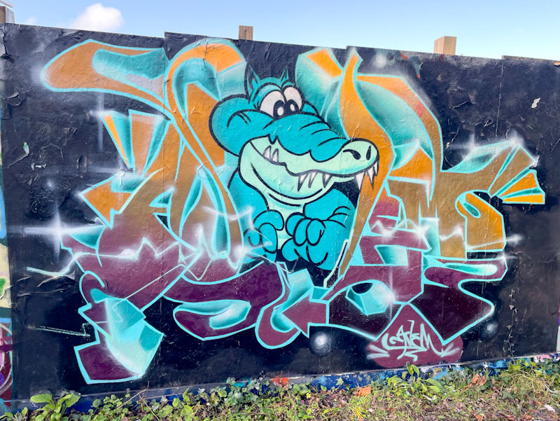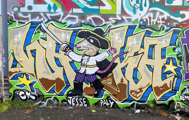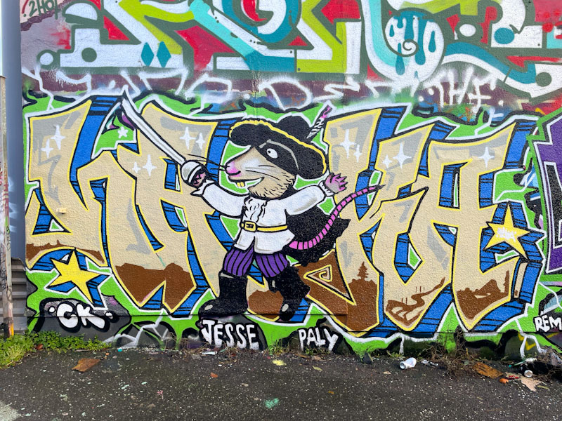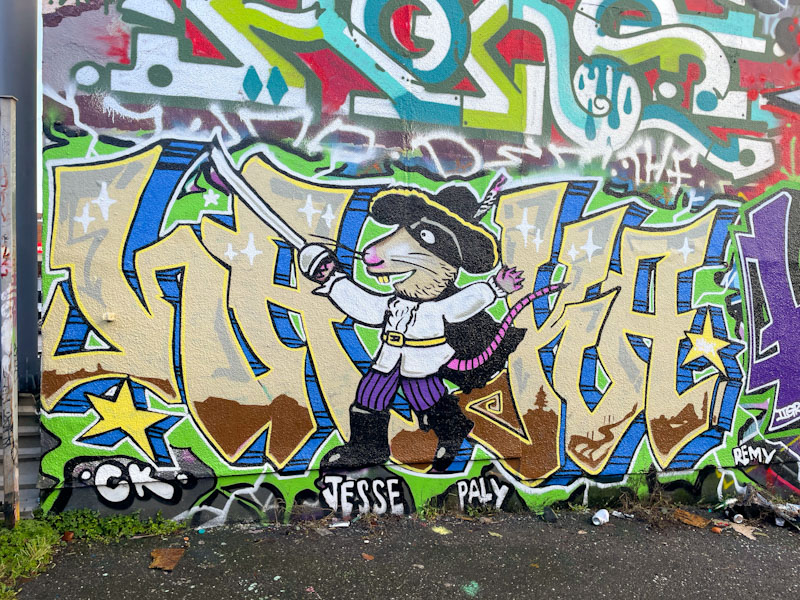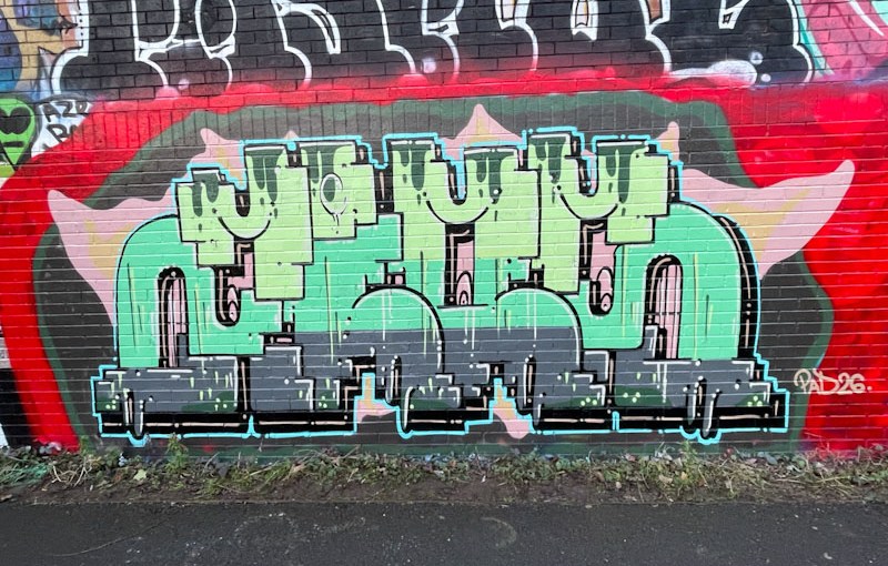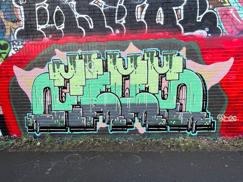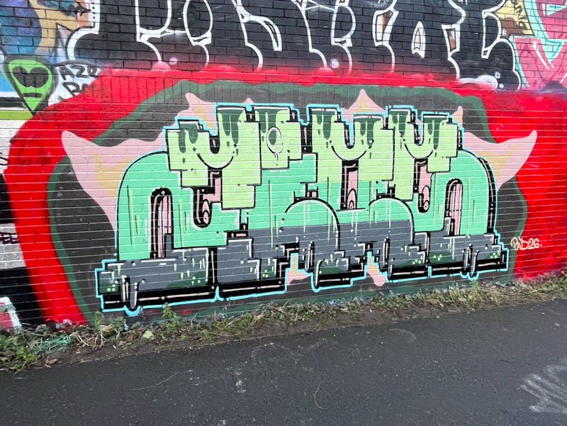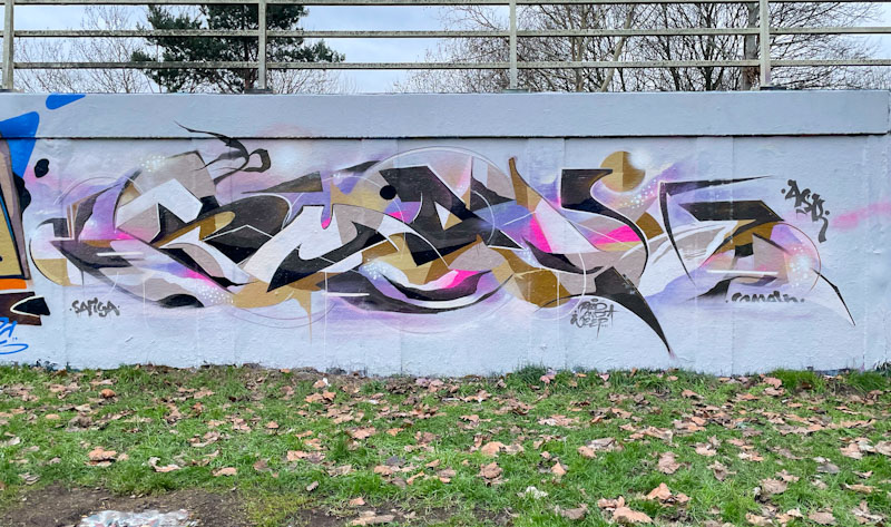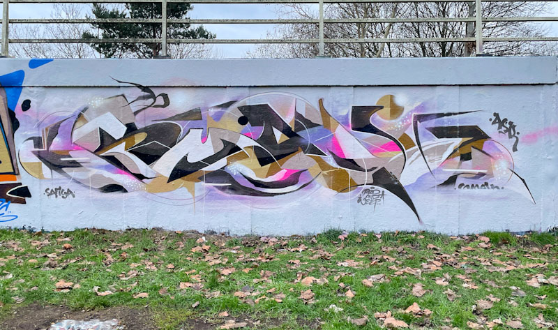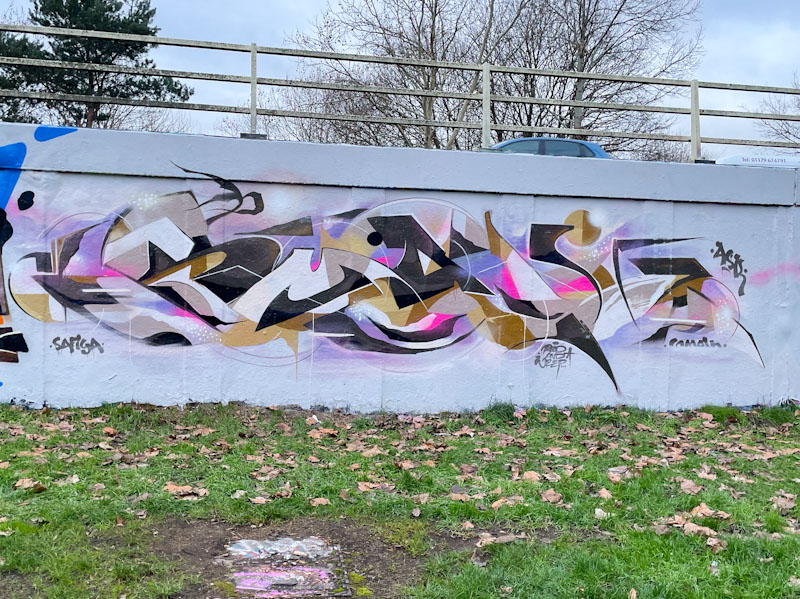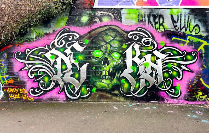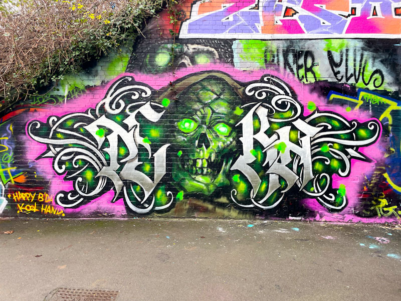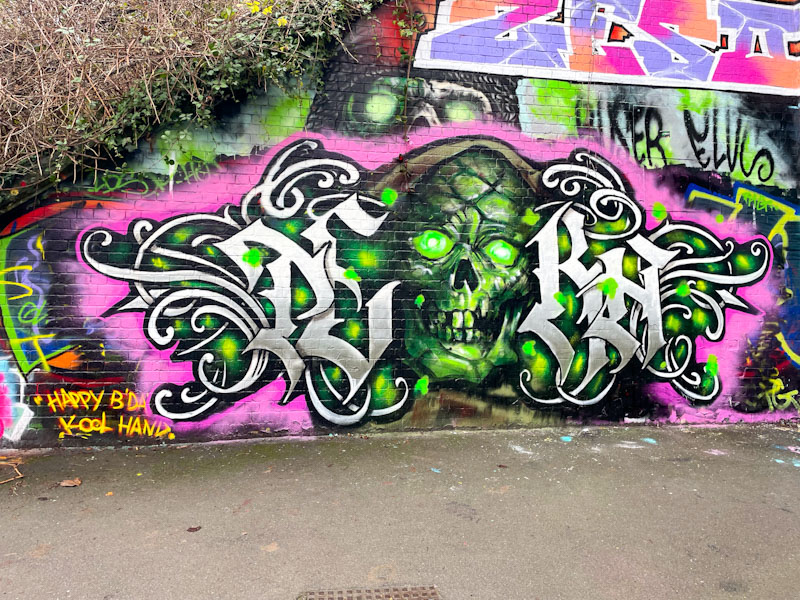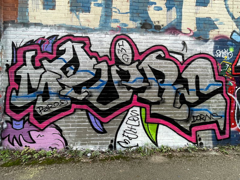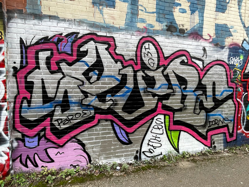
A gallery of great graffiti writing from Bristol’s Bbygwya, AKA. Flux, Lux, Luxe. Member of the Resting Bitch face Crew (RBF).
Instagram: @livelaugh_luxe
all photographs by Scooj


A gallery of great graffiti writing from Bristol’s Bbygwya, AKA. Flux, Lux, Luxe. Member of the Resting Bitch face Crew (RBF).
Instagram: @livelaugh_luxe
all photographs by Scooj


Some artists can be a little cheeky with their placements and some take that cheekiness to a new level by adding in adventure, whether on railways, derelict buildings or as in this case high up on buildings. Nice One has a record of going high.

I remember when there was scaffolding on this building, and Nice One taking advantage of the opportunity. His Times New Roman font (or similar) seems to work rather well on this building, and probably goes unnoticed by most folk, as people tend not to look up when they tread the streets. Nice one, Nice One.

Really quick ones today. I am unexpectedly dropping my son and a friend off at Heathrow this morning after a last minute change of plans, so am very short of time to write posts. This is a rather nice one from Mage on the roundabout.

Mage has had an incredible 2025, and his work can be seen absolutely everywhere in Bristol. It seems as if he is on a mission. The quality of his work is variable, but his energy and enthusiasm unmatched. This is a bit of a beauty, with his angular letter shapes, but those fills are to die for. Excellent stuff.

Tucked away in the corner of Montpelier Park is a wall that is well worth a look every once in a while. At the moment, it is occupied by Butch alongside some graffiti writing by Beer.

I have always said that there is something about the letter shapes and the way that Butch overlaps them that I find most attractive, I can’t put my finger on it, but it works for me. The letters are filled with horizontal layers of blue tones and a royal blue drop shadow. Somehow this blue aggregation works really well against the predominantly red noisy graffiti background, which isn’t always the case when painting messy walls. A nice way for Butch to round off 2025.

During the second half of last year, I thoroughly enjoyed witnessing the coming together of Asre and Zinso, which felt like a perfect match in terms of writing styles. Asre has had a great year, producing no end of graffiti writing pieces and thrown in a few characters too along the way.

This is a modest piece on the wall of the Dean Lane swimming pool which includes shout-outs to his graffiti friends. The nicely designed letters are filled with four horizontally laid out shades of blue, with some reversing-out of bubbles between layers. Buffing out the wall might have helped with shutting out the noise from around the piece, but it actually is fine as it is. Looking forward to lots more in 2026.

There is a little corner of the M32 Spot where some new, small hoardings have been erected and Hypo, painting with Posh and Kool Hand wasted no time in decorating them.

This is a smaller piece than I am used to seeing from Hypo, but it contains many of the elements of his developing style, in particular a liberal sprinkling of small spheres reflecting the main five colours of the letter fills. Nice shout-outs to Ticks RIP and Minto. Fun under the M32.

The Peel Street Green spot is a funny one. Sometimes it can go for weeks without any refreshes, and other times it can change every few days. It is one of those places that I need to visit regularly just in case, it is also quite a nice walk with the dog alongside the River Frome.

This piece by Bbygwya (AKA – Lux, Luxe, Flux) was part of a birthday paint jam for Roma I think. The letters LUXIE are nicely presented, with some great fading in her fill work of pinks and greys. Her letters are given a lift with some white highlights and white corner spots. Altogether a nice piece of graffiti writing from Lux.

There are a few writers who stick to their letters and work on improving them from piece to piece, this being one of them. This might be the best I have seen so far from Roma, which was painted alongside Bbygwya (Luxe/Flux).

The turquoise, blue and black colours work well together in this piece and the steady drop shadow in white contrasts nicely. A light blue plasma streak runs through all the letters, giving off a bit of a glow, which adds interest to the whole idea. Some scribbled butterflies finish the piece off nicely. All good work from Roma.

2025 has been an outstanding year for Bloem and Sub, with both artists making great strides forward with their work. In particular, Sub’s steady progress is beginning to bear fruit as he introduces more ideas into his letters, particularly with his fills.

I have always felt that Sub’s letters were a little over large, but now that he is being more creative with his fill patterns, the space lends itself to something quite grand, like this repeating black and white pattern. This must have taken a while to complete freehand, but it was certainly worth the bother. A deep 3D drop shadow in dark red sets the piece off beautifully.

In the middle of the two pieces is a wonderful character piece of Betty Boop, skilfully and faithfully reproduced by the pair. I have a feeling that both artists were involved in the creation of this character. It is not the first time that Betty Boop has appeared in Natural Adventures (see below).

Bloem continues with her outstanding work, and this Burberry check piece is simply brilliant. The letters spell out BLOEM, and the check design flows beautifully through the piece, swishing in all directions. I love the red smily face and strap handle. This is a supremely well crafted piece and a wonderful collaboration. Bravo!


This piece is difficult to describe in its entirety. It is an epic piece to celebrate one year on from the Goldie inspired Ikea wall, and also to honour DJ Randall, and this particular spot has been used by the THK crew for a few years now to pay tribute to the departed musician. The paint jam included work from Goldie, Jody, Dibz, Posea, Zuke, Soker, Cheo and Fade. It is worth noting that this piece hasn’t been touched since it was painted in August.

From the left, the collaboration begins with a piece of graffiti writing by Goldie and some flowers by Zuke. Some bright and rather beautiful work here to get things going.

Next up is a portrait of DJ Randall by Jody, one of many renditions of the artist that has graced this spot. Once again, the portrait piece is embroidered by some flowers by Zuke. The greyscale piece is punctuated only by a gold tooth and gold ring.

Dibz is up next, with the letters AMBER (I think), and of course, there are some more flowers surrounding the letters, and a trademark Bee by Cheo. The letters are beautifully filled, and the drop shadow has a wonderful pulsating effect.

The steel case with the Metalheadz logo and record sleeve are by Posea and each of the contributing artists has signed the sleeve, almost as if it were a tangible object.

Finally, the epic wall is rounded off with writing from Soker, a toucan smoking a cigar and a python by Cheo and the letters THK by Fade, once more festooned with Zuke’s flowers. The whole wall is a bit of a masterpiece, that has been enjoyed by many this year.