
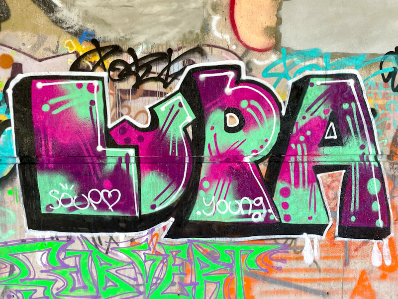
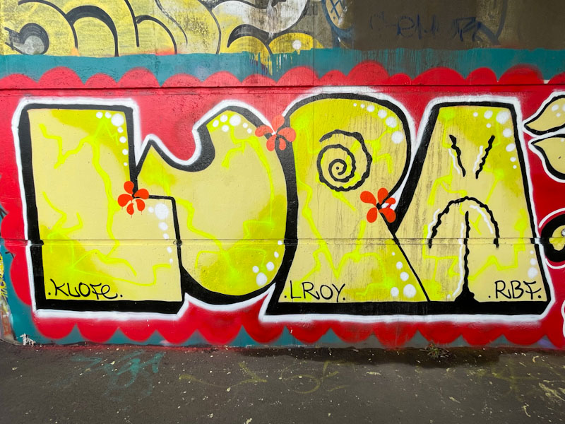
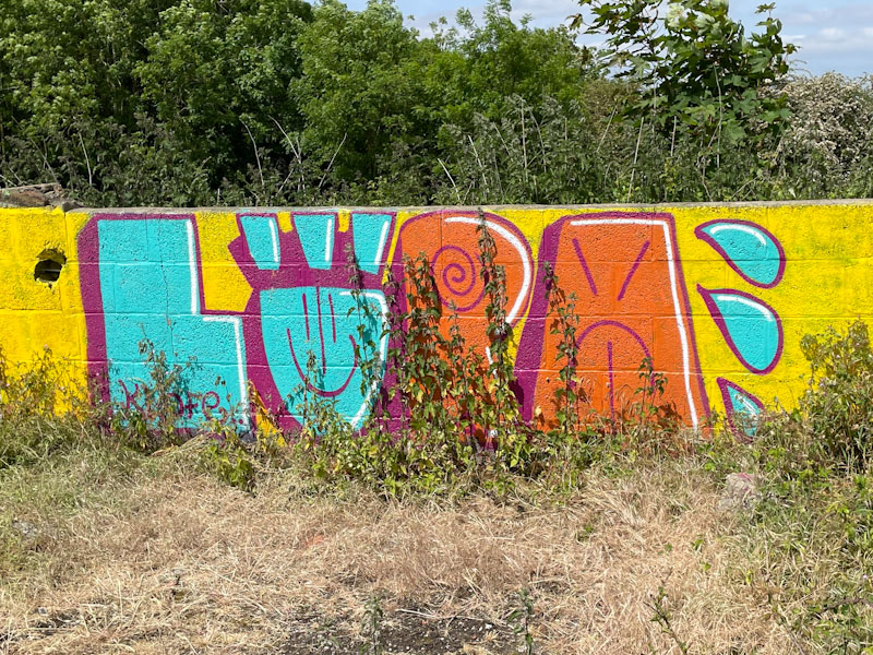
A gallery of fabulous, bold writing from Bristol graffiti writer and RBF stalwart, Lupa.
Instagram: @lup4_4
All photographs by Scooj
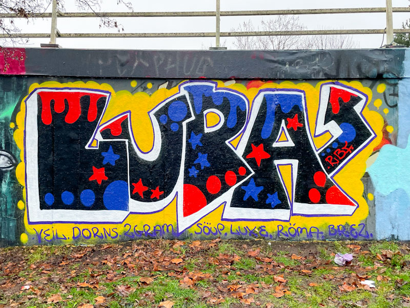


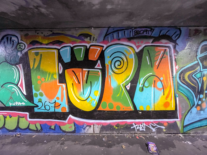


A gallery of fabulous, bold writing from Bristol graffiti writer and RBF stalwart, Lupa.
Instagram: @lup4_4
All photographs by Scooj
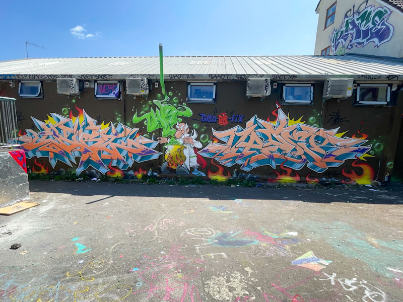
I think I was about five or six years old when I was given my first Asterix book. My mother was having her hair done and bought me ‘Asterix the Gaul’, to keep me occupied for the very boring two hour hair appointment. Not only did the distraction technique work, but it began a love affair I have had with these cartoon adventure books ever since. I still buy (in hardback) every new edition that is published, even though both the original author and illustrator (Goscinny and Uderzo) have now died. Imagine my excitement when I came across Dibz and Fade while they were painting this epic piece in Dean Lane.
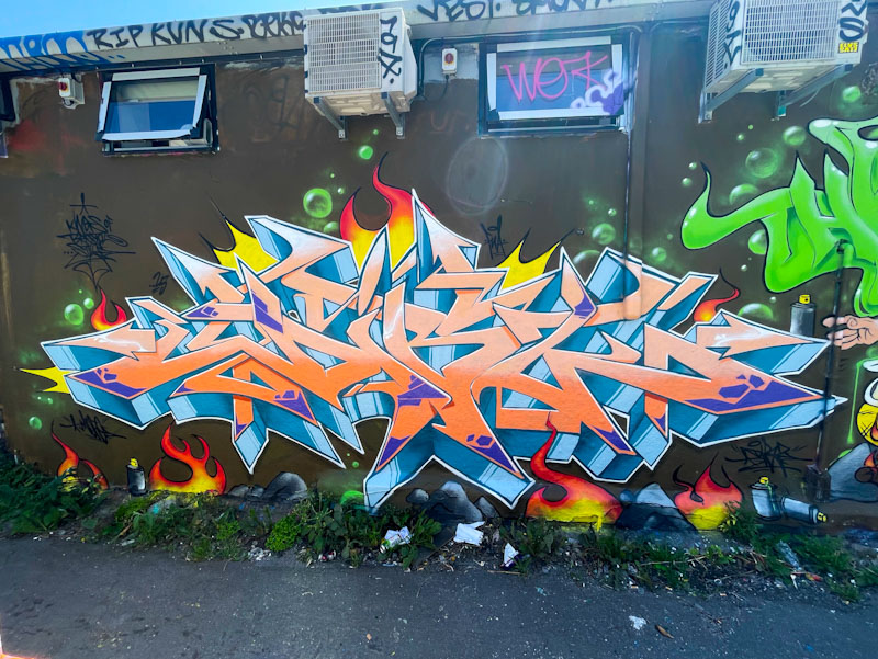
I can’t really add much commentary about the artists that is new, and I have run out of superlatives to describe their work. The writing on the left, by Dibz is about as tight and sharp as you can get with wildstyle graffiti writing. The orange letters with a deep 3D drop shadow, which has a metallic sheen to it, spell DIBZ.
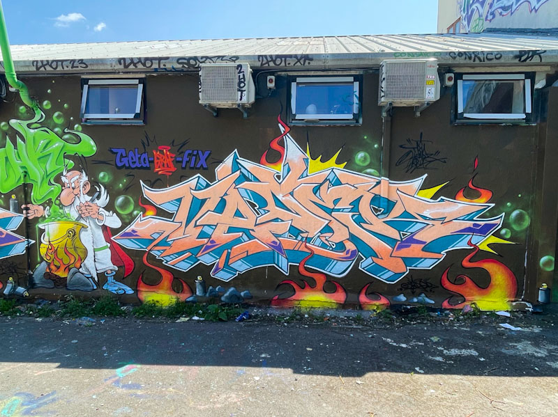
To the right hand side of the collaboration, Fade has adopted the colour selection for his piece, but, although subtle, his letters and style are a tad softer than Dibz’. A notable change in this collaboration is that the artists have swapped sides from their usual preference, which must feel a little bit like sleeping on the wrong side of bed. Maybe?

The centrepiece of this production is a near-perfect rendition of the druid Getafix, who makes the secret magic potion that gives our protagonists, Asterix and Obelix, their strength. The artists have been so true to the original artwork, Uderzo himself would have been impressed. This really is a remarkable collaboration and shows off Dibz and Fade at their very best. I’ll forgive them for the ‘Geta-graf-fix pun.
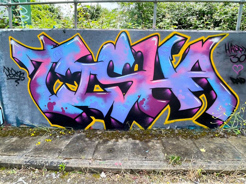
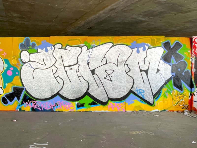
Most of the artwork at L Dub is painted by a handful of trusts and one of the most visible of them is DJ Perks, and I was fortunate enough to meet him while he was painting a different piece on this trip. I think that it is the first time I have ever met anyone actively painting at L Dub.

This piece looks very much like a tribute piece, perhaps a birthday or something for Tisha. I am taking a wild guess that she might be one of his children, but whoever it is, it is a very fine piece of graffiti writing indeed. Some beautiful fills, and the subtlest of white highlights adding a little 3D vibe. Very nice work from one of the most modest artists in Bristol.

I don’t think there will ever be a time when I am not happy to see a piece by Face 1st. Of course, since he moved away from Bristol, that sense of joy is heightened, because his pieces appear less frequently and have become a little bit of a rarity.
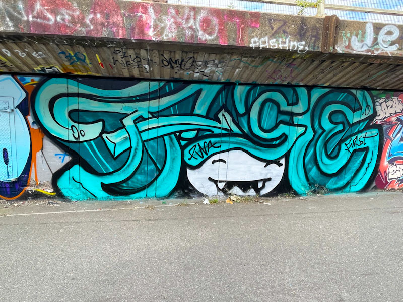
This is a classic laughing girl with big hair piece from Face 1st. The big hair spells out FACE, in script-like letters, with a very deep drop shadow. The blue tones with the white face work well, and although not the tidiest piece I have seen from the artist it is nonetheless distinctive and very, very Bristol.
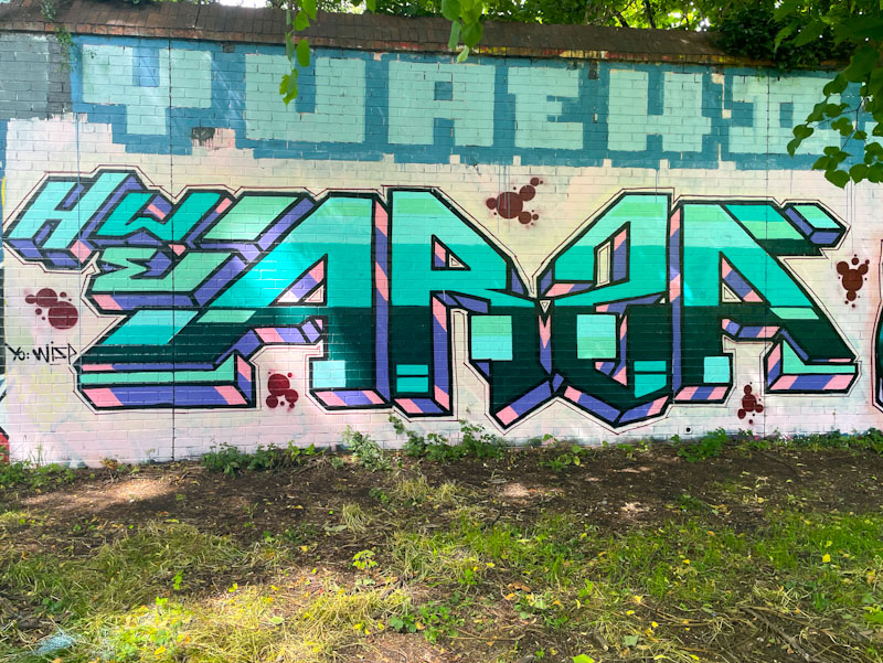
What is a little peculiar is that if I look back through my archives I would probably find half a dozen or so pieces by Totosoapcity, but it is only recently, once I found out the artist’s name, that I have actually started to post his distinctive writing.
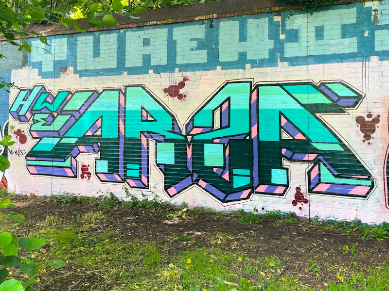
There is a symmetry to Totosoapcity’s writing, and I am never too sure what the letters spell, but I think it is ARSA. There are some good blues, pinks and purples in the piece with a deep 3D drop shadow vanishing in the centre, below the wall. There are a few decorative circles filling and breaking up the white space around the background. A nice piece. I will have to trawl through my archives and dig out some old ones.
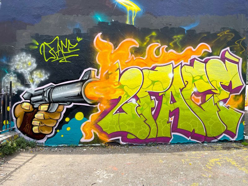
I was rather lucky to be in the right place at the right time as Two Face was drafting up this piece on the wall. I haven’t come across the artist before, and he tells me that he has only recently moved to Bristol, so I will be on the lookout for his work, for sure.
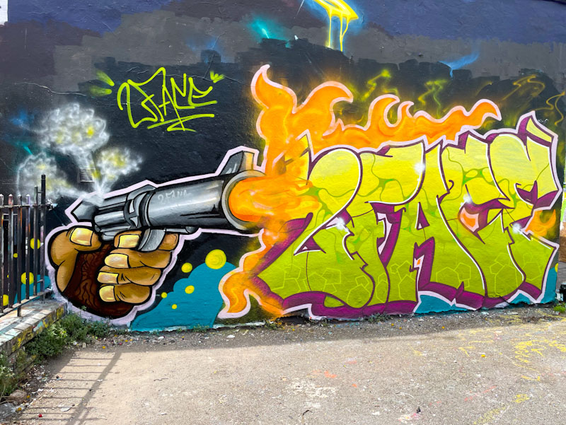
The combination piece is really rather good, incorporating a hand and fired gun on the left and some rather nicely presented writing on the right, with very fine fill work indeed. Lots of textures, techniques and perspectives in this debut (to Natural Adventures) piece. Bravo!

Unfortunately, I don’t get to post every piece by every artist, and even the artists I am more partial to don’t get fully represented here. There is so much artwork out there that only a fraction ever makes it onto these pages. Although I have posted a lot of Desi pieces, the same cannot be said for her partner, Mr Two Gram. Here they combine well on one of my favourite walls.

On the left Desi has painted a combination piece with her VEIL letters and a Chinese lucky waving cat (why are these such a thing? I never saw them when I was a kid). The piece is really nicely finished, and such a marked improvement on her early works, there is so much more sophistication and technique in her work these days.
Mr Two Gram tends to paint pieces that are reasonably consistent from one to the next, perhaps with a colour change or letter change from time to time. He likes to stick with his 2GRAM lettering (or TWOGRAM) often in Chrome, but not always. I would class Mr Two Gram as a graffiti writer’s graffiti writer, if that makes sense – one for the purists. This is a cool collaboration.
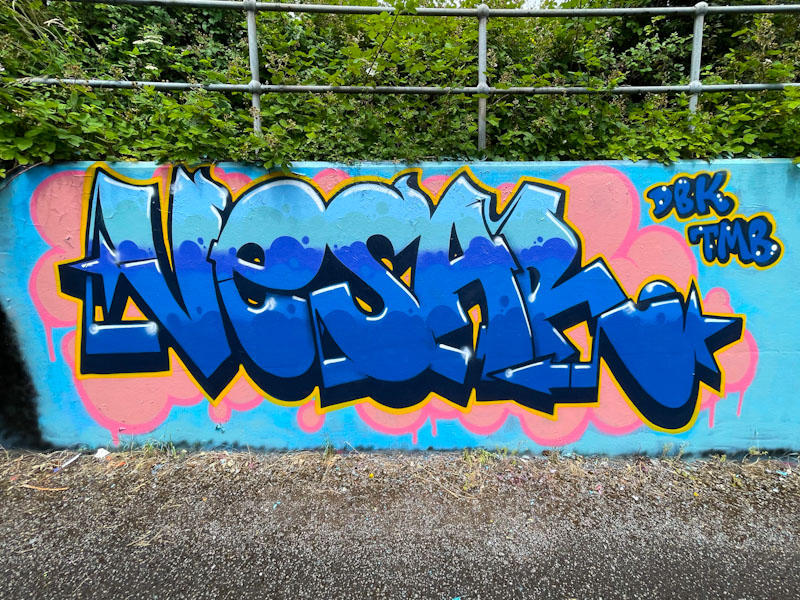
A graffiti artist who writes, and has been writing for some time in Bristol, is Vesar, and it is something of a mystery that in ten years of blogging about Bristol street art on Natural Adventures, this is the first time I have posted a piece by him. Shame on me. I have no explanation.
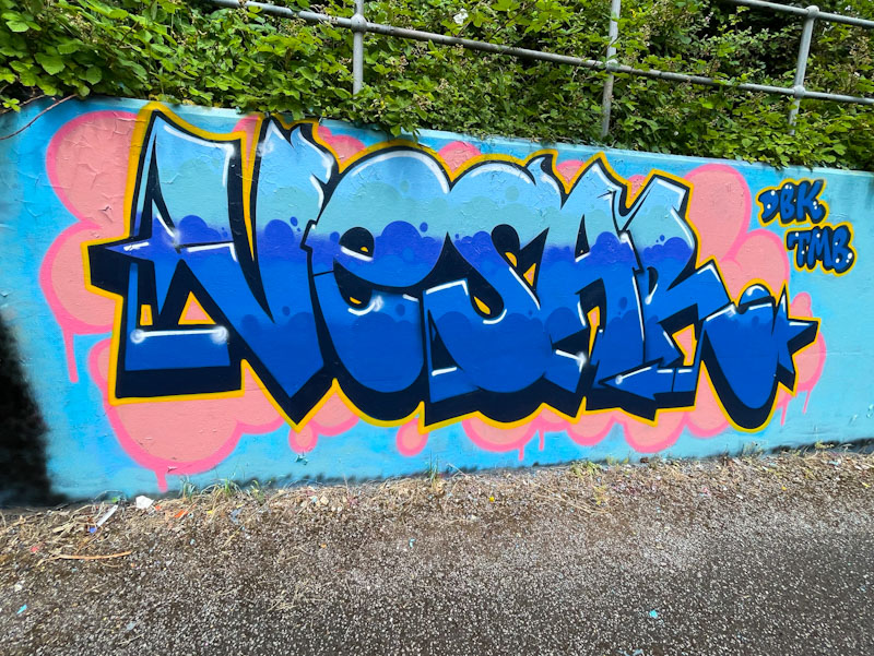
I would say that I have noticed a significant uptick in the quality of his work lately, and that might account for this post and I hope some more to come. Vesar has selected the winning combination of pink and blue tones, which is always going to get noticed by me at least. The writing is neat and tidy with three horizontal blue strips interfaced with bubbles. A yellow border separates the letters from the pink cloudy background, which itself has a darker pink border. Very nice work, and welcome to Natural Adventures.
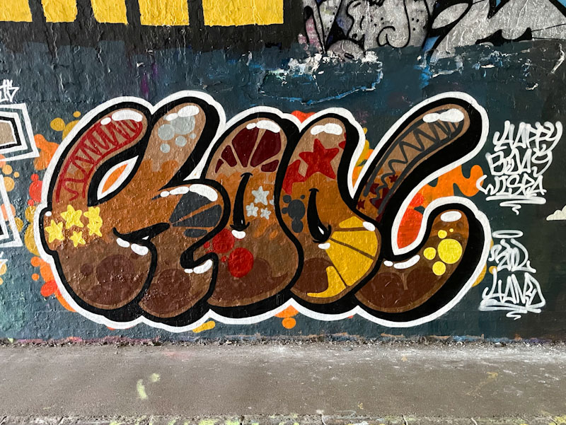
Kool Hand has been having a great 2025 so far, producing numerous characters and writing pieces all over the place, each contributing to a noticeable and steady improvement over time. This is a lovely piece that was painted in the tunnel as part of Wispa’s birthday paint jam.
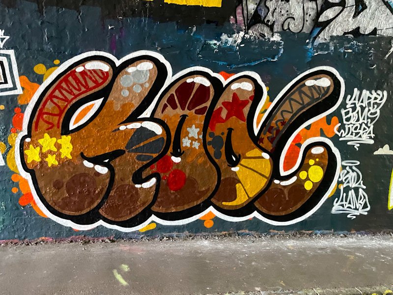
This KOOL writing is very well produced, although in my least favourite range of colours. He is experimenting with some interesting fill pattern, which all look rather nice, and his fat white highlights work quite well to give the letters some depth. This is a nice piece to add to Kool Hand’s ever-expanding portfolio.

Noise consistently turns out great graffiti writing pieces. Never too showy or ostentatious, he always puts his big letters to good use. I have noticed that of late he has been using quite dark colours and tones, which adds a weight to his work.

This is a superb display from Noise, with slightly more elaborate letters than normal, but it is the fill that is most captivating. The lower half of the deep red letters has an incredible cloudy marbling effect, simply stunning, and the white highlights on the letters create superb depth, giving texture to the letters, lifting them off the wall. A top piece of graffiti writing from Noise.


