Diced Mango is an artist reasonably new to me, having only been aware of his street pieces for about six months or so. He has become rather busy lately and his letters are appearing in various spots around the city.
Diced Mango, St Werburghs, Bristol, January 2019
This piece, from January this year was in St Werburghs tunnel and shows how the artist plays with shapes and shadings to make the letters look like they are twisted a little. Clever stuff and it gives me ideas for things that I can try out at home. Several more to come from Diced Mango soon.
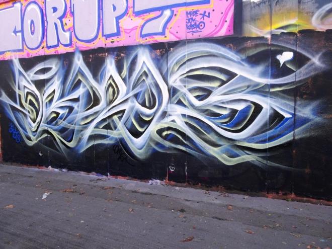
In Bristol it would seem at the moment that one is never far away from a Mr Klue piece. He is keeping very busy indeed, and this was from a couple of weeks back, during a paint session with Mr Sleven and DNT.
Mr Klue, Moon Street, Bristol, March 2019
Using, what I am guessing are his favourite colours (he uses them a lot) he has created another calming abstract writing piece that possibly spells out KLUE (or you can even read WONE – Mr Klue’s surname). His light touch pieces always have an ephemeral feel about them, that they might just waft away on the breeze. Still loads more to come.
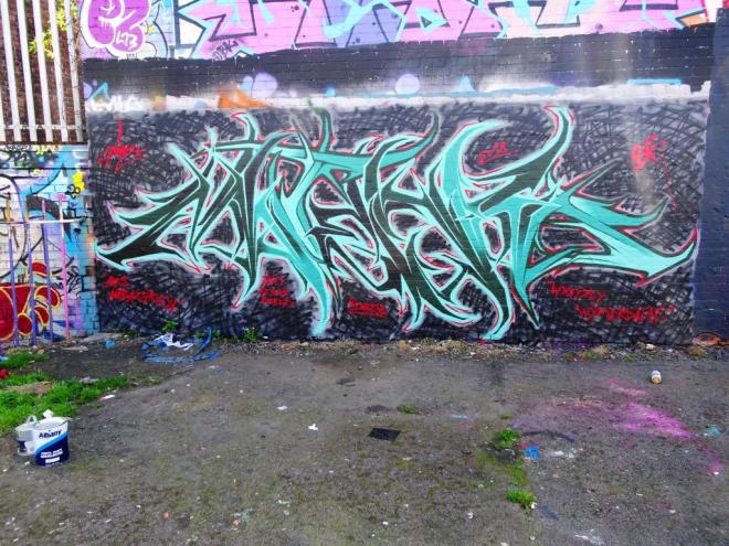
Another supreme example of gothic graffiti writing from Hire, who seems to have a real soft spot for this left-hand end of wall in Dean Lane. He has sprayed several other pieces here before. Hire used to work quite a lot in The Bearpit, but I haven’t seen anything of his there for an age.
Hire, Dean Lane, Bristol, March 2019
This is a bright, confident and strong piece that is impossible to ignore. It screams out at the passer-by ‘look at me’. The letters I think spell out HIRE – I can see it whether it is there or not. He has also written quite cryptically ‘The BF One’ along the base of some of his letters. I have seen BF written before, in fact Hire’s Instagram handle is #hireonebf, but I don’t know what it relates to. He is a man of few words. I’ll have to ask him next time I see him.
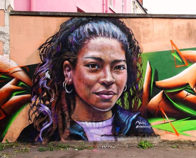
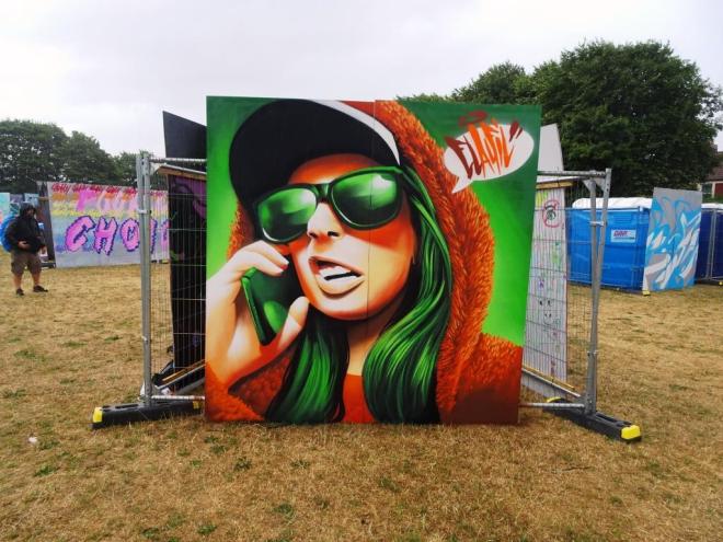
This was my favourite wall from Upfest 2018 and it was the first time it had been painted by street artists. I love it that every year, the organisers of the festival find new places for artists to paint, especially as these pieces on permanent walls live long after the festival ends.
Michel Velt, Upfest, Bristol, July 2018
This is a gorgeous collaboration between Michel Velt and Elafil. The stunning portrait is bt Michel Velt, an artist from the Netherlands. I cannot tell you how much I admire this piece, it has such life and emotion in it – I feel like I could speak to the woman portrayed. Beautiful without being over-photorealistic if you know what I mean.
Elafil, Upfest, Bristol, July 2018
Elafil painted probably my favourite piece of the 2018 festival and here he gives us a little extra piece of 3D writing just for good measure. It is clear he had some paint left over from his piece in South Street Park to use in this fine collaboration. I love, love , love this wall.
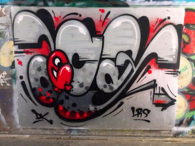
Consistent… a word I would use to describe the work of Decay, and in that I mean consistently good. Of course, this year has seen Decay changing his designs considerably away from his trademark abstract work to writing, and what writing.
Decay, The Bearpit, Bristol, March 2019
This piece is notable for two things: first, it is really neatly done and fits the board perfectly and second, it is something of a rarity in The Bearpit these days and very welcome indeed. A beautifully worked piece with some fabulous attention to detail. Always great to see the instantly recognisable colour palette brightening up the place.
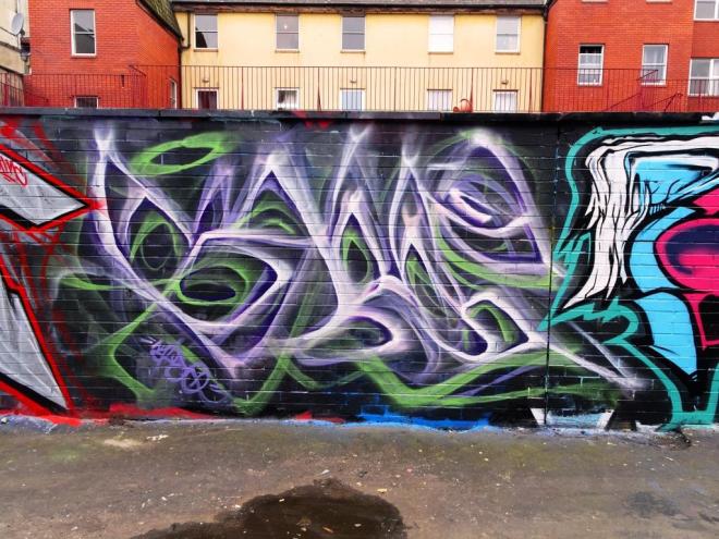
Mr Klue is on a roll and there can be no question about that. His wispish abstract pieces are turning up with extraordinary regularity, especially in the vicinity of St Werburghs and the M32 roundabout. One of the things he usually takes great care with is the preparation of the wall before he starts his work, because the background is an integral part of his style.
Mr Klue, M32 roundabout, Bristol, February 2019
In a sense some of his work, like this one, is less abstract than first meets the eye. If you look very carefully, you can make out the letters KLUE in this piece, but you’d probably have to be looking for it to see it. Another great effort from Mr Klue, and one of several lined up to post.
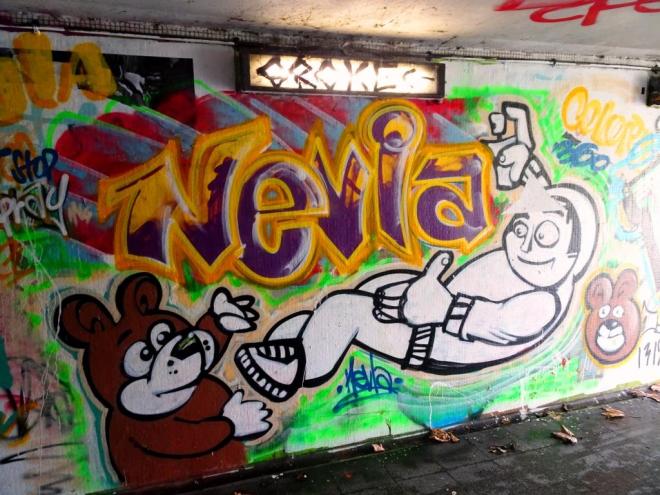
I haven’t seen too much of Nevla’s work lately, so it was great to come across a whole pile of pieces in the tunnels of the Lawrence Hill roundabout a couple of weeks back. This is a rather cute (a word I rarely use) piece of a character spraying the name Nevla book-ended by a couple of bears.
Nevla, Lawrence Hill, Bristol, February 2019
I have a feeling that the tunnels on this roundabout will become more of a playground for street/graffiti artists over the summer. It is interesting to observe the shifting sands of street art spots, especially as so many great walls in Stokes Croft have disappeared (gentrification).
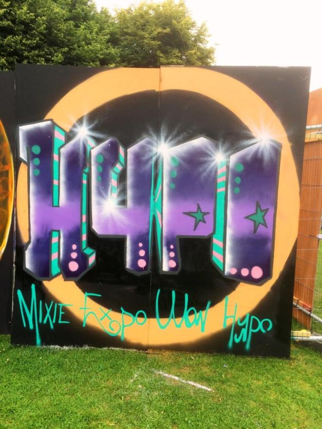
I think this was the first time I saw anything by Hypo, but I think I might have been somewhat overwhelmed by the anti-May work by Peter Sheridan next to it that this piece passed me by a little. I am glad that I have had time to reflect and dig it out of archive.
Hypo, Upfest, Bristol, July 2016
I have noticed that Hypo likes to work with a vanishing point in the middle of his work, so that all 3D shading gravitates to the centre. I like the reasonably straightforward graff writing of this piece especially the splashes of white on the corners. At the bottom he recognises Mixie, Expo and Ulow as well as himself. A nice Upfest piece…below is his offering from 2017.
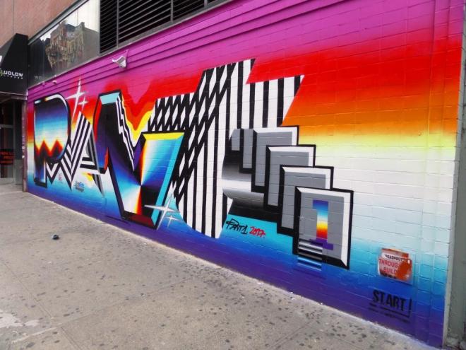
On my walks around New York, I somehow ended up near this piece on several occasions, I guess it was easy to recognise and see from a distance, so it had imprinted on my mind. It is an interesting designed writing piece by Felipe Pantone.
Felipe Pantone, Ludlow Street, New York, October 2017
The whole thing, the bright prism colours, the black and white stripes, the precise straight lines all remind me very much of 1980s design, when there was little or no subtlety and everything was vibrant and ‘in your face’. I guess what I am saying is that I get some strong retro vibes from this piece. A nicely thought out and painted piece.
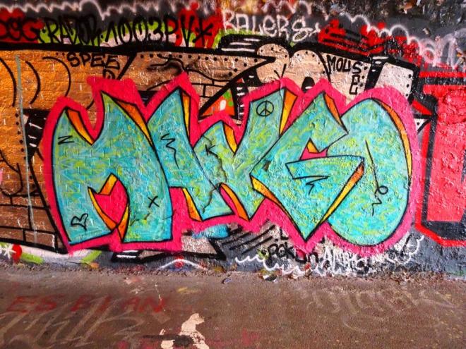
Clean, sharp, crisp, brilliant design and a touch and tone that altogether scream out the name Dibz. This is a really classy piece from the local artist, and if I have any complaints at all it is that we just don’t see enough of his work around the place.
Dibz, Dean Lane, Bristol, January 2019
Everything about this is good and even if you are not a fan of graffiti writing you must be able to appreciate the quality of this piece. From the cerise background, which acts as a brilliant host colour for the rest of the piece, to the split colours used in the lettering and the graded shading therein, this piece oozes quality. I could go on, but feel that I am in danger of sounding a little too unctuous and so will leave you to judge the piece for yourselves. It is good though.