
.
Look at the sky dad
I might have ignored the cries
and been the poorer
.
by Scooj
.
Look at the sky dad
I might have ignored the cries
and been the poorer
.
by Scooj
There are a bunch of writers in Bristol who have one thing in common, they write the same letters in roughly the same letter style, but add creativity in the colour selections and fill styles that they choose. Phour is one such artist, and this is a recent piece of his from St Werburghs tunnel.
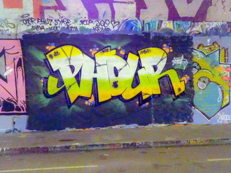
The tunnel is a great place for rainy day painting and there is a rich seam of, in the main, great graffiti and street art. In fact the only problem with the tunnel is the light conditions, which mean that photographs from there never do the artwork justice, with a lot of orange and yellow polluting the images. With a little adjustment, I managed to get as close as possible to the true colours of this Phour piece. Nice letters, nice 3D work and a very good background. Good to see.
It would appear that lockdown impacts on different artists in different ways. Some will hunker-down, and they disappear from the scene for a while, others are liberated and seem to go crazy, hitting walls with refreshed vigour. Falling into the latter category is Slim Pickings (TES) who has been out and about a lot over the last month or so.

We know what to expect from Slim Pickings’ pieces – sharp crisp lines, reliably solid fills and unbounded 3D shading. It is all here with the addition of a couple of little white highlights. Great stuff. Looks like he might have had a small issue with his yellow paint, especially just to the right of the ‘S’. Good to see his work at L Dub.
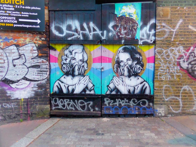
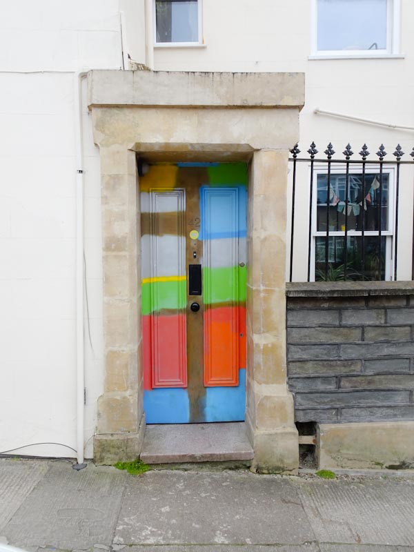
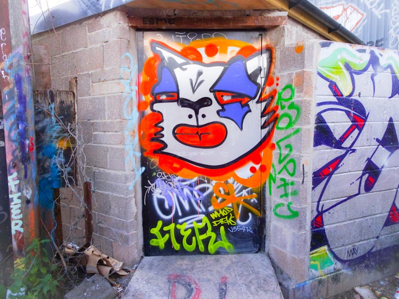
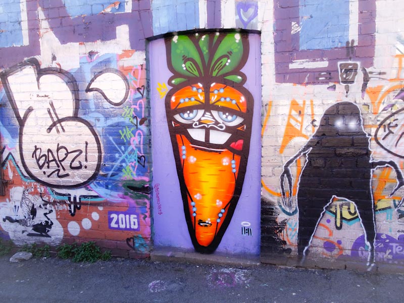
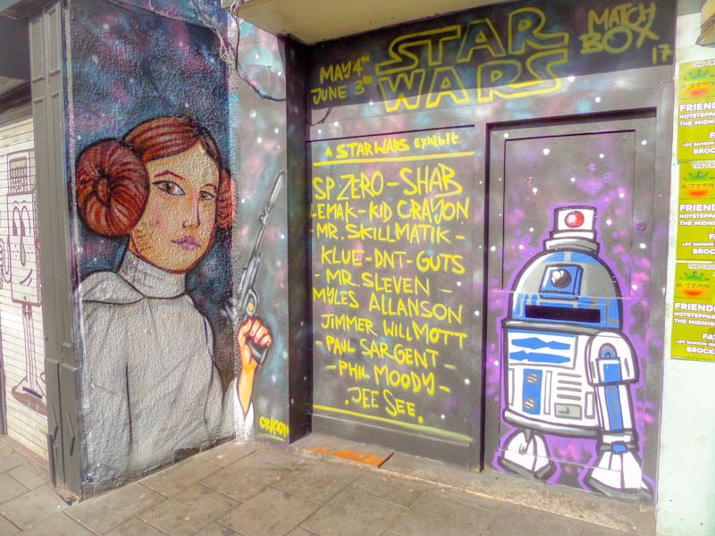
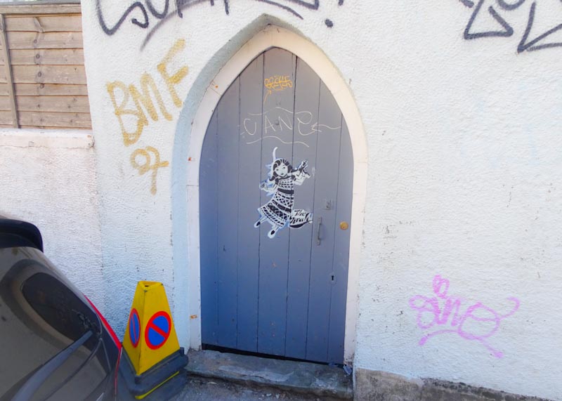
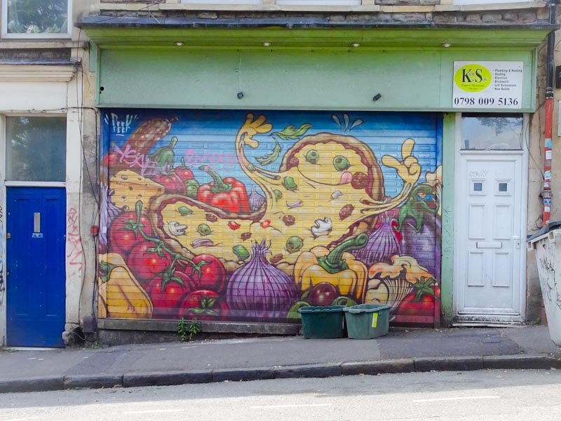
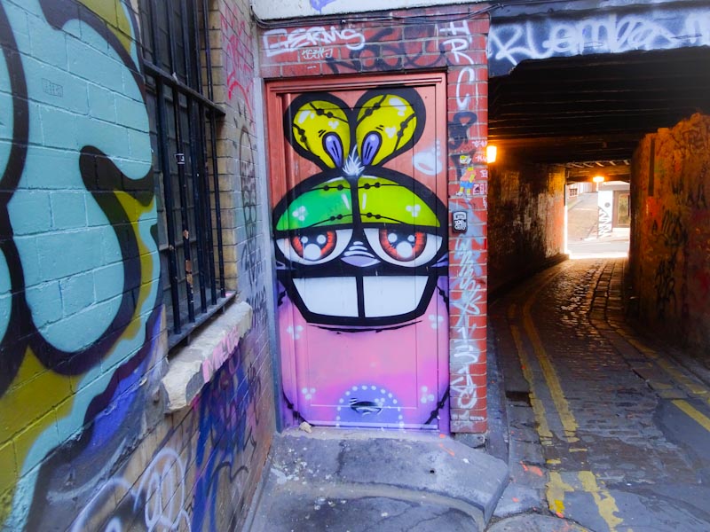
Doors 135 – back to the archive for some street/graffiti art doors
Things are very busy at work and the streets are wet. This means that my opportunities to get out and find some new doors are significantly depleted. So it is back to the archive. These photographs first appeared on Natural Adventures in April and May 2020 (even though some of them were taken long before that). Enjoy.
So that’s your lot for the week, a week in which the world seems a safer and more reliable place.
If you have made it this far, you probably like doors, and you really ought to take a look at the No Facilities blog by Dan Anton who has taken over the hosting of Thursday Doors from Norm 2.0 blog. Links to more doorscursions can be found in the comments section of Dan Anton’s Thursday Doors post.
by Scooj
.
Amanda Gorman
such great dignity and poise
inauguration
.
by Scooj
The most common phrase I have used when writing about the work of Face 1st is “I will never tire of the work of Face 1st” and that phrase is as true now as it ever has been. Big or small, throw up or intricate piece, it just doesn’t matter, his art chimes for me, and he and those like him, are the engine room of Bristol graffiti art.

The new(ish) ramps at the M32 Spot are proving to be quite a fertile ‘canvass’ for our artists and Face 1st has painted this back board with one of his characteristic winking girls with hair made up of FACE. I love everything about this. There is an element of Marine Boy anime in those eyes.
in writing that last sentence I got distracted by Marine Boy. If you don’t know what I’m talking about, take a trip down memory Lane with typing Marine Boy into YouTube. Enjoy.
Another artist having a bit of a spree at the moment is Dott Rotten, whose work is in the top division. Take a look at this piece of graffiti writing from a week or two back and tell me that it isn’t out of the top drawer. This is an artist who is at the top of his game and seems to be enjoying it.

The writing with his familiar SPOILT letters is nicely worked with two shades of blue, perfect orange outlines and some superb trademark bubbles. The whole piece is lifted up with a deep red 3D shading. This is great graffiti writing.
.
The Trump tyranny
at long last comes to an end
time to call a cab
.
by Scooj
This is an interesting piece from Laic217 because the writing behind the character is most un-Laic217 if you know what I mean. Also the character, although obviously by the Laic217 is not quite his typical style and could conceivably be by another artist.

It is nice to see artists switch it up a bit from time to time and this is a great example of that. I can’t remember when I last saw filled writing like this from Laic217, an element usually provided by his painting compatriot Cort. Overall this is an unexpected and intriguing piece and demonstrates the range that Laic217 has.
When all else in the crazy world we live in is kicking off and our landmarks and routines are blown apart, there is a beating heart, metronome-like, tick-tocking in the background and that is the quiet, modest, ever-present production line of graffiti writing from Corupt. It is rather comforting when you think about it.
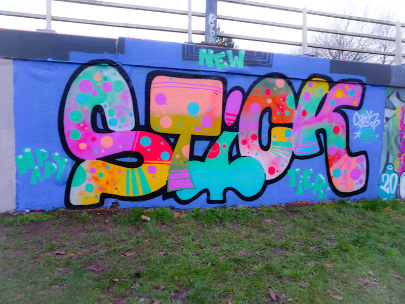
In this outstanding piece Corupt has written STICK, which is one of the two common letter combinations he uses. His humour shines through with this “Happy New Tier” story to welcome all of us into 2021 in a lockdown situation. The letters are beautiful, the fills are beautiful and the colour combinations are beautiful. A beautiful cheery piece.


