.
Prolonged dry weather
laying foundations for drought
build those reservoirs.
.
by Scooj
.
Prolonged dry weather
laying foundations for drought
build those reservoirs.
.
by Scooj
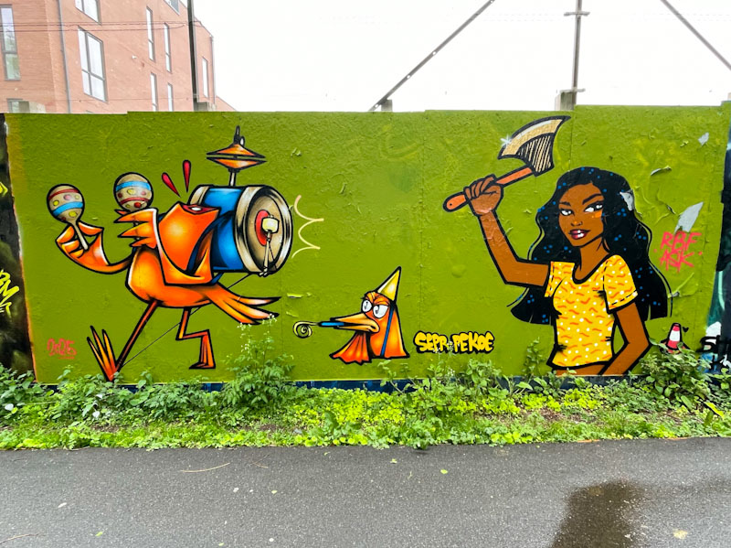
I’m not sure why, but I am always surprised (and thrilled) when I see collaborations between Pekoe and Sepr. Somehow in my head I don’t see them as natural collaborators, but how wrong I am. This delightfully witty piece on the long hoarding at Greenbank took me several attempts to get decent pictures. The fine weather we have been experiencing has a downside which is that full sun causes shadows to be cast everywhere. Eventually I took advantage of an overcast day and made my way to the spot.
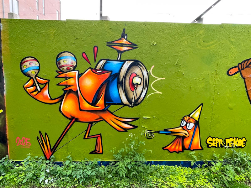
The combination tells a story of a headless chicken, and in the left hand side, Sepr has created one of his superb cartoon characters, in this case a ‘one chicken band’. Obviously the festive bird wasn’t to everyone’s taste and the decapitated body marches on as the head complete with party hat watches on.
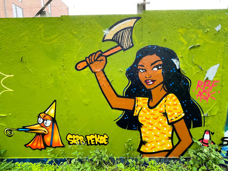
The perpetrator of the violent crime is a rather charming young woman wielding an axe, which makes one feel a little uncomfortable. Pekoe has done a great job here and unusually has painted more of a full character than her more usual head portrait. I have noticed that recently she has also been painting traffic cones in her pieces, like a little signature. The collaboration is witty, gruesome and really well painted. It would be great to see more of these story pieces from these great artists.

Every day, pretty much, I see graffiti and street art and every once in a while I see something by an artist I know and I think to myself ‘this is special, this is really classy’. This clever piece of combined writing and a portrait by Conrico left me feeling that this was special, definitely a ‘keeper’.
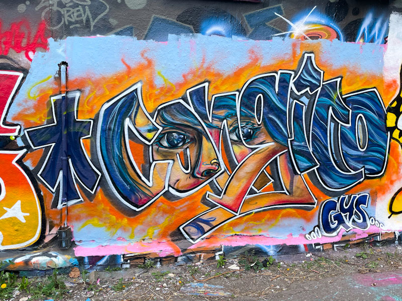
Conrico has painted his name, but instead of a solid or patterned fill, there is a portrait of a girl behind, as if you are peering through the letters to see her. The piece is expertly executed, but at the same time incredibly modest. No fanfare, no showing off, just a really great fusion piece.
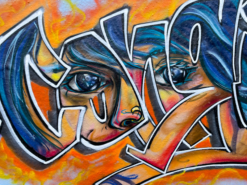
Conrico has been turning out some great pieces recently, and this one expands and continues the series. As ever, I look forward to more.
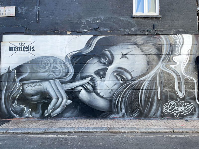
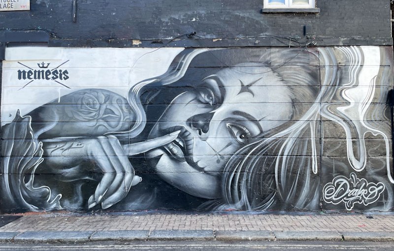
Wandering around without a set route is quite the best way to find street art in my experience. Following a map or guide only takes you to specific places, and it is by turning down a back street, or catching a glimpse of something in your peripheral vision and going to investigate it that makes exploring places so much fun. I see too many people navigating their way around the place with their head down looking a little screen and Google Maps or some other way finder and missing all the incredible people, architecture, events or nature that surrounds us. That’s enough sanctimonious nonsense. I found this superb Drake piece while wandering about aimlessly with my head and eyes up.

This is an outstanding greyscale portrait piece by Drake, an artist whose work I have seen in Bristol, but that I don’t know much about him. The piece has a commercial element to it in so much as it is promoting Nemesis, a tattoo parlour – perhaps a friend of Drake’s. Certainly a superb piece.
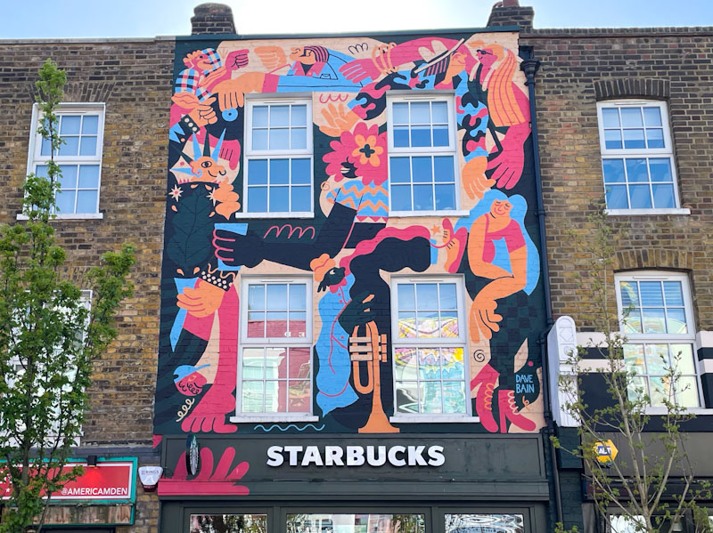
It is always gratifying to find pieces by artists I am familiar with when I am on my travels, especially if they are from the West Country, so to come across this large mural in Camden Town by Dave Bain was rather special. Camden High Street and the area around it is curious in that it hosts the full range of art from high-end murals to tagging and everything in between.
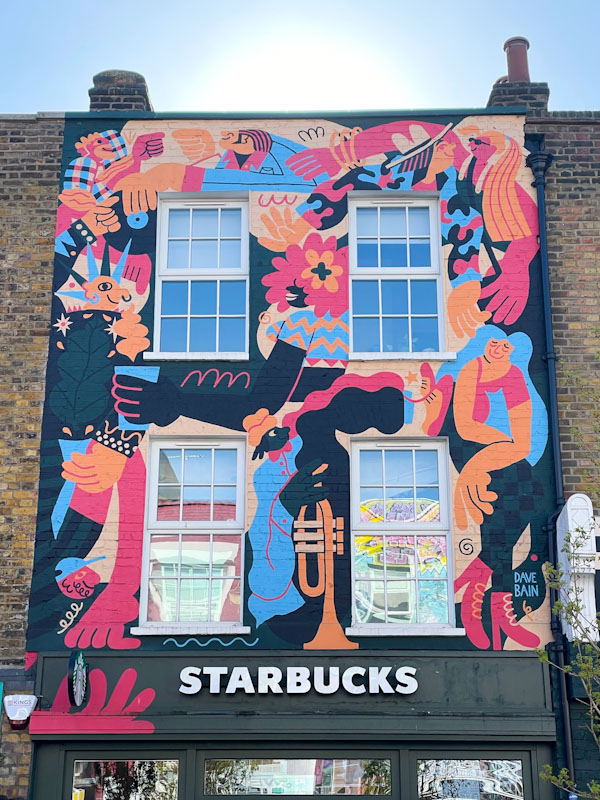
This mural is full of colour and is a wonderful representation of the vibrancy of the area, with a punk character, musician and generally cool people having a good time. I think the days when Camden Town was a special place have long since gone, and it is now a honey pot for tourists with all the customary trappings, and references to its cool history. Maybe I am being a little harsh, but it is not how I remember it as a kid. Starbucks I am sure are rightly proud of this fine Mural.
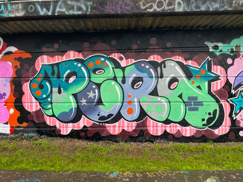
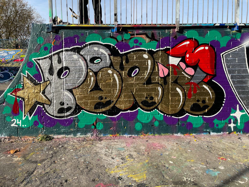
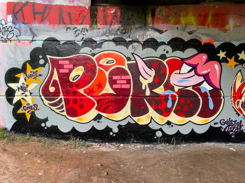
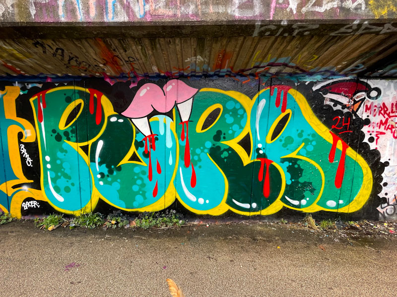
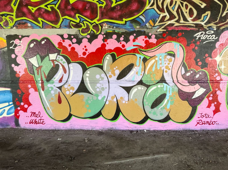
A gallery of fabulous graffiti writing and a selection of vampire teeth from Bristol/Spanish artist and tattooist, Pura Decadencia.
Instagram: puratattoos
All photographs by Scooj



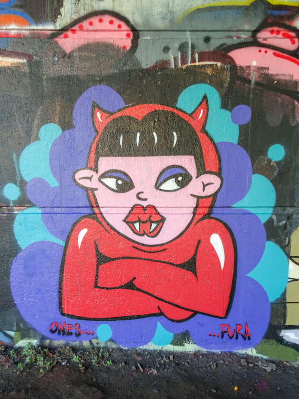


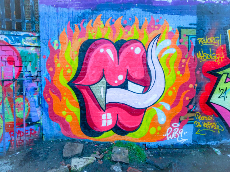
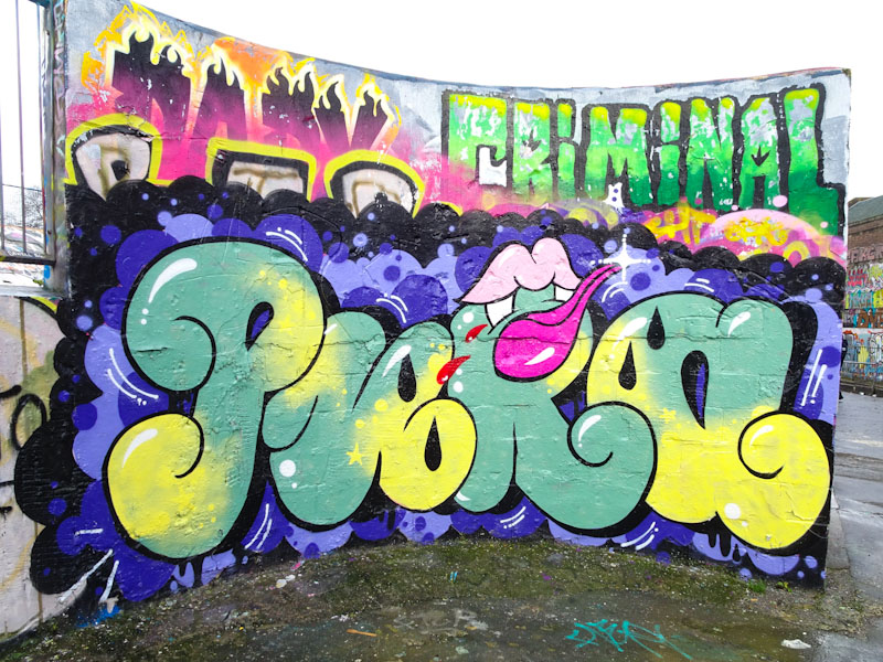
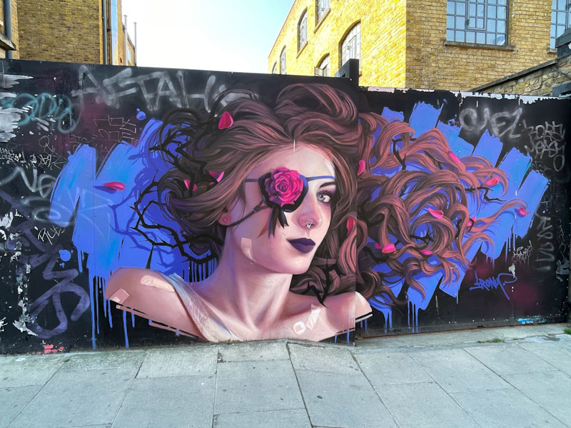
The highlight of my recent trip to Camden Town, was finding several pieces by Irony, including this one, that I had never seen ‘in the flesh’ before. He really is one of my favourite artists, and all of his work is of the highest quality. What I particularly like is that he seems to be equally comfortable painting high-end festival walls or spots like this one – he isn’t precious at all, and is a very modest gentleman.
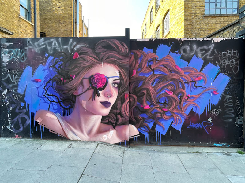
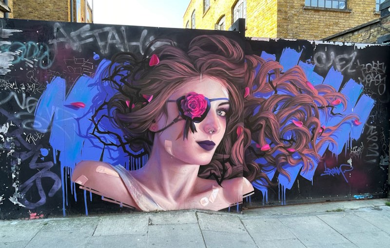
There is a hell of a lot going on in this wonderful detailed portrait piece, and symbolism that I don’t think I will get to the bottom of, although it is possible that he is ‘patching up’ the piece in a clever way. While writing this post, I have found out that this is a repair job on a piece that was originally painted in 2018, and so the plasters and the eye patch are probably literally covering up blemishes in the original.
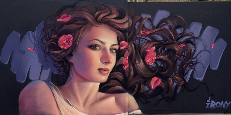
The facelift is quite stunning, and as you can see from this photograph taken by the artist of the original piece, the portrait has taken on a quite different persona. It is an amazing recognition of his talent and respect from others, that his work is still there seven years on in the first place.

As ever, outstanding work. You can see more of his pieces in this short gallery.
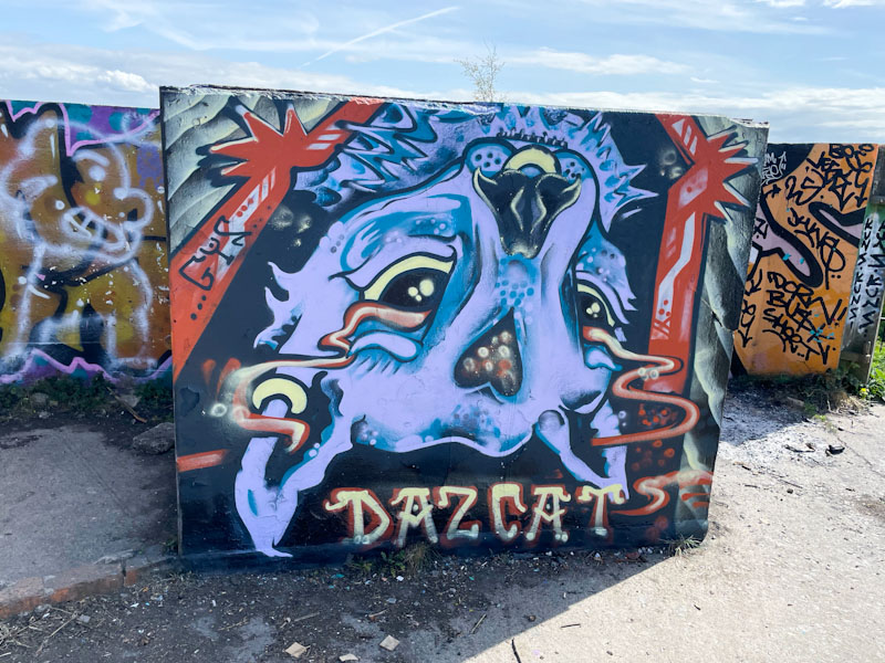
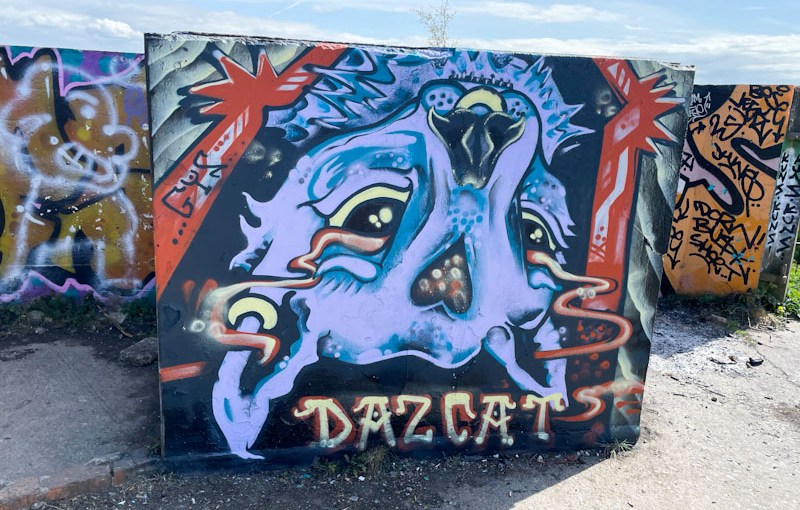
It would seem that Daz Cat is rather partial to the concrete blocks up at Purdown, and whyever not? The spot is a wonderful oasis away from the bustle of the streets and has some stunning views over the north and east of Bristol, the dog particularly likes it up there, perhaps it is the lure of the stinky goats.
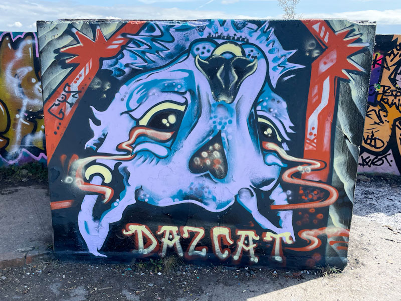
Daz Cat has switched things up a bit by painting this cat portrait upside down, which would completely goof me up, but I am not an artist, and maybe it is concepts like this that separate out the ways artists and non-artists see the world. The purple cat has a fine gold nose ring and a vapour trail from eyes to ears, which must be symbolic of something, and is an idea Daz Cat has used before. This is a fun piece from the cat supremo.

.
Three little piggies
curious to find out more
the dog sniffs the air…
.
by Scooj

Tucked away behind the iron fence of the swimming pool at Dean Lane is this fabulous collaboration combination piece from Werm and Zake. Werm, more than adequately providing the symmetrical letters, and Zake offering a couple of different cheeky characters peering over the top of them.

The horizontal band colour scheme, painted on an off-white background, works really well, and Zake has cleverly incorporated the band of colour into his characters. I’m not quite sure what it is about it, but this feels like a really classy piece to me, and I really like it.