.
At his happiest
in synchrony with his man
sand, sea and a ball
.
by Scooj
.
At his happiest
in synchrony with his man
sand, sea and a ball
.
by Scooj

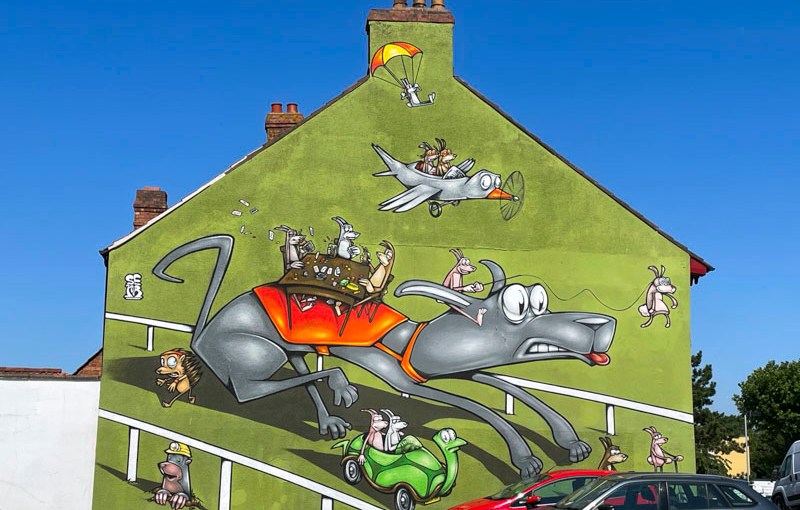
This is a magnificent piece by Sepr which I was lucky enough to find quite by accident recently during a trip to scout out three hoardings in Fishponds. I had been aware of the piece for a while, but simply didn’t know where it was.
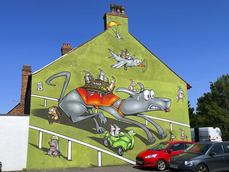
It is annoying that many of the best walls and spots are adjacent to car parks, and because of that parts of the pieces painted are obscured by vehicles. It is a known known, but nonetheless irritating. You have to get really lucky to find such murals with a clean view. This piece is unsurprisingly on the side of the Greyhound pub.
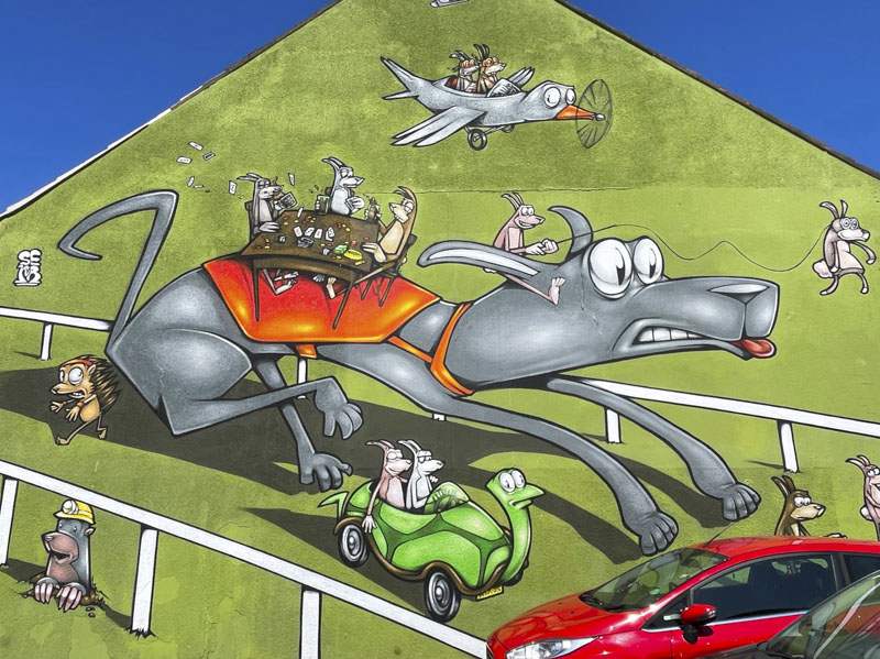
Sepr has stuck well to the brief , featuring a greyhound racing round a dog track, with some creatures gambling at a table on his back. Added to the charming scene are random animals – a hedgehog and mole, some rabbits in a tortoise car and more rabbits in a bird-shaped aeroplane. So much going on and plenty of good humour – a classic Sepr piece.
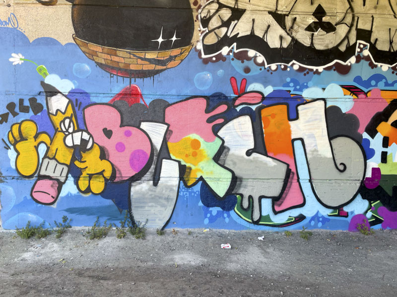
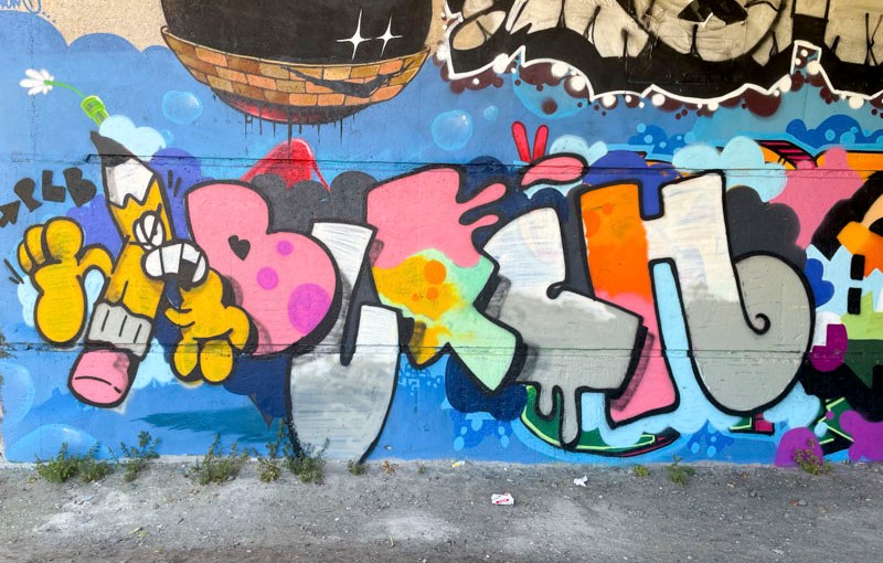
This may be the most dynamic and sophisticated piece that I have seen by Butch to date, painted as part of a PLB paint jam underneath Brunel way. The first notable thing about the piece is that it is full of colour, and he has combined his letters with an animated character on the left.
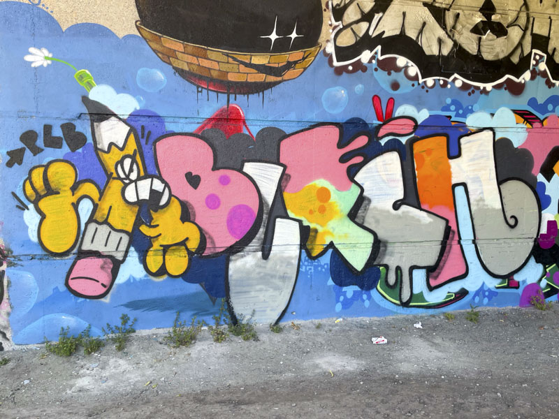
Butch nearly always overlaps his letters so that the letter to the left sits over the letter to the right. This layout distinguishes his work from other writers. Each of the letters is decorated independently, although the ‘U’, ‘C’ and half of the ‘H’ share a grey and white colour scheme. The character is a running pencil, with a big mouth. What he is running from I have no idea. All in all an entertaining combination piece.
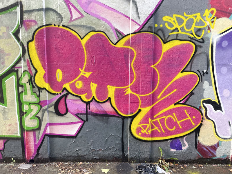
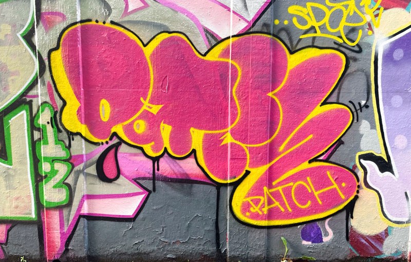
I really enjoy it when ‘new’ artists come on to the scene, and this is the third piece that I have found this summer by Patch. There is something about the simplicity and form of Patch’s pieces that I really like, and they remind me a little of TES’ letters that have remained reasonably consistent over many years (although he has been much more experimental lately).
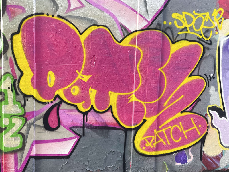
This straightforward piece with solid fills uses cartoon letters of varying sizes to create the word Patch. Just in case, the artist signs the piece as well for good measure. I look forward to seeing more of these mega-tag stamp pieces popping up around the city.
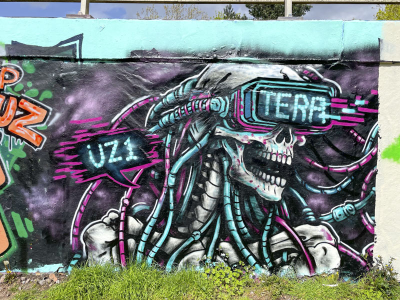
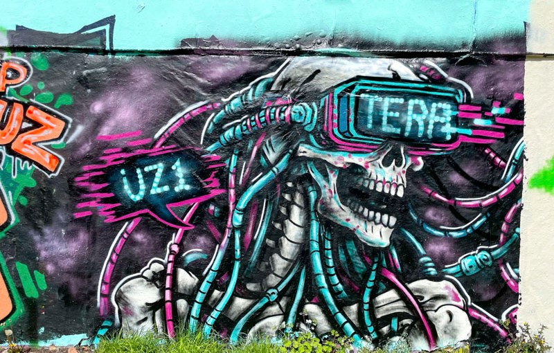
This wonderful piece by Tera was all that remained from a paint jam by the time I got to it. Even though the full extent of the piece is somewhat reduced, I felt it was worth posting in any case, because Tera is one of the most creative artists in this demonic/horror genre around.
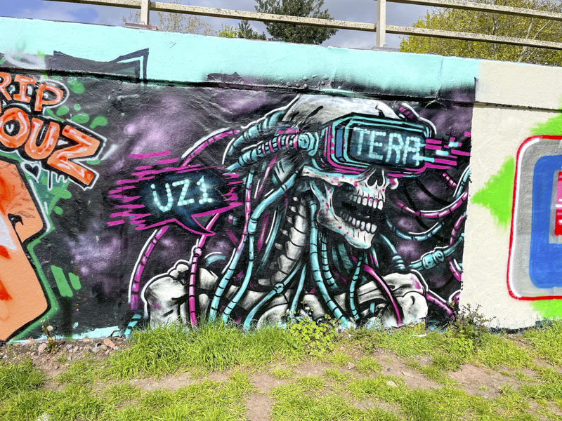
The piece features a skeleton (of course) connected up to several pink and blue tubes and a visor with the word TERA emblazoned across the front – all in keeping with a robot/dystopian/horror theme, which might not be everyone’s cup of tea, but certainly is impactful. Could it be that Tera is taking on the mantle left behind by Laic217?
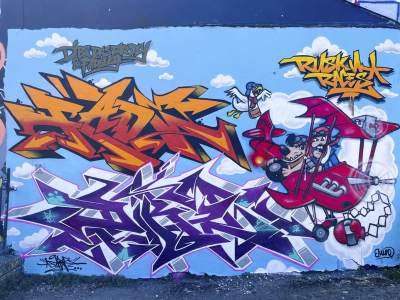
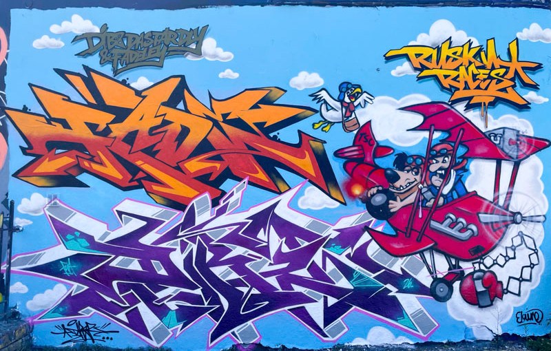
The Wacky Races cartoon series is deeply embedded in some of my happiest memories. As children, my two best friends and I would watch it every week together, adopting our favourite characters – being the youngest, I got third choice and was Professor Patent Pending, which I was actually quite happy with. Our own fortunes were dictated by those of our chosen characters, and winning the race was joyful and bestowed bragging rights until the next episode.
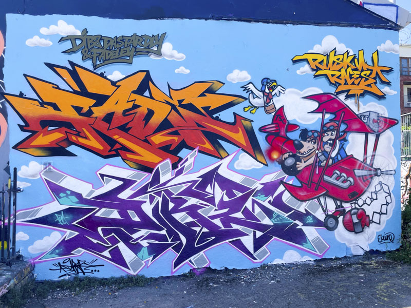
This is a wonderful combination of writing from Fade and Dibz and the character piece by Rusk. The wildstyle writing is top class, with each piece hanging perfectly in the blue sky. The writing is accompanied by the words “Dibz Dastardly & Fadely”, a direct reference to the characters in Rusk’s character piece.
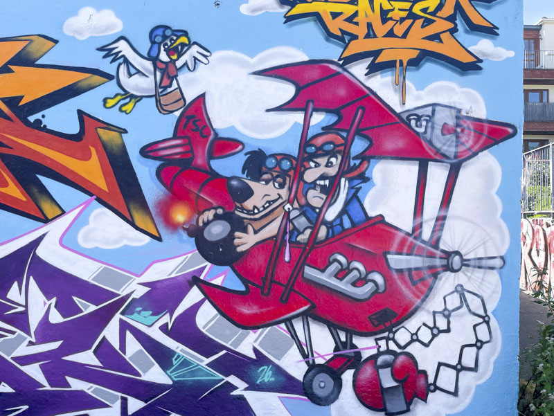
Rusk has done a great job with Dastardly and Mutley in their flying machine, and has conflated Wacky Races with Stop the Pigeon, which was a spin-off series from Wacky Races. I love this collaboration, a real trip down memory lane – probably 55 years or more ago. Thank you.
Doors 365 – Doors of Saltaire – May 2025
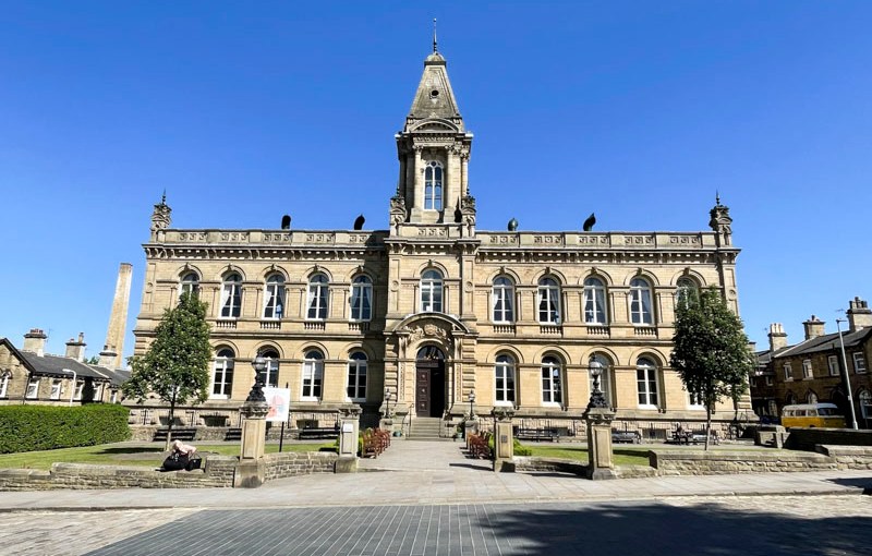
My job takes me round the country from time to time, and in May 2025, I was lucky enough to be present at the launch of a new National Nature Reserve (Bradford Pennine Gateway NNR), which was celebrated in Saltaire. Saltaire is an incredible model village that had been completely off my radar. It is a World Heritage Site and was purpose built as a village for workers at the nearby mill – here’s more from an AI trawl:
Saltaire is a Victorian model village in West Yorkshire, founded in 1851 by the textile manufacturer Sir Titus Salt to provide high-quality housing and amenities for the workers at his nearby textile mill. Designed with wide streets, solid stone buildings and impressive public spaces, the village reflected progressive ideas about industrial living and has remained remarkably well-preserved.
Today, Saltaire is a UNESCO World Heritage Site, recognised for its outstanding industrial heritage and architectural significance. Its distinctive stone terraces, original features and carefully maintained historic buildings make it a popular destination for visitors and a valuable example of Victorian craftsmanship, where traditional details, including many original and sympathetically restored doors, continue to contribute to the village’s unique character.
This week’s doors are primarily from the civic buildings in the village, I hope you enjoy them:
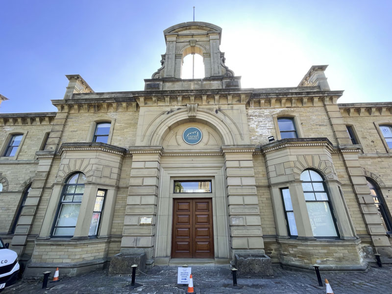
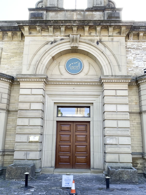

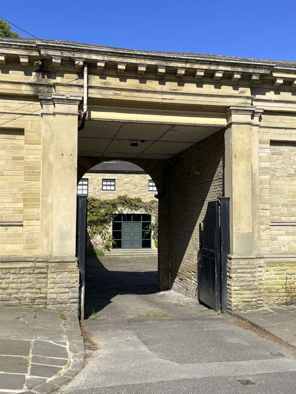
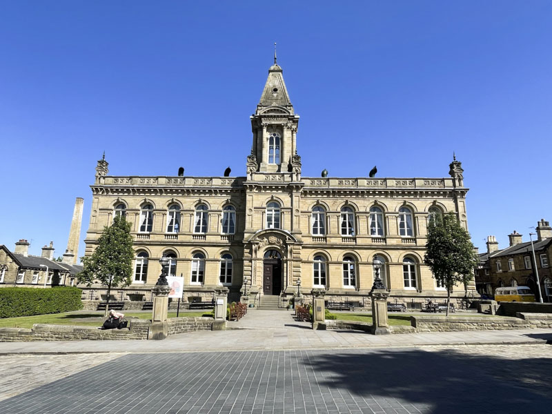

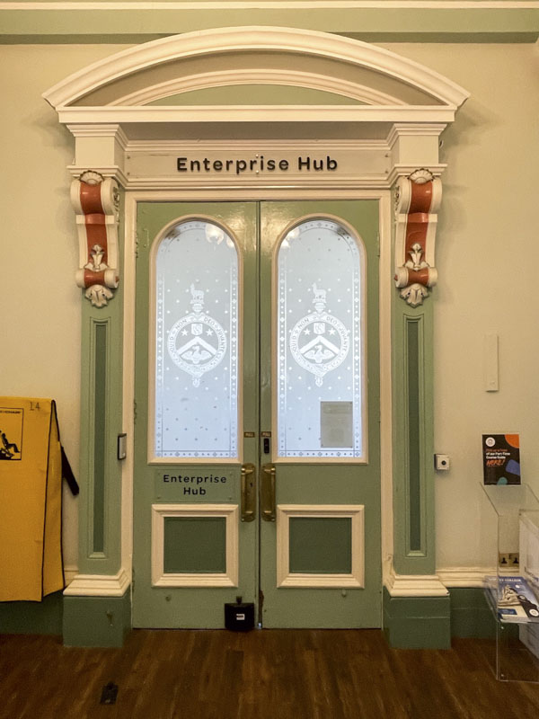
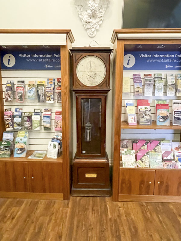
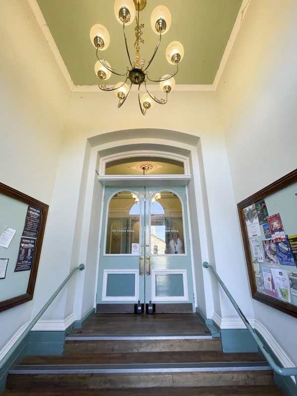
That’s yer lot this week, but I’ll be posting more doors from this incredible town next time. Enjoy your weekend, when it comes.
If you have made it this far, you probably like doors, and you really ought to take a look at the No Facilities blog by Dan Anton who has taken over the hosting of Thursday Doors from Norm 2.0 blog. Links to more doorscursions can be found in the comments section of Dan Anton’s weekly Thursday Doors post and his Sunday recap.


John D’oh has given me an unforgettable spring and summer with his extraordinary outdoor gallery on the concrete columns supporting the M32 above. Dozens of his stencils decorate the area with humorous and poignant material and then the council come along and buff them which allows him to refresh his gallery with new work. The circle of graffiti life.

This black and white piece with a clever touch of colour carries a powerful message and observation, with the words:
Poverty is not just the lack of money; for a child, it is a lack of security, opportunity and the simple freedom just to be a child.
A quote widely attributed to UNICEF, and perfectly illustrated with a child clutching a teddy bear. The piece is a moving one and right up there with some of John Dohs’ best commentary pieces.

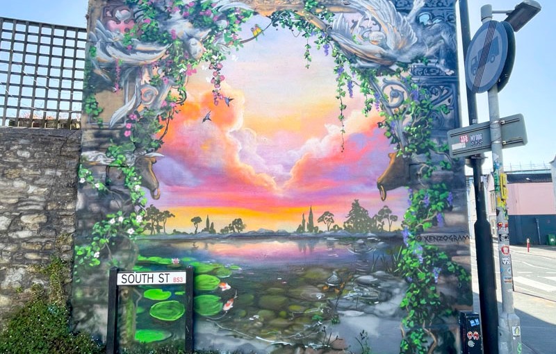
Xenz has absolutely smashed it with this atmospheric neoclassical vista on South Street. The piece is an absolute treat for anyone strolling along North Street and a real head-turner. The wall is a special one and Xenz has more than done it justice.
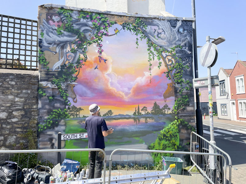
It is interesting to see the changes that Xenz made to his largely complete piece when I passed by while he was painting, such as the lily pads and rocks in the water, and some white flowers on the creepers to the left. As you can imagine from the amount of intricate detail in his work, this piece took more than a couple of days to complete.

Xenz’ fantasy work allows the mind to drift into another world where calmness and peace are at the heart of everything. This is definitely a personal favourite from this year’s festival.
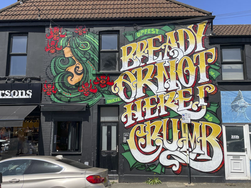
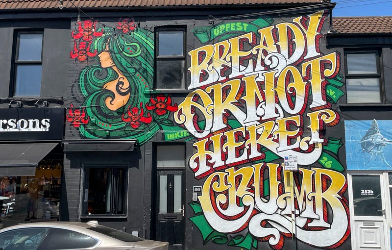
One of the ‘sure things’ about Upfest is that Inkie will give the Parsons Bakery a refresh, and offer another bakery related pun, this has become a tradition now and something to look forward to on the Upfest calendar.
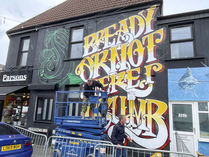
This year Inkie has gone to town with his ‘Bready or not, here I crumb’, which is a groan of a pun, but actually rather good. The writing is outstanding in his bold style, and it is possible many seeing it won’t actually get as far as reading it, being seduced by the grand nature of the lettering.
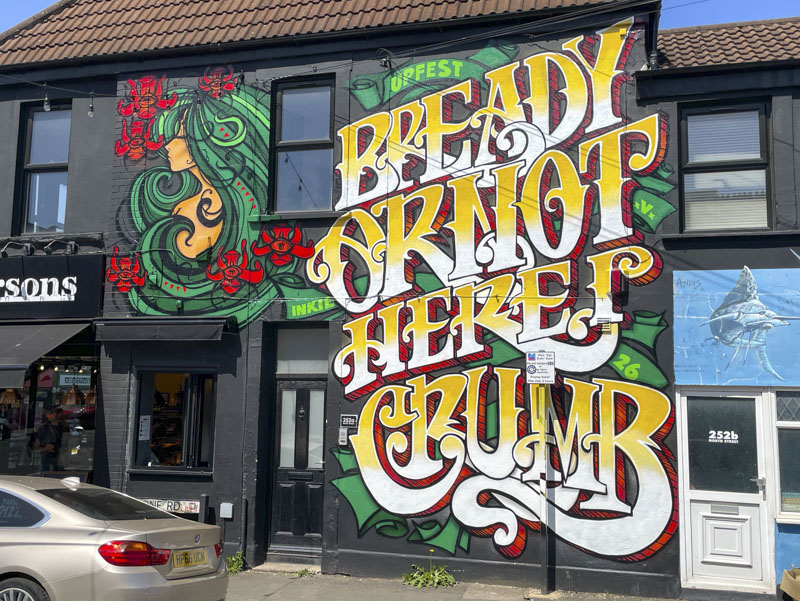
Inkie completes the piece with one of his trademark stylised portraits. No need for a signature here. Inkie is synonymous with Bristol street art, and after Banksy, is probably the best known graffiti export from the city, alongside Nick Walker, perhaps. Brilliant to see this refresh and enjoy the humour of the piece.