

.
Loitering unseen
an unnerving sense of threat
a predator waits
.
by Scooj
.
Loitering unseen
an unnerving sense of threat
a predator waits
.
by Scooj

Lee Roy is no stranger to Natural Adventures, nor is he a stranger to this spot on the M32 roundabout, and I have a feeling that he might have overwritten one of his own pieces to paint this one, or at least a short while after.
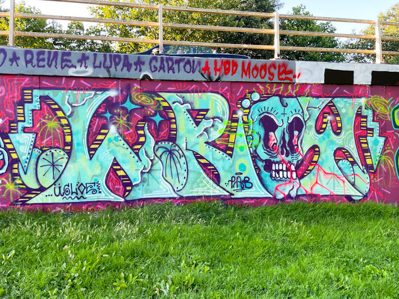
In this piece we see Lee Roy’s free approach that touches on anti-style, full of energy and activity. The colours are rich and complementary, but the eye is immediately drawn to the skull, with red ‘lightening’ coming from its bloodshot eyes. This feels like a good old-fashioned piece of graffiti writing.

Such is the volume of pieces dropping in Bristol these days, that I am still posting pieces from Werm’s birthday celebrations, like this one by Kool Hand, from some weeks ago. I don’t think that I am ever going to get close to getting on top of this and perhaps need to be a little more judicious in my selections, although this is a challenge, because part of the point of the graffiti/street art posts on Natural Adventures is to showcase the range and diversity of pieces, from high-end to beginners, without prejudice.
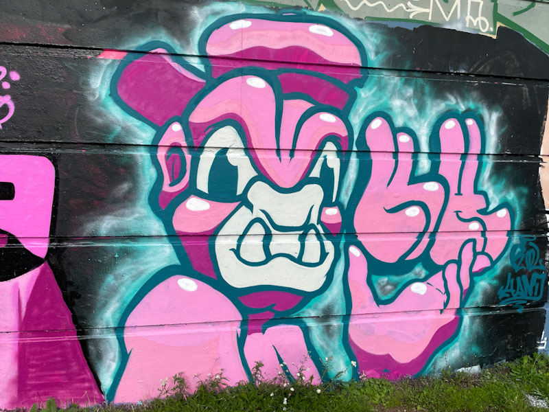
In this piece, which is pink, consistent with the colour choice for the paint jam, Kool Hand has reverted to his staple orangutan character and the letters KH. As Kool Hand has developed his artwork, so this character, which has a three-quarter profile and loads more depth than some of his earlier renditions, shows off how far he has come and continues to improve. A nice piece with a familiar face.

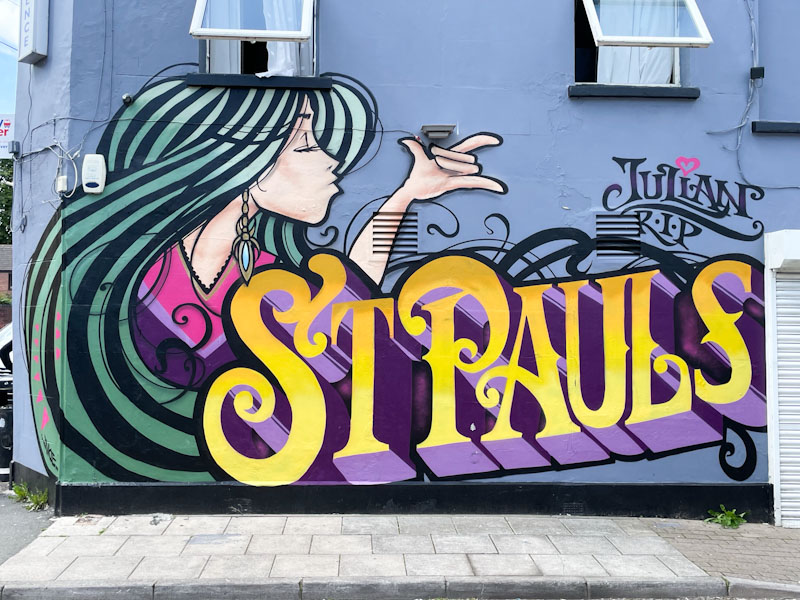
You can be pretty certain that Inkie will have a presence at the Cheltenham Paint Festival, which is great. What is even better is that although this piece was from the 2022 Festival, I managed to find it this time round… only a year late, but better than nothing I suppose.
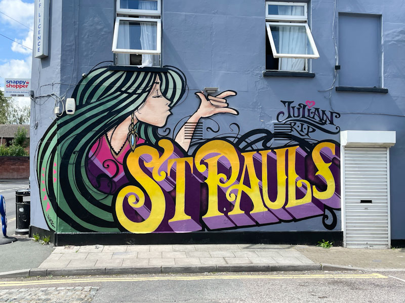
The character/writing combination is along the lines that you would expect to see. A beautiful girl with long flowing hair alongside some large block writing. I am not too sure what the ‘St Pauls’ refers to. There is a St Paul’s church very near where this was painted, but it could I suppose be a reference to Bristol’s St Paul’s district. Unmistakably Inkie, the piece is still looking fresh as a daisy. Nice Tribute to Julian too.
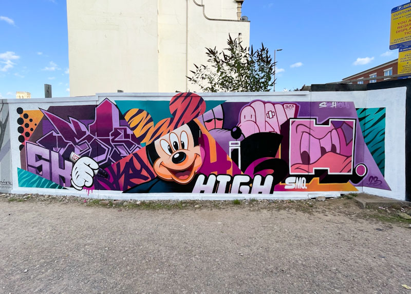
Each time I think that SkyHigh can’t possibly up his game, he manages to do so with what appears to be ease. I can’t imagine he has too much headroom for improvement, but hey, this is SkyHigh we’re talking about (no pun intended).
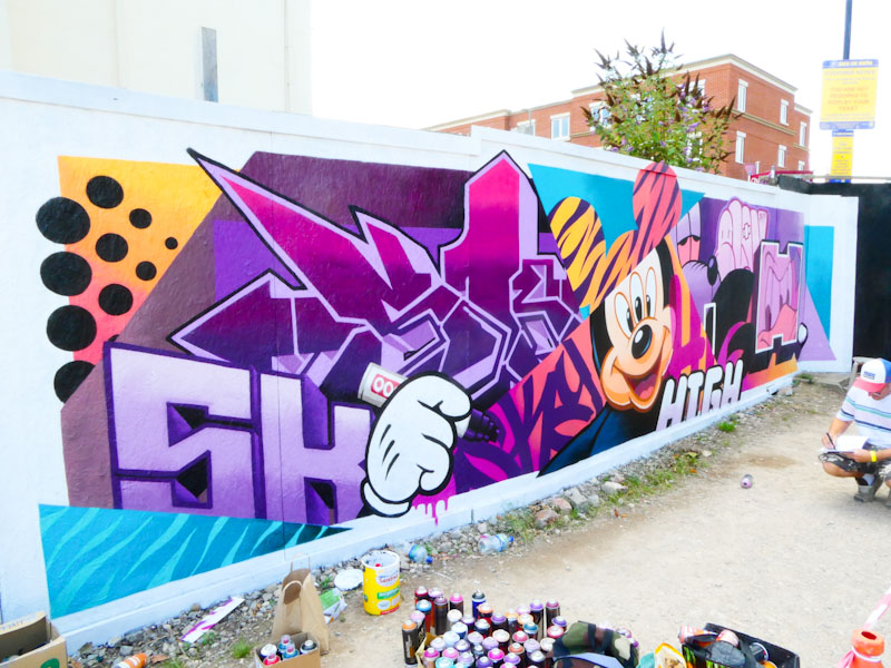
This large piece is a perfect mash-up of characters, letter fonts and styles, seamlessly joined together to spell out SkyHigh in several combinations. The inclusion of Mickey Mouse, Pluto and Donald Duck add a sense of fun to the piece as well as being a bit weird with some additional eyes thrown in for good measure.
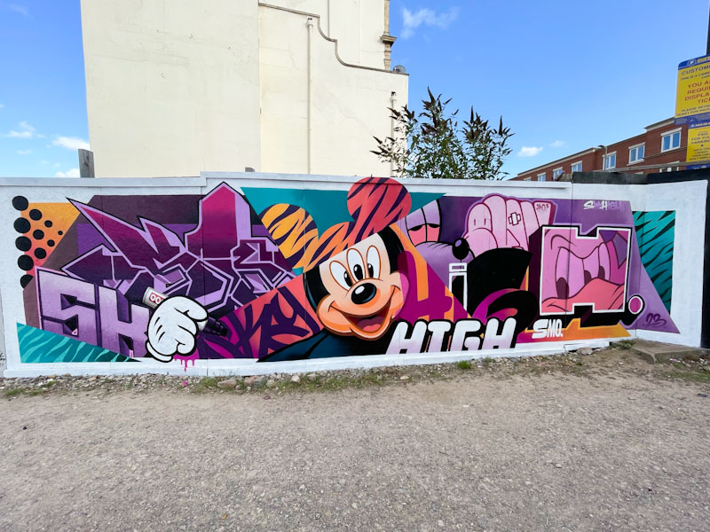
One of the awesome things about the piece is how SkyHigh manages to compartmentalise each element as tight as tight can be, and yet there is a fluidity that makes sense of each of the components into an impressive whole. This is as close to graffiti writing perfection as you can get.
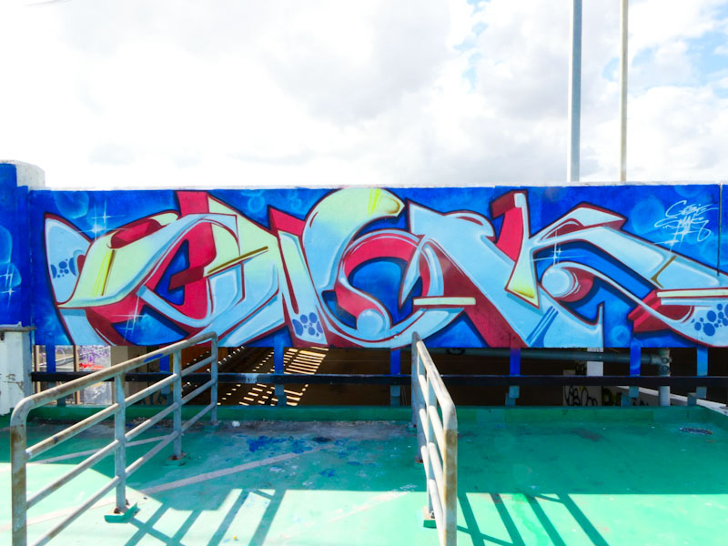
UPDATE (2 November 2023): On posting this piece on Instagram I am informed by Smak that this piece is not by him and that the content of this post should be ignored. This happens from time to time. The piece is by Smerk, and the letters indeed spell SMERK. A forgivable mistake on my part.
I haven’t seen too much work by Smak in Bristol recently, so it was great to see this piece on the multi-story car park in Cheltenham at this year’s Paint Festival. The first thing to notice about this Smak piece is that it is really rather different from the usual style of his writing. That isn’t to say he isn’t incredibly versatile, simply that this is a small departure, and one I rather like.
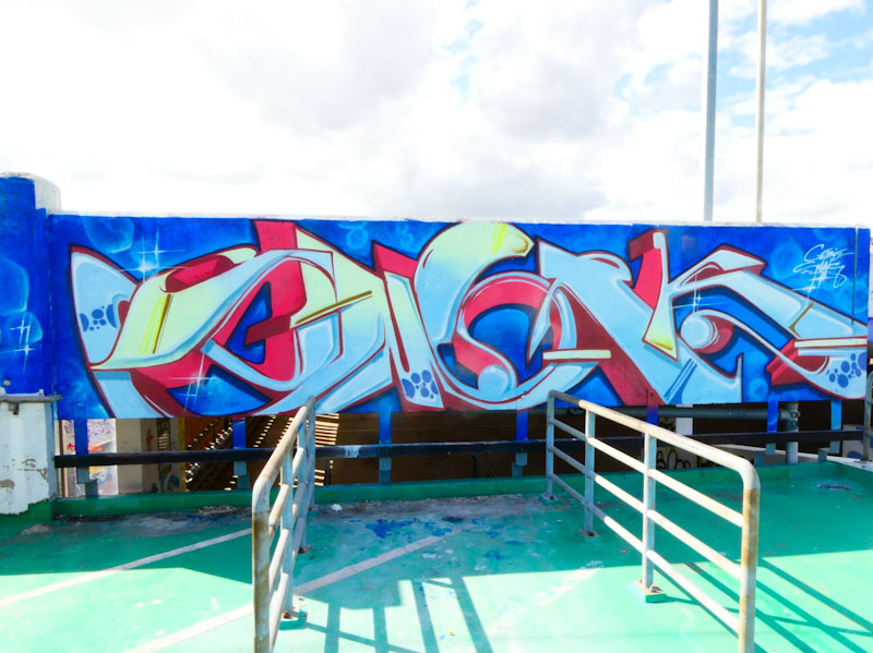
The letters in this piece have a slight 1920s/30s feel to them, like a modern version of something you might see at a lido or cinema, if you know what I mean. Perhaps it is the colour palette or the deep 3D shadows in red, combined with the letter shapes, I don’t know, but the overall effect is most pleasing and very easy on the eye. Unfortunately, by the time I got to the car park, Smak had already finished, but there were plenty of other artists up there to catch up with.
.
Indian summer
maybe too early to crow
welcome nonetheless
.
by Scooj

One of the highlights of my trip to Cheltenham for this year’s Paint Festival was the opportunity to meet and chat with Elno, a lovely, lovely person who made plenty of time to talk about her work, and a piece that I photographed earlier in the year from the Lighthouse Community Gardens. I caught up with her just as she was completing the piece, only the sword handle was incomplete and, of course, her signature.
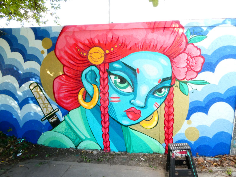
I made a bit of a mistake asking Elno if her character had any links to Avatar (the film), and she swiftly put that one to bed. I gather that she has been painting characters like this for a while, and it is purely coincidental that this one resembles any kind of animation film characters, and if I am honest, I feel a bit of a fool for even asking as the resemblance is tenuous at best.

There is so much to like in this piece from the composition with its very strong Japanese influence. Characters with large eyes are always beguiling and beautiful, and the red hair, complete with flower, complements the blue skin perfectly. I love the touch of patterned material on the woman’s shoulder, adding some extra class to the piece. I suggested that she try to make it to Bristol for Upfest, a suggestion that didn’t fall on deaf ears. Let’s hope.

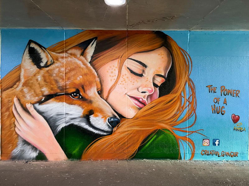
I have only once before posted anything by Creative Ginger, and that was at last year’s Cheltenham Paint Festival, also in the Honeybourne Line tunnels, and featured a young woman cuddling a fawn. This year it was the turn of a young woman cuddling a fox, and what a fantastic piece it is too.
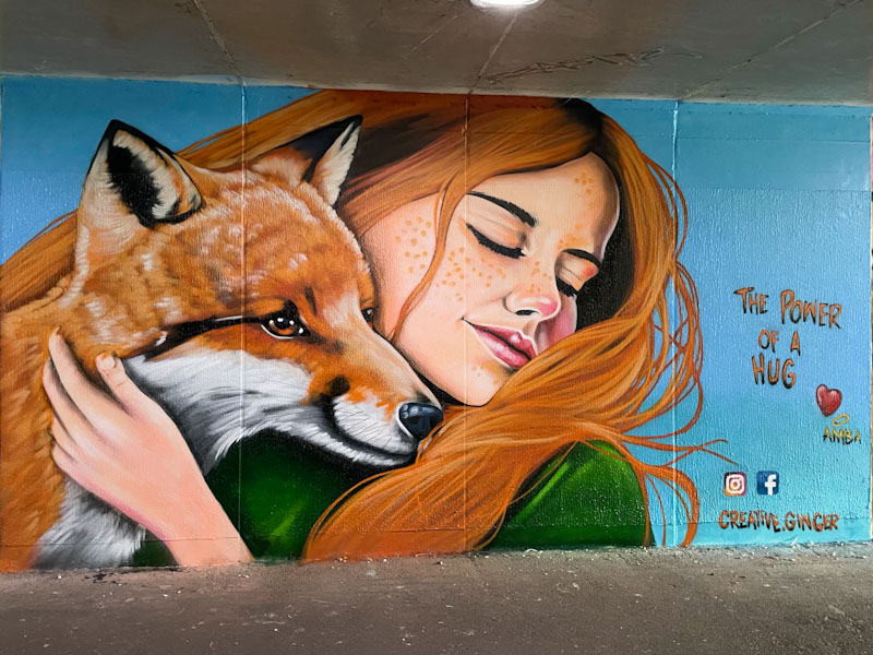
This kind of work contains a lot of emotion and warmth and the style stops just short of photorealistic, while being accurate, calming and soft. Foxes play a very large part in street art (note to self: do a special gallery of foxes) and Creative Ginger has done a great job with this one, and plays with the girls hair colour and texture alongside the foxes. A perfect mural, and one which I am sure appealed to the many families visiting for the festival. It would be great to see Creative Ginger at Upfest.

.
Sweetest victory
sweeter for last minute goals
more than just a game
.
by Scooj


