.
Curled up by my side
some call him a man’s best friend
my companion
.
by Scooj
.
Curled up by my side
some call him a man’s best friend
my companion
.
by Scooj
Pretty much my favourite collaborations are those between Billy and Merny, their naive styles complement each other so well and they both tell fabulous stories with their paintings. This collaborative wall was painted a couple of weeks ago.

To the left, as is usually the case with their collaborations, is Billy’s piece, that claims ‘it used to be different here’. It would appear that the piece is a commentary on the huge development that is going on on the other side of the hoardings. The woman in a strawberry dress, overlooking a new housing development, has the look of a Dick Bruna character, the artist who created Miffy the rabbit. Everything about this piece is perfect… the story, the artwork and the location.

To the right of Billy’s piece is a rather bleak message from Merny in which a man, perhaps a teacher, is pointing at words on a board that read ‘no one cares’. I would suggest that maybe this is a reflection of the troubled times we live in where we have an inept and out of touch government that is looking after the interests of the wealthy. The signature numbered labels create interest and humour to the piece.
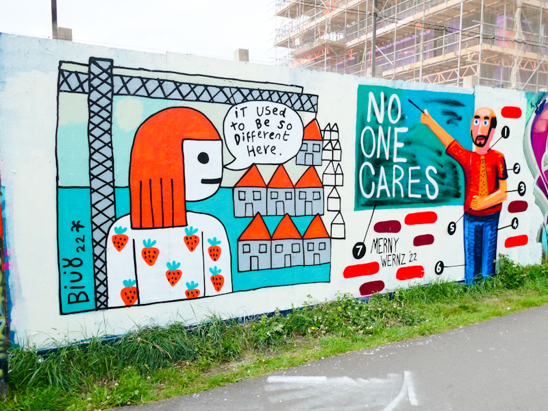
What a fabulous collaboration from these two. I was pleased to get photographs as often their pieces don’t last long, which is both irritation and disrespectful.
Every once in a while, something very special appears, and when it does it might just be on this wall or one of the adjacent walls, that tend to be left untouched for long periods of time. The special piece in question is this stunning collaborative effort from Andy Council and Soker.
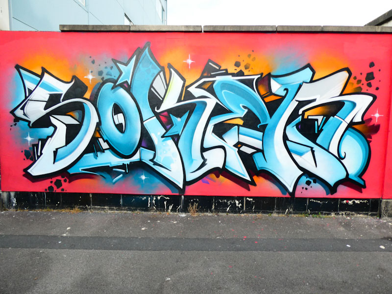
Soker has really been pretty quiet over the last two years, but it is always worth waiting for his pieces when he finds time to paint. With this graffiti writing, set on a tangerine-sunset background, Soker has shown us what he is capable of, with gorgeous letters in full relief and stunning colour selections. This is simply too good.
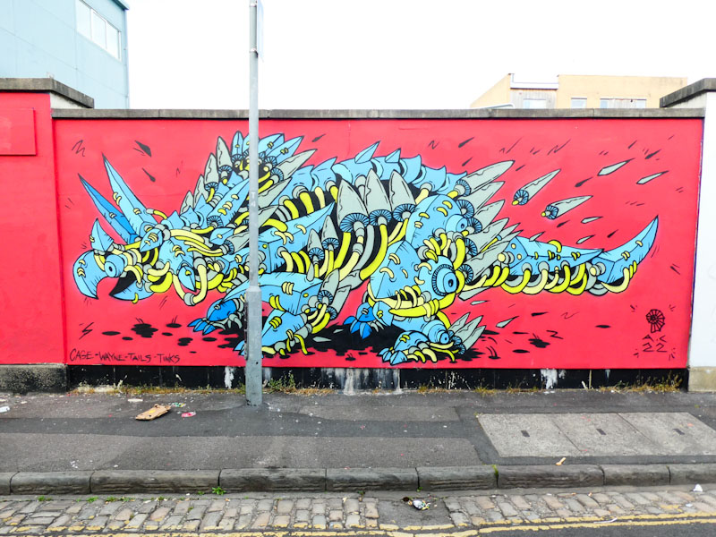
Alongside his friend, Andy Council has painted one of his wonderful dinosaur pieces, it looks like some kind of Triceratops to me, with his clever ‘stitching’ style, where the component parts of the animal’s body appear to be stitched together with yellow thread. I love the way Andy Council’s work is developing and changing, showing that he is constantly pushing boundaries and improving (if that is at all possible). What a truly wonderful collaborative wall, and how blessed we are in Bristol to have these two outstanding artists.
.
Shameful BBC
no more benefit of doubt
Government mouthpiece
.
by Scooj
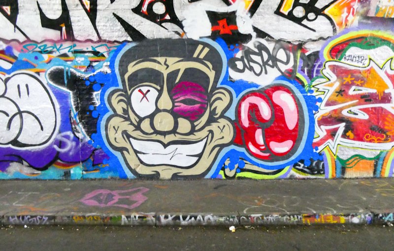
Last Saturday was one of those very special red-letter days for me. I took the dog for a walk, that ended up being a bit of a marathon, during which I visited four spots and met nine or ten artists, several of them for the first time. Among the artists, it was an enormous pleasure to meet Asre, or Runaway Joey as he is known, for the first time, and very touching to find out that he knew who I was and had been keen to meet me and had even read some of my posts… my work here is done.
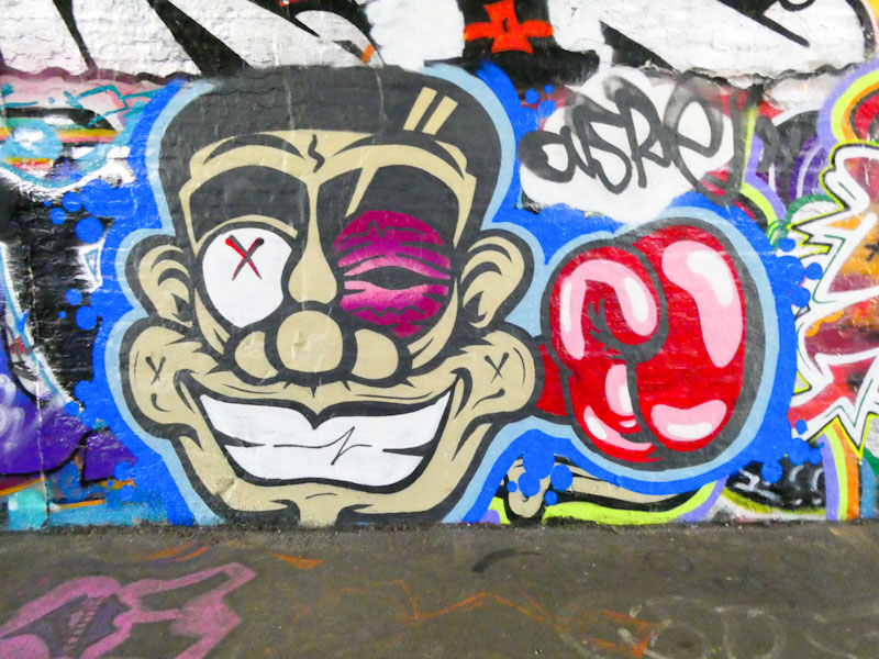
This is one of a multitude of variations on a theme by Asre, with the stylised cartoon face that we are becoming accustomed to seeing all over the place. This poor fellow looks like he has come a poor second in a boxing bout, with a severe black eye. Once again, the strong clean lines and solid fills are nicely worked, and the boxing glove provides additional interest – I like the way Asre has highlighted the glove with pink and white, giving it a cool 3D effect. There is so much more to come from this prolific artist and all round great bloke.
Every year, it seems that Mr Klue takes some time out from painting walls, which is a pity, but it makes his return all the sweeter when it does happen. Mr Klue has been busy lately creating his outstanding pieces at the ‘farm end’ of St Werburghs tunnel, which seems to be his safe, ‘go-to’ spot.
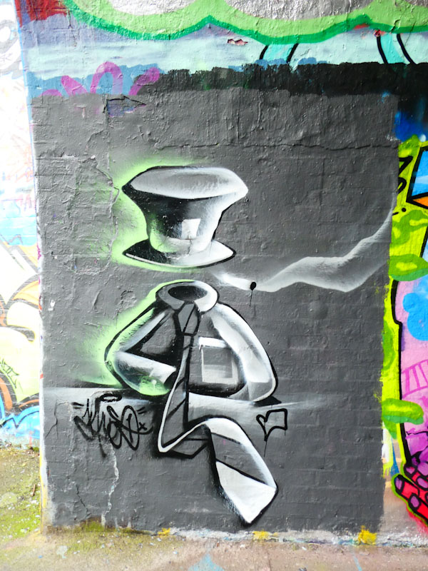
This piece returns to a running theme in Mr Klue’s art, which is a portrayal of the Mad Hatter from Lewis Carroll’s Alice in Wonderland – a rich source of inspiration for many street artists. The exaggerated top hat with the 10/6 ticket is matched up with a shirt and tie along with a smoking cigarette. There is something slightly unsettling, but also endearing about this piece. It is always good to see Mr Klue’s work, and I hope this will be a sustained effort from the fabulous abstract artist.
Until a couple of days ago when I posted a piece by Phour, there had been a long gap since the last one, and now today we have another one. Throughout the drought period, Phour has been painting, but I simply haven’t been able to find space to include any posts by him. My job of recording street art and graffiti in Bristol gets more difficult by the day because of the sheer amount of work that is appearing. You might have noticed that I am starting to drop three posts a day when I can, just to share as much as possible.
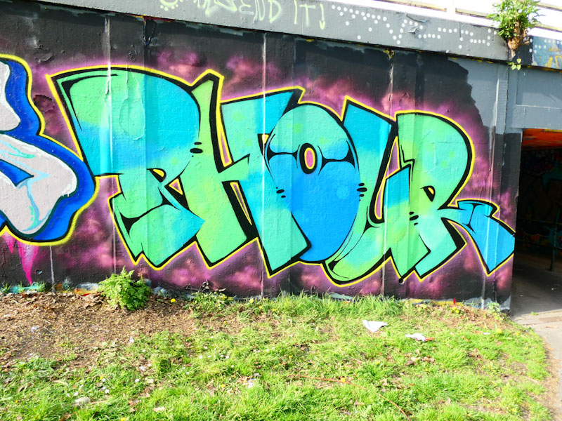
This one from Phour is a particularly good example of his work, with some stunning fades in his letter fills and a clean, crisp yellow border. The whole thing is set on a cosmic cloudy backdrop, which keeps it all tidy. More great work from Phour.
This is another gorgeous T-Rex piece painted as part of the recent renewal of the high hoardings in Elton Street on the outside wall of the Lost Horizons Arts Centre. T-Rex as always, has produced a very classy dinosaur on a very classy background.
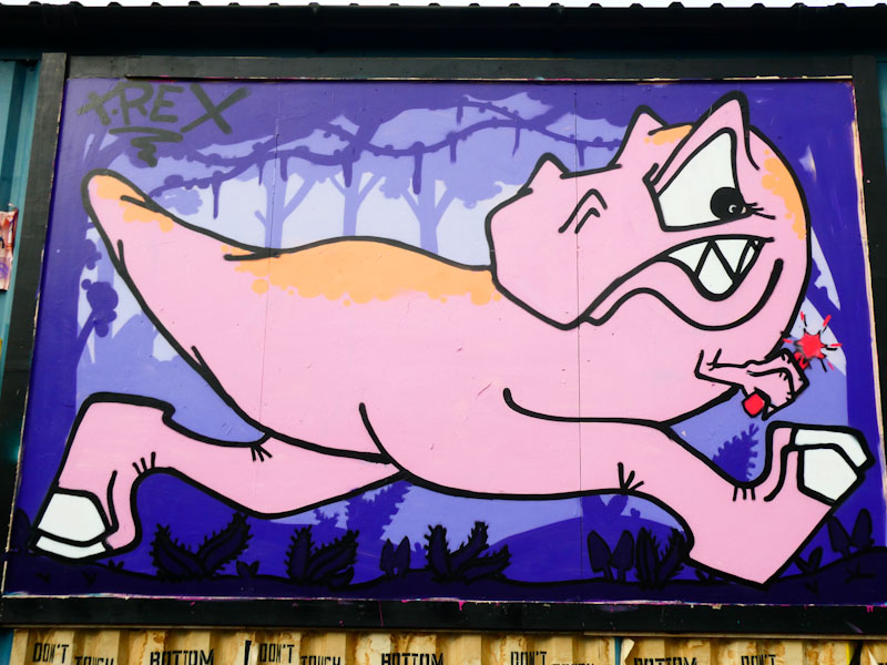
Of course, the dinosaur is full of mischief, running off with a stick of dynamite in its hand – I’m not sure what the story is here other than to highlight the naughty character. The pink Tyrannosaurus Rex, which is cleverly positioned in the frame by looking backwards, has all the hallmarks of the artist… strong and solid fill and clean solid outlines. In this particular piece, the background deserves a special mention, providing a forest canopy kind of habitat. Great to see.
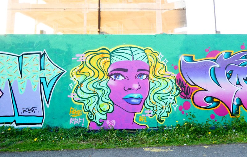
Another wonderful piece from Pekoe, painted during a bit of a purple patch, when she seems to be getting out and about rather a lot, which can only be a good thing. This stunning portrait was painted alongside RBF crew friends and carried the blue background theme that bound the pieces on the collaborative wall together.
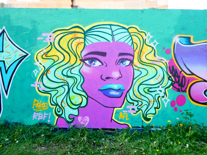
Pekoe has a remarkable talent for painting these portraits, which are so distinctly her work. I guess that the difference between her work, and the work of photorealists is that her style shines through, whereas sometimes it can be difficult to identify a photorealist artist. I am not sure if I have explained that very well, but in short, her work is unique. This time we have a purple face and blue and yellow hair decorated with orange and green symbols and shapes. Another fine piece from Pekoe.
.
Two ruddy faced girls
with blonde bunches and glasses
Help their father shop
.
by Scooj




 Natural adventures