.
The moon, bright yellow
and as full as it can be
opposes sunset
.
by Scooj
* on watching the sun set to my left and full moon rise to my right in cloudless skies. A wondrous thing.
.
The moon, bright yellow
and as full as it can be
opposes sunset
.
by Scooj
* on watching the sun set to my left and full moon rise to my right in cloudless skies. A wondrous thing.
This lovely piece from Desi is another from the RBF paint jam a little while back and continues the bright and optimistic colour scheme adopted for the whole wall. I would love to watch an RBF paint jam, but alas, my working routine means I am restricted to lunchtimes and weekends (during which I have a whole ton of family commitments).
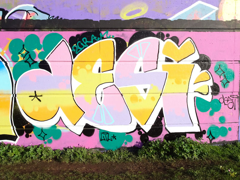
Desi is an artist who has only been painting for a year or two, and with every piece her ideas and skills improve. It won’t be too long before she is giving some of the more established female writers a run for their money. The pastel shades used have a touch of ‘love hearts’ about them and this is a nice sugar-coated piece. I like the introduction of the blue triangles, adding interest to the fills.
Ooh what a beauty from Logoe, in the last place I would expect to find a piece by him, and just how well does it work on this wall? I love absolutely everything about this piece, and was super-pleased when I found it, especially as I haven’t noticed on any social media (at the time of writing).
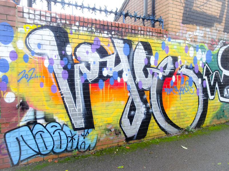
To the untrained eye, the piece might read something like ‘vogue’, but for anyone who knows his work, the script lettering and horizontal dusting of spots would give him away long before reading the Logoe letters. I think that this is one of my favourite pieces by the artist and a gem of a find. Still more to come (I think).
.
Will it ever end?
abnormal becomes the norm
fatigue has set in
.
by Scooj
There were so many original and interesting pieces that appeared during a Bristol Womxn Mural Collective Dean Lane paint jam back in November that I simply have to keep returning to my archive to dig them out to share.
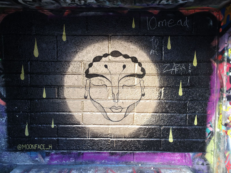
This Beauty was painted by Hana Moonface whose stunning illustrations can be viewed on her Instagram feed. The gold and black colours work well and there is a serenity in the face that is calming. Definitely an unusual piece to find in a spot more used to tags and throwups. Looking forward to seeing the collective at work again soon, perhaps in the spring.
For every piece that I post on Natural Adventures from Greenbank, there are probably a further twenty or so that never actually make it, which gives you some idea of just how many pieces there are on this long wall (hoarding).
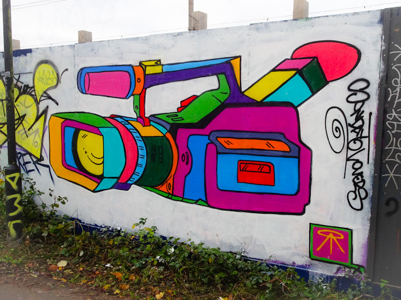
This rather unusual piece, but all the better for it, is by Stika, AKA Apex_aloy, who has made a couple of appearances on this blog before. Everyday objects can be a surprising inspiration for artists, as this ‘camcorder’ seems to be for Stika. Another artist who is inspired by everyday objects is Merny, and both uses colour to the max. There is a charm about this piece, and an artist’s signature to be proud of. I’ll be on the hunt to find another Stika piece soon.
.
A happy childhood
thousands of hours spent glueing,
painting, admiring
.
by Scooj
This is the second Chill/Etza collaboration that I have posted on Natural Adventures, and as you will have noticed, the former of these two tattoo artists has been really busy on the streets of Bristol lately.
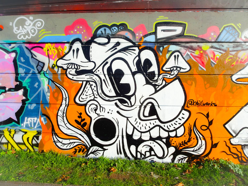
The left-hand side of the pair is by Chill, and features another of his quirky black and white carton characters, looking little bit trippy if you ask me, judging from the mushrooms emanatinng from the character’s eyes. Set on a flaming orange background, the piece really stands out.
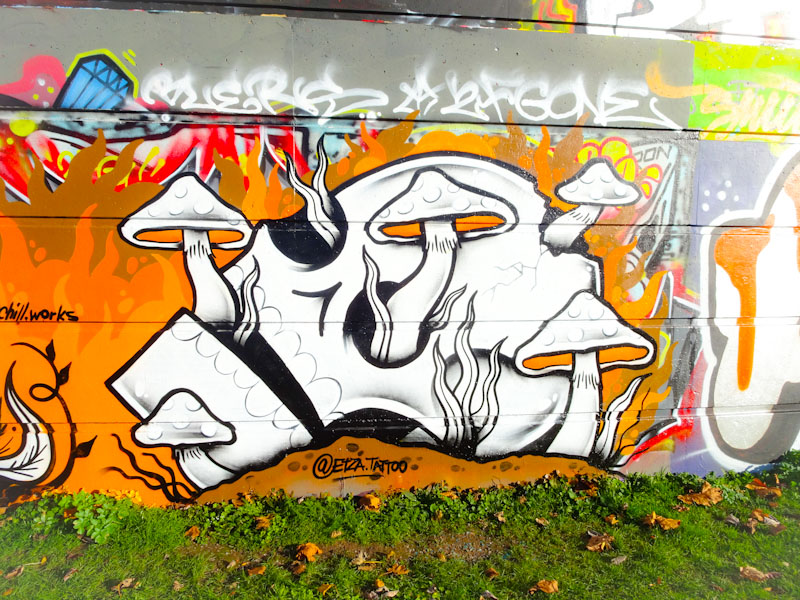
To the right is Etza’s contribution continues with the mushroom theme, but these are growing from a skull. Is it the same character as chill’s, only deceased? Who knows?. The skull again is rather cartoonish, and I reckon Etza could do with a little bit of advice from Laic217 on refining that jaw arrangement a little. This is a fun collaboration from these two, and I hope they continue to work together producing these vibrant pieces.
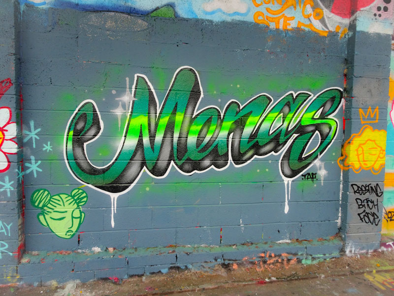
Oof! I am absolutely loving these script writing pieces that Mena painted in the late autumn, and the departure from her customary blocky letters is inspired. It is so good when writers experiment with new styles, and this is a winning formula in my opinion.
Painted alongside fellow RBF artists, this is a real stunner. Looking like a neon sign, the clever horizontal fills are really effective. Also the sharp lines are so skilfully done. All in all a really classy piece.
An artist, whose work I have photographed many, many times, but rarely, if ever posted on Natural Adventures is Dybe. Well I am putting that wrong right with this post today. I believe Dybe is part of the No Frills crew, and he has certainly been busy alongside Slim Pickings, Biers and Bags all over Bristol lately.

Dybe’s writing is superbly presented, and seems always to be very tight and clean. The letters are not the kindest for graffiti writing, but he always presents them really well. There is usually a little character that emerges somewhere in his letters, and in this piece it is on the ‘Y’. There are loads of elements to admire, such as the fades of colour fill, the brick wall and the drips. An all round excellent piece of writing. More to look forward to from Dybe.


