Over the rooftops
rising higher with each gust
compelling viewing.
by Scooj
- On being spellbound and disgusted in equal measure by litter blowing in the wind.
Over the rooftops
rising higher with each gust
compelling viewing.
by Scooj
Over-committed
it’s become a way of life;
unenjoyable.
by Scooj
This collaboration is a real treat and raises the bar by quite some margin. It is by Subtle and Rezwonk and is quite the best collaboration I have seen on this wall this year, in fact possible anywhere in Bristol.
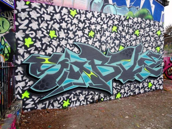
Rezwonk has provided an incredible background of little white symbols – actually I think they are made up of the letters R E Z W O N K, and in amongst them are some bright green ones randomly spaced. Each of the symbols has been dabbed, probably with a cloth, to give them some texture. This really does provide a perfect backdrop.
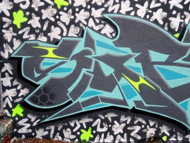
The writing from Subtle is nothing short of sublime, every single part of it touching on perfect, right down to the hex shading on the S and the T providing texture and interest, but it is the 3D effect that really sets this piece apart. It is hard to look at it and not be fooled into thinking it has been written on a board that stands proud of the wall by a couple of inches. Also some of the accents have picked up the same bright green used by Rezwonk, to provide some read-across between the two.
An utterly outstanding collaboration that takes collaborations to a new level.
A colleague alerted me to this hoarding, which is within lunchtime walking distance from my work, so I felt obliged to go and take a look. Sometimes such tip-offs can be a bit of a disappointment, because not all ‘street art’ is worth the trip. This wonderful piece by Smak however was absolutely worth it.
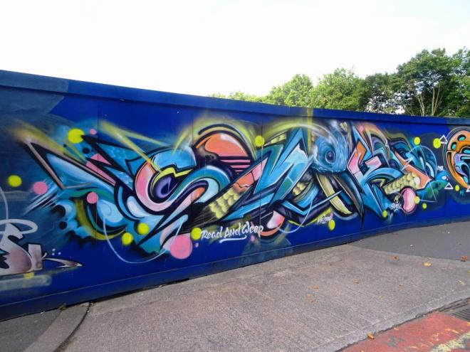
I had kind of been aware of these hoardings but didn’t know that there was anything decent there. In fact there were three notable pieces of which this is the first. Smak is an interesting artist in that he has two personas. This is his ‘graff’ persona, but he also does high-end pieces and commissions under another name – he even painted a large wall at Upfest this year (to follow).
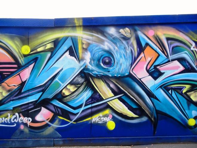
This wildstyle writing is really skilfully done and spells out SMAK. In the middle of the work he had woven in the head of a bird, and there are some feathers in there too. A classy piece.
I found this by complete accident. I was driving around town and decided to make a quick trip over to the M32 roundabout to see if there was anything new to photograph there, but on the way I passed this building and caught sight of the bright colours in my peripheral vision. Thank heavens for peripheral vision…eh?
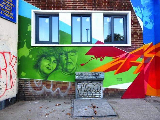
The piece, on a newly redeveloped site is by Zase and has really made a statement for this otherwise utterly unremarkable building. I often wonder to myself whether great murals add to the value of a property or detract from it. I know my own personal view, but would love to know the view of buyers and sellers of property.

I’m not sure what the brief was for this mural, but he has incorporated portraits of ordinary people, perhaps reflecting the diversity of the surrounding area. As always he has incorporated his 3D ZASE, which is something of a hallmark on his murals.
If you can be bothered, it is well worth going onto Google maps and streetview to see what a fantastic improvement has been made to this building by the refurb and the mural togather. This is almost like gentrification but maintaining the spirit of the community, and I am all for it (provided the resulting apartments/offices are truly affordable).
I have had this piece in my archives for a little while now, and what is amazing is that the piece is still intact in one of the tunnels of The Bearpit, or at least it was last week, and has remained undogged since early August. The piece is by Tommy Fiendish – occasional visitor to Bristol.
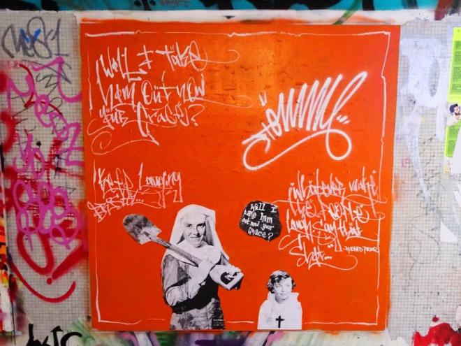
Tommy Fiendish has made a little video of a version of this piece, entitled ‘will I take him out now your grace?’ which, if you are a fan of Terry Gilliam should tick your box. I do like his work which tends to have a subversive of humorous streak and is perhaps a little more visually challenging than much of the stuff you see around the place. All good.
I arrived at this piece a little too late to see it in its original condition. It had been a collaboration between Mr Draws (in the middle) bookended by Tasha Bee. However, before I managed to get to see it, Oner had made a little contribution of his own.

I have to admit that I rather like Oner’s burners. There is a certain honesty about them, unpretentious but nicely turned out and often just a little bit edgy. Tasha Bee has rapidly made it into my group of favourite Bristol artists with her stylised characters and pretty flower motifs.
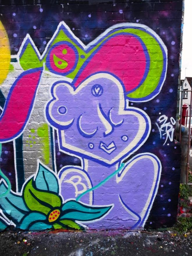
She is very prolific, and even today on a long walk with the dog I found a couple more of her pieces. There is something rather spiritual about her characters, it might be something to do with the simplicity of the lines or the closed eyes or the little peace and love signs, I’m not sure, but they ooze serenity. It is a pity I didn’t see the Mr Draws bit in the middle, but I can imagine it.
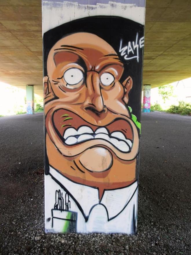
I have been prompted to publish these wonderful cartoon faces by Zake from my archive because I am aware that he has done some more recently. I was hoping that I could find out a little bit more about the artist in the meantime, but all my searches have been fruitless.

Zake’s faces are wonderfully expressive and in terms of their size and format seem to work very well within the rather tight constraints of the columns under the M32.

Another characteristic of Zake’s work is the selection of brown colours for the faces, which seems to provide a good contrasting base for the features. I love this man with the pens in his shirt pocket. These are great small pieces, and it would be good to see where Zake takes this work.
Ideology
of self-interest and pride
divides a nation
no mention of compassion
no mention of partnership.
by Scooj
Ok, so I have been doing a little bit of a trawl through my archives to let a few overlooked pieces see the light of day. This one by Hire I managed to photograph moments before it was buffed over, I forget who by (I think it was Dibz), but you can see the paint can at the ready in the bottom left of the picture.

Hire is one of several Polish artists in Bristol, adding an international feel to the work we see here. His writing tends to be very cryptic and his lettering angular and sharp, looking like shards of metal. Normally his writing spells out his name, but I’m not so sure that it does in this piece. It is quite a ‘dark’ piece, which is often the case with his work, even his bunnies are touched with menace or melancholy.


