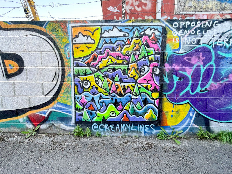
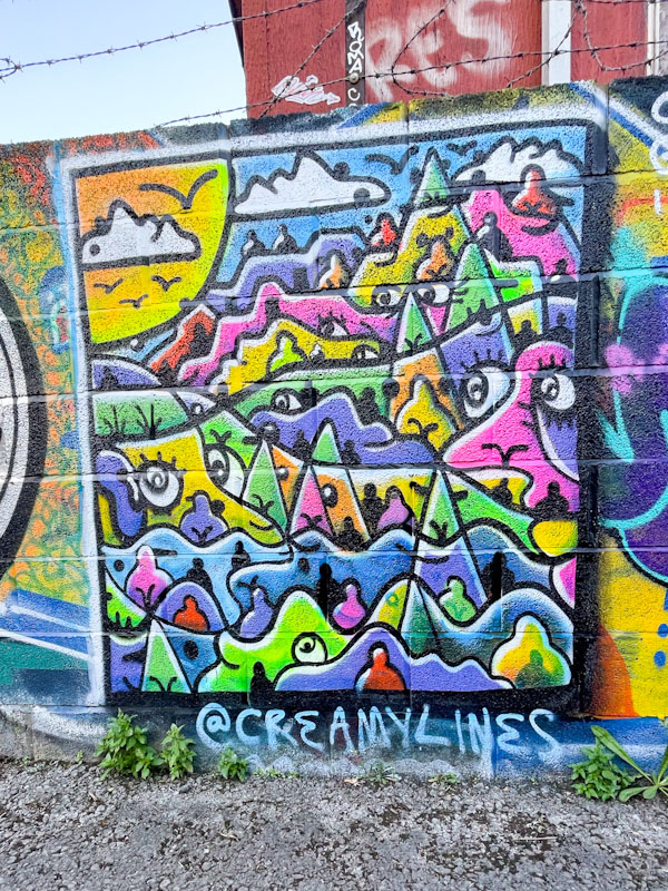
Going through my archive, I found this beauty by Creamylines, which I photographed last September. I don’t quite understand how this one slipped through the cracks, as I like to post every piece of his that I find… but it did, so I am posting it now.
Creamylines, River Avon, Bristol, September 2025
The theme is what I’d expect to see; The sun, some clouds, a landscape, this time with mountains and a number of figures, faces and eyes scattered throughout the piece. There is joy and humour here, and a connection with our landscape that is most potent. Creamylines’ pieces are a wonderful distraction from the urban grind of everyday life. Thank you Creamylines.
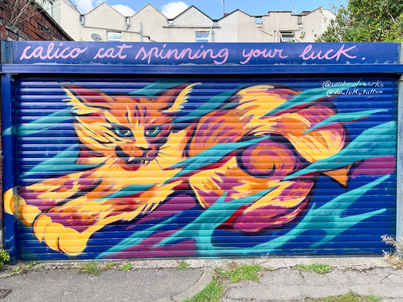
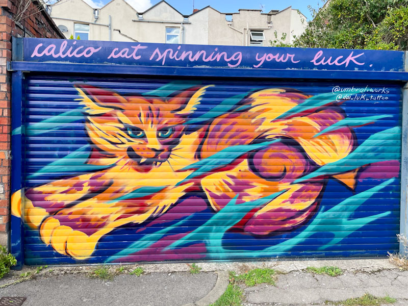
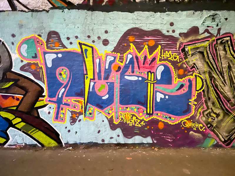
Umbral and Dai Luk, Lucky Lane, Bristol, September 2025
With the turnover of pieces being rather slow this year, I have a quick opportunity to rifle through my archive, and this is a delightful piece by Umbral and Dai Luk painted at a Bristol Mural Collective paint jam in Lucky Lane last September.
Umbral and Dai Luk, Lucky Lane, Bristol, September 2025
The slightly fierce looking stylised calico cat is notable for its long curly tail. The piece is set on a blue background with a blue pattern running behind and in front of the cat. This is what I would term a true collaboration, where both artists have combined their skills to create the single piece. The calico cat is spinning its luck, but isn’t what I’d call a calico cat – but I am splitting hairs. Great shutter collaboration.
Dirtygypo, St Werburghs, Bristol, December 2025Dirtygypo, Brunel Way, Bristol, October 2025Dirtygypo and Posh, Sparke Evans Park, Bristol, July 2025Dirtygypo, Dean Lane, Bristol, July 2025Dirtygypo, Greenbank, Bristol, March 2025Dirtygypo, Cumberland Basin, Bristol, March 2025Dirtygypo, Sparke Evans Park, Bristol, March 2025Dirtygypo, Cumberland Basin, Bristol, January 2025Dirtygypo, St Werburghs, Bristol, August 2024Dirtygypo, Cumberland Bain, Bristol, July 2024Dirtygypo, Dean Lane, Bristol, July 2024Dirtygypo, Cumberland Basin, Bristol, July 2024
Haka is another of those artists who is at the very heart of the Bristol graffiti art scene. His authentic and good-natured style, and occasionally, although less so in recent years, politically motivated work has been replaced in the last three or so years with lighthearted children’s picture book combinations. This piece is just a straightforward piece of graffiti writing.
Haka, River Avon, Bristol, January 2026
This bright and optimistic piece is painted on some relatively new hoardings alongside the River Avon, surrounding a new development – you can see the initial concrete pillars, which I am guessing will be lift shafts for the new building. Haka has produced a lovely clean piece with great yellow and orange colour separation and plenty of fill decorations. A drop shadow veers off to the right, and the whole thing is contained in a green background splat with orange crack lines. A really nice piece of graffiti writing.
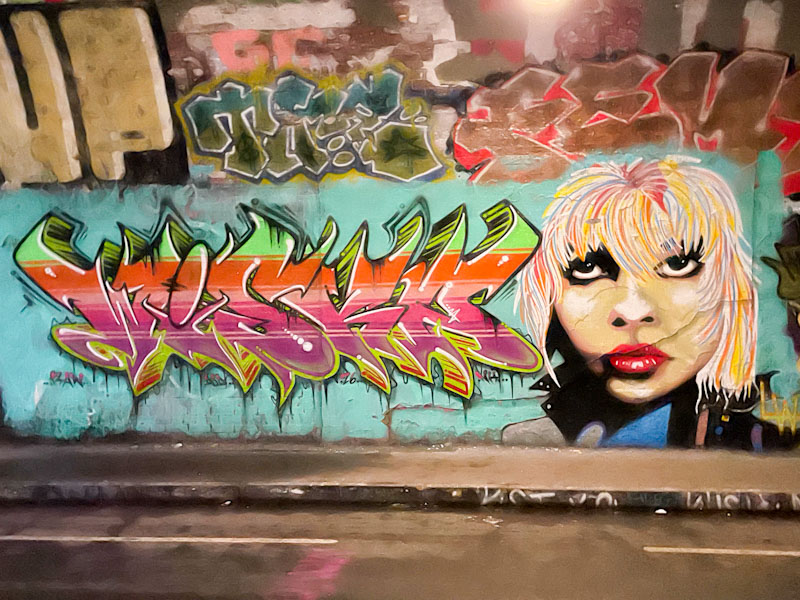
Neddy Ned Ned and Jest Soubriquet, St Werburghs, Bristol, February 2026
It has been really hard work finding new pieces so far this year. The near constant rain has kept most artists at home. I am expecting a deluge of work once the sun returns, and my files for March and April to be overflowing. At least St Werburghs tunnel seems to offer refuge for those brave enough to venture out, like Neddy Ned Ned and Jest Soubriquet.
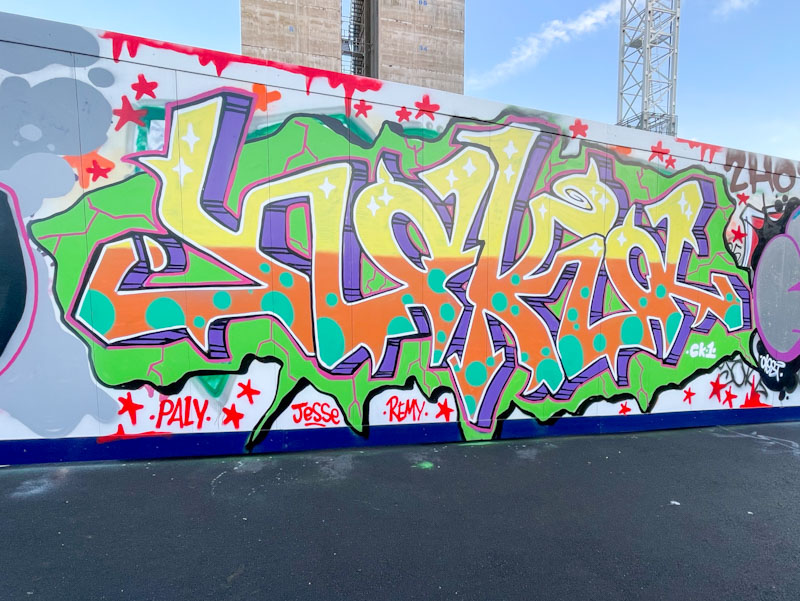
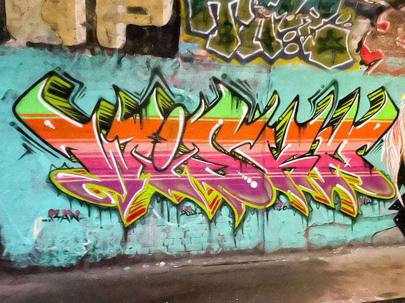
Neddy Ned Ned, St Werburghs, Bristol, February 2026
I really wasn’t expecting this piece, so it definitely came as a pleasant surprise. The letters, spelling out WISKA are by Neddy Ned Ned, and are full of colour, with delineated horizontal stripes running through the letters in colour sequences. The drop shadow has a disappearing point in the middle of the piece, and the upper half colours are black and green and the lower half, red and green. A nicely thought out piece.
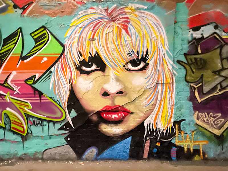
Jest Soubriquet, St Werburghs, Bristol, February 2026
The portrait piece by Jest Soubriquet is really striking, especially the lips and eyes. I feel that the top half of the head needs to be higher, as the proportions don’t quite work. I like the mix of a realistic face with stylised hair, it works for me. Nice to see these two painting together.
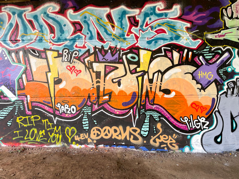
Doors 342 – Doors from the City of York (Part III), June 2024
The doors this week continue on my journey from my hotel to the office, which takes me close to York Minster (more on that next week). It is all a while ago now, and I forget exactly where I was when I took the pictures. I hope you enjoy them:
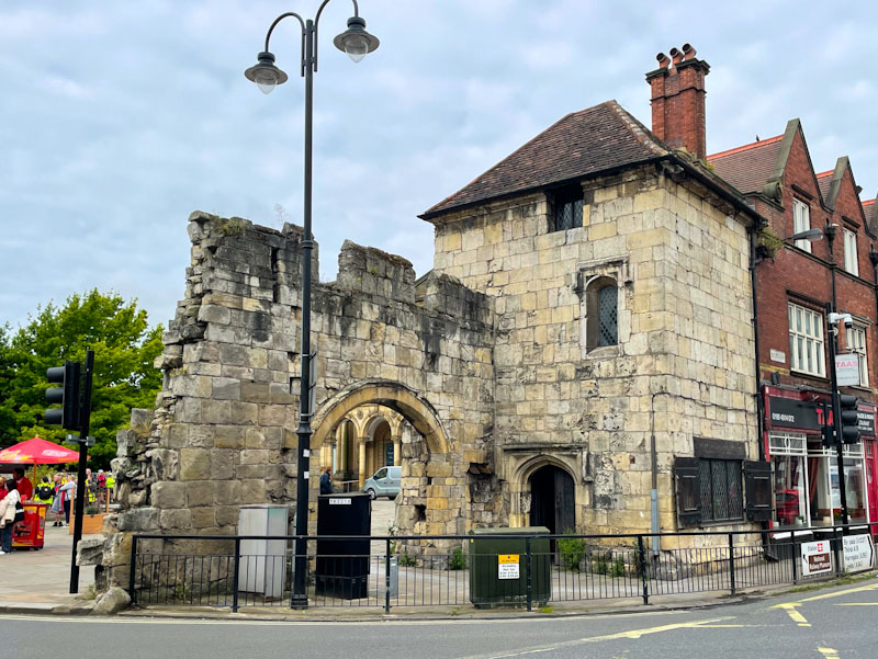
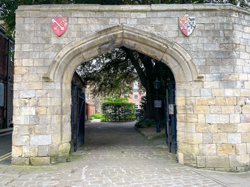
City gate and gatehouse, Your, North Yorkshire, June 2024
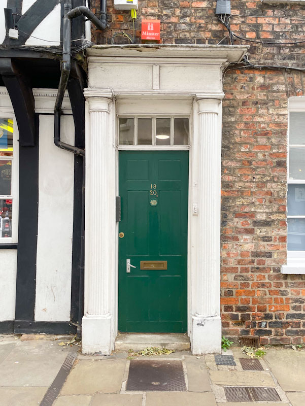
Green door and porch, Your, North Yorkshire, June 2024
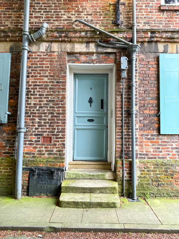
Blue door and steps, Your, North Yorkshire, June 2024
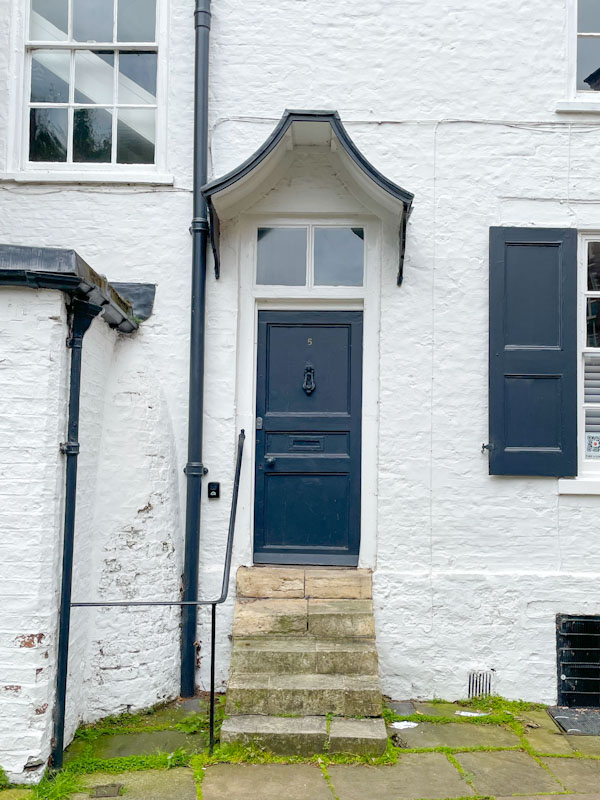
Black door, steps and awning, Your, North Yorkshire, June 2024
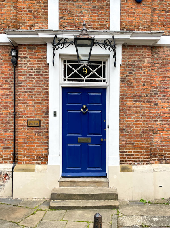
Splendid blue door and lamp, Your, North Yorkshire, June 2024
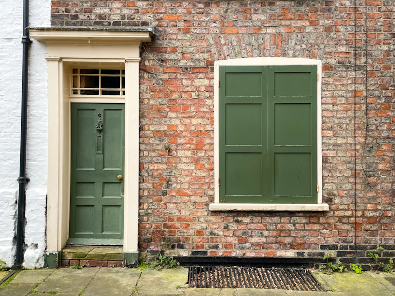
Green door and shutters, Your, North Yorkshire, June 2024
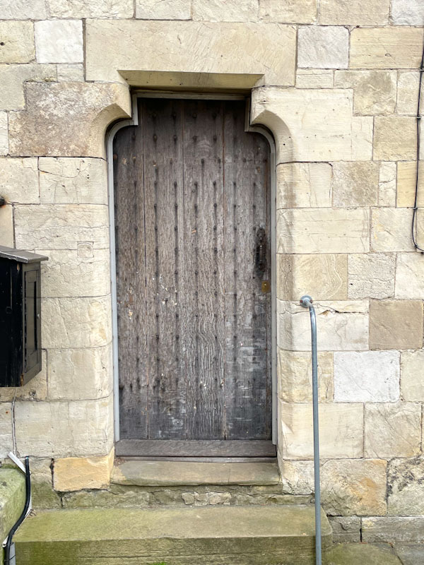
Stone doorway and studded wooden door, Your, North Yorkshire, June 2024
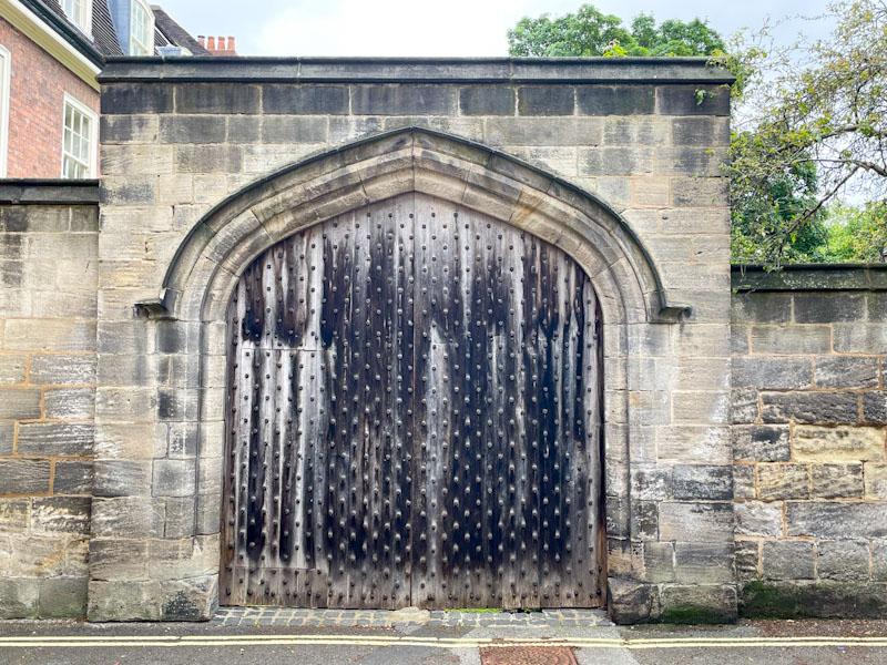
Large gateway and studded doors, Your, North Yorkshire, June 2024
Gateway with crests, Your, North Yorkshire, June 2024
Certainly the City of York has some stunning historic doors, many of which are rather classy. Next time I’ll share some doors from York Minster. Until then, I bid you farewell.
If you have made it this far, you probably like doors, and you really ought to take a look at the No Facilities blog by Dan Anton who has taken over the hosting of Thursday Doors from Norm 2.0 blog. Links to more doorscursions can be found in the comments section of Dan Anton’s weekly Thursday Doors post and his Sunday recap.
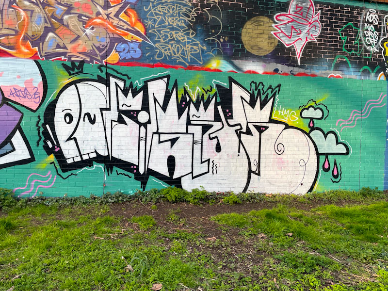
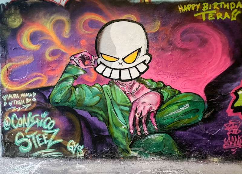
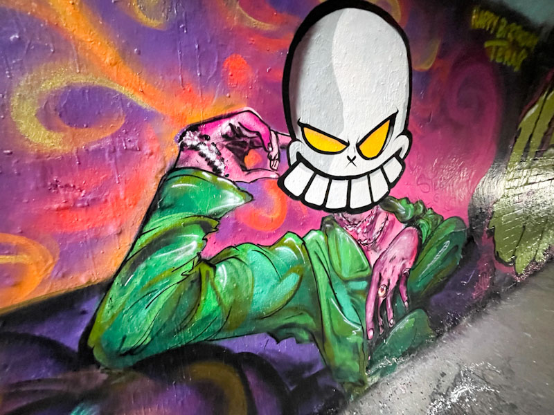
This is an interesting augmentation piece by Zinso, using the underlying work by Conrico to make his mark. This kind of addition takes us into the murky waters of convention and respect, particularly with this Conrico piece, which had only been present for a few days, celebrating Tera’s birthday. While I rather like augmentation pieces, I do feel that they should have a period of clear space between the original and the addition.
Zinso, St Werburghs, Bristol, January 2026
The skull face that has been added is neat and crisp, and very much what you’d expect from Zinso. It also provides a totally different look and feel from the original by Conrico. As I have said many, many times on Natural Adventures, it is a jungle out there.
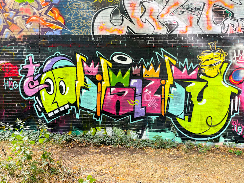
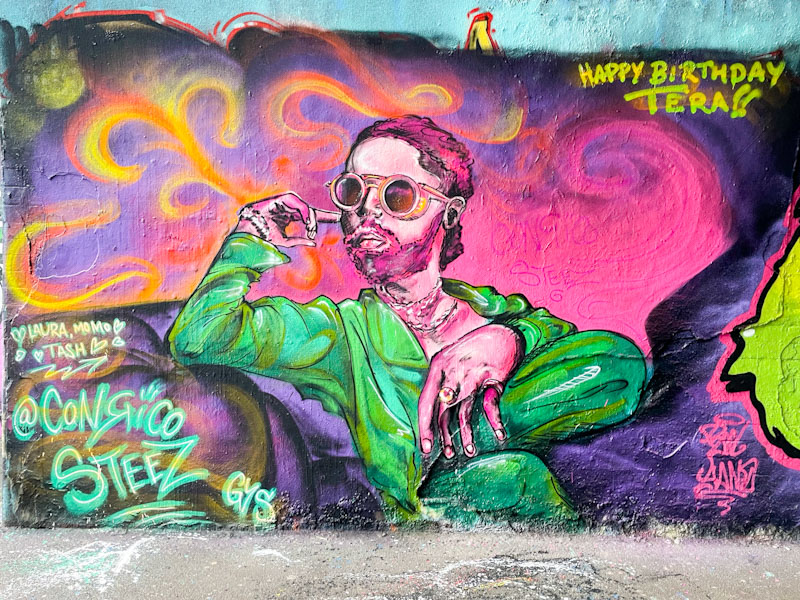
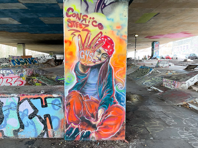
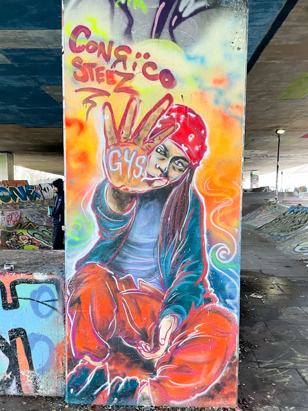
Conrico has been smashing it out of the park lately, particularly with his portrait work, which can be a welcome relief from overdosing on graffiti writing. This is a wonderful column piece underneath the M32, and a perfect showcase of Conrico’s work.
Conrico, M32 roundabout, Bristol, January 2026
In this piece, Conrico has painted a young woman sitting cross-legged with her hand held out and the letters GYS (Graveyard Shift) emblazoned on her palm. There are loads of layers and textures in her clothes, and what is quite remarkable is that the piece is entirely painted with spray cans and not a paint brush in sight. Fine red and white outlines are carefully applied to give definition and sharpness. This is simply brilliant, both in composition and execution.