.
A young man in Greece
magical awakening
entrancing story
.
by Scooj
.
A young man in Greece
magical awakening
entrancing story
.
by Scooj
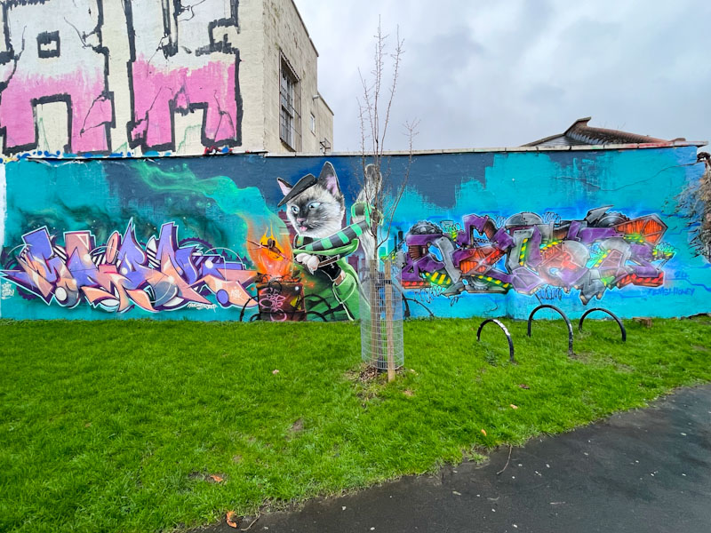
The wall on the Coach and Horses is one of the best ‘outdoor galleries’ in Bristol and often hosts some really classy work that tends to remain untagged for reasonably long periods. It probably doesn’t have the same turnover as some of the more accessible or popular walls, which means we can enjoy the artwork for longer. This collaboration is by Smak, Sled One and Oust.

Smak needs no introduction on Natural Adventures, being something of a staple over the years. This is a finely crafted and executed piece of writing that spells out SMAK. The colour palette is is perfect, and offset by the appearance of a black and white stripe design on some parts. The writing is wonderfully intricate without being over-fussy – clean crisp and classy.
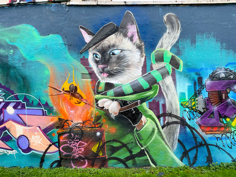
We don’t get to see enough of Sled One’s genius on our walls these days, so everything we do get to see, we ought to be grateful for. In this central panel, Sled One has painted a cat toasting a mouse on a stick over a fire, surrounded by barbed wire. There is a story here, but not one I can tell you. There is a mixture of styles, which is a bit unsettling. The cat is approaching photorealistic, but the mouse is most definitely cartoon, which confuses my brain somewhat. Brilliant artwork.

The right hand side of the collaboration is some unusual writing from Oust. The letters are more like constructions, with hints at industry and engineering. I haven’t come across Oust’s work before, so am a little unsure if his style is always like this or that this is a one-off. I guess Oust was visiting, and took the opportunity to paint with friends/acquaintances. There are some great colours and ideas in the piece which is full of contained energy. Fabulous collaboration.
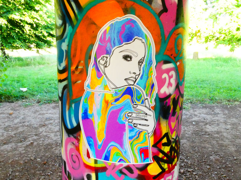
Trawling through my archives in search of a particular piece definitely has some extra benefits, which mainly consist of unearthing ‘lost’ work that was either by an unknown artist at the time or simply got left behind due to the volume of photographs coming in each week. I was so pleased therefore, to stumble on this lovely wheatpaste by Abbie Laura Smith from last summer during my last rummage.
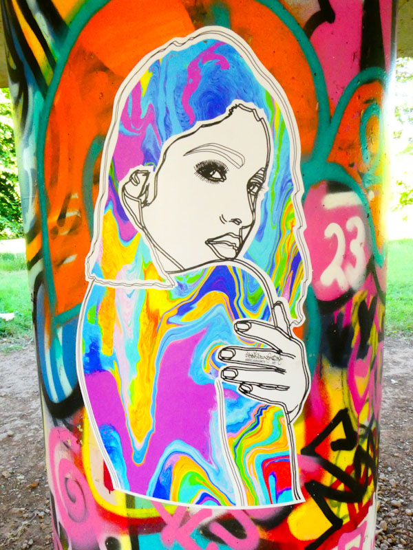
The small paste up, looks like it is slightly out of focus, but that is due to the double line outline of the portrait. I love the way that Abbie Laura Smith has placed this colourful piece on a colourfully tagged column, almost disguising it, and as I have said before, the placement of paste ups is just as important as the artwork, and she has smashed both elements with this one. I am so pleased to have been able to share this, albeit ten months late.

This is a throwback piece to last June, which has remained dormant in my archives, because at the time of photographing the piece the artist was unknown to me. Since then, the artist’s identity has emerged and is known as j9449j, which is a bit of a mouthful. This is great news, because I have several more pieces in the archives to share and I really like their work.
The abstract piece hints at a rural landscape, certainly there are some organic forms in the piece. This artwork is so original, at least in the context of street art, that it is difficult to assess against any normal criteria or conventions. For example the small additional piece to the right works perfectly as a counterbalance to the larger piece on the left, There are some lovely shapes and patterns and a carefully thought out colour palette. Enjoyable and unusual stuff from j9449j.

One of the great joys of the last six months has been the thriving partnership between Mote and Mr Crawls. Rarely do you get the chance to watch on as two artistic talents arrive at a confluence and thrive as collaborators, while maintaining their individual identities.
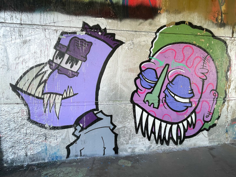
This collaboration, on the ‘wet wall’ on the north side of the river underneath Brunel Way features two toothy monsters set on a chrome background (a strong feature of their recent work). On the left, Mr Crawls has a go, and smashes it, at painting a monster, which is a bit of a departure from his birds. The purple-faced monster, in spite of the array of sharp teeth, looks gentle enough. On the right Mote has created a monster, also with sharp teeth, in which the fill patterns give the piece away as one of his. As I have said before, they tend to bounce ideas off one another, and you can see how they have both shared an approach to painting the eyelids. So much fun from these two.
.
Tightest league in years
with seven remaining games
victors one of three
.
by Scooj
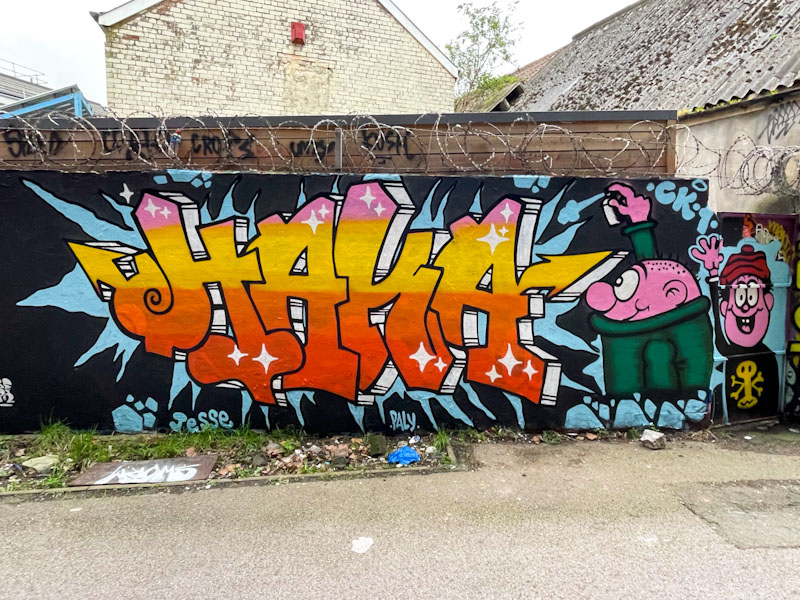
It was a great pleasure to meet Haka, alongside Inkie and Sepr, when he was painting this piece as part of a collaborative wall last month. Although Haka had pretty much finished when I caught up with him, he did subsequently add another character to the right of the piece.
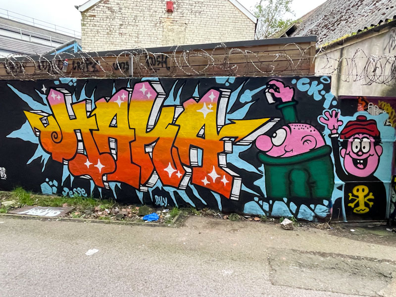
Those familiar with Haka’s work will recall that he tends to paint combination pieces with his customary letters accompanied by characters from children’s books, shows or comics. When I was a kid, there were three popular children’s comic, Beano, Dandy and Beezer, and these characters come from one or other – I think that they are from the series Bash Street Kids, although the modern revised version, not the one I grew up with. The two characters here are Wilfred and Danny.
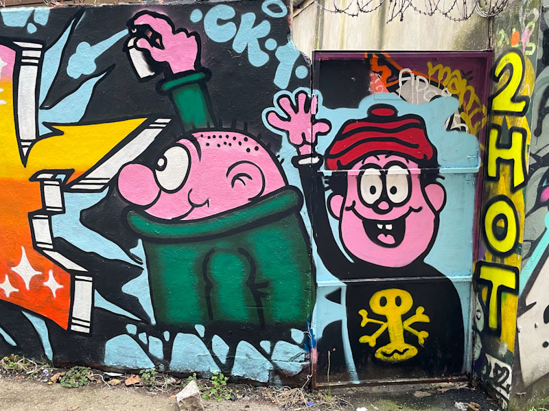
There is mischief in this piece, with a bright and vibrant HAKA and the cheerful duo. I cannot think of a more appropriate place to paint these characters than in this spot, which is often frequented by real-life Bash Street Kids. Great stuff.
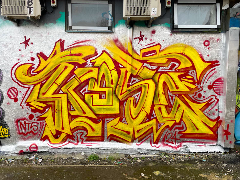
Bursting onto the walls in Dean Lane was this stunning and vibrant piece of writing from Kosc. Kosc is an artist who appears to be equally at home with writing or character/scenic pieces, and only a few posts ago I shared an amazing Samurai mask that he painted as part of an NTS Crew collaboration. He is a master of his styles and designs.
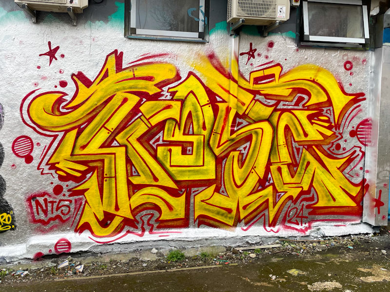
This piece cries out to be seen, with its bright colours and busy letters spelling KOSC. As I look at it now, I wonder to myself whether he ran out of the orange colour for the ‘O’, or whether the letter is deliberately more yellow to create a focal point to look at. I guess I will only find out by asking him in due course. A great find, that didn’t last too long, if my memory serves me right.
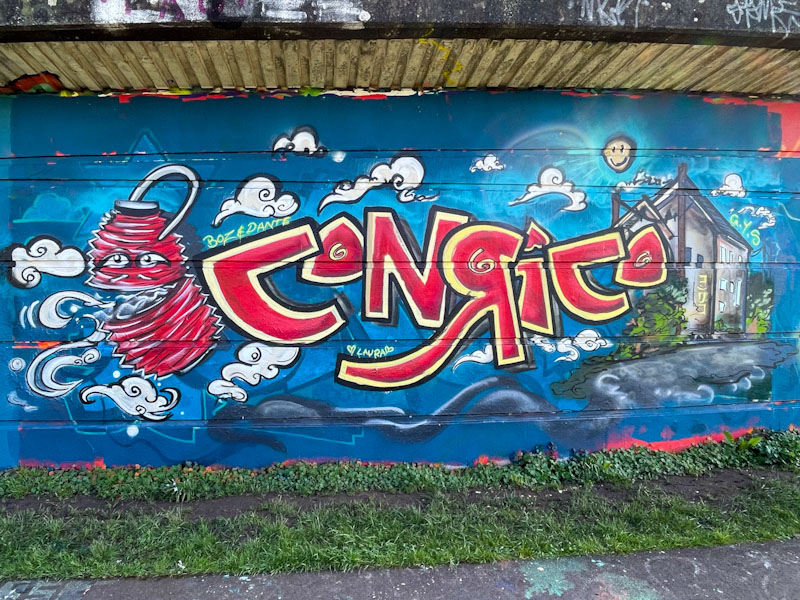
Conrico has been turning out some sensational pieces lately, and what is interesting about this one is that he posted on his Instagram feed some sketches of the animated Chinese lantern before painting this wall, which goes to show how much thought goes into the pieces that artists paint.
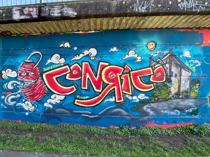
The letters CONRICO are superimposed on what looks like an afternoon landscape with the lantern on the left and a building on the right. As ever, Conrico’s artwork looks like it is painted with a brush rather than a spray can, and I imagine he paints with lots of short controlled sprays to achieve this effect. There is character writing on the side of the building, hinting at an East Asian scene. Wonderful stylised clouds finish off this fine combination piece from Conrico.
.
Saturday job list
way too boring to complete
a carry over
.
by Scooj


