.
Tightest league in years
with seven remaining games
victors one of three
.
by Scooj
.
Tightest league in years
with seven remaining games
victors one of three
.
by Scooj
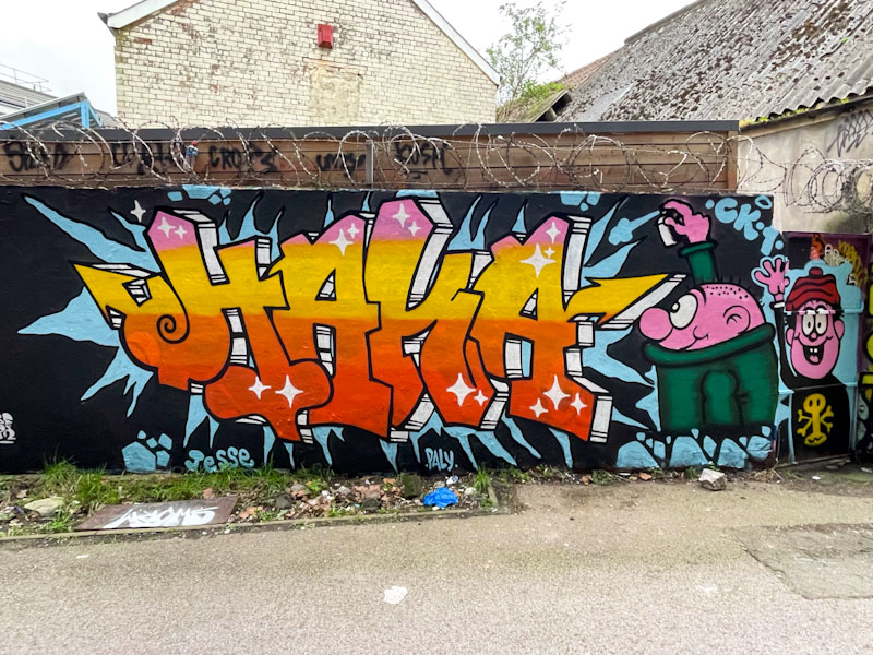
It was a great pleasure to meet Haka, alongside Inkie and Sepr, when he was painting this piece as part of a collaborative wall last month. Although Haka had pretty much finished when I caught up with him, he did subsequently add another character to the right of the piece.
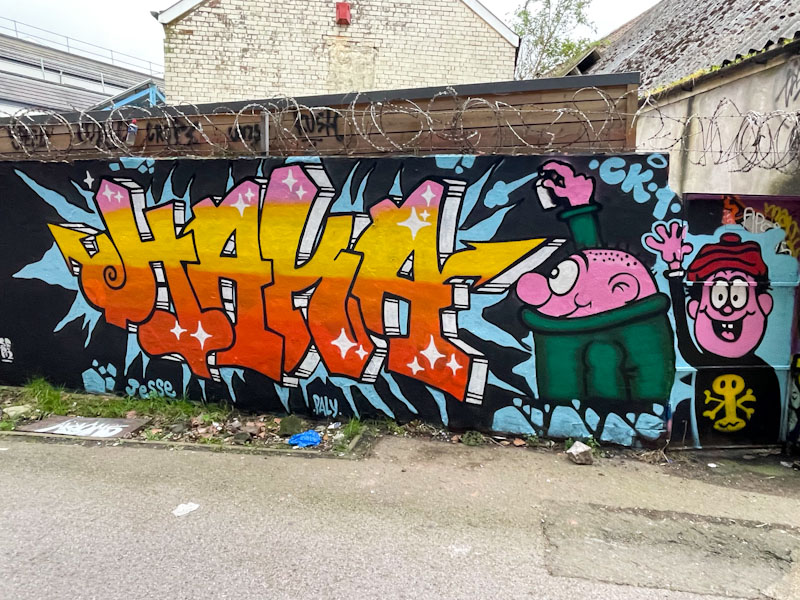
Those familiar with Haka’s work will recall that he tends to paint combination pieces with his customary letters accompanied by characters from children’s books, shows or comics. When I was a kid, there were three popular children’s comic, Beano, Dandy and Beezer, and these characters come from one or other – I think that they are from the series Bash Street Kids, although the modern revised version, not the one I grew up with. The two characters here are Wilfred and Danny.
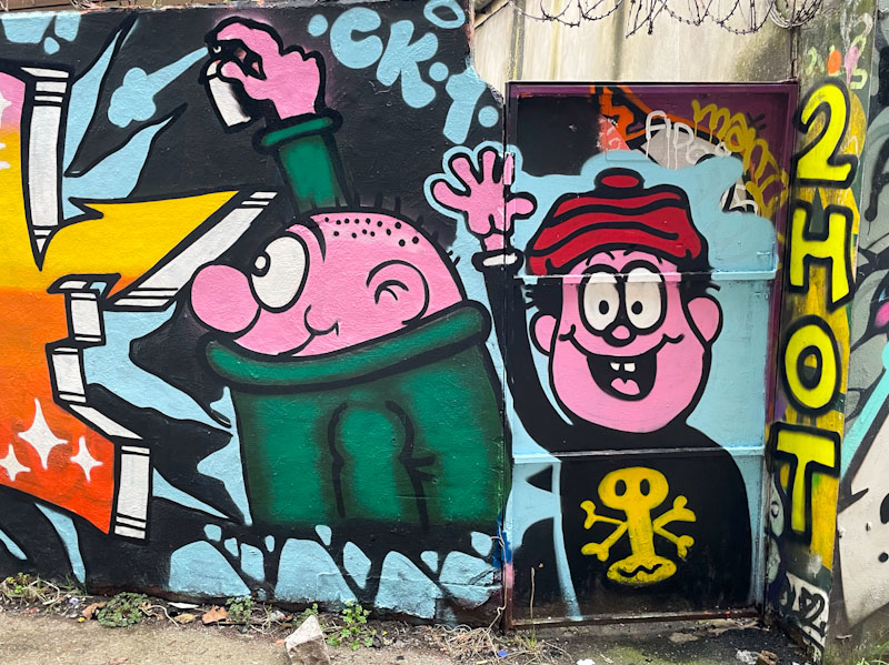
There is mischief in this piece, with a bright and vibrant HAKA and the cheerful duo. I cannot think of a more appropriate place to paint these characters than in this spot, which is often frequented by real-life Bash Street Kids. Great stuff.
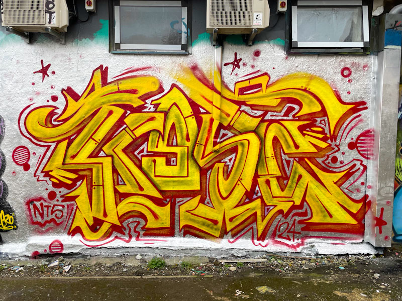
Bursting onto the walls in Dean Lane was this stunning and vibrant piece of writing from Kosc. Kosc is an artist who appears to be equally at home with writing or character/scenic pieces, and only a few posts ago I shared an amazing Samurai mask that he painted as part of an NTS Crew collaboration. He is a master of his styles and designs.
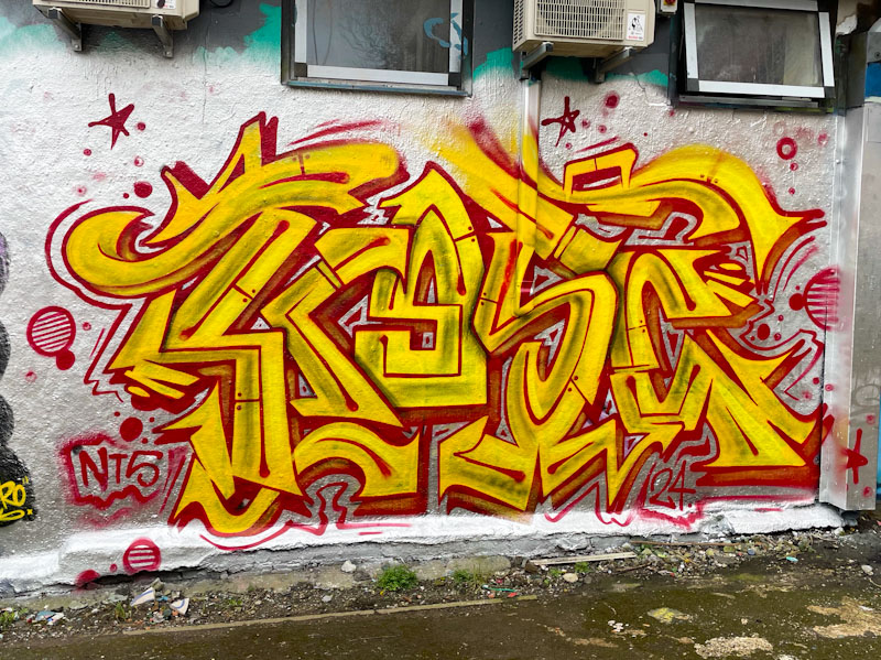
This piece cries out to be seen, with its bright colours and busy letters spelling KOSC. As I look at it now, I wonder to myself whether he ran out of the orange colour for the ‘O’, or whether the letter is deliberately more yellow to create a focal point to look at. I guess I will only find out by asking him in due course. A great find, that didn’t last too long, if my memory serves me right.
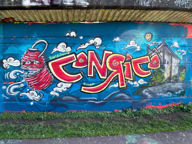
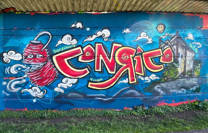
Conrico has been turning out some sensational pieces lately, and what is interesting about this one is that he posted on his Instagram feed some sketches of the animated Chinese lantern before painting this wall, which goes to show how much thought goes into the pieces that artists paint.
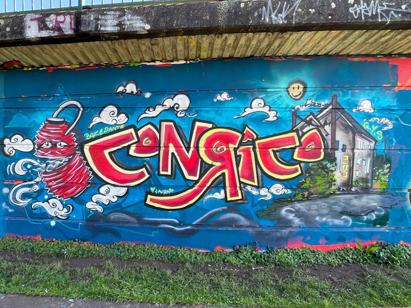
The letters CONRICO are superimposed on what looks like an afternoon landscape with the lantern on the left and a building on the right. As ever, Conrico’s artwork looks like it is painted with a brush rather than a spray can, and I imagine he paints with lots of short controlled sprays to achieve this effect. There is character writing on the side of the building, hinting at an East Asian scene. Wonderful stylised clouds finish off this fine combination piece from Conrico.
.
Saturday job list
way too boring to complete
a carry over
.
by Scooj
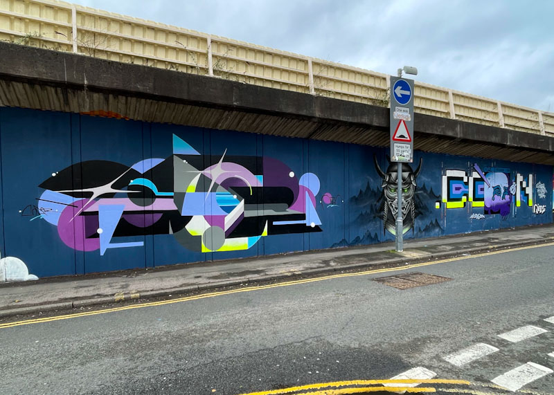
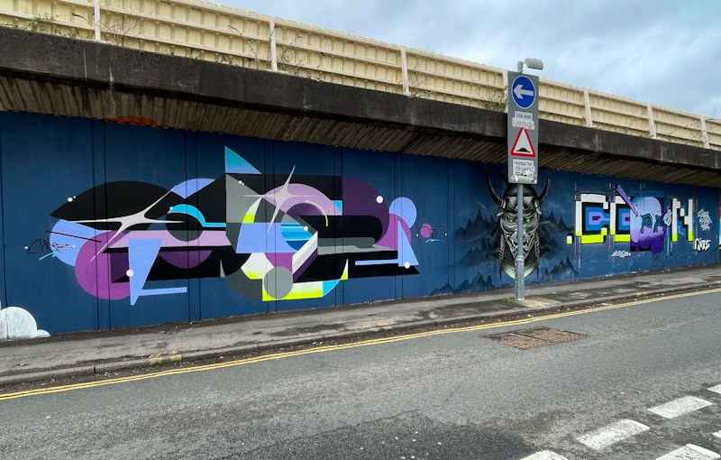
Although this outstanding collaboration from Saor, Kosc and Mudra was painted a few weeks ago, it has taken me quite a long while to get round to posting it, which is largely down to the sheer volume of new art appearing on the walls of Bristol at the moment. I would say that this winter, in spite of the appalling weather, has been one of the busiest I have know for street/graffiti art and my archives are bulging.
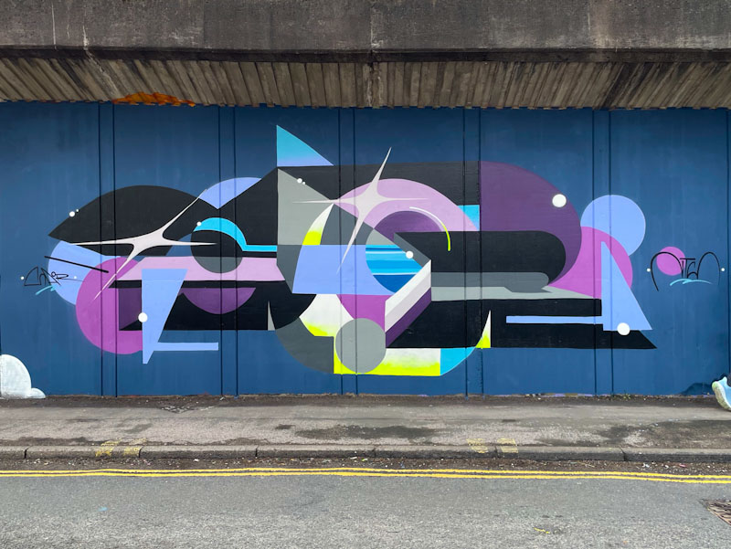
Saor has made a few visits to Bristol lately, and has smashed each piece out of the park, and this is another in a succession of unbelievable artworks. In line with the overall collaboration colours, Saor has disguised his SAOR letters in an outstanding geometric design. What I love about Saor’s work is the blended of borders, which means that all of his lines have to be ultra crisp and sharp, which, of course, he excels at.
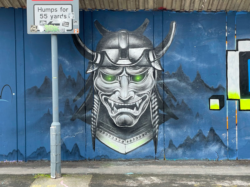
In the middle of the triptych is a brilliant samurai portrait piece from Kosc, unfortunately a little obscured by the street sign. There is a lot of precision in the detail of the mask and Kosc has achieved incredible depth and texture in the piece. Kosc is an artist who appears to be at the top of his game these days and is producing some outstanding work.
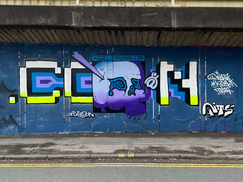
Rounding off the collaboration is this unusual piece of pixelated writing from Mudra, which seems to be playing with the letters ‘.CON’ (dot con). The skull in the middle of the letters, is a little strange, in fact I find the whole piece odd, and a bit out of kilter with the rest of the collaboration. There might be a story about the piece that I don’t know about which might explain it. Altogether though this is yet another amazing collaboration from the NTS crew.
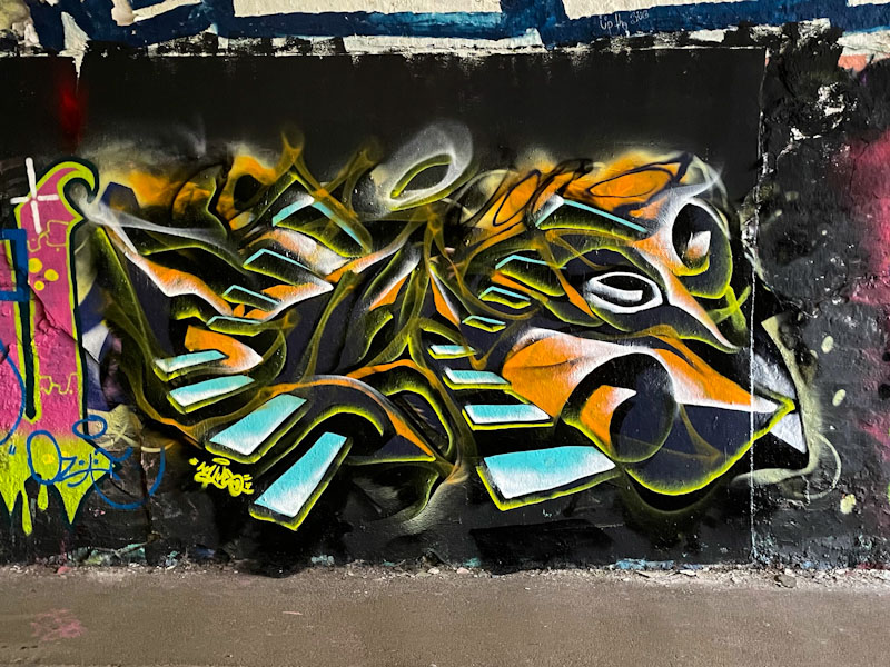
Ooh! I love this abstract writing piece from Mr Klue. It has been a while since I last saw one of his pieces with the distinctive ethereal steps. The colours too are a slight digression from his recent penchant for purples and blues.
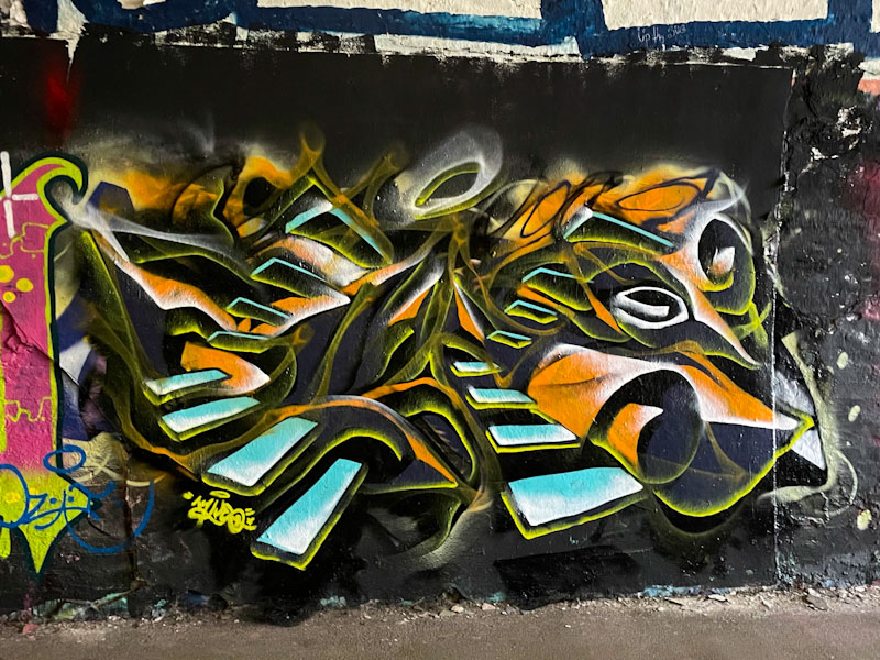
It is almost impossible to distinguish them, but the letters Spell out KLUE, as is customary in his pieces… I will get caught out one day, I’m sure, when they spell something else. There is something that is very pleasing on the eye about this piece, and a version of it would not be out of place in an art gallery or hung on a wall. Fabulous work from Mr Klue.
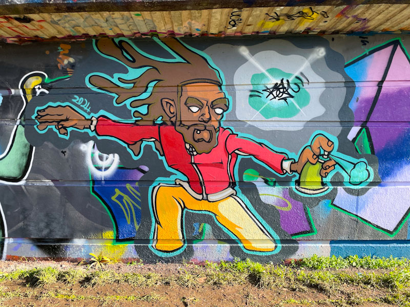
I suspect that this is just a little taster of what is to come from Bean later on this year, as he dropped a couple of pieces during what I suspect was an early spring break from his studies. His work is really developing well, and his stylised cartoon characters are each so unique.
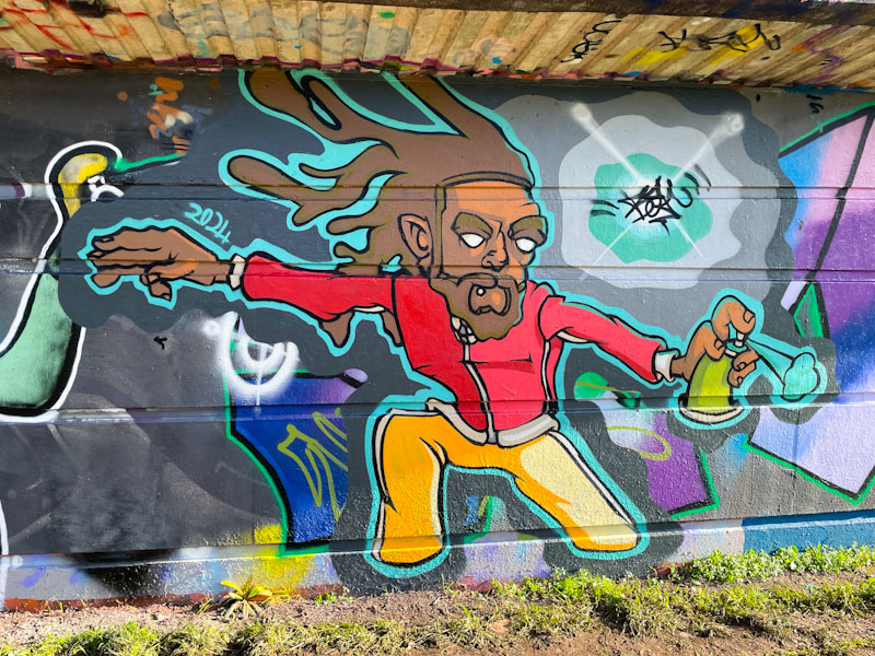
I like the way that Bean has added a bit of a buffer around his character, allowing it to stand out a little better from the ‘noise’ or artwork that he has overpainted, it certainly makes a significant difference to the outcome. I would love to see some of his work on a fully buffed wall, maybe this summer. This piece is a cracker, and the character feels really animated, with lots of movement in his hair and from the spray can.
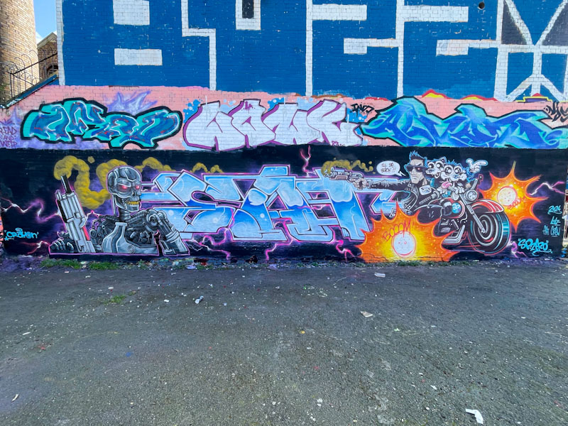
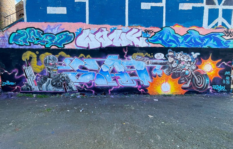
What an absolute pleasure to see SPZero76 and Kid Crayon teaming up this spring to bring us some more EAT Crew joy. This is a fabulous collaboration celebrating the Terminator film franchise, painted in the styles of the two artists, but remaining reasonably honest to the film’s characters. The middle ‘liquid metal’ section spells out EAT.
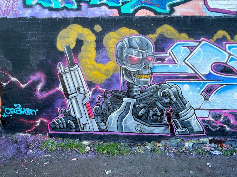
On the left, is a brilliant rendition of a terminator robot by Kid Crayon, complete with smoking gun. The dystopian future character is menacing enough, although Kid Crayon’s soft edge style takes some of the heat out of the menace. There is some great detail in the mechanical workings of the robot, and the whole thing is finished really nicely.
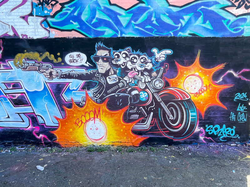
To the right, SPZero76 adds his own twist to the motorcycle-riding Schwarzenegger character, with the inclusion of a couple of racoons that tend to frequent his pieces. There is movement and drama in the piece, which is clean and sharp, just as you’d expect to see from SPZero76.
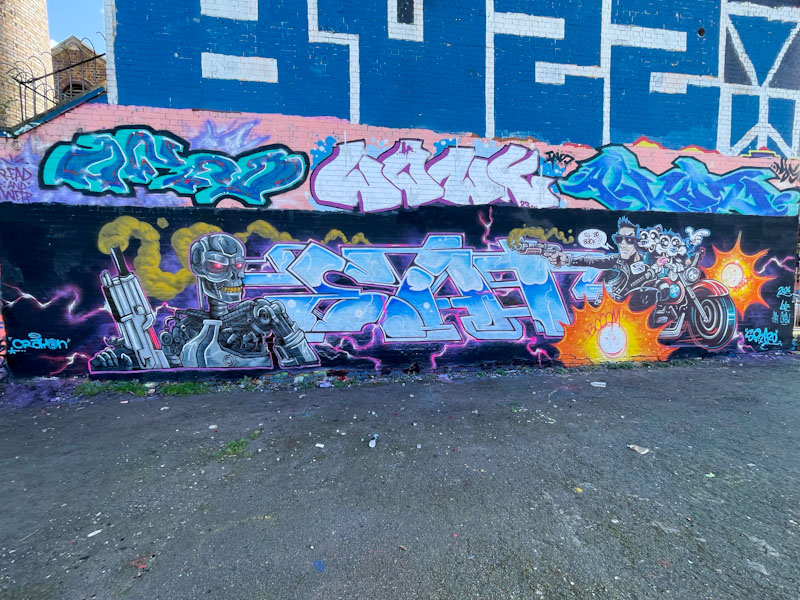
All in all, it is just to see these two collaborating again, and I sincerely hope that they manage to do so more frequently this year than last. I’ll be back!
.
Nighttime thunderstorm
eclipsed by green collection
five thirty ay em
.
by sleep-deprived Scooj




 Natural adventures