
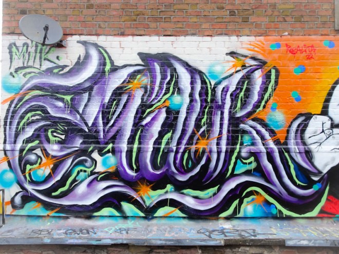
A gallery of superb graffiti writing from Wxttsart, a.k.a. whatsxmilk. Writing the word MILK in a cross-over of anti-style and calligraffiti.
Instagram: @whatsxmilk


A gallery of superb graffiti writing from Wxttsart, a.k.a. whatsxmilk. Writing the word MILK in a cross-over of anti-style and calligraffiti.
Instagram: @whatsxmilk

.
The slightest movement
among white woodland florets
drew my attention
.
by Scooj

Oh! how I have missed Tasha Bee’s work in recent years! She has had a long lay-off while concentrating on her Pot Heads pottery business. At last she has found a moment to paint one of her extraordinary portraits and there is no question that she hasn’t lost her touch in the slightest, carrying on exactly where she left off.
I hope that this isn’t a one-off and represents a return to Bristol’s walls, because she has been sorely missed. The subject of the portrait has a serene expression, a trademark of Tasha Bee’s work, and has flowers in her hair. Perfectly executed and modestly hidden away behind a bush, this piece is a thing of beauty. Bravo!
I have attempted to photograph this sumptuous piece by Alex Lucas several times, but always there were huge shadows cast across it. At last, a fortnight ago I managed to capture it in all its glory, and with a magnificent blue sky behind. Alex Lucas truly provides a special USP for Bristol with her nature-inspired designs and illustrations that she transposes onto walls so seamlessly, and which are present all around the city.
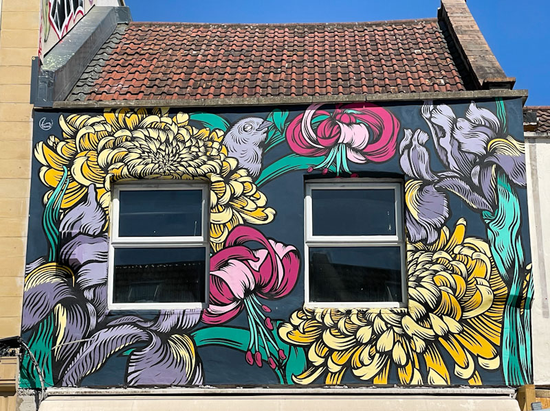
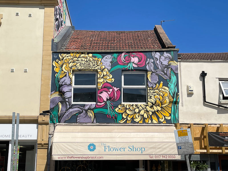
Painted above a flower shop, this stunning mural featuring what look like chrysanthemums, fuchsias and an iris is full of rich detail. A finch of some kind is hiding within the glorious floral display adding further interest. So full is the piece that you barely notice the two windows taking up a significant amount of space on the ‘canvass’. A rare beauty in this part of Gloucester Road.
Although his frequency of painting has slowed just a little since the spring, Hypo continues to have a sizeable presence in Bristol, which can only be good news. I will be brutally honest about this piece and say that I don’t think it is his best work. The concept and letters are all good, but the colour transitions through the piece feel a little lost and I am thinking that the grey background might not be helpful in this respect.
Don’t get me wrong, I think it is still a lovely piece of writing, but I know that Hypo has recently been smashing it and this one doesn’t quite make the bar IMO. I guess consistency can be difficult to maintain, but I know that he will be out and about again with another banger. I look forward to his next piece.
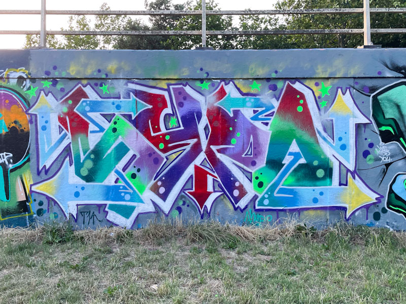
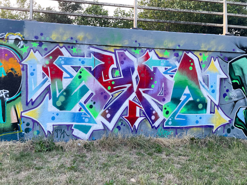
Since first encountering Raid earlier this year, he has been one of the most productive forces on the streets of Bristol, and right now, that is some achievement. I have met the artist on a couple of occasions, and he seems to be a really decent bloke, he also told me how he is enjoying playing with his letters, trying new ideas, but with the same general style.
These pinky-purple letters on a light pink background are easy on the eye. His fills have been very nicely executed and provide plenty of interest, and the turquoise/white sparks running through the piece add a detail that rounds the whole thing off nicely. More in the pipeline from Raid.
.
The rage inside me
can make enemies of those
who might be my friends
.
by Scooj
* political rage is a primeval thing that can cloud better judgement, but Sunak and those he represents really get my goat, when it comes to climate change and green policies.

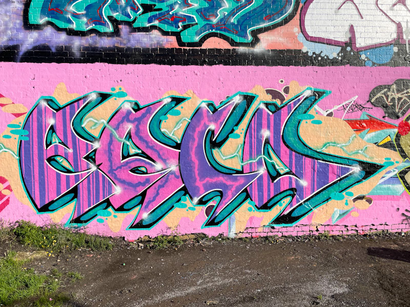
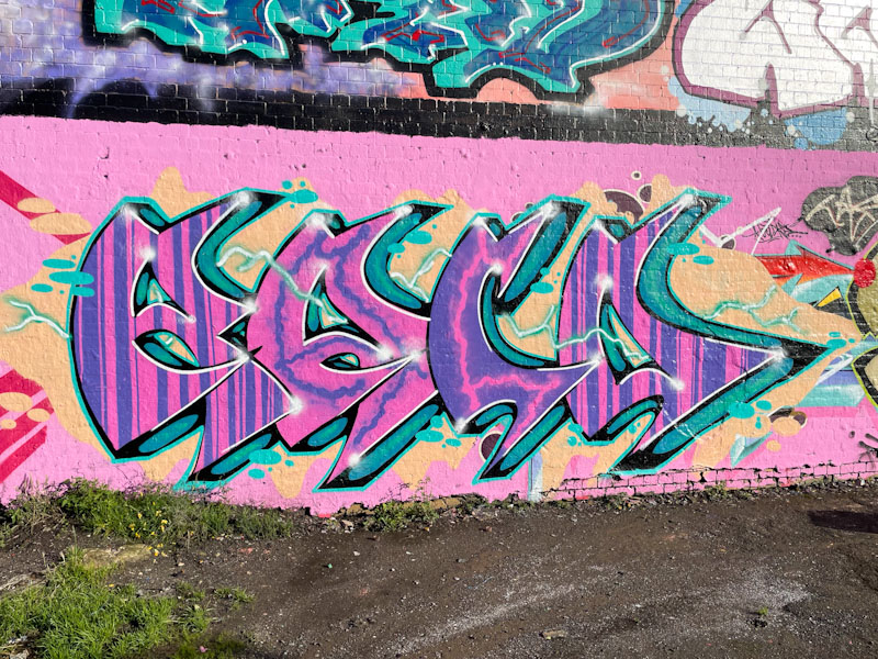
A consistently great writer in Bristol is Claro_que_sssnoh, with his distinctive and unusual style of graffiti writing. This one is a bright and shiny golden piece, which works well on the rather dark and gloomy wall.

Spelling out HONS, the joined up letters offer a mixture of straight and curly letter shapes that typify Claro_que_sssnoh’s style. Some nice fills, including some trademark series of spots. The pink and yellows work surprisingly well together, and altogether this is a top quality piece from the Sunday Loving Spaniard.

Mote has taken a bit of a shine to this spot on Peel Street Green, and the wall lends itself really well to his work, because it is square. It isn’t quite so good for graffiti writers, who in the main prefer rectangular spaces for their letters.

This Mote monster is armed with an array of extremely sharp teeth, and three eyes (the central one more of a pineal body than an eye). Usually Mote creates happy-go-lucky monster characters, but this one isn’t quite as light as some of his others. Colourful gums and lovely fills, Mote just keeps on getting better and better.
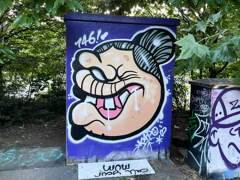
Although I have photographs of work from previous visits that Kapochino or Kapo has made to Bristol, I believe this is the first I have posted… (checks notes). Kapochino is a writer who includes character faces on the sides of his work, but in Bristol I have only seen the character faces, which are a bit of a mega-tag statement saying “I woz ‘ere” kind of thing.
In this piece, Kapochino has decorated a utility box in the middle of the M32 roundabout with a granny version of his character complete with a bun and drooling mouth. It is always gret tom welcome frequent visiting artists to Bristol, and I am mindful of digging out some of his previous work.


