.
September breezes
initiate first leaf fall
and shiny conkers
.
by Scooj
.
September breezes
initiate first leaf fall
and shiny conkers
.
by Scooj

The columns under Brunel way are a real pain to photograph, and it would be infinitely preferable if they were square, with four faces, like the ones under the M32. No amount of complaining will make any difference, so you’ll have to make do with these slightly inferior images of a rather interesting piece from Nugmoose. (Nice to see a Mr Draws piece in the background).

Nugmoose definitely has his own take and unique style of subject and painting, usually, if not always, built around a world of aliens. This rather satanic goat-alien is typical of his creativity, all wrapped up with some alien writing at the bottom of the piece. Not all street art is the same, and Nugmoose definitely pushes the boundaries.

Here he is again with some more bright and striking pieces of graffiti writing. I am of course talking about the prolific Klashwhensober. It is strange, but there was a time a few months ago when I was bumping into Klashwhensober at least once a week, and our clocks were in sync… however, I haven’t seen him for quite a while now. The same thing happened with Werm.

Both of these pieces are at Greenbank, and a feast for the eyes. The first, spelling SOBER is really eye-catching and is notable for the smorgasbord of fills transitioning horizontally through the piece with interest through every layer, truly a thing of beauty.

The second piece is slightly more muted, but still beautifully presented. Spelling KLASH, this piece again offers some exquisite fill patterns and colours, complemented with a beautifully painted 3D shadow with a central disappearing point. Both pieces are top notch and a real celebration of Klashwhensober’s workmanship. Bravo!

This is an outstanding collaborative piece from Rusk and Zesk. Zesk was one of the first artists I wrote about on Natural Adventures, probably because he had painted a piece on the wall of a pub very close to my place of work. At the time I thought he was a regular artist in Bristol, but in reality I have only seen a handful of his pieces. I believe he lives a very long way away. It would seem that he is a pal of Rusk’s, as they did a couple of collaborations in what must have been a recent visit to Brisl by Zesk.

The artists have switched things up a bit, with each writing the other’s name, which in reality isn’t too much of a challenge as they share two letters in the right place. On the left is Rusk writing ZESK. I rarely have anything other than praise and admiration for Rusk’s work, and that hasn’t changed here. Tight and on-point.

Zesk’s RUSK is an absolute delight and introduces his magic, glitery touch which makes his work stand out. The background stars are particularly pleasing. You’ve got to love that ‘R’ as well. Magnificent.

Another classic piece recovered from my archive, and one that baffles me that it never made it into Natural Adventures at the time. It is a wonderful piece by Conrico from October 2019, and features a house character painted in his illustrative style.

The piece, like so much of his work, tells a compelling story, although I don’t quite know what the story is. Entitled ‘Bang’ the house-character is shooting indiscriminately with its pistol fingers. What I particularly like is that the house itself is a fine Victorian/Edwardian design, so typical of the housing stock in Bristol. Bravo!
.
Too great the shared loss
school friends shuddering with shock
tragic episode
.
by Scooj

Another rather nice piece rescued from my archive, this time by Trafficity in May 2018. I know that each time I dive through old folders, I will find more of these pieces that for whatever reason never saw the light of day, and actually, I quite like ‘discovering’ them… it feels like getting a bit of a present.

The letters say ZIOM and take the form and style that Trafficity uses, which is rather unique. There is a kind of symmetry to the whole word, which although not a palindrome, is almost visually palindromic. The muddy dull colours, which are not my favourite, somehow just work well – perhaps it is the splash of blue background that helps.
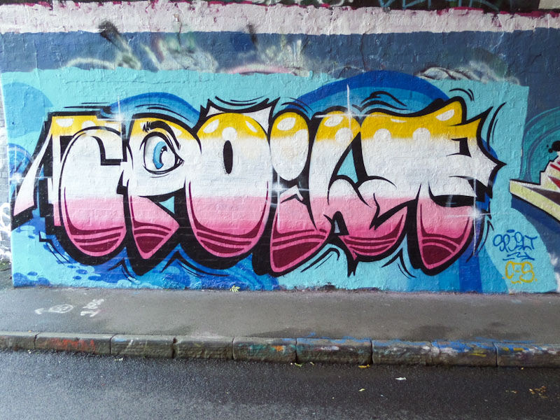
Every once in a while, I take a quick canter through my archives, just to see if there is something significant that got left behind. This is most definitely a piece that I should have posted back in September 2017, but like so many pieces before it, missed out. I am sharing it now.
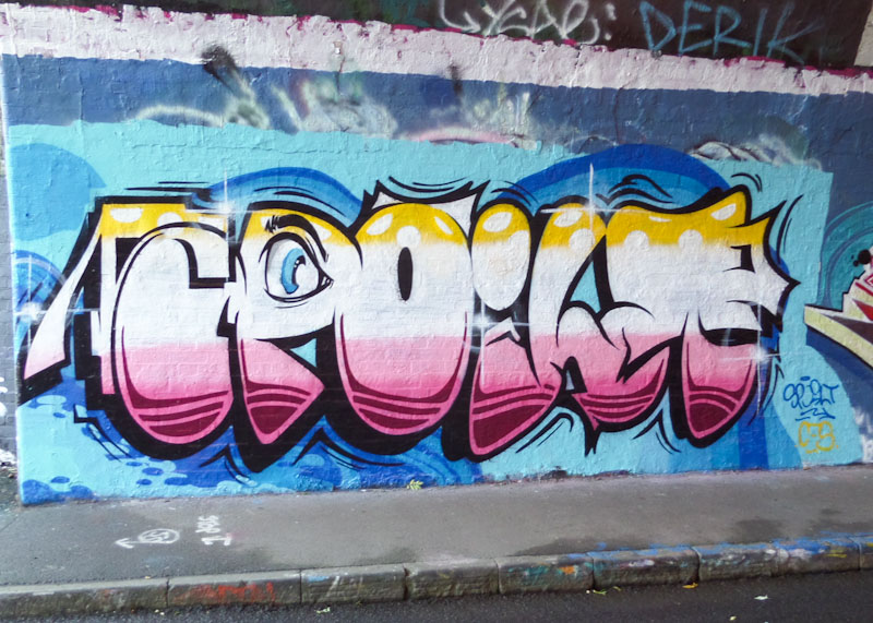
The writing is by Dott Rotten and spells out SPOILT, which he most commonly writes. What is interesting about this piece is that it is quite unlike much of his other work, and could easily be by half a dozen other artists about the place. Everything about the piece is good, the background and the design of the letters and fills. It is the execution though that stands out; this is a perfectly finished piece, crisp and clean, from a master.
Doors 194 – Porto doors (Part 8)
No surprises this week as I continue to share more lovely doors from Porto, Portugal. There is a little bit of a theme this week along the lines of pairs or trios of doors. I very much hope you enjoy them.


There is little doubt that I will look back on my trip to Porto, with my daughter in June 2022 as one of the highlights of the year, and I might even go as far to say of the decade. It is a visually rich city and culturally fascinating, divided up into distinct areas for shopping, port manufacture, residential, administrative etc.
I still have a few remaining doors to share from this trip… I do hope you don’t get too bored.
I hope you have a fabulous week ahead, and if you are in the UK, enjoy the extra Bank Holiday on Monday, taking time to reflect.
If you have made it this far, you probably like doors, and you really ought to take a look at the No Facilities blog by Dan Anton who has taken over the hosting of Thursday Doors from Norm 2.0 blog. Links to more doorscursions can be found in the comments section of Dan Anton’s Thursday Doors post.
by Scooj

Often associated with Face 1st, Moon Street has a new kid on the block in the shape of Kid Krishna, whose work has been appearing all over Bristol over recent months. This is the first of his pieces to appear on Natural Adventures and highly unlikely to be his last.

Kid Krishna’s writing is very distinctive, with long thin letters, looking like planks of wood stacked in a pile. I believe the letters spell out KRISHNA, but I could be mistaken, such is the disguise. Expect to see a whole lot. Ore from the artist in this blog, I already have a considerable back-catalogue of his work in my archive. Definitely something creative and different.


