.
I spoke to the Earth
and she said she was hurting
love is not enough
.
by Scooj
.
I spoke to the Earth
and she said she was hurting
love is not enough
.
by Scooj
One of my favourite writers in Bristol at the moment is the Spanish artist Claro_que_sssnoh. His distinctive pieces are sometimes associated with his HMR crew and sometimes, like this one, as stand alone pieces.
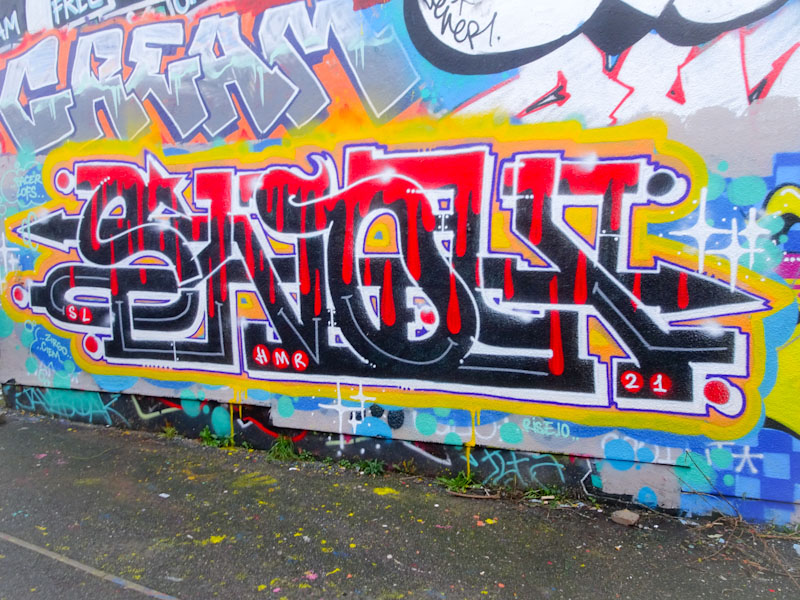
Claro seems to particularly favour this spot for his solo work and at any one time there may be several of his pieces here of varying ages. What makes his work distinctive is that the letters are made up of a continuous line of script, like joined up writing, which is quite unusual in graffiti writing in my experience. Beautifully colourful and nicely finished, this is a fine piece from Claro.
In the last few months, Slakarts has had a bit of a renaissance and what fun it has been. His familiar portrait pieces have been given more body and depth and are all the better for it.
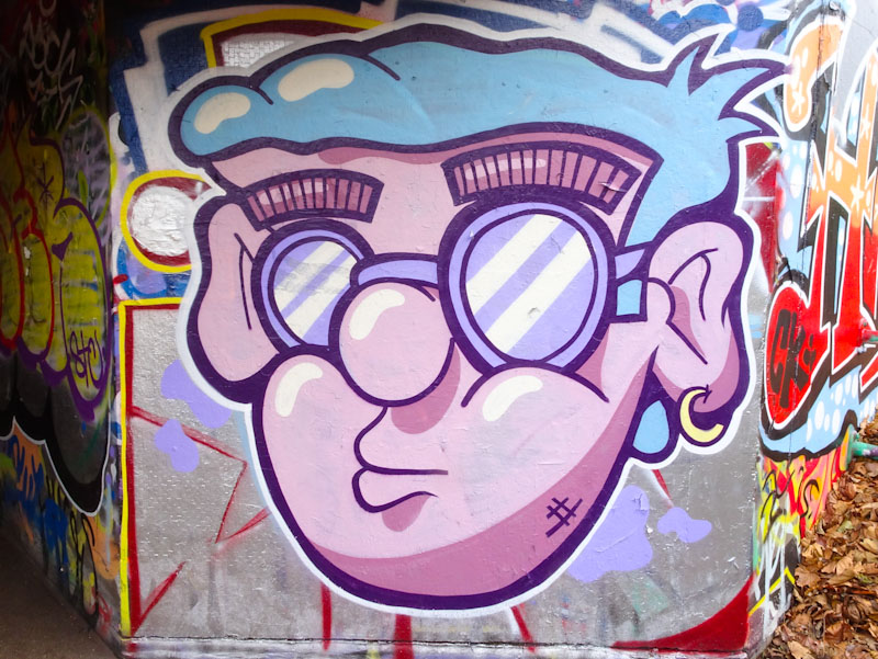
This is a perfect example of his newer work, where the character is lifted off the wall rather than being flat. Depth is an important development in street art work, and Slakarts is achieving it in bucket loads at the moment. An all round lovely piece.
The PWA boys were so very busy in 2021, and their numbers swelled with the additions of Nightwayss, Zake and Chill. Few spots in Bristol were untouched by their joyful collaborations, among them this fine wall at the M32 roundabout.
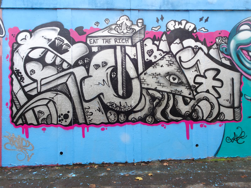
To the left is a well crafted piece of writing from Soap with some curious and interesting ideas creeping in, including the slogan, much used by street artists, ‘eat the rich’. The whole thing is liberally sprinkled with cut gemstones, something I must ask Soap about next time I see him.
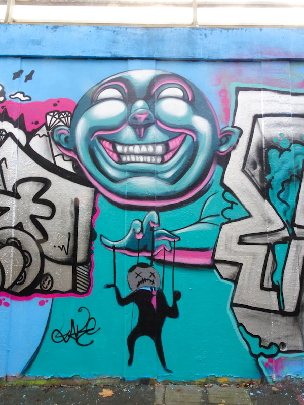
The middle section of this triptych is by Zake with a characteristic face, full of expression and beautiful contours exaggerated by skilful shading and highlighting. The face also has a hand which is operating a little string puppet. There is a story here, but I am not too sure what it is.

The final part of the collaboration is by Face 1st and it is a really fabulous bit of writing, sans smiling girl. Lots of gunge oozing from the 3D lettering, which seems to have been a bit of a thing for Face 1st in 2021. There was a fourth part to this collaboration, which was the Nightwayss piece I posted a few days ago, but it didn’t sit as part of the symmetry of these three pieces.
Happy New Year.
Happy New year to you all. I hope that 2022 brings considerably more good fortune than 2021 for people and the planet.
The best part of discovering Elton Street was, if I am honest, having a chance to see this absolute beauty from Hazard. She really has gone from strength to strength over the last year, incorporating some abstract themes into her portrait work, and I stand by the comment I made about her Wilder Street mural that she has elevated herself into the world class tier.

The themed colours for all the pieces in Elton Street were pinks and blues (Clare Grogan would be thrilled) and Hazard has incorporated these perfectly into this portrait piece. I think that this would have to rate highly in my favourite of all pieces of 2021, alongside her Wilder Street mural. Outstanding.
.
Nothing to see here
consigned to room 101
bring on the new year
.
by Scooj
Happy New Year folks.
An artist whose work I really rate, but never seem to have many photographs of is Conrico, or Conrico Steez as he signs himself. I think that part of this discrepancy is that he paints many of his pieces in places that I don’t tend to go all that often. Anyhow I managed to snap this rather fun column piece under Brunel Way recently.

If I am honest, circular column pieces are a pain in the backside because of the difficulty in capturing the whole thing in one shot. I often think that it would be good if phones could do panoramas the opposite way round… if that makes sense, then columns would be a piece of cake. The character face has that Conrico life about it, derived from the style he uses which is like drawing with spray paint. Good to see.
Since changing his moniker from Eman to Werm, Werm has been getting busier and busier and is constantly developing his writing styles and his characters. One thing for sure is that he is a fast learner and adds weight to the saying ‘practice makes perfect’… he practices a lot.

This writing and character combo, by LRS crew members 3F fino and Werm, is under Brunel Way in, where the light conditions are always a massive challenge for taking photographs. The character is by 3F fino and I think is a bear or something from Star Wars or something. The writing by Werm uses his currently favoured heavy block letters, spelling WERM, which can be seen in multiple spots around the city. In recent years, the LRS crew have certainly made themselves highly visible in the city.
The side wall of Bishopston Tiles has been a bit of a honeypot recently with several fabulous stencils by John D’oh, all with an environmental theme, something that the artist obviously cares about deeply. This sensational tiger stencil must have taken forever to cut and prepare. There are at least four layers that I can see, each using a greyscale tone from black to white.
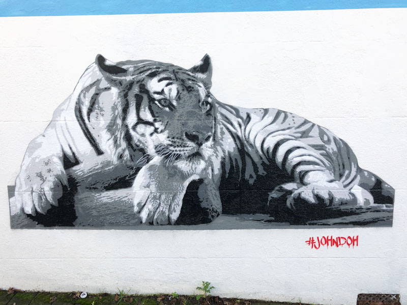
I might be doing the piece a disservice because there was some text accompanying the wall as a whole reading ‘Extinction is forever – endangered doesn’t have to mean extinct’. So a message of hope and a stencil of high quality and extreme beauty from John D’oh. Still more to come from this magnificent spot.
Part of a larger PWA collaborative wall, this piece by Nightwayss is a bit of a stand alone work and so I am posting it separately. In recent months Nightwayss has been experimenting with these fragmented self-portrait pieces, and he seems to be really enjoying them. They are certainly a bit of a departure from his monkey pieces, but nonetheless great fun.

Nightwayss has used some strong red colours for the self-portrait, and has had great success with creating the reflections on his glasses with white patterning. There is a lot here that seems to be in development, but each of these new-style pieces seems to be better than the last. The portrait is interrupted with a superb bit of NIGHT writing in which Nightwayss seems to have created a bit of a fluid feel to the letters. The whole thing is an interesting study in a new direction.


