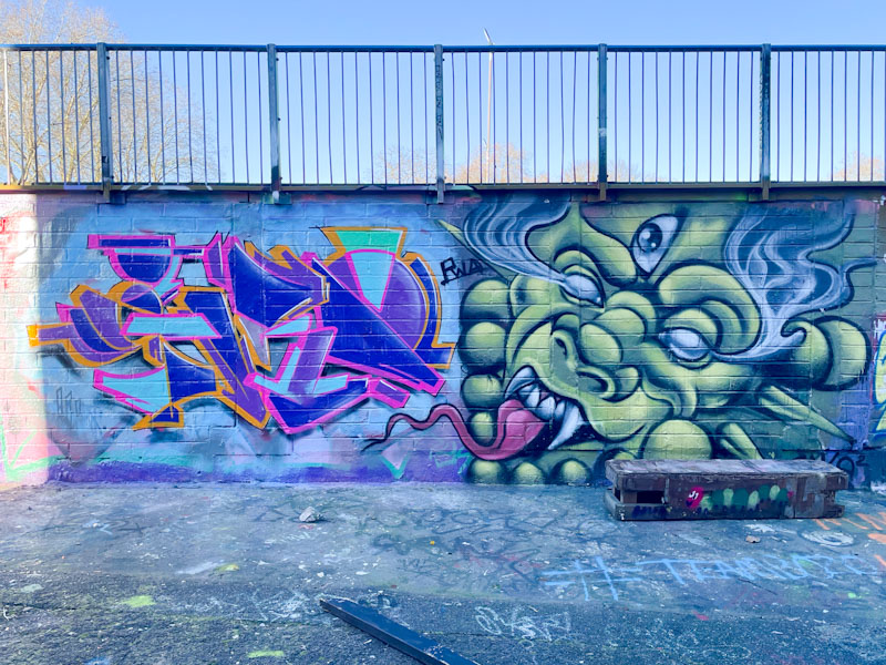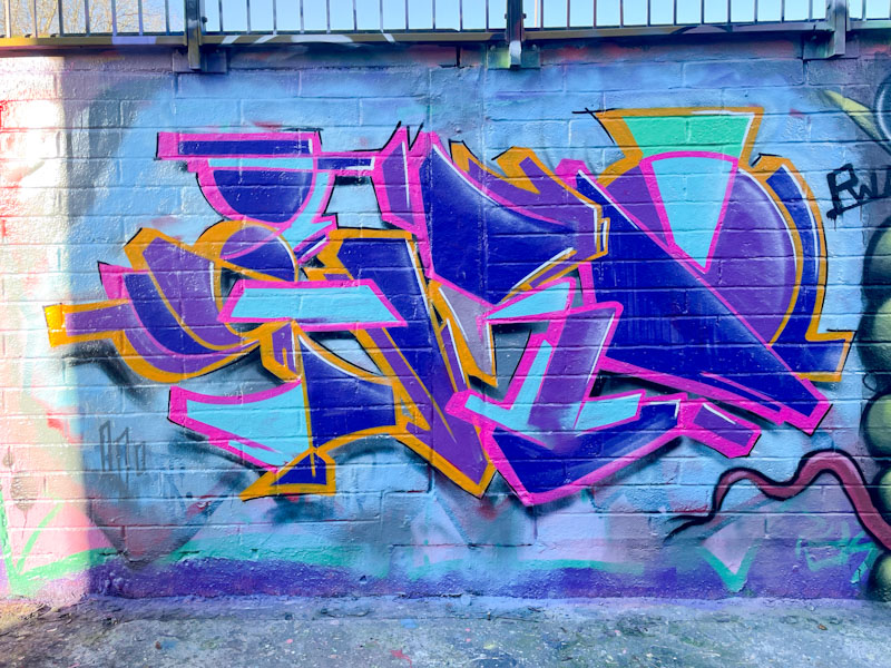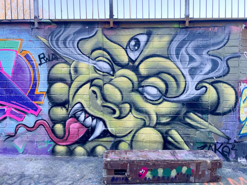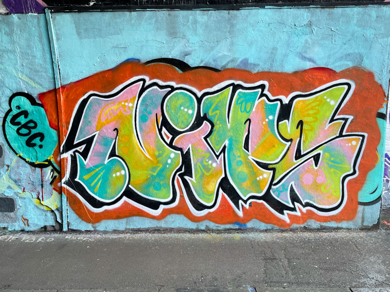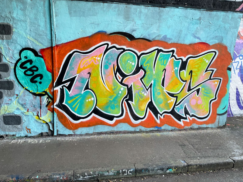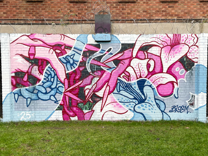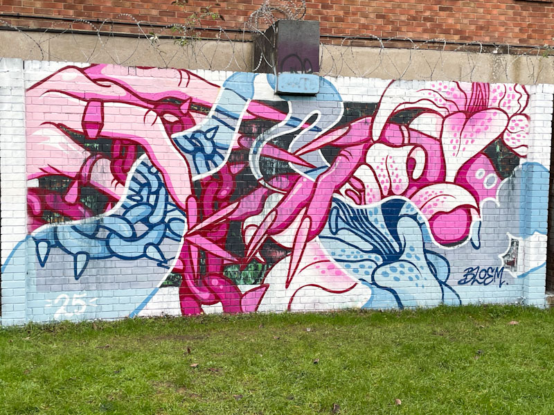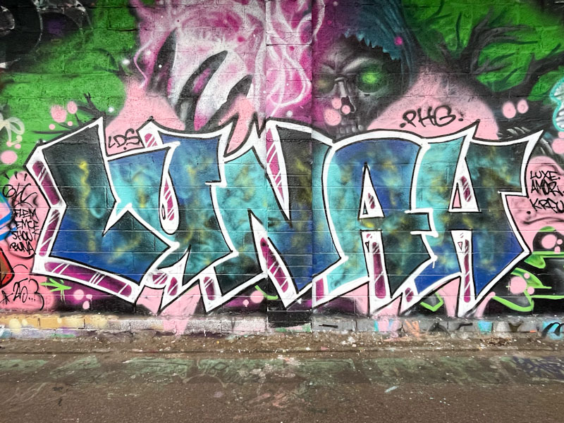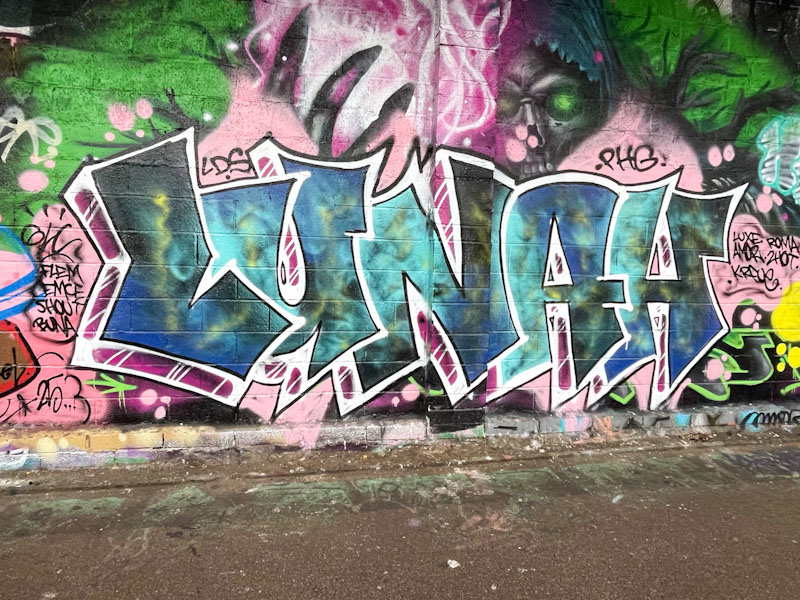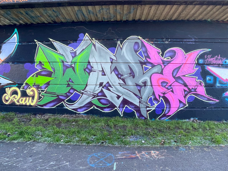
One of the nice things about birthday paint jams is that they tend to encourage artists who don’t paint all that often to come out of the woodwork. One of those artists is Ware from the RAW crew. I have only ever seen his work a few times in Bristol, and it is possible that he lives and paints elsewhere, which may be why I don’t see his stuff all that often.
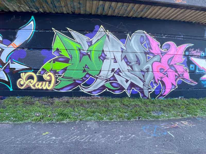
This is a wonderful and technical piece of wildstyle writing. Each of the letters is assigned a colour, from green to light grey to dark grey and pink. The design of the letters is verging on a kind of Gothic or calligraphy font, but not quite. This is very nice writing, beautifully presented, and a great way to celebrate Shade One’s birthday.