.
What kind of crazy?
The early train for London
a work-day birthday.
.
by Scooj
.
What kind of crazy?
The early train for London
a work-day birthday.
.
by Scooj
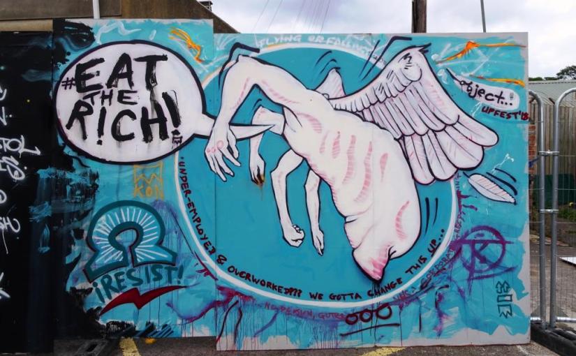
Well, I’m not too sure where to start with this one from Object… really. The piece features a fairly grotesque headless, winged, multiple-armed torso with a speech bubble containing a well-used phrase ‘eat the rich‘. The phrase itself is attributed to Jean-Jaques Rousseau and alludes to the suggestion that when the people have nothing more to eat, they shall eat the rich.
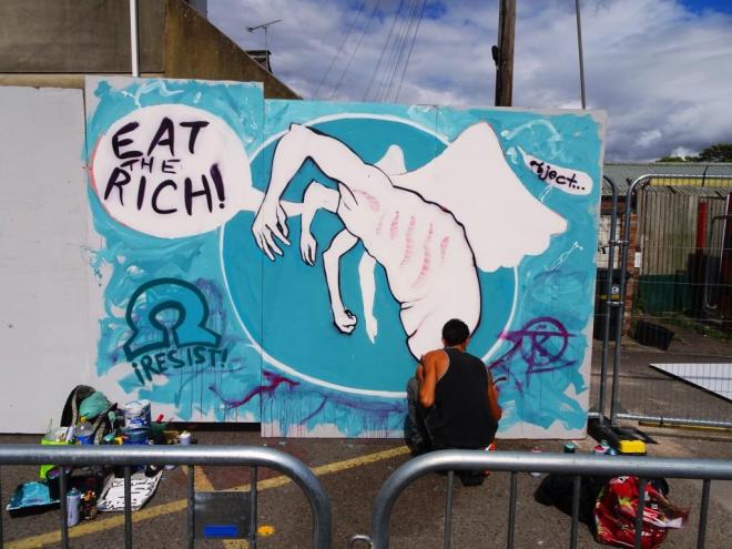
As political as ever, Object… is tireless in his championing of the underclass, the unrepresented and the unfortunate. His work always comes across as very passionate, and often pained by the injustices of the world…visceral is perhaps the word I am looking for. I realise his work might shock or leave you cold, but I am actually a fan of this thoroughly decent man and artist.

There was a great contribution to Upfest 2018 from the Gums n Tongue crew and this section by Lazy Obit continued The Simpsons theme with an interesting depiction of Millhouse masquerading as a super hero, but which one I am not sure.
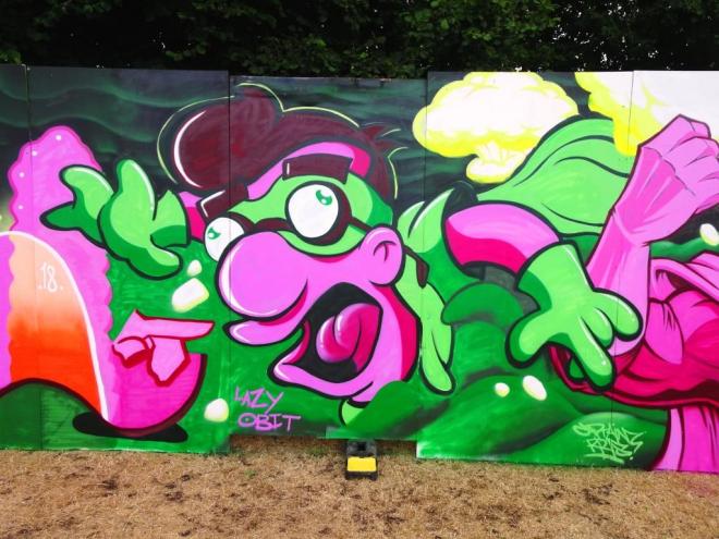
As with all the pieces from this crew, Lazy Obit has produced a high quality, fun piece that enters into the whole spirit of Upfest. On reflection, it might have been better for me to post the whole wall in one go, but my original decision to post them separately was to allow each one to be enjoyed individually. This was a great piece on a great wall from a great crew.
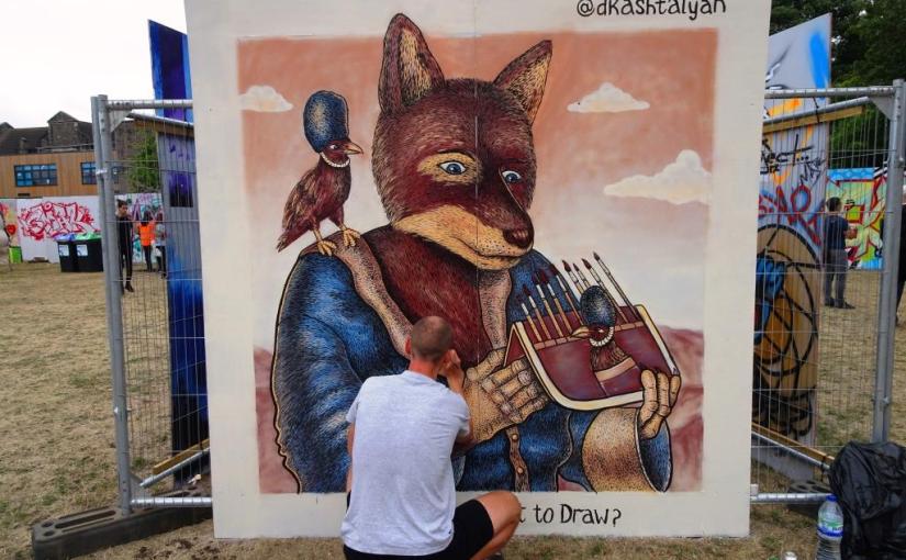
I love this kind of illustration street work…something that could appear in a children’s book, but is on a huge scale. The detail and interest that Dima Kashtalyan has managed to capture in this piece is inspiring.

I know little of the artist other than that he is an illustrator/artist from Minsk in Belarus. He uses a pointillism style and likes to pose questions and burning issues in his work. Here he asks the question ‘to draw or not to draw?’ probably a crowd-pleasing slogan at an art festival.
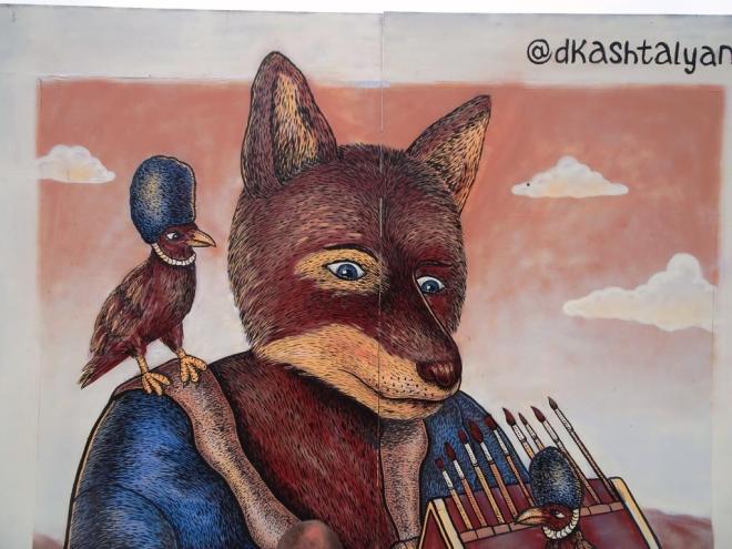
There is something very comforting and familiar about this piece and I would gladly have it hanging on a wall at home. Really great stuff.
There is so much going on in this magnificent piece by Andrew Burns Colwill, but it is not busy…on the contrary it is calm and peaceful which is somewhat at odds with a fragmenting world it represents.

I like Andrew Burns Colwill very much, both as an artist and as an acquaintance, and I managed to catch up with him a couple of times during the festival. He had started early, so by the time I first found him on the Friday, his work was already well underway.

The piece combines several ideas and themes, but the obvious one is a representation of the biggest issue of our time (other than climate change), Brexit. The world is represented by an apple, and we hold it in our (multicultural) hands.
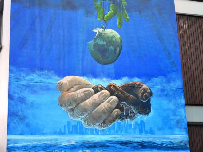
A bite has been taken from the apple and is seen sinking in the water below. A closer look at the lost piece of apple shows the UK cut-off and drifting away all alone. One can read in so many metaphors into this work – brotherhood, loss, a gift, urbanisation and so on, but for me it is the isolation of the UK that stands out.

A most brilliant piece, and one of the highlights of the 2018 festival.
‘Cheelay flaykes?’ She asks
in her sweet foreign timbre
and it makes me smile.
by Scooj
The steep sweet meadows
now clad in deep mountain snow
softly summon me.
by Scooj
About Ponny left us a few of his poignant wheatpastes about the place during Upfest, of which this is the third I have posted. All of them have featured subjects who have hit upon hard times. The beautiful stencils in dark tones highlighted with copper have a sad but gentle feel to them and they are full of pathos.
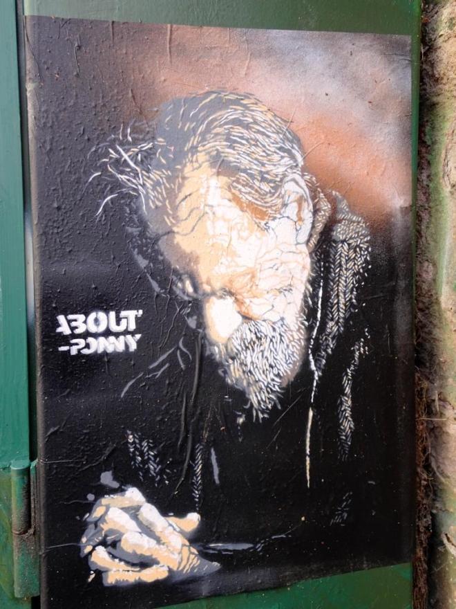
I am full of admiration for the work of this Italian artist, and how, in a quiet and subtle way, he reflects the troubles of our age of austerity and economic struggles. No fuss, no ranting, simply an honest portrayal.
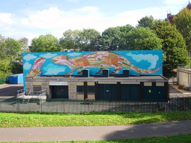
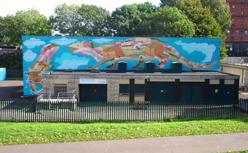
Here we see yet another great new wall for Upfest 2018… the organisers really pulled out all the stops for the tenth anniversary festival. Slightly off the beaten track, but well worth the walk is this enormous piece by Andy Council on a Wessex Water building.
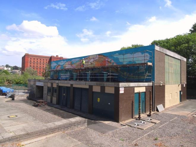
This is a really wonderful piece that features a couple of Otters, characteristically for this artist composed of architectural landmarks from Bristol. Andy Council needed extensive scaffolding to get the piece completed safely, which remained in place beyond the end of the festival, so many visitors might not have seen the completed piece.

He seemed to be enjoying himself up there, but was well away from the bustle of activity in the main painting areas.
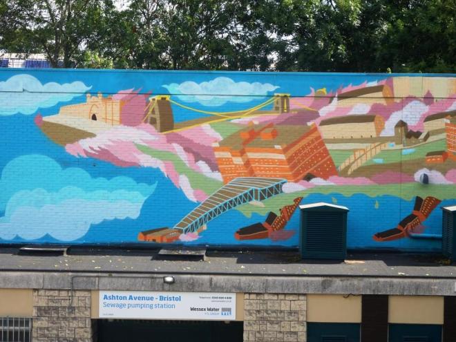
Three landmarks clearly visible on the otter on the right are the Clifton Suspension Bridge, the Create Centre and the Tobacco Factory. This is yet another outstanding piece from Andy Council and one that I hope remains for a long while.
Aaah, familiar stuff from Mr Draws and one that had been inadvertently omitted earlier in the year, which is surprising really, because it is so very good.

There is always something very cheery about his work that works for me. In this piece, the filler is absolutely beautiful, the two colour palettes above and below the yellow line are brilliantly complementary and the bubble effect imperious. I really love the simple idea and lovely execution of this one. Can’t believe it has taken almost a year to post it!




 Natural adventures