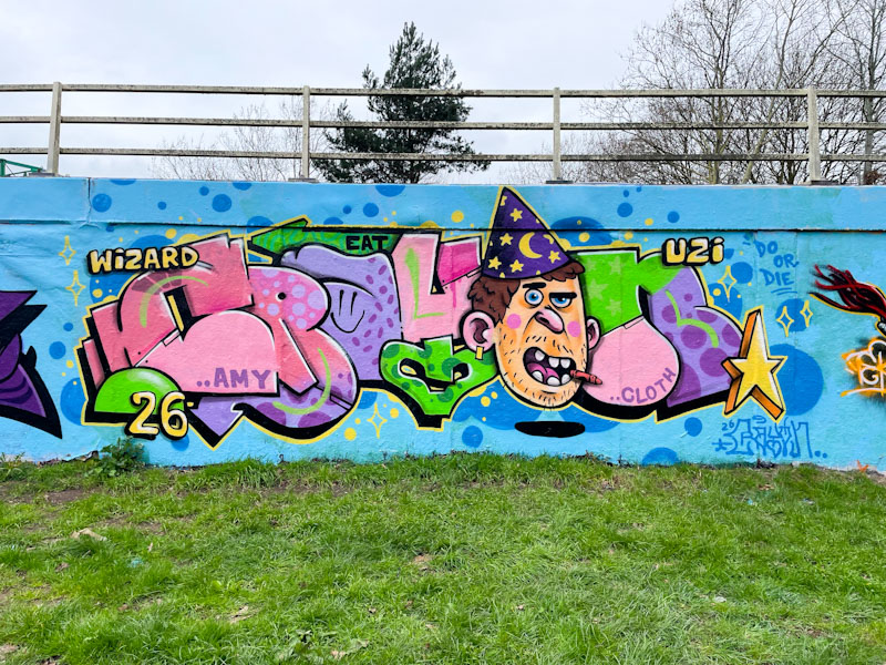
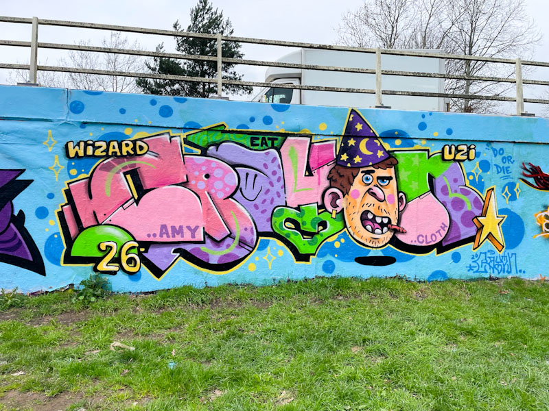
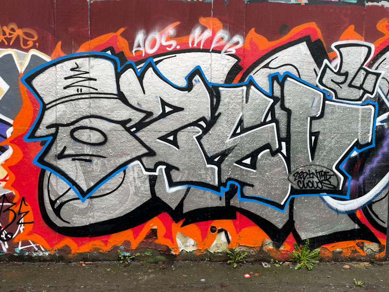
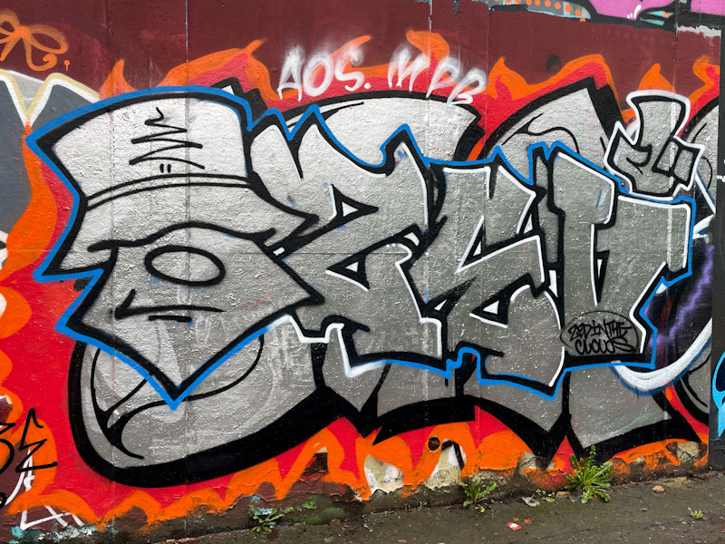
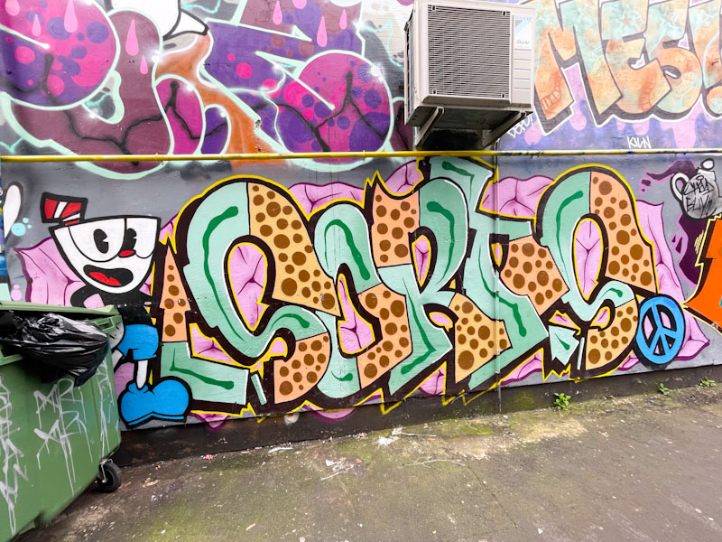
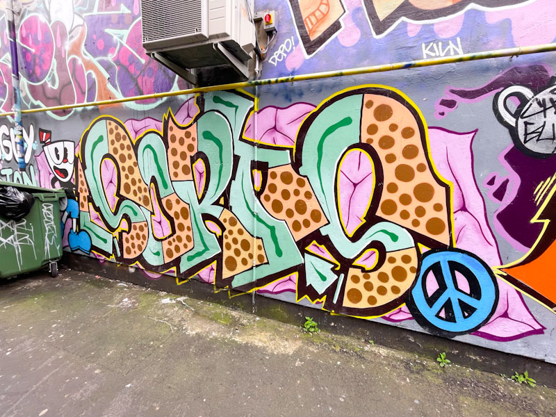
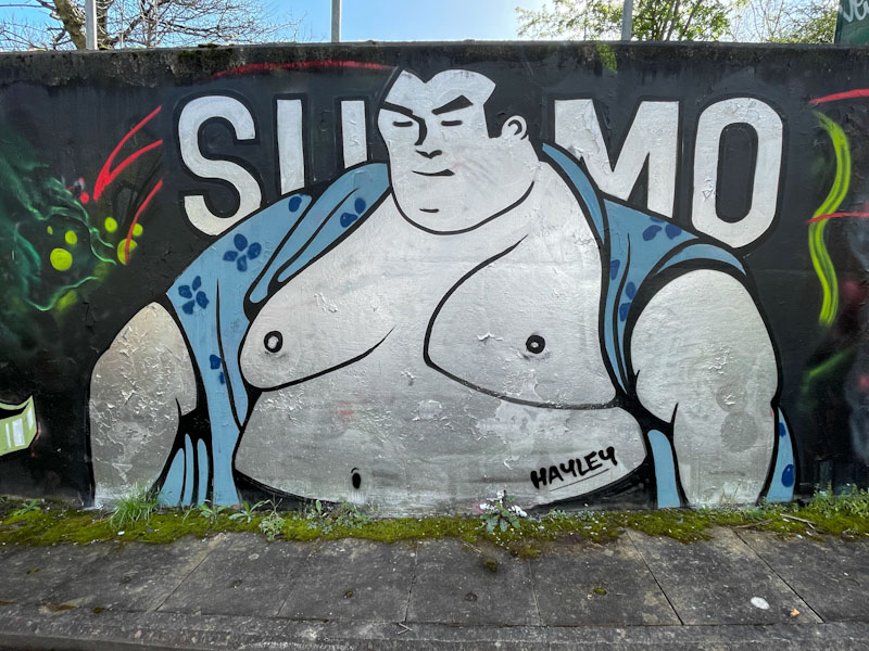
A gallery of incredible character pieces painted in a cartoon style by South Wales-based The Art of Sok.
Instagram: @theartofsok
Big Cartel: https://theartofsok.bigcartel.com
All photographs by Scooj


A gallery of incredible character pieces painted in a cartoon style by South Wales-based The Art of Sok.
Instagram: @theartofsok
Big Cartel: https://theartofsok.bigcartel.com
All photographs by Scooj


I enjoy observing new artists who try to break out onto the scene, and after all, all graffiti/street artists have to start somewhere. As they progress, they will make mistakes, both in their art, and equally importantly regarding etiquette. Even I fall foul of this from time to time – there are codes and principles, even if there are ‘no rules’. On this occasion, Seed painted his large letters recently, over a beauty by Werm. Generally speaking you shouldn’t paint over something that you are not equal to or better than, and Seed isn’t yet at Werm’s level. The logical consequence is that you end up with only high-end pieces on all walls, and that is where taggers and bombers come in, freeing up walls to be painted again.

Seed is learning gradually, and improves from piece to piece, but his work is still rather crude. His letters here are large and square, and his 3D drop shadow missing on the bottom of them. He is experimenting with some plasma lines to break up the large swathes of pink. He has also included a little cartoon-style character, completing the combination piece. Keep practicing and perhaps stick to practice walls for the time being.

This is a rather nice combination collaboration from Turoe and Dibz, and I think that Fade was there too, but possibly in a filming capacity. The depths of a wet and rather horrible winter seem to be dimming, and many artists are waking from their slumbers.

It turns out that this hoarding, which is actually the side of a large skate ramp, is becoming a bit of a honey-pot for high-end pieces. Although I can’t be absolutely sure, I think Turoe painted the TWC (The Wild Criminals) letters breaking out from the grey ‘wall’. Some great colours and textures in the fill, the hole and the wall.

I think that the Yosemite Sam character is the work of Dibz, which is unfortunately behind a bit of temporary railing, which I should have moved really for the photograph, but it is a real bit of street furniture that gets in the way from time to time, and adds authenticity to the record. The character is superbly painted, and so true to the cartoon character. Warner Bros and Looney Tunes would be proud.

Slakarts doesn’t paint on the street much these days, but the last two pieces I have found by him have both been up on Purdown on the square concrete slabs of the old WWII gun emplacement. I guess it is a place he feels comfortable painting, a little less exposed than the streets.

This is a lovely abstract piece containing his usual character, which has been absorbed a little into its surroundings, and there is some ambiguity to his features. Slakarts has used some great colours in this fun and uplifting piece.

It has been difficult to walk the dog so far this year, all the parks I usually go to are waterlogged mud-baths, and cleaning him afterwards is a bit of a palaver. Purdown is perhaps the best bet, because it is at the top of a hill and the water drains off it reasonably well, so I went up there a couple of weekends ago, and was met with several new pieces, which I was not really expecting.

This is a shouty piece by Bogat, who is known for his characters with woolly hats and large mouths. I don’t see his work all that often, but pretty much always post it when I do, because it has a simplicity and authenticity that I really like. Some bold colours and a good fit for the square concrete slab, and a few RIP shout-outs.

Finding work by artists that are new to me is one of the great pleasures of this hobby. I rarely tire of the great work of Bristol artists, and we are truly blessed in the city to have such a wide spectrum of talent and styles. Visiting and new artists are, however, a refreshing addition to the scene, and this piece by Lise Rupa is something special.

I have an affinity with squid, having worked on a Japanese squid fishing boat for a year, (but that is another story). This unusual piece has a sketch-like quality to it, or almost looke like a wood-cut piece, with its two-tone colours and black hatching. The squid is anatomically correct, which pleases me greatly. What a wonderful way to make your presence known.
Below is my second ever attempt to paint with spray cans, it happens to be a squid, which is why I include it here:


Here we have a lovely Desi piece which reverts back to her DESI letters, rather than her VEIL letters that she has been favouring in recent months. If you look closely, you will notice that she has been joined with an impish addition by Posh.

Desi’s letters are filled with four shades of purple containing reversed out spots through the colour courses. The letters are finished well with a black drop shadow and fine yellow border.

The addition of a Posh character exclaiming the words ‘eh up’, perhaps betraying a Derbyshire or Yorkshire origin, is a bonus bit of fun. Different artists, different styles, most likely painted at different times.

For quite a while now, I have been photographing Fasho’s writing, but held back on posting any pieces due to the fact that I know nothing at all about the artist. It seems that until I meet them, I’ll not find out any more, so I thought I’d go ahead with this nice green piece in the tunnel.

Fasho has a rather unique style of writing that includes exaggerated rounded ends to all the letters, giving the writing a soft appearance. This combination piece (which I am assuming is all by Fasho, although the character might be another artist’s work) contains the letters FASHO and a gun-wielding soldier on the left. There is good definition between the green fills and patterns and the white and black borders, keeping the piece tidy. A peace icon in the position of the ‘O’ indicate where this piece is coming from. Much more from Fasho to come from my archives.

This character piece from Zake almost feels like a throwback to some of his earlier work, which focussed on just the head of a character. Of course, his style has developed since then , but this piece is uncluttered by other ideas and incorporations.

This wall is a particularly good spot for character artists, because it is too square for graffiti writers. As ever, Zake has created a face with so much depth created with clever use of shades and tones, and some subtle white flashes. Great grinning work.

Many times I go out to photograph street art, I come away empty-handed, especially when it has been raining a lot, but every once in a while I get lucky, not only with finding new pieces but also meeting the artists who paint them. This trip to the River Avon was particularly fruitful.

I caught Malibueb while he was finishing this piece off, and chatted with him, because I wasn’t familiar with his work, and guessed he was visiting. It turns out he is a Swiss musician and was doing a set in Bristol that evening, but he also paints a bit – well he was just being modest I think, because this is a fine chrome combination piece with an excellent old school character rounding it off. It is always good to welcome visiting artists to Bristol.