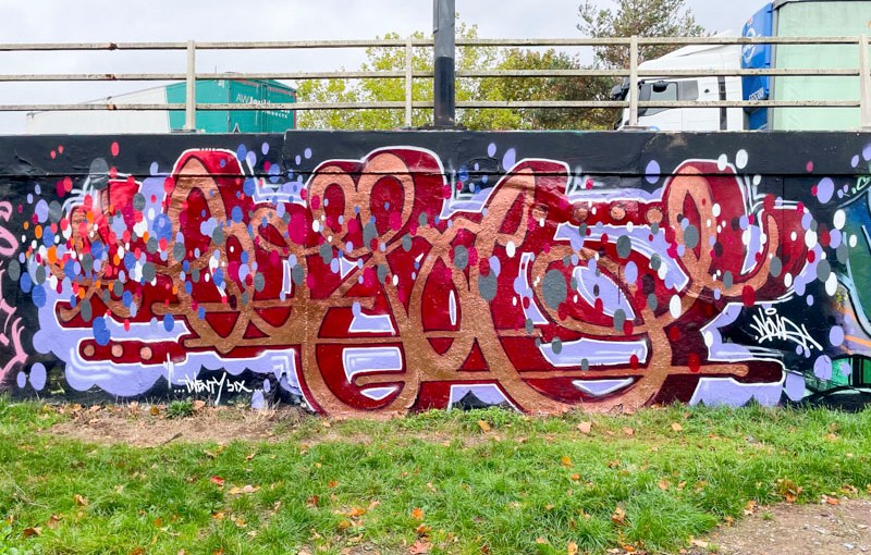
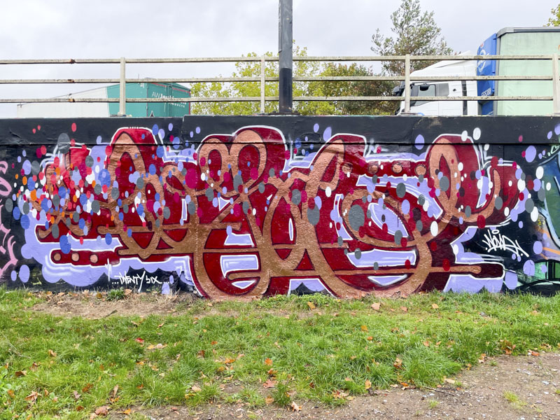
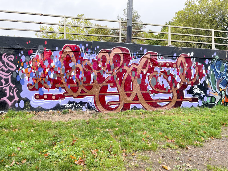
Logoe has been back in town recently and produced a couple of outstanding pieces. Nobody does script graffiti writing quite as well as Logoe does and this piece on the roundabout is a beauty.
Logoe, M32 roundabout, Bristol, October 2026
The main fill of the lettering is a gorgeous metallic copper which sits alongside a deep red drop shadow, which sets the whole piece off in the right direction. There is a rhythm and flow to the piece which is so easy on the eye. The scattering of spots adds life and interest. A supreme example of logoe’s work.
We are in the midst of another Logoe blitz, that is to say that a couple of weekends ago he visited Bristol and dropped in excess of six pieces about the place, which is the way he rolls. He saves up all his painting energy, there aren’t many opportunities where he lives in Wales, and paints for England on his weekend visits to our city.
Logoe, New Stadium Road, Bristol, October 2024
This is a particularly nice example of his script writing style – a lovely clean piece in beautiful copper tones, really brightening up this fairly dreary spot that still bears the smoke damage on the ceiling from an arson car blaze in this little underpass a couple of years ago. Logo is a Trojan, who simply doesn’t know when to stop, and I love it.
Ryder seems to like this particular spot as much as I do, or at least it would appear to be that way given that he paints it reasonably often. This piece is a classic piece of Ryder wildstyle graffiti writing, which is always of the highest order.
Ryder, M32 Spot, Bristol, February 2022
The most striking thing about this piece is the copper colouring of the letters that seems to change completely in tone, depending on where it is viewed from. This is the kind of piece that one could easily imagine being slapped on the side of a wagon on the New York subway. Classic, clean and tidy. Pure graffiti writing at its best.
I don’t know what I expected Elvs to look like before I met him but somehow it wasn’t what I saw. Maybe it was that he was much younger than I thought, but then isn’t everyone these days? I have been an admirer of Elvs’ work for a few years now, so it was great to catch him midway through doing a piece.
Elvs, M32 roundabout, Bristol, May 2019
His work is so distinctive and intricate and appears to follow a general formula, the repetition of which, by his own admission, becomes recognisable as his work. I guess if you have done enough of these things you begin to master every curve and shadow and he seems to turn out perfect pieces every time. He didn’t seem to mind me chatting for a little while… it must be quite irritating having people asking inane questions, but if he was irritated he didn’t show it. Another great piece of graffiti writing from Elvs.
Oh my oh my. This utterly outstanding piece by Elafil was the biggest head turner of the festival. I had to revisit it several times, just to enjoy the bold brash colours and expression knock me over. I seriously rate this piece as a brilliant piece of street art. The bottle green and copper tones work so well together and create something that assault your eyes – ‘hey look at me’ the piece is saying.
Elafil, Upfest, Bristol, July 2018
Another thing about this particular piece is that it is unquestionably photogenic, which is great for someone like me who likes to present great pictures of street art in my posts. The only downside is that when I got to see it, the artist had already finished and fled the scene. Next time!
Elafil, Upfest, Bristol, July 2018
Elafil is from Spain although I’m not sure which part. He clearly has ambition to join the international circuit and on this evidence shouldn’t have any problem at all. He has a website which showcases some of his great work, but alas no ‘about me’ tab.
There is rarely a Voyder piece that I look at and think…that’s not much good. In fact I can think only of one, and I am not going to share which one here. This is another stunning piece from a little while before Upfest 2017, when Boogie was in town, whose piece can be seen just to the right of this picture (to follow).
Voyder, Raleigh Road, Bristol, July 2017
This time Voyder has gone for a copper coloured design which carries a really nice 3D quality about it emphasised by the white shading and stars. Appearing to lie behind the writing is a rainbow, interestingly in reverse order from convention, which would normally start with red on the left.
Voyder, Raleigh Road, Bristol, July 2017
I have several more Voyder pieces in my files – I just need more time to get them all out.