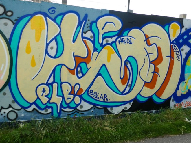
You might recall that almost two weeks ago I posted a piece by Whysayit, commenting that I haven’t seen much of his work in recent years. It would seem that he is becoming a little more active, and this is one of two pieces by the artist on the Bristol to Bath cycle track at Greenbank.
Whysayit, Greenbank, Bristol, June 2022
Whysayit has a very organic style, spelling out YSAE, with letters that look like they have been squeezed out of a tube. The colour combination is a bit iffy in my view, with a solid, pale sandy yellow for the letters and a turquoise blue for the deep shadow. Yellow and red colours have been splashed in for letter shadows and drips. This is an interesting piece that has elements of Miro or Tanguy in it. I’ll be on the look out for more from Whysayit.
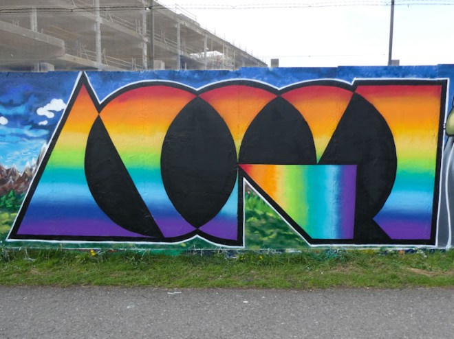
There are some artists who never need introducing because their style is so unique, and without doubt Acer is one of those artists. Although he switches up his design concepts from time to time, they are still instantly recognisable as his work.
Acer, Greenbank, Bristol, May 2022
This playful rainbow lettering piece at Greenbank uses his current style and typeface to create the word ACER, with one small twist, literally, the piece is upside down. Clever work, once again perfectly executed.
Pretty much my favourite collaborations are those between Billy and Merny, their naive styles complement each other so well and they both tell fabulous stories with their paintings. This collaborative wall was painted a couple of weeks ago.
Billy, Greenbank, Bristol, April 2022
To the left, as is usually the case with their collaborations, is Billy’s piece, that claims ‘it used to be different here’. It would appear that the piece is a commentary on the huge development that is going on on the other side of the hoardings. The woman in a strawberry dress, overlooking a new housing development, has the look of a Dick Bruna character, the artist who created Miffy the rabbit. Everything about this piece is perfect… the story, the artwork and the location.
Merny, Greenbank, Bristol, April 2022
To the right of Billy’s piece is a rather bleak message from Merny in which a man, perhaps a teacher, is pointing at words on a board that read ‘no one cares’. I would suggest that maybe this is a reflection of the troubled times we live in where we have an inept and out of touch government that is looking after the interests of the wealthy. The signature numbered labels create interest and humour to the piece.
Billy and Merny, Greenbank, Bristol, April 2022
What a fabulous collaboration from these two. I was pleased to get photographs as often their pieces don’t last long, which is both irritation and disrespectful.
Another wonderful piece from Pekoe, painted during a bit of a purple patch, when she seems to be getting out and about rather a lot, which can only be a good thing. This stunning portrait was painted alongside RBF crew friends and carried the blue background theme that bound the pieces on the collaborative wall together.
Pekoe, Greenbank, Bristol, April 2022
Pekoe has a remarkable talent for painting these portraits, which are so distinctly her work. I guess that the difference between her work, and the work of photorealists is that her style shines through, whereas sometimes it can be difficult to identify a photorealist artist. I am not sure if I have explained that very well, but in short, her work is unique. This time we have a purple face and blue and yellow hair decorated with orange and green symbols and shapes. Another fine piece from Pekoe.
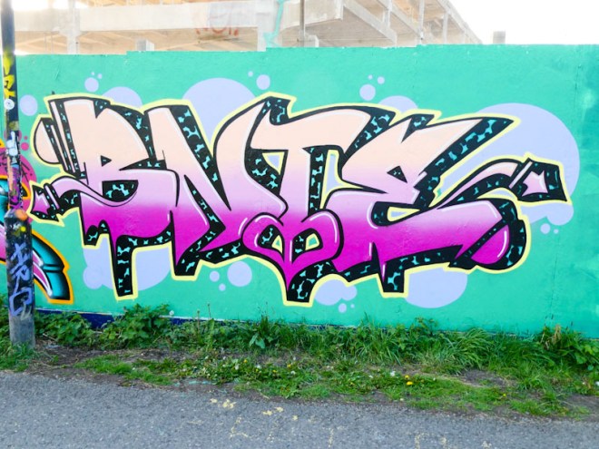
I have always enjoyed Bnie’s writing. I can’t put my finger on it, but there is something about her work I love. It might be the letters BNIE, which are so unusual (Beany?), it might be the letter shapes, fills or shadows, or possibly the combination of all of these, but there is something there that lifts her work into a different level.
Bnie, Greenbank, Bristol, April 2022
This piece was painted alongside some RBF crew friends all using the same background, suggesting a collaborative approach. As always, the cow spot 3D shadow, a speciality of Bnie, steals the show. A fabulous piece from a fabulous artist.
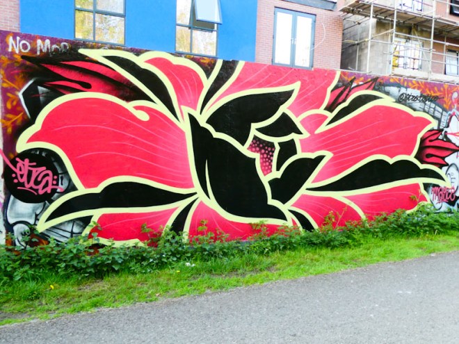
This piece is not bad for a tattoo artist, not bad at all, in fact it is blooming marvellous, and Etza has absolutely smashed it with this enormous floral piece, painted alongside his collaboration pal Chill. The piece is something really quite different and most arresting.
Etza, Greenbank, Bristol, April 2022
Etza has created a clean and sharp flower in rich red, yellow and black colours that has all the hallmarks of a sumptuous wallpaper design. There is a strong field of floral artist in the UK, including our own Alex Lucas, and Philth, who I think works out of London. This piece would sit proudly alongside those others, and proudly so. Finding this was a surprise and a pleasure.
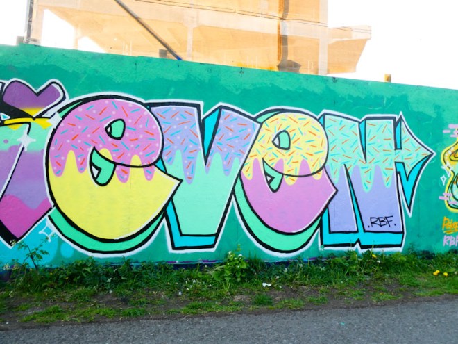
Evey has been rather busy this spring with her friends from the RBF crew, and it is always such a pleasure to see her work. Evey has a rather simple style, that is always full of colour and seems always to have a happy disposition, bringing smiles to faces.
Evey, Greenbank, Bristol, April 2022
I don’t quite know why Evey spells out ‘Even’ with here letters, and it is quite unusual to have repeated letters in a tag (unless they are together, like an ‘OO’ for example). In this piece, Evey has draped her colourful letters with icing and some hundreds and thousands, giving them a celebratory feel.
Billy continues to utterly delight with her uncomplicated storytelling pieces. Her work is so accessible and has a deep connection with the viewer, and I imagine especially so with younger audiences. There is nothing pretentious or conceited about her work, it is full of fun and commentary that is pleasing to the eye and great for lifting the spirit.
Billy, Greenbank, Bristol, March 2022
I particularly like this piece, I mean what’s not to like about dogs, birds, hats, flowers, a pencil and a lava lamp. I think that the grey background works really well with the overall presentation and the colour scheme is superb. A feast for the eyes and a triumph for Billy – one of my favourite pieces of hers so far.
This epic collaboration between Conrico, Acer and Zake, an unlikely trio of collaborators, appeared on the Greenbank hoardings about two weeks ago and is truly eye catching in its boldness and presence.
Conrico and Acer, Greenbank, Bristol, April 2022
I know that pairings of these three artists have happened in the past, but I don’t think I can recall that the three have collaborated together before. Starting at the left hand side, Conrico has provided a landscape backdrop, that actually runs to either side of the whole collaboration. Conrico definitely seems to enjoy painting these landscapes, and they have that paintbrush appearance that he achieves, I think by using banana caps. The mountain range and greenery is in stark contrast to the outstanding ACER writing in the prism colouring and superb letter design that Acer is painting with at the moment.
Acer, Greenbank, Bristol, April 2022
It has been fun observing Acer, whose central theme is geometric design, change his ‘look’ several times over the years. This latest rainbow lettering is such a strong statement, and demands to be looked at and enjoyed.
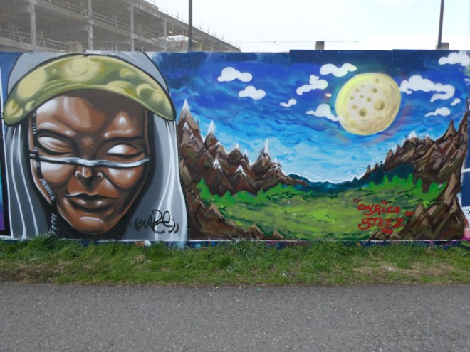
Zake and Conrico, Greenbank, Bristol, April 2022
To the right hand side of the collaboration is the painting of Zake and Conrico, with the latter rounding off his mountainous landscape which incorporates a rather cheesy full moon in a blue sky scape.
Zake, Greenbank, Bristol, April 2022
The Zake portrait is as good as any I have seen from him, and is a reminder of just how far the artist has come over the last two or three years, especially if you look back at his column pieces at the M32 Spot. The features and shadows are outstanding in this face, and there is a movement from Zake’s figurative style towards a more realistic style… watch this space to see what direction his work goes in. What an eclectic and amazing collaboration from these three artists.
‘Milk’ seems to be such an unusual word to choose for a writer, but I guess there is plenty of scope for playing with letters, and it is certainly memorable; I would be interested to know why Wxttsart chose it. Whatever the reason, he has made it his own and Bristol is becoming a bit of a Milk city.
Wxttsart, Greenbank, Bristol, March 2022
Wxttsart creates these script letters that feel quite organic in both the wobbliness of the letters and the fills, in contrast to some writers where it is all about straight lines or solid fills or angles etc, this somehow feels much more free and expressive. Some lovely blue drips to finish the piece off. Nice work from this LRS crew member.