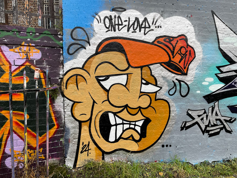
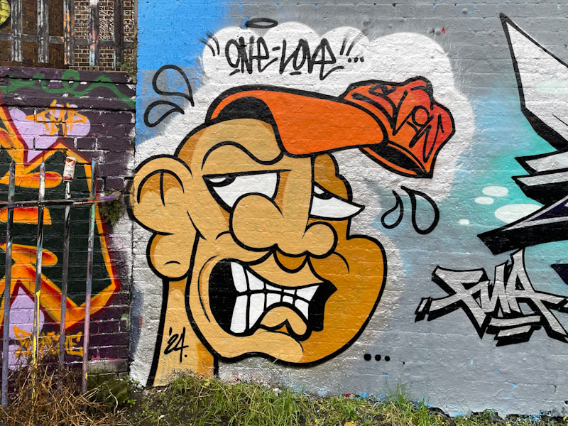
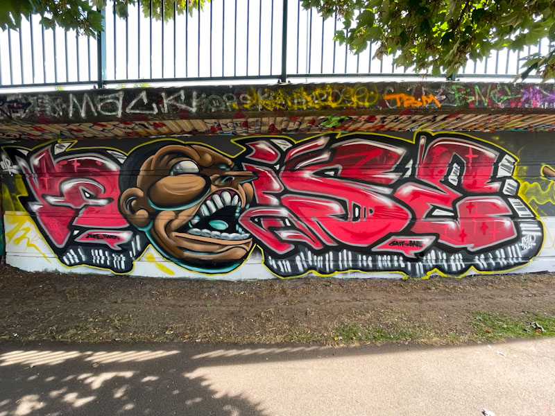
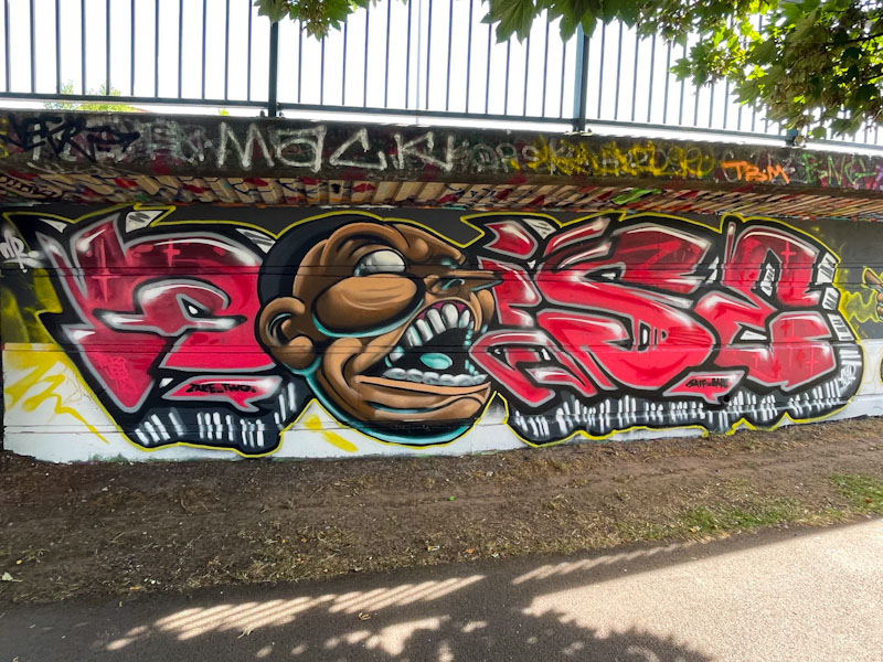
Zake bases his work around a cartoon face. A few years ago, the face would usually be just the face, but these days, the face has become the central element to something bigger, perhaps more of a narrative around the face, with things going on. A glance at this updated gallery of his work gives you some idea of his development and growth as a street artist.

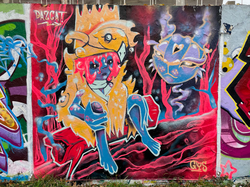
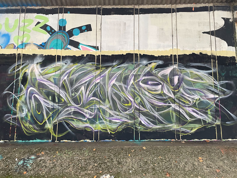
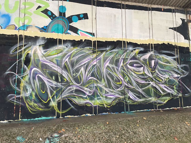
This is a curious piece, and all I can think of when I look at it is ‘sperm cell’, a thought very difficult to unthink. I suppose it could be a tadpole, or at a stretch some kind of eel. Whatever it is, it is mildly unsettling and weird. The piece was painted as part of a three-way collaborative wall by Hire, Zake and Ceus, where each piece was utterly distinct from the others in style, colour and content. So the only real element of collaboration was the background and the friendship of painting together.