
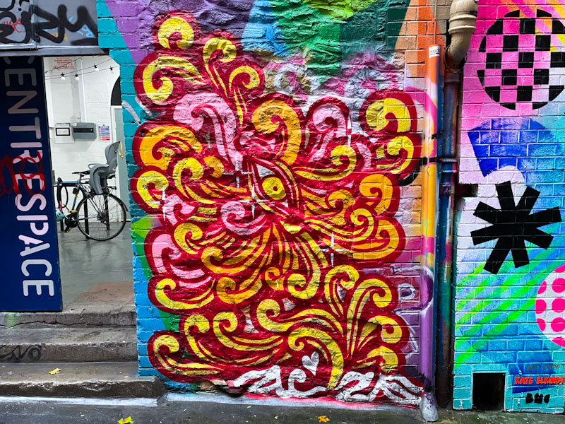
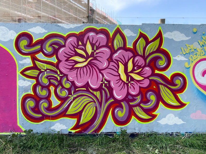
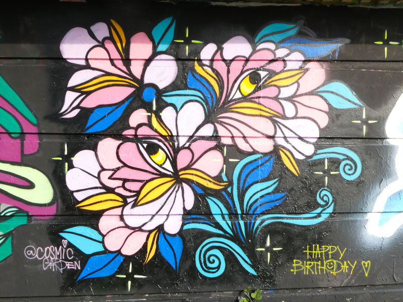
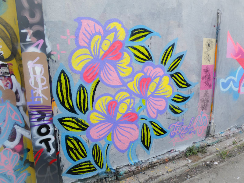
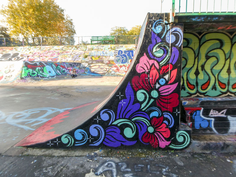
A gallery of amazing floral murals from the Bristol-based street artist and tattoo artist Peggy.
Instagram: @misspeggybrown
Website: misspeggybrown.com
all photographs by Scooj


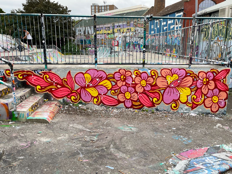
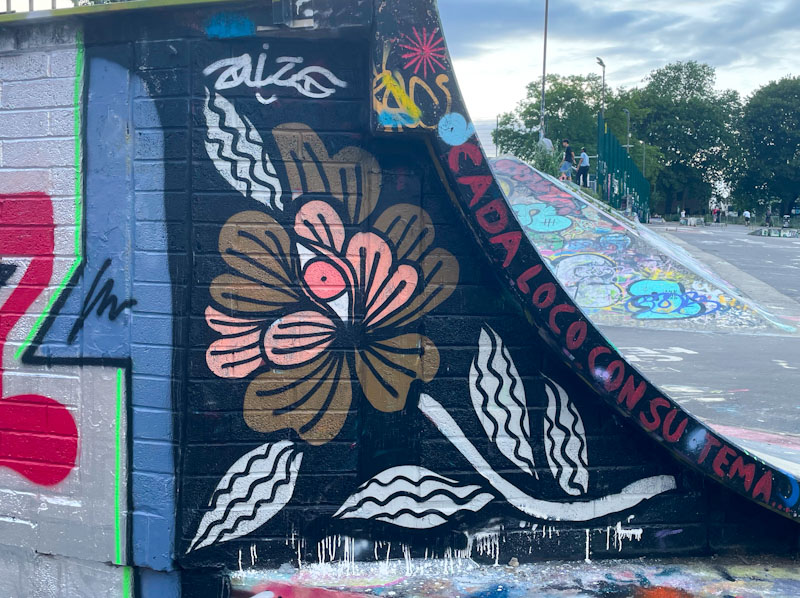

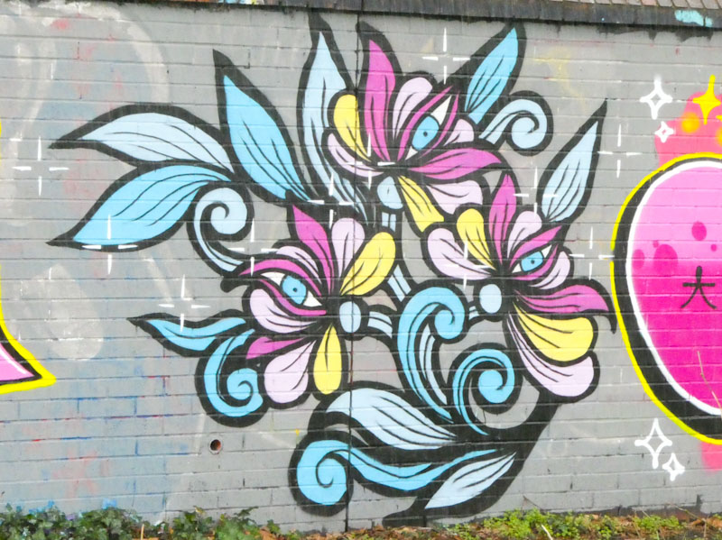


A gallery of amazing floral murals from the Bristol-based street artist and tattoo artist Peggy.
Instagram: @misspeggybrown
Website: misspeggybrown.com
all photographs by Scooj
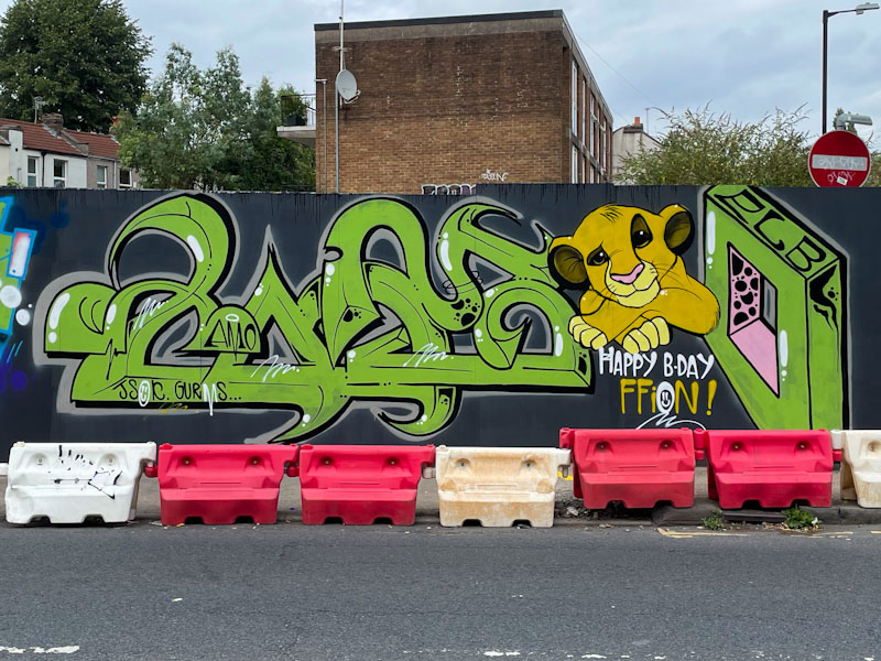
It is rare for new hoardings to remain unpainted or untagged in Bristol, and no sooner had these gone up around a new development site, than they were decorated with several throw ups including this fine anti-style graffiti writing and character combination piece by Taboo.
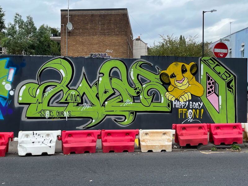
Taboo has been reasonably quiet lately, so this piece came as a very welcome surprise. As you can see it is a birthday tribute piece to Ffion, and includes a cute portrait of Simba from the Lion King Disney film. The writing, which is really on-point, spells out TABOO, of which the lion cub makes up the first ‘O’. I love the pink inside the second ‘O’, adding just another layer of interest.
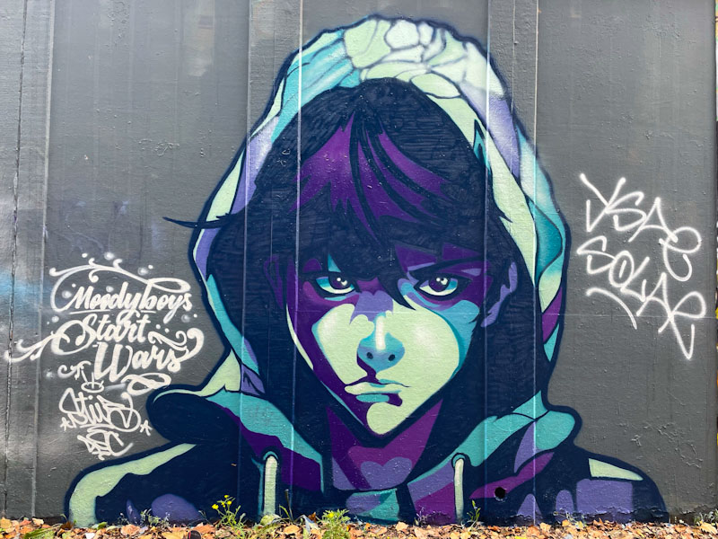
Stivs is something of an enigma, you never really know quite what you are going to see from him next. He is both an accomplished portrait and scene artist, as well as an exceptional calligraffiti writer. In this piece, he has created a wonderful cartoon book style portrait.
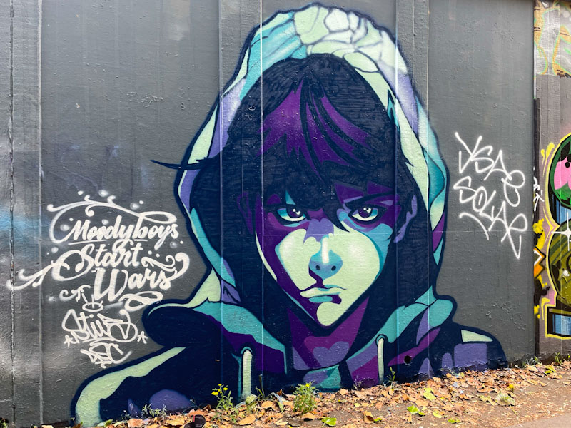
I took this photograph on my second trip to the wall, because the sun wasn’t quite right on my first visit. Unfortunately, by the time I returned, YSAE and Solar (one of them) had tagged it. At least they were respectful enough not to go over the portrait itself. The piece is called (I presume) ‘moody boys start wars’.

The artwork itself is exceptional, and it is one of the best renditions of comic-book style artistry I have seen, and at scale too. I have included a photograph I took on my first visit, which has no tags, but bright vertical strips of light where the sun has caught the wall and corresponding shadows. Phenomenal stuff from Stivs.
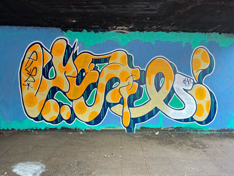
This is rather a special piece from Whysayit, because it is unusual to see anything by him quite as big and bold as this one, and to see his work on a (partially) buffed background. The anti-style letters spell out YSAE (why say), which stand out really well.

Although nicely finished, there is something quite raw about this piece, especially in the translucency of the orange colour, a colour, along with yellow, that can (depending on the brand of paint) be rather thin. I don’t know if he was running out of paint, or whether it is a feature, but the tail of the letter ‘E’ is finished off in white, in throw up style zigzags. The letters are finished off with a rather nice 3D drop shadow in dark blue with vertical green stripes and a clean white border. A very nice example of Whysayit’s work.
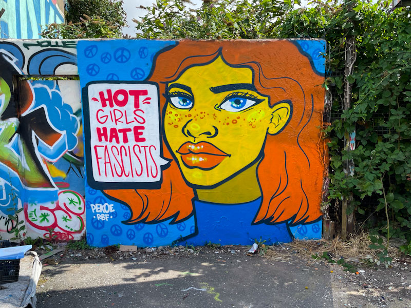
This amazing portrait piece by Pekoe is simply perfect. It appeared shortly after the far right riots that flared up recently in the wake of the stabbing of three girls in Southport. I won’t share my thoughts on the riots here, but I suspect that my feelings are consistent with the vast majority.
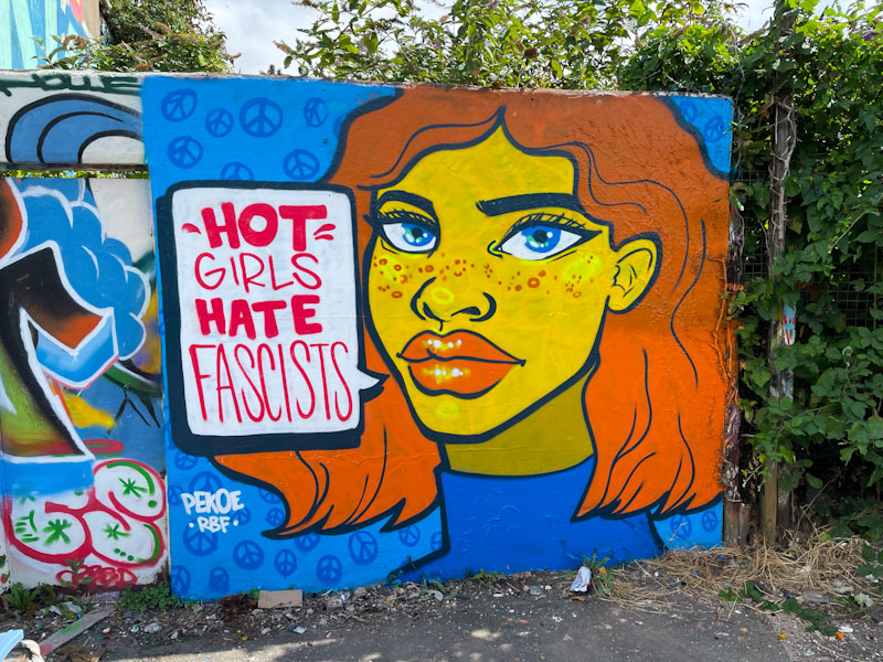
Pekoe has her own way of answering back at the far right thugs, by hitting them where it hurts, their ego, with a speech bubble that puts down fascism in a single blow, “hot girls hate fascists”. The words alone are enough, but she accompanies it with one of her fabulous portraits. The right piece in the right place at the right time. Bravo Pekoe.
Oh what a beauty from Dirtygypo in the tunnel. He has been writing all over the place with his characteristic letter style, but I am still no closer to having any idea what his letters spell out. The only way out of this particular conundrum is to bump in to the artist at some point and ask him.
This is a really colourful piece with each letter element containing a different colour fill, and there is a special treat in the letter that looks like a reverse ‘t’ with a mosaic of colour shapes creating interest and variation. This, like his other pieces, is lively and vibrant and a very welcome contribution to the Bristol street/graffiti art scene.

I haven’t seen an awful lot from Pl8o for quite a while, so it was really great to come across this recent piece in Sparke Evans Park. There is something rather different about Pl8o’s work that helps it to stand out from the crowd, and I think that can be attributed in part to the aesthetically pleasing letters P L 8 O… it just kind of works.

This is a bit of a cheeky one featuring a character who makes up the letter ‘P’ and who happens to be doing a fart. This is quite a common theme with street art characters and usually provokes a chuckle or two. The point about this piece is that Pl8o draws attention to to the gaseous emission with the text “is it art, or is it fart”. Great fun and skilfully done.

.
Lazy summer’s day
warmth reflected from the shrubs
peacock butterfly
.
by Scooj

L Dub (Lawrence Weston) is a funny old spot, really. It involves a 15-minute walk alongside the M5 motorway on a pathway which runs through a kind of brownfield site of scrub and thickets. The place is absolutely bursting with wildlife, which thrives in and around the drainage ditches, which I presume take excess water away from the motorway. It is interesting that these dilapidated ‘forgotten’ spots are often some of the most biodiverse in the country. The place is festooned with all sorts of interesting plants, dragonflies, beetles and butterflies,,, an unlikely nature hot spot.
It also plays host to a water pumping station which offers several walls for painting, and a pedestrian underpass which takes you under the motorway and some other roads and provides plenty of graffiti opportunities, for those that can be bothered to find the place. Acer One has recently painted a couple of pieces here, away from the crowds.
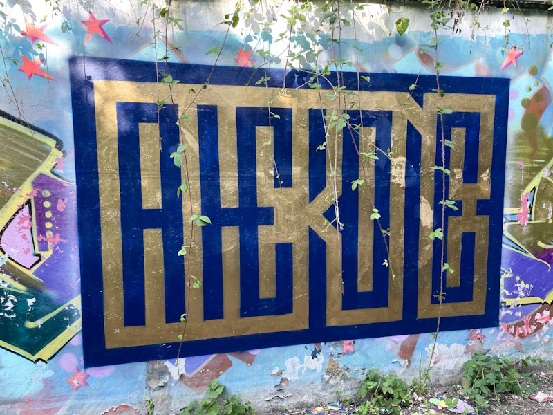
This is a complex piece, which demonstrates how his mind works (in his own words) and is also a little bit experimental. The letters spell out ACERONE, but are alternately coloured, so it starts with a dark blue A, followed by a gold C, then a blue E and so on. Fascinating stuff that can take a little while to work out and keeps those brain cells ticking over.
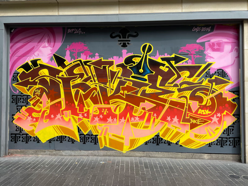
It is always great to see work by Inkie, but especially so when outside Bristol, it feels like a home from home. This is an outstanding piece of writing with some flat pink, stylised portraits and silhouetted urban landscape in the background.
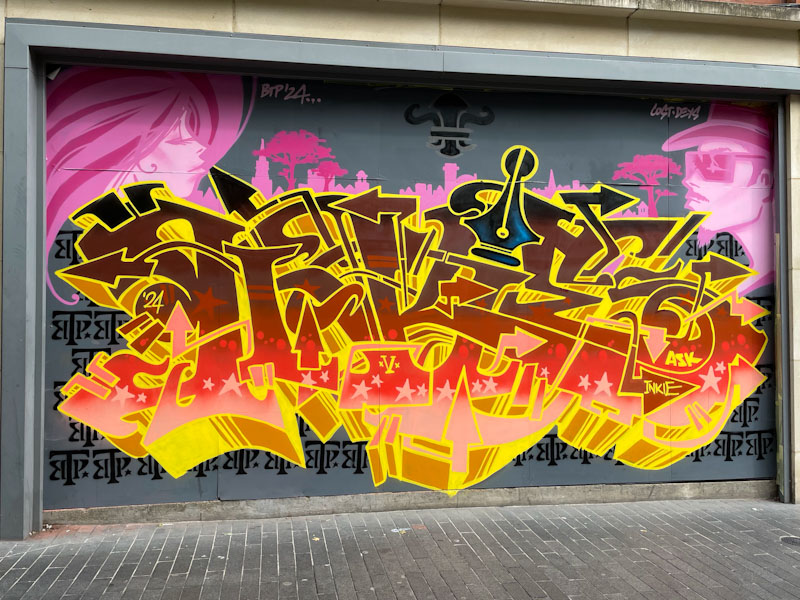
The letters BTP, which form a kind of print backdrop, stand for Bring the Paint, a street art festival hosted in Leicester every now and again. This piece was painted by Inkie for this year’s festival, and accompanies others that he has painted in previous festivals here. This a really nice, tight graffiti writing, and a superb example of Inkie’s work.


