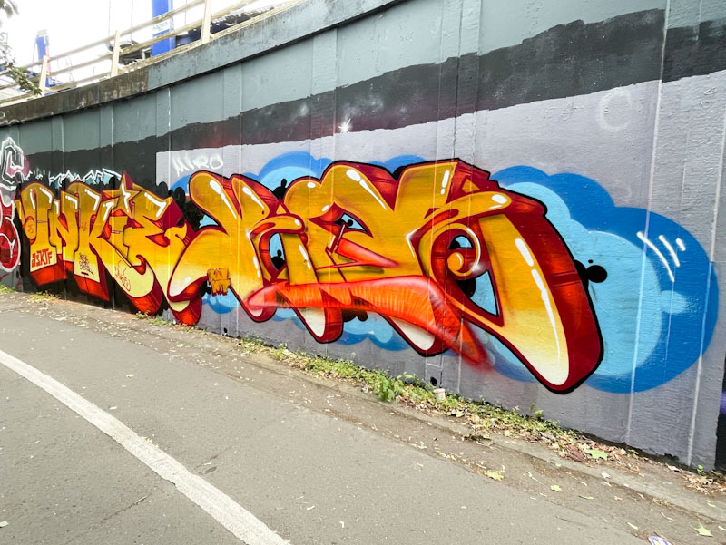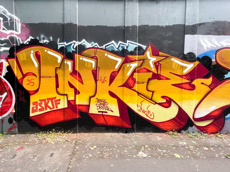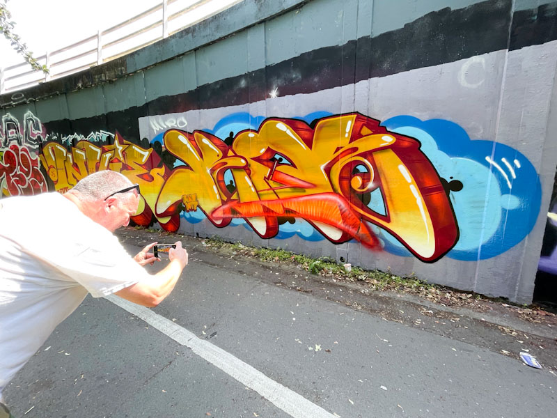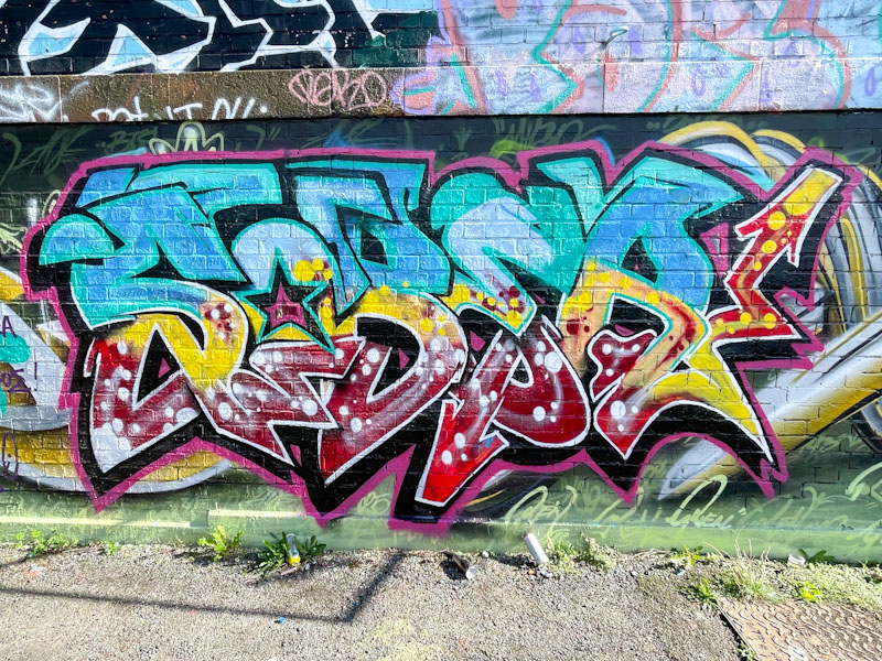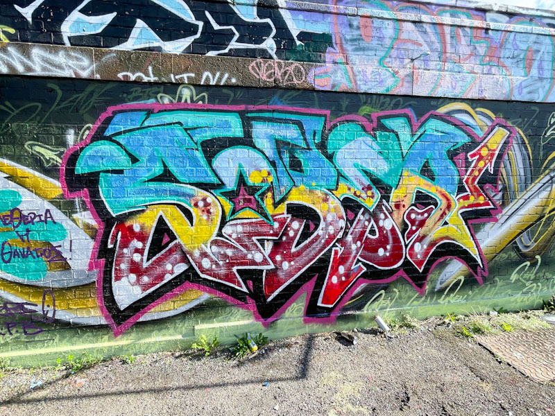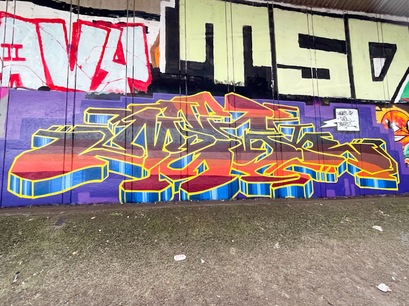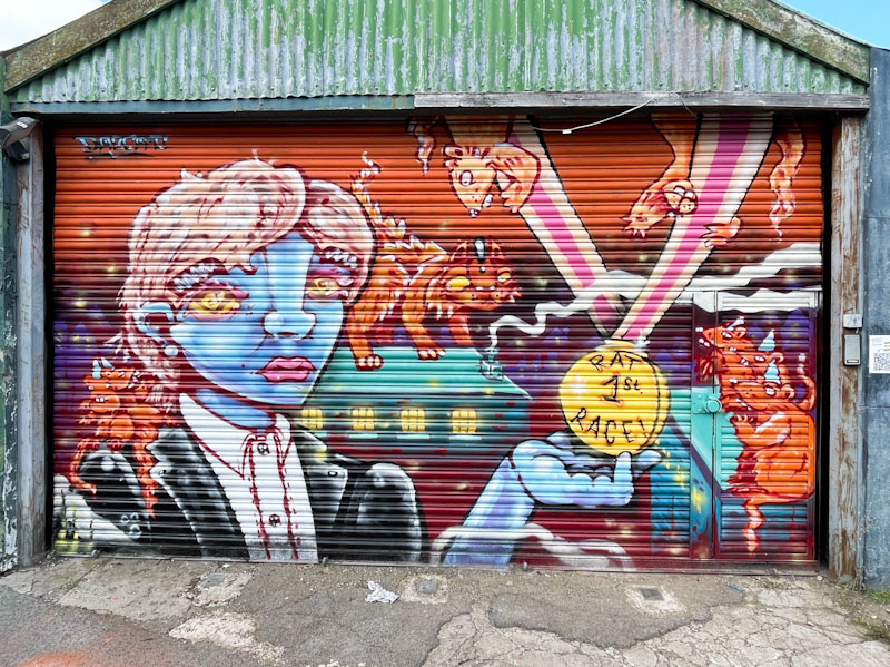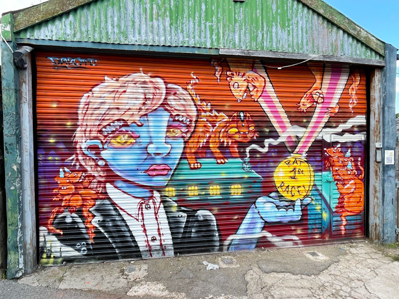
It has been great to see a small burst of activity from Zase in recent weeks. Zase is arguably Bristol’s best anamorphic graffiti writer and here he has collaborated with friends, Real143 and Mysobastarts.

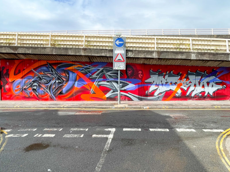
To the left Real143 and Zase have painted two extraordinary anamorphic pieces that are set on a red background, both with extraordinary detail and elements that deceive the eye into thinking the letters are popping from the wall. Both anamorphic, each in a different style.
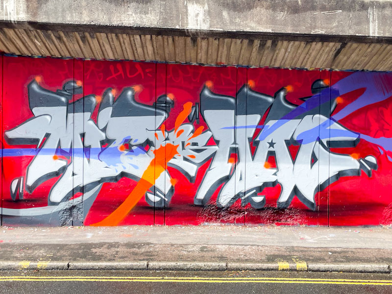
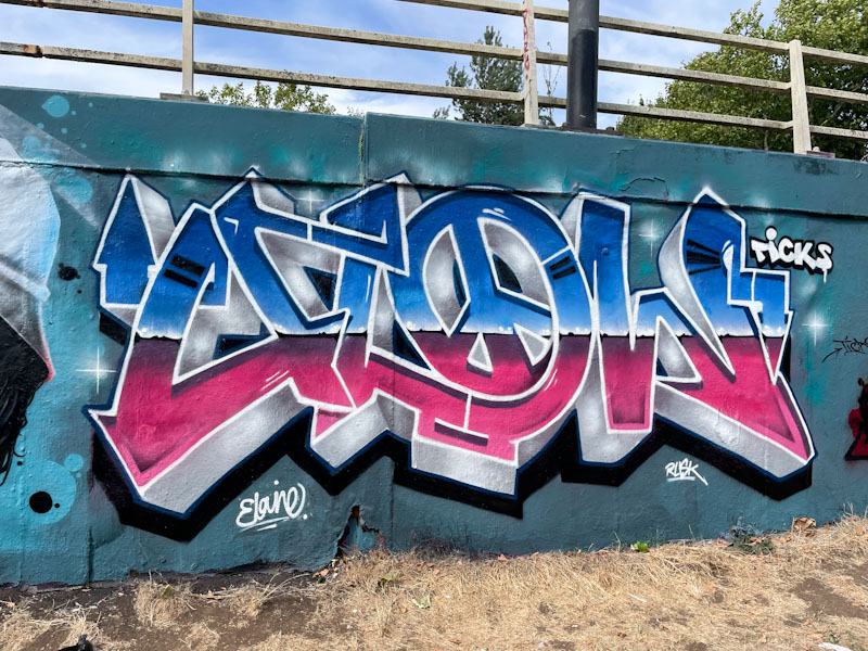
To the right, Mysobastarts has written some flatter letters filled with three horizontal colour tones and decorated with magnificent splashes of red and blue colour, consistent with the other half of the collaboration. I am not certain what the letters spell, but it looks like ‘mic hag’. All in all, the whole collaboration is as tight as it is possible to be. Fabulous.