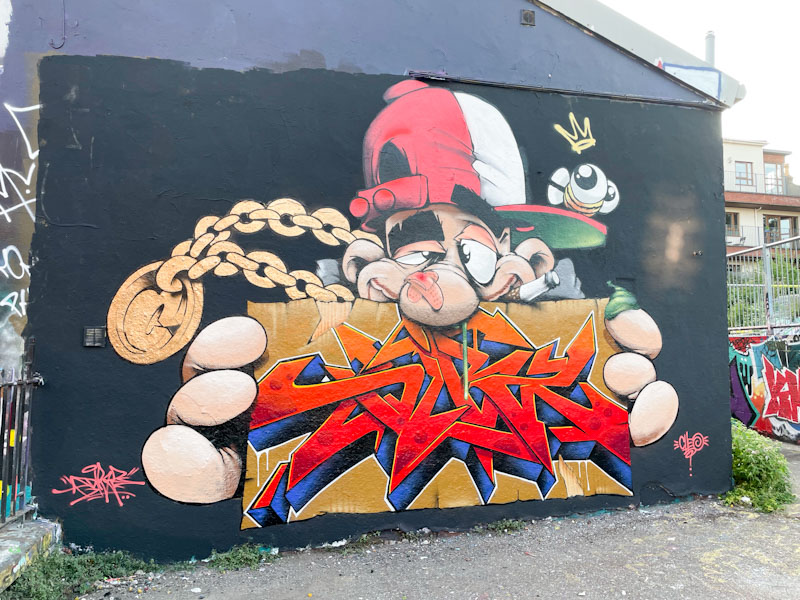
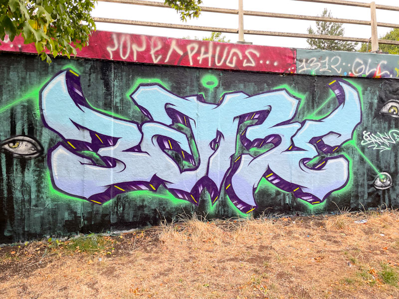
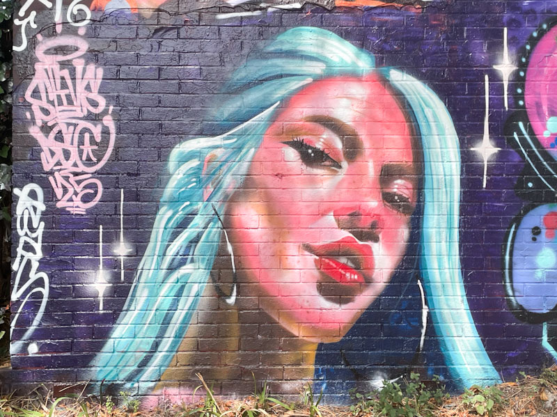
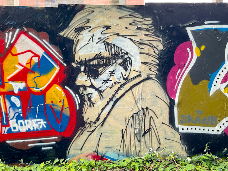
I can’t think how many times Dibz and Fade have teamed up in the last couple of years, but it must be into dozens, and this piece shows the true nature of total collaboration, where both artists created this incredible work together, and it isn’t possible to know who painted what. Lots of crew shout-outs are scattered around the outside of the piece in pink. Wildstyle writing at its best.
The piece spells out, rather appropriately, ‘Wild Style Addicts’ which probably sums up these two rather well. The gold and purple colours complement one another well, and it all looks very neat and tidy on the black wall.
I will have mentioned that Zinso has been rather busy of late, and also that he appears to be relatively new to Bristol. How wrong am I? I was looking through archives and noticed that I have posted pieces by the artist way back in 2019 and 2020, but those were character pieces and not writing. I can’t believe that in the intervening years I haven’t noticed his work, so have to assume that he has found a new burst of energy and time recently
Zinso, Dean Lane, Bristol, June 2025
This is a rather neat piece of bubble writing with a really deep 3D drop shadow, lifting the piece nicely off the wall. The piece is really nicely finished and greatly superior to most bubble writing that I see, that is usually associated with quick throw ups. Loads more to come soon, and below are a couple of his pieces from a few years ago.
Zinso, Brunel Way bridge, Bristol, January 2020Zinso, M32 Spot, Bristol, November 2019
I wish I had photographed this piece before it got tagged up at the base, because it is another truly classy column piece by Silent Hobo underneath the M32. I have noticed that many of Silent Hobo’s recent pieces have a rather melancholic tone, and I wonder if he is expressing himself through his art and the stories it tells.
Silent Hobo, M32 Spot, Bristol, June 2025
In this piece, a young man is looking rather sad, and has a wooden stake piercing his heart. I would interpret this as being heartbroken, but perhaps I am reading too much into it. What I can say is that Silent Hobo’s portrayal of Bristol youth and their preoccupations and joys is unparalleled.
These are three small boards outside a café on Narrow Quay, which I assume are commissions, or at the very least, permitted by the establishment. The artist is #DFTE and illustrate perfectly his philosophical musings delivered in his singular letter style with plenty of drips.
#DFTE, Narrow Quay, Bristol, June 2025
The first declares “love you too” presumably in response to a statement. The second is s little more challenging, and is perhaps a great reflective motto, “Don’t believe everything you think.
#DFTE, Narrow Quay, Bristol, June 2025
The third board in this trio, “Your anxiety is lying to you” is, I think trying to be helpful, but to anyone who suffers from anxiety, it probably just confuses and upsets – I can imagine tying oneself in knots over that statement. These original pieces represent a great way of integrating street art into our everyday lives. Nice work from #DFTE.
Doors 317 – Doors of Godalming, Surrey, March 2025 (Part III)
A quick one this morning as I haven’t left myself much time to write. This is the third selection of doors from Godalming, a small town in deepest Surrey, a place that on the face of it is reasonably affluent, and definitely has some lovely buildings dotted about the place. I hope you enjoy these doors:
Blue door and high chimney stacks, Church Street, Godalming, March 2025Yellow door, Church Street, Godalming, March 2025Blue door and covered passage, Church Street, Godalming, March 2025Door with large hinges to St Peter and St Parl’s church, Church Street, Godalming, March 2025A pair of inset doors, Church Street, Godalming, March 2025A rather nice blue door with fanlight and lamp, Church Street, Godalming, March 2025Unusual wide and low door, High Street, Godalming, March 2025A classy old studded door, High Street, Godalming, March 2025Shopfronts and doors in the early evening, but it is those windows that are really special, High Street, Godalming, March 2025
I rather like this selection of doors and the range of periods, but that last building is a beauty in my view. Here is an excerpt from a website called Geograph, about the building:
Godalming High Street: Nos. 74-76
I was puzzled by this building. A date-stone says 1663, but at first glance I thought that unlikely – probably because I was taken in by the honeycomb glazing bars.
Later, dipping into the Surrey volume of ‘The Buildings of England’ I found Ian Nairn having one of his rants: ‘Nos. 74-76 . . . coming right at the end of the C17 Artisan tradition of brickwork in Surrey, and a deplorable end too . . . All sense of proportion, and even of picturesque outline, is gone’. He makes the useful point that the window design is of 18th century origin – lifted from one of Batty Langley’s pattern books.
Nairn goes on to concede that (along with No. 80, somewhat similar) Nos. 74-76 are ‘good fun to have in a town’ – even if they lack architectural merit. My own view would be that brick-built structures dating from the 1660s are pretty rare in a small-town context, and we should be grateful for those that survive.
So That’s it for this week, more to come from Godalming next time.
If you have made it this far, you probably like doors, and you really ought to take a look at the No Facilities blog by Dan Anton who has taken over the hosting of Thursday Doors from Norm 2.0 blog. Links to more doorscursions can be found in the comments section of Dan Anton’s Thursday Doors post.
This is a wonderful old school combination piece painted at the L Dub spot by Turoe, although I think that the character might be by Veks. Everything about this oozes class and experience.
Turoe and Veks, L Dub, Bristol, June 2025
The character wearing a baseball cap has been buffing the wall with a roller, thus indicating a form of self-portraiture. The letters, spelling STYLE are perfectly filled with blended horizontal shades transitioning from purple through red and orange to brown. A striped 3D drop shadow rounds off this piece off nicely and create a metallic sheen effect.
Mage and Piewaste, Stapleton Road, Bristol, June 2025
This is one of those stacked collaborations that have to be taken as a pair, because separating them might look a little bit awkward. I am not 100% sure that it was painted as a collaboration or whether both artists painted their pieces separately, but you can see that Piewaste’s piece overlaps Mage’s piece above it, and was therefore completed second.
Mage and Piewaste, Stapleton Road, Bristol, June 2025
Mage has presented a regular set of letters, but with a creative fill that includes a dashed line pattern reversed out. It is great to see an artist reinventing himself in the way he has with a completely new set of letters, although I have to say I preferred his old letters.
Piewaste, who has written WASTE in letters that are close to anamorphic, creating a strong sense of depth and three dimensions, also includes his trademark eyes looking out from the writing like a cartoon forest at night (kind of thing). Nice to see these two pieces together like this.
It seems today that it is all about Hypo – the previous post was a birthday tribute to Hypo from Subtle, Ulow and Minto, and this is one of his very own pieces from L Dub. Hypo has had a purple patch that has been continuous for about two years now and shows no signs of abating.
Hypo, L Dub, Bristol, June 2025
The letter blocks in this piece are each assigned a different colour, and have a lot of strong graffiti writing motifs, such as the arrows and little double bars, stitching the letters together. It is interesting to note how different the ‘H’ and the ‘O’ chrome letters look quite different due to the different colour drop-shadows. Another nice piece from Hypo.
Subtle, Ulow and Minto, M32 roundabout, Bristol, May 2025
This fine trio of pieces was painted as part of Hypo’s birthday celebrations, and brings together Subtle, Ulow and Minto – quite a line-up. There is a whole lot of colour and talent on display, marking out this section of wall as being a bit special.
Subtle, M32 roundabout, Bristol, May 2025
To the left, Subtle has created a masterclass of colour and design, with some wicked letters spelling HYPO, set on a fabulous red background with pink spots, looking like wrapping paper around the writing. Outstanding stuff.
Ulow, M32 roundabout, Bristol, May 2025
We don’t get to see Ulow’s work all that often, so it is always a great pleasure to come across one of his characters. The superb presentation of different tones and shades create a wonderful 3-dimensional effect as if the character is walking straight out of the wall. A combination of simplicity and complexity all in one character piece.
Minto, M32 roundabout, Bristol, May 2025
Rounding off the trio is this busy piece of writing from Minto. The style here has as much to do with what is absent as it does with what is present, a little bit like Benjimagnetic’s writing. Lots of colourful splashes and unfilled spaces combine to spell out MINTO, in a complex arrangement. Altogether an outstanding collaboration. Bravo!
The emphasis of this post will walk through how augmentation works. In street art circles, augmentation (adding to an existing piece) is relatively rare and can be considered as a little insulting to the original artist, or lacking in creativity. On the other hand, it can be seen as flattering and complementary to the original work. Here is a wonderful example of a piece by Mr Klue that has been augmented by Posh.
Mr Klue, St Werburghs, Bristol, May 2025
This rather nice purple ‘KLUE’ abstract writing has been hanging around at the entrance to the tunnel for quite a while, which doesn’t really come as much of a surprise as he kind of ‘owns’ this spot, by occupation at least. The purple is beautifully picked out with white and yellow highlights that create wonderful depth to the piece. Now all is just fine and dandy, and then along comes Posh!
Mr Klue and Posh, St Werburghs, Bristol, July 2025
Quite a while after this piece was painted by Mr Klue, Posh came along and added into it three posh characters, in yellow, picking out some of the colour in the original piece. These ‘toffs’ have a strong political message, one that picked up a lot of coverage at the Glastonbury Festival, ‘Death 2 the IDF’. Once again, street art acts as a wonderful commentary on contemporary issues, and has an important role to play in free speech and expression. This is a great example of how augmentation can work really well, and Mr Klue thought it was rather funny.