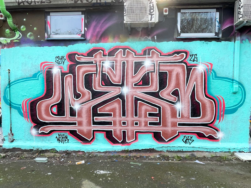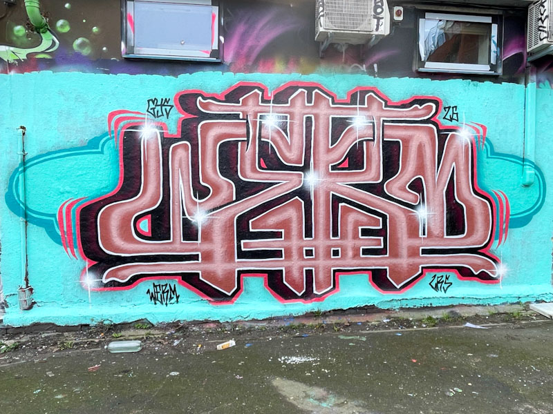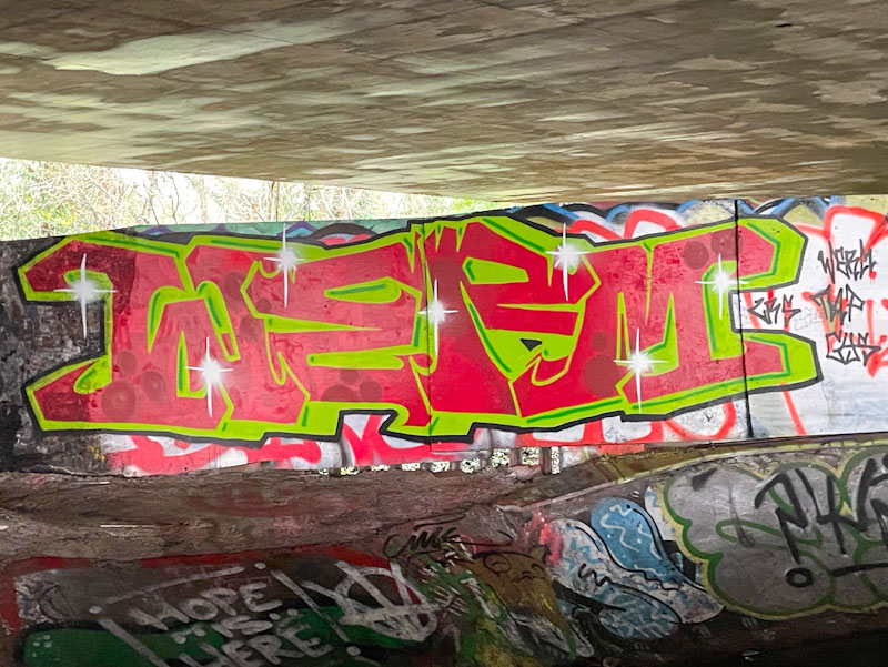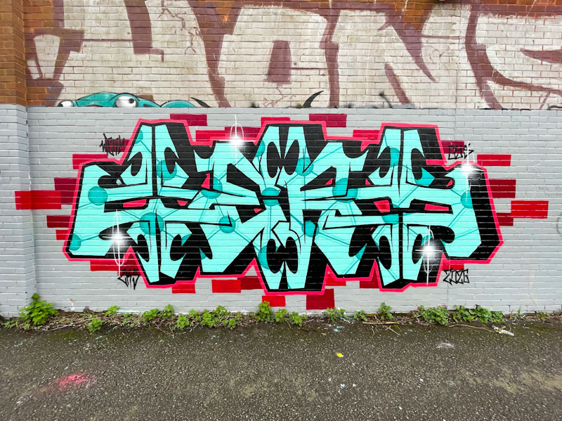
Werm has been on fire this year, turning out a variety of tight pieces, each with a slightly different look. This piece brings us back to his favoured structural letter style with a solid bilateral symmetry.
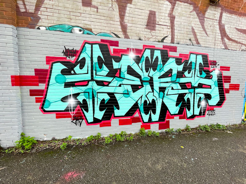
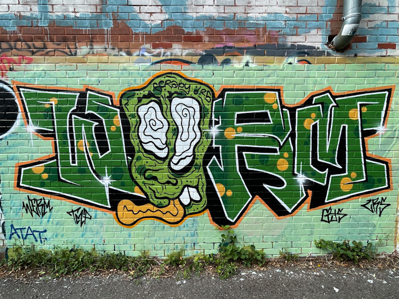
What makes this one stand out for me is the superb colour selection and freshness of the piece. Everything is near perfect. The letters are beautifully proportioned. The turquoise fill with its contiguous pattern of blue circles joined with lines has a molecular model feel to it, and is simply amazing. The red border is regular and clean and the piece sits on a beige buffed wall with superb red bricks randomly distributed. A very classy piece from Werm.