
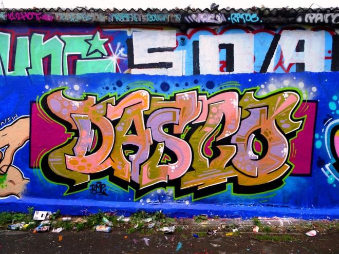
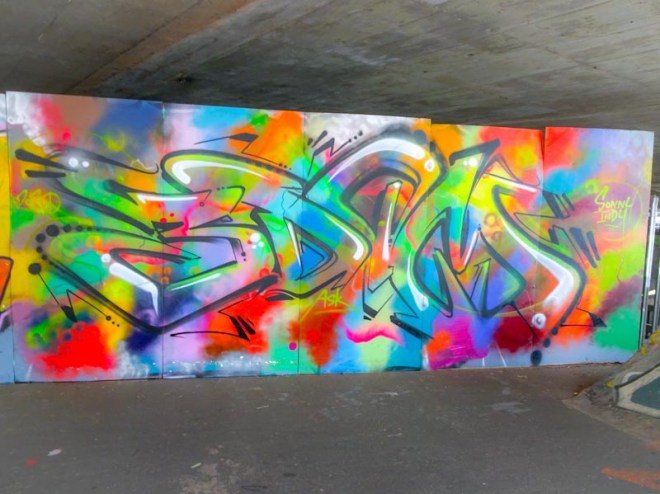
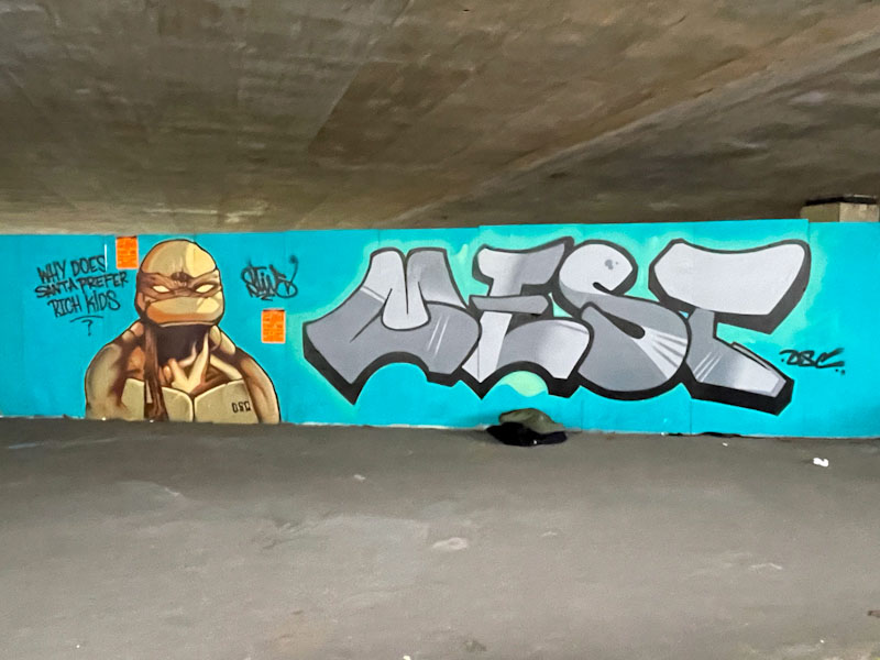
A gallery of incredible graffiti writing and character work by Dasco, who will be remembered for the outstanding pieces he painted in Bristol before returning to Spain.
All photographs by Scooj

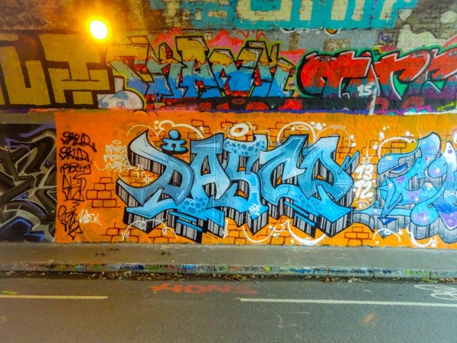
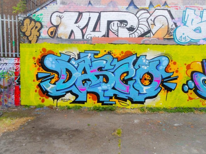
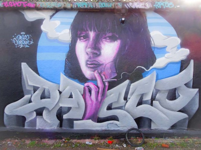


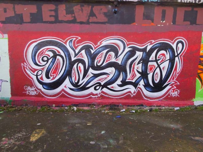

A gallery of incredible graffiti writing and character work by Dasco, who will be remembered for the outstanding pieces he painted in Bristol before returning to Spain.
All photographs by Scooj
Not many artists are painting the long wall at Sparke Evans Park these days, since the arrest of an artist about six or seven months ago. Slowly but surely people are drifting back to the wall, but unusually for Bristol, having to keep their eyes peeled and wits about them at all times. This is a great pity, because this would be a perfect candidate for a legal wall. There is no tagging here, and the colourful wall is an added attraction for people who use the park for recreation. It has become a bit of a ‘wall of fame’, well respected and curated in a self-policing manner.
This far end of the wall was recently painted by Face 1st and Soap in one of their PWA pairings. To the left, Face 1st continues to explore different ways in which he can slice a face up. Very rarely for the artist, he has not tried to work in the letters FACE into the piece, rather he is focussed on the task in hand, the slicing.
Soap too continues to explore a theme he has been enjoying recently, spelling out his name with the ICE King for an ‘A’ and a Face 1st face for the ‘A’. Although the colours the artists have chosen are a little muted on a dull day, they are nonetheless attractive and have been beautifully worked into both pieces. Great to see something new on this wall.
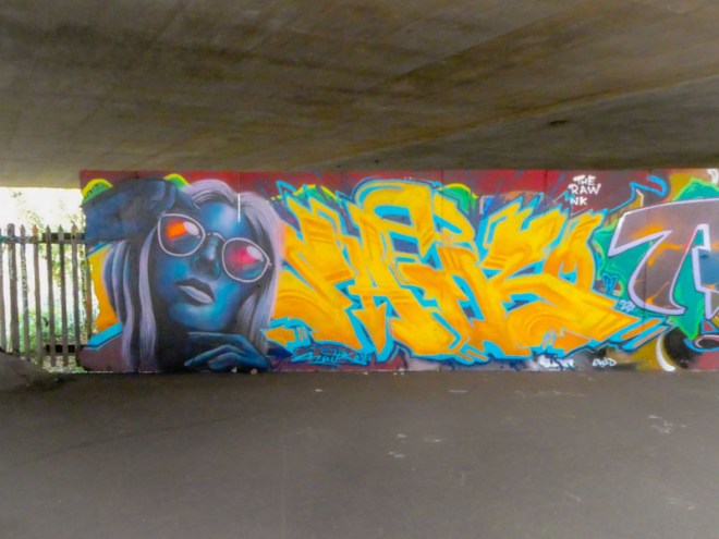
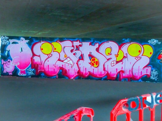
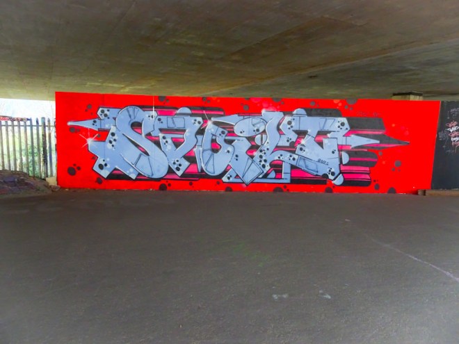
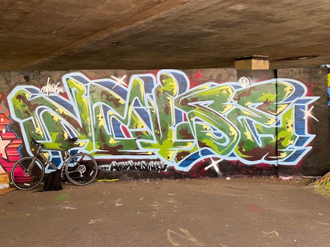
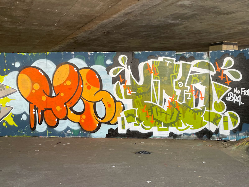
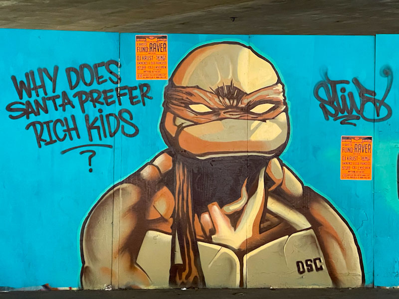
I took these pictures a short while ago, but held back on publishing a post because I couldn’t work out who the artist was. It took me a long time to work it out, but I got there in the end. I’m not sure I have seen his work before in Bristol, but it is clear that Saik0134 is a hugely talented artist, and is welcome back anytime.
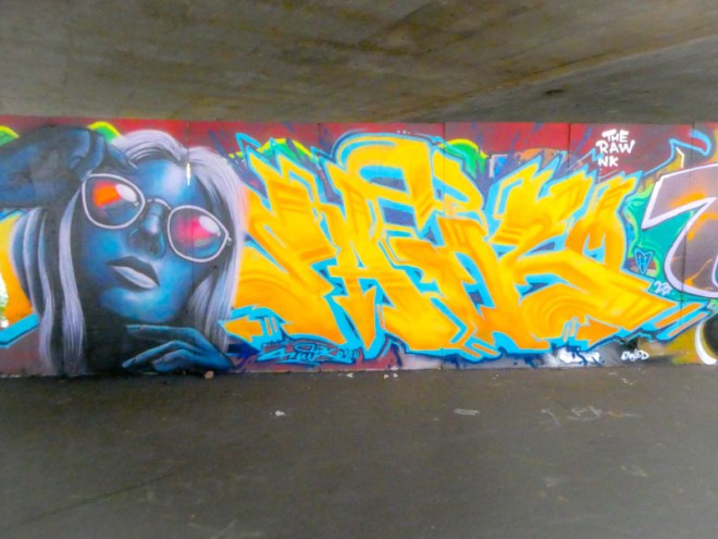
Painted on one of my favourite walls in Bristol, this portrait/writing combo stands out from the crowd. The bright lettering and striking portrait are real attention-grabbers. Even though the piece is not painted on a buffed wall, it doesn’t seem to matter too much, with the piece occupying nearly all the space. The letters spelling SAIK are nicely done in yellow and orange with light blue drop shadow, but for me it is the portrait that is the trump card.
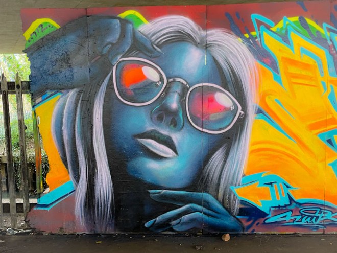
The eye is drawn immediately to the woman’s glasses, reflecting the light, a clever street art technique, and she is beautifully painted in shades of blue and grey. This is a fabulous portrait piece, and I would love to see more from the artist in Bristol, or anyone else for that matter. This artist is not to be confused with another who used to paint in Bristol called Saik One.
Looking at a single wall and how it changes over time.
3. Long hoarding at the top end of the M32 Spot


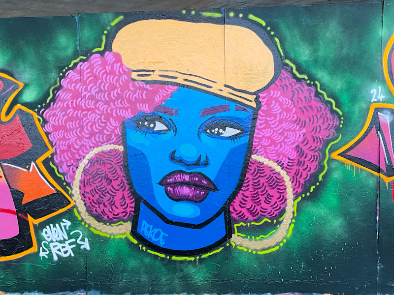
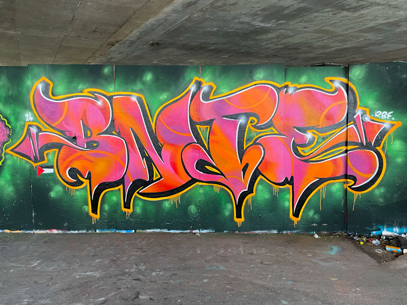


Some things work so well together, strawberries and cream, Morecambe and Wise, Pekoe and Bnie. These two from the Resting Bitch Face (RBF) crew seem to have a great rapport, which rubs off when they collaborate.
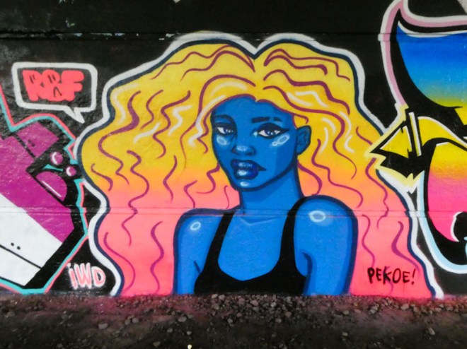
This pairing was painted alongside Wispa, but I decided to post them separately as these two followed a strict colour scheme. To the left is a really fabulous portrait piece from Pekoe, which includes an upper torso, something of a rarity in her work. The hair is fantastic – I absolutely love this piece.

To the right is some outstanding technicolour writing from Bnie, beautifully designed and executed. The piece is totally on point, and I love the clever touch with the outer border, which is pink and white along thee top, and blue and white underneath. This is a nicely thought out and eye-catching piece.

This magnificent piece by Werm was painted some time ago, but the light conditions were never right each time I photographed it, with dappled sun and shade being the main culprit. Recently, on an overcast day, I managed to catch it in its full glory. The wide-angle setting on my iPhone has also made capturing pieces in narrow spaces a whole lot easier.
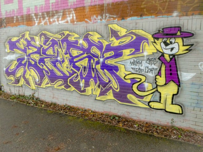
Werm has come so far in a relatively short space of time, and this is a really high-quality graffiti writing and character combination. The intricate letters, spelling WERM are perfectly balanced with a superb Top Cat character, an absolute favourite when I was growing up. I am glad I persisted with this fine piece from Werm.

It is possible, in fact it is absolutely the case, that in documenting street art and graffiti, one can have a blind spot, and believe me I have had many over the years. This particular blind spot relates to the work of Raid, whose work I simply hadn’t registered until I met the artist while he was painting this piece in Dean Lane a little while back.

Of course, I have since found two more of his pieces, and I suspect there are plenty in my archives – something else to look out for next time I go archive-surfing. What makes my omission even more crazy is that this is the work of a superb writer. His letters are beautifully presented, and have a good proportionality about them. The lines are nice and sharp and fills solid, and his wispy decorations add a touch of flair. Watch this space for more from Raid.

I follow Wispa (Willo the Wisp) on Instagram, and it seems that not only is she talented and prolific with her art, but she seems to travel extensively to paint with friends wherever she pitches up. Fortunately, she appears to have some RBF friends in Bristol, and we are treated to her work every now and again.
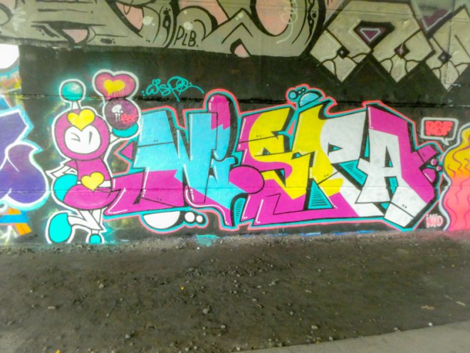
This piece under Brunel Way is a real cracker, with so much to enjoy. The first impression is how bright and colourful the piece is, but it is so much more than that. The fills in the letters are strong and the lines between colours straight and sharp. Of course, the character on the left tops the piece off beautifully, but it would be just as strong without it, demonstrating the quality of her writing. I hope she returns soon, although there is a little extra piece she painted on this visit.
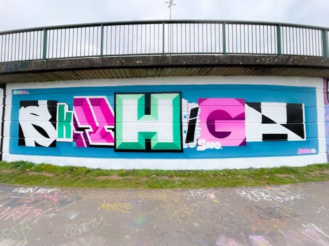
Back to the here and now, I bring you this magnificent large piece from the visiting SkyHigh. Although it was only painted a few days ago, it has already been painted over, which I have to say I find a little disrespectful, but I guess most graffiti writers don’t know how long the piece they are overpainting has been there. Some though are resentful and malicious and deliberately target work superior to their own to exert some kind of childish power… when that happens we are all losers.
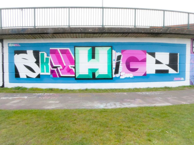
Sky High has absolutely nailed his style of writing, choosing different block styles for each letter of the word. He also manages to keep everything so clean and tight, even down to the white frame for this piece.

The colour selections are great and there is an element of symmetry in their deployment. I particularly like the style of the ‘Y’, which I think is probably the most challenging letter technically in the piece. I’m already looking forward to his next visit to Bristol (with Roo, of course).
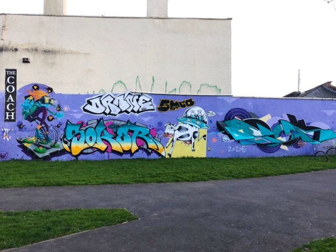
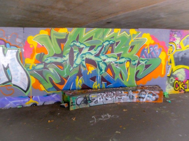
How, oh how, did I manage to overlook this piece for posting? I surprise myself when trawling through my archives and I find stuff like this, and it is also quite a pleasurable experience, because it gives me the perfect excuse to talk about some outstanding artwork. This long wall is a collaboration masterclass from 3Dom, Soker, Sepr and Epok which dates back to February 2021 (actually that is when I took the pictures, I think the artwork had been there for some time already).
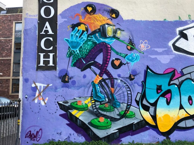
First up is this amazing character piece from 3Dom, featuring an unicyclist juggling bombs, with his arms weighed down with lead wights, and avoiding landmines. I imagine that this is a metaphor for the tightrope we are navigating as individuals, as a nation and as humanity itself. At least this is how I read it. As we would expect, it is beautifully painted.
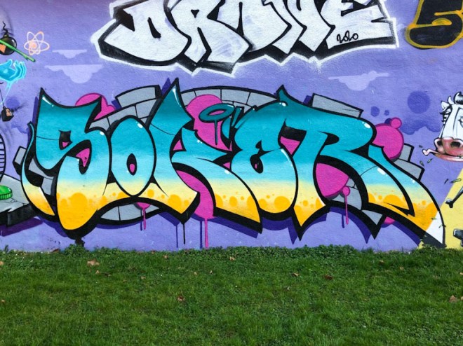
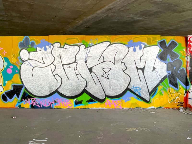
The second piece is some incredibly tight graffiti writing from Soker, one of the very best writers around. It is especially gratifying to dig this piece out from the archives, because he is going through a rather quiet period at the moment.

Next up is the magnificent Sepr with a whole story unfolding. Aliens in a spaceship are trying to drag a cow into the sky, but finding the going difficult. The aliens are contacting their base with the words, “Easton… we have a problem” – a local corruption of the famous quote. Brilliant and witty.

Finally, we have something of a rarity, an amazing piece of writing from Epok. I can’t think when I last saw a new piece from Epok, but this must have been one of his last in Bristol. I hope that the break in his productivity will at some point come to an end and that he will once again bless us with his unique geometric designs. What a collaboration, and what a wait.


