
A gallery of bold and beautiful writing from Bristol’s Evey
Instagram: @evenrbf
RBF Crew
All photographs by Scooj


A gallery of bold and beautiful writing from Bristol’s Evey
Instagram: @evenrbf
RBF Crew
All photographs by Scooj

The turnover at Sparke Evans Park is very slow these days, and the chance of meeting artists actively painting there is minimal, however that is exactly what happened when Evey, Peggy and Desi were painting this wall a short while ago. Of course, I had to go back again to get clean pictures of the completed wall, and what a wall it is.

To the left of the three is a gorgeous EVEN from Evey, painted in the pink and blue colours replicated through the collaborative effort. There are some nice letter shapes and a band of horizontal fades running through the letters, which are given a little bit of extra interest with squiggles, hearts and a peace sign.
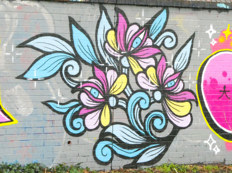
In the middle is a wonderful floral design from Peggy, picking up hints of the pink and blue theme, and adding in some yellow touches to lift the design further. Each of the flower heads contains a signature eye peering out. The style of strong black lines and colourful fills betrays her tattoo art background.

To the right, Desi picks up the bold lettering and colours and in part reflects Evey’s work, although there is a subtle difference in the patterning, with both colours appearing in each of Desi’s letters and alternating top and bottom halves from one letter to the next. The whole wall by these three ladies recognised International Women’s Day, and what a fine way to celebrate it.

In Bristol, we have several what I would call ‘occasional’ artists, who are accomplished in their own right, but simply don’t paint walls all that often and Serm would fall into that category. For example, I have only spotted five of his pieces since February 2021, and although he may have painted more than that, his pieces are few and far between.

The great thing about these occasional writers is that it is always extra special when you do come across a piece. Serm tends to paint large block letters, which he has done on this occasion with a yellow background and shades of purple and lilac in his letter fills. There is a strong sense of industry and solidity in the piece looking like it would weigh a lot if you could pick it up. A few more years, and I might have enough Serm pieces to cobble a gallery together.

Now this is a proper mash-up collaboration, a conflation of two distinct styles from two outstanding artists, Benjimagnetic and Hemper. It is rare to find something of this nature where the artists fully collaborate so that the whole piece is one, and not two.
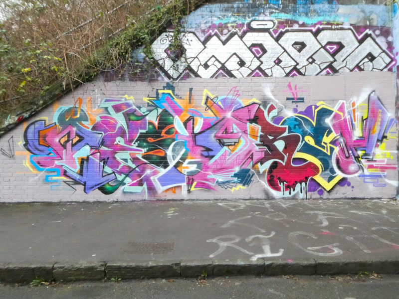
Although it is one combined piece, it is possible to disentangle which artist painted which bits. Broadly speaking the letters with straight bits and geometric elements are by Benjimagnetic, and the more curvy elements are likely to be by Hemper. It doesn’t really matter who painted what, because the end result is a wonderfully complex piece of writing that is jam-packed with great artistry.

This is a rather classy piece of writing from Wxttsart which was painted alongside a stunning portrait by Rozalita, and both of them stand out, with red being the dominant background colour used.

As always, Wxttsart’s work spells out MILK, although up until recently I have had difficulty in describing the letter style. I think I have almost cracked it though. The uniformity of the letters and stylised script font suggests that the work could be described as calligraffiti, but it also has a slightly abstract feel to it too, so I like to call Wxttsart’s artwork ‘abstract calligraffiti’, which works for me. Whatever you want to call it, it has an impact. Almost time for a gallery of his work – watch this space.

When this piece was painted, it was the fourth by Mr Klue in a row. That sequence has now been broken, with the first piece having recently been painted over. It is something of a miracle that he had four joined pieces in the first place.

Painted in his wispy abstract style, this KLUE writing has a fabulous colour scheme, picking up like green and shades of purple and pink, with white highlights on the upper part of the word. Truly inspiring and thoughtful stuff from Mr Klue.

This is the second of two ‘lost treasures’ that somehow got stuck in my publishing system from January, and which continues to be a bit of a mystery to me. It is a stunning and bright piece by Smut, and a great reminder of his outstanding talents.

Smut always creates arresting pieces with bright bold letters and the cleanest finish of any artist in Bristol. His work is always immaculate and precise, and a benchmark for others to strive for. The black letters, with a white 3D shadow and border, are interrupted by a school of pink ovals passing through, with an element of ‘transparency’ where they drift in front of the black lettering. Brilliantly conceived and executed.

I’m not quite sure how it happened, but this piece and another one somehow got stuck in my publishing conveyor belt. Human error, of course, but I have managed to recover the mistake and bring you something a little different from Logoe, painted back in January.

Logoe’s letters are usually in a rather scratchy script form, but for a change he has presented us with fat, nicely rounded letters. Perhaps he was having a Rubensesque moment. The signature feature of a scattering of colourful oval dots in a horizontal row identifies the piece as one of Logoes (which of course the writing does too). Very nice to see something a bit different.

This is a really classy piece by Klashwhensober, which reveals a raw talent combined with dedication from the artist, developed over the last couple of years. The writing is not as busy as many of his pieces and feels like a moment of clarity, or a pause, in his rapid-fire execution of ‘SOBERs’.

There is a reason that bees and wasps adopt the black and yellow colours, which is to advertise their stinging capability and ward off predators. The colour combination cuts through the chaos of colour all around us. The letters are set on three bubbly patterns in blues, greens and purple/orange, which break through the letters at certain points. It is the SOBER that is the star of the show though painted in a thin yellow font, with a beautifully proportioned black 3D drop shadow, which works so well to create depth to the letters. This is a confident and strong piece from Klashwhensober, one of his best yet.
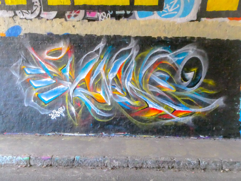
Mr Klue has been smashing it in the tunnel this year, and at the time of writing has five pieces there, all of them intact, four of which are adjacent to one another. This is a really unusual state of affairs for the tunnel and speaks to two things; his work is respected and; he manages to paint frequently enough to gain a space advantage over other artists.

This wonderful abstract writing piece picks up on warm and cold colours competing for space, with the bluer colours being top lit and the warmer ones under lit. Spelling out KLUE, the piece also incorporates some floating steps, which are a favoured theme in many of his pieces and sketches. More to come from Mr Klue.


