
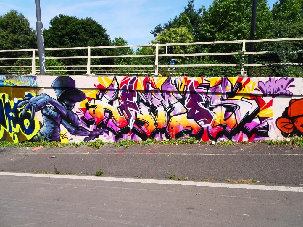
A gallery of brilliant graffiti writing pieces from Bristol-based artist Hemper
All photographs by Scooj


A gallery of brilliant graffiti writing pieces from Bristol-based artist Hemper
All photographs by Scooj
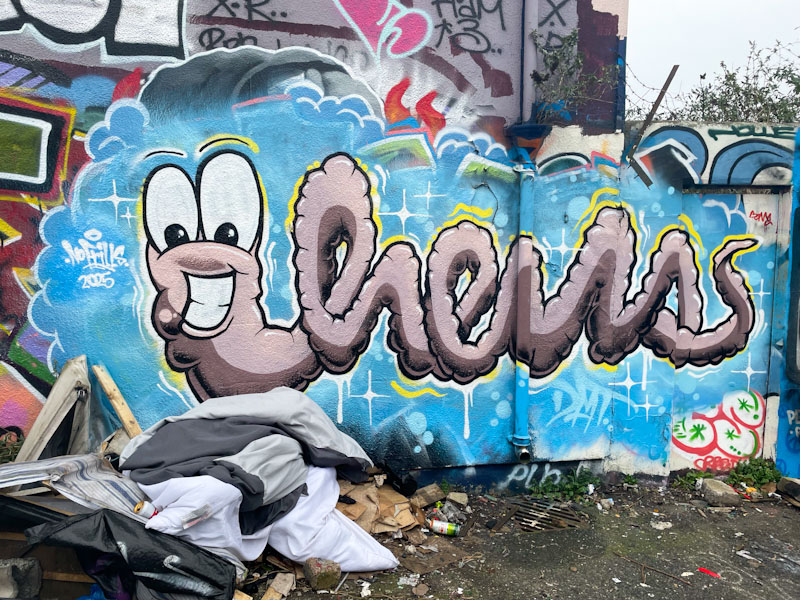
Here we have another absolute scorcher from the fantastically productive Hemper. This artist’s trademark is his extraordinary creativity; how many different ways can he present the letters HEMS? Combined with his enormous skill and talent.
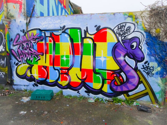
In this piece, Hemper has created a snakes and ladders board decked out in the garish colour squares that are so familiar to many of us from our childhoods. What an amazing thing to be able to do from a few old tins of spray paint. This is a magnificent, bright, happy piece. Thank you Hemper.
“Work to live, don’t live to work” – can’t argue with that.
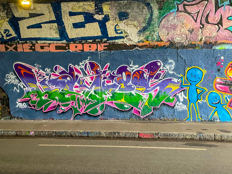
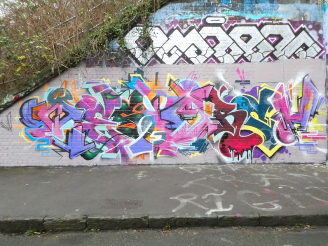
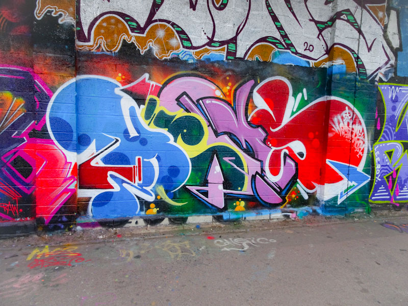
Another one from the archives and one that I am so pleased to have re-found. It is a lovely collaboration from Turoe and I think Veks, although I might have that wrong. I think I never posted it at the time because I was uncertain about the artists, and it disappeared, quite neglected.
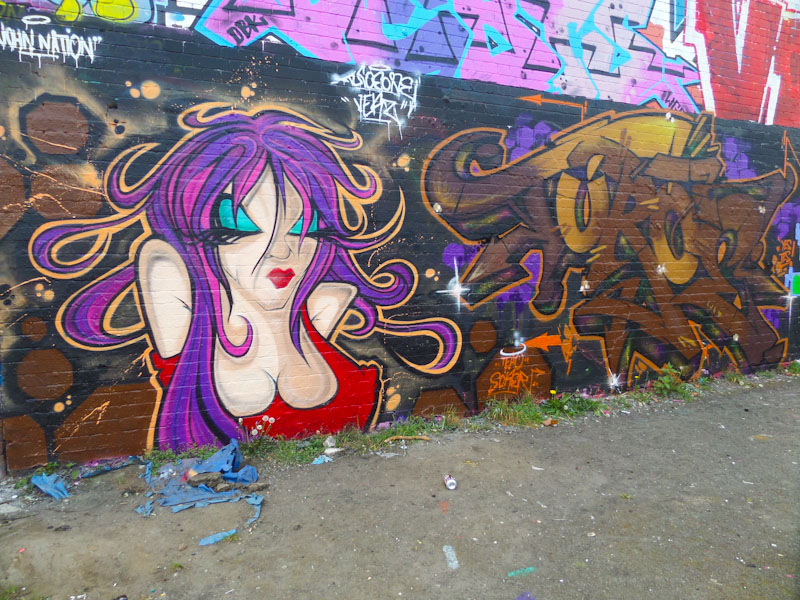
Dating from way back in April 2017, the writing in dark brown colours is clearly by Turoe, who definitely wasn’t on my radar back then (what kind of blind was I?). The character I believe to be by Veks and is masterfully painted, so crisp and clean and vibrant. I feel I should have done more homework at the time, but I don’t think I even had an Instagram account back then and was still learning (that never ends). A fine and once forgotten, until now, collaboration.
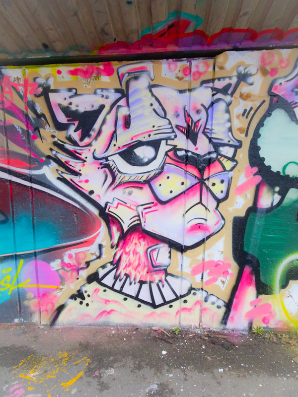
There are some artists in Bristol whose style is recognisable from the slightest glance. It might be the shape of the letters, the colours, the form or any number of common themes or motifs. Every now and again though they let their hair down and do something quite different. This is something different from Dibz.

This is a fun and rather small burner from Dibz, which if it weren’t for the letters might be difficult to attribute to him. What you can always be assured of though from Dibz is outstanding clean lines and finishing and this piece is no different. I caught up with him while he was painting another more Dibzy sort of thing on an adjacent wall and asked why he had painted something so different here and he indicated that he was just having a bit of laid back fun. Great to see.
Readers of Natural Adventures will be familiar with cat pieces by Daz Cat, but I think this is the first Time I have posted anything by Sage. I actually got lucky because I met the pair for the first time when they were painting this rather nice collaboration. Such nice people… and like policemen and doctors and teachers, so young.
Daz Cat told me that he was using up dregs for this piece, not that you’d know it. This cat is full of colour and detail and the three-quarter profile has given Daz Cat some different perspectives to play with.

Sage, I think is responsible for some interesting mega tags that I have seen about the place without knowing who they were by. This, of course, is a bit of writing and I think he likes to do writing and characters in equal measure. I need to find and write about more pieces from Sage.
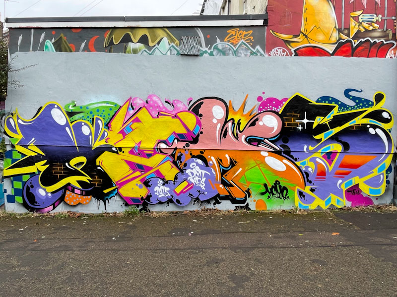
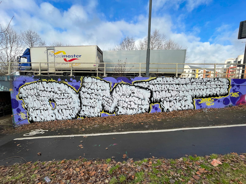
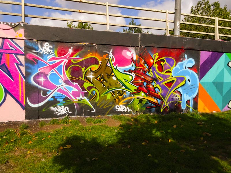
It is a great pity that Epok is a rare visitor to Bristol these days, preferring to paint in Gloucestershire, where I presume he must live. The upshot of this is that each of his pieces in the city is very precious, like this one as part of an ASK collaboration from a while back.
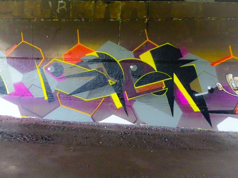
This wall is a nightmare to photograph due to the amount of glare streaming in from the left hand side. Even on overcast days it is tricky. This is a spectacular geometric piece from Epok, combining his straight lines and angles with circles and semi-circles, spelling out EPOK. Although part of a five-way collaboration, this section of the wall was shared by Epok and painting pal Piro who combined styles and colour schemes. Good to see a new Epok piece in town.
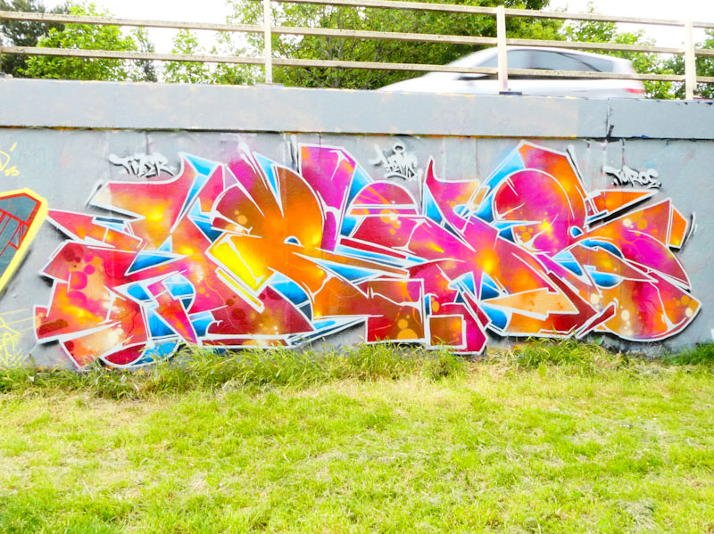
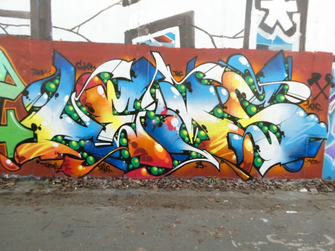
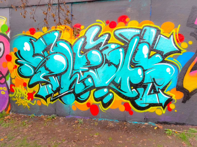
Another Bristol artist who seems to paint walls in pulses with long breaks in between is Subtle. This is one of two lovely pieces of graffiti writing from the artist a week or two back both using a similar colour palette.
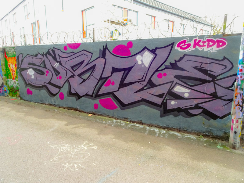
This particular hoarding is notoriously difficult to photograph because of the bright sky behind it and I would guess is best photographed at dusk. These turned out ok, but everything behind the piece is bleached. Subtle presents us with his super-size letters and a some really neat bubble decorations in pink and white. The borders and shadows are very nicely done and this piece is everything one would expect from Subtle… big, bold and beautiful.
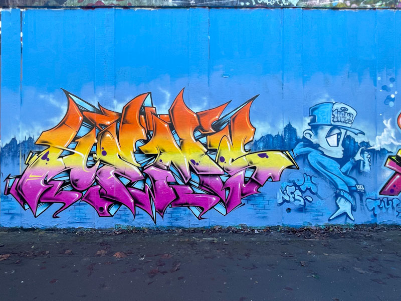
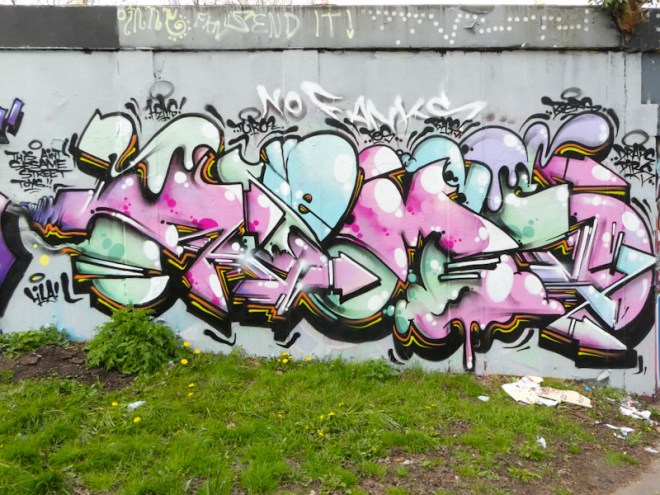
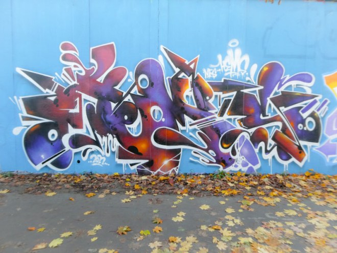
Dott Rotten has been spoiling us with his SPOILT pieces of late, and this red and green beauty on the M32 roundabout is an absolute classic. Dott Rotten’s writing style is fairly recognisable, although when he writes other letters it can take me a while to pin him down. However, it is not so much the style that gives him away as the quality of his finishing.
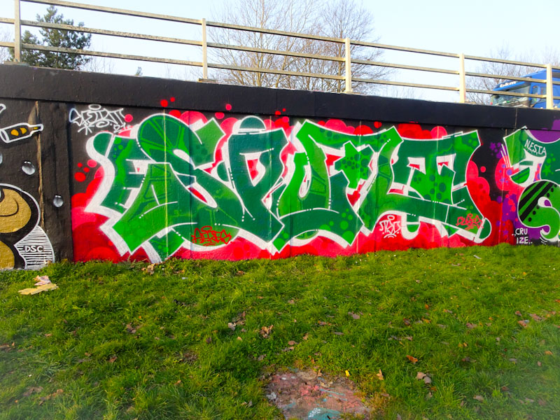
In that respect, there are some similarities with Rusk’s work which is always so neat and tidy. These joined up letters are brought to life with a light and dark shade of fill with some repeating patterns of dots and boxy segments. What makes it jump out though is the wonderful contrast with the vibrant red backdrop. A lovely piece.
Another nice piece from Mr Draws whose work creates a drumbeat for the whole graffiti art scene in Bristol. If Mr Draws isn’t painting then things must be very, very bad indeed. I don’t post all of his work, simply because with only two posts a day on Natural Adventures I have to be selective with all artists. Anyhow, in my retirement I’ll have hundreds of images in my archives to post, so all is not lost.
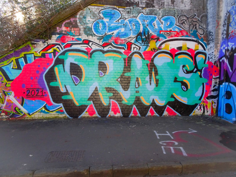
The entrances to St Werburghs tunnel are so much easier to photograph than the interior, and the colours are so much truer. This is a classic Mr Draws piece, with a deep black shadow and some decent fills with yellow accents. Mr Draws marches on.
Moon Street, once one of the most vibrant and active graffiti streets in Bristol has become something of a forgotten backwater since the gentrification tsunami struck the Stokes Croft area about two years ago. Since that time decent pieces are few and far between, but every now and again there is a little gem, like this dazzling piece from Lee Roy.

Everything about this one screams out ‘look at me.. I’m here and I want to be seen’. As I have said in an earlier post of a piece from Lee Roy, he seems to have gone into overdrive in the last few weeks and is chucking up his unique brand of graffiti writing all over the city. I particularly like this one though. Great for the somber mood we seem to find ourselves in these days.


