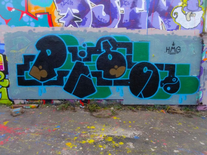
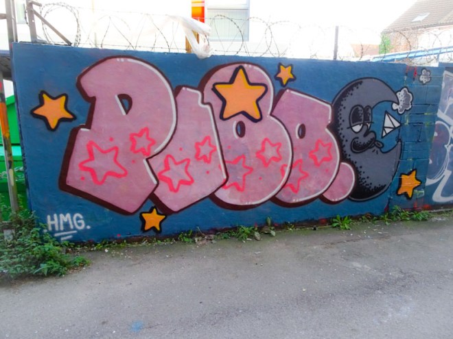
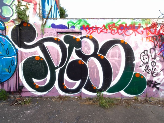
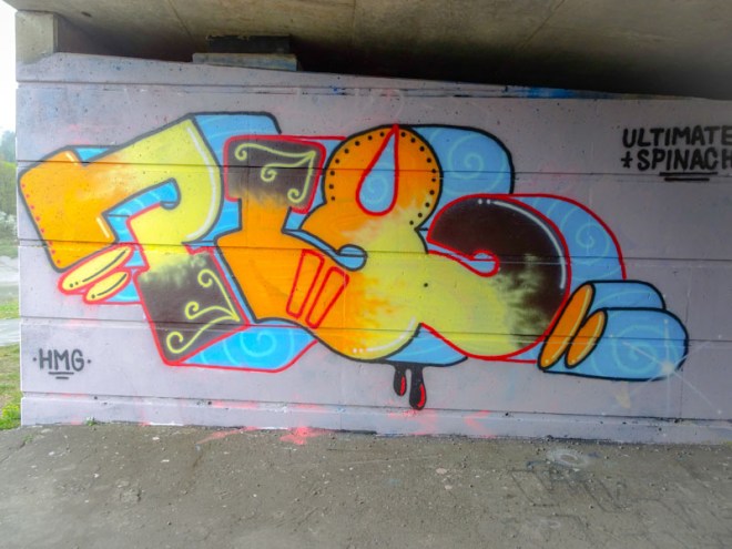
A gallery of fabulous graffiti writing from Bristol’s Pl8o
All photographs by Scooj







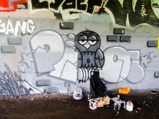


A gallery of fabulous graffiti writing from Bristol’s Pl8o
All photographs by Scooj
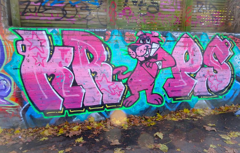
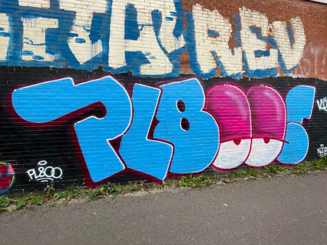
Once I start posting about an artist, it seems that I find more of their work on both the streets and in my archives, and this is definitely the case with Krops. I don’t know why it took me so long to post any of his work, probably because there is simply so much choice in Bristol that it becomes difficult to post everything.

Anyhow, this is a classic piece of Krops work, that has probably been around for quite a while, incorporating a character in the middle of his KROPS letters. The star of the show is the Pink Panther character, and Krops has carried the pink theme through to his letters, the whole piece set off nicely on a light blue background.
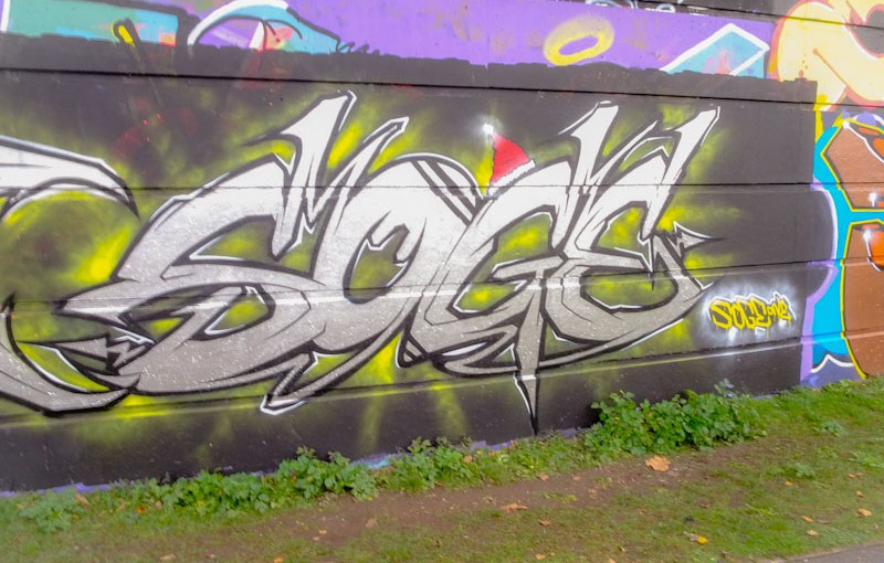
This is a little Christmas piece from Soge, who has quite a quiet year in 2021, and is a welcome sight. There haven’t been as many Christmas themed pieces this year as I might have expected, but I haven’t been out too much last week so hope to stumble across a few more.
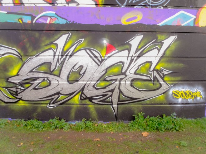
This is actually part of a collaboration with Hire, and the pair have painted quite a few times together in the past. Nicely designed and finished, this is a welcome return from Soge. Happy Christmas.
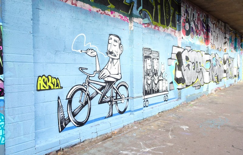
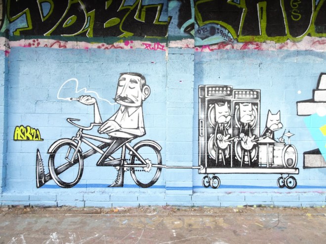
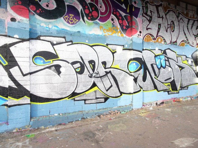
It’s Christmas Eve, hooray! I am going to give us all a bit of a break and keep my commentary of this sensational collaboration by Sepr and 3Dom brief. Characters accompanied by writing in this long panel. Great stuff.
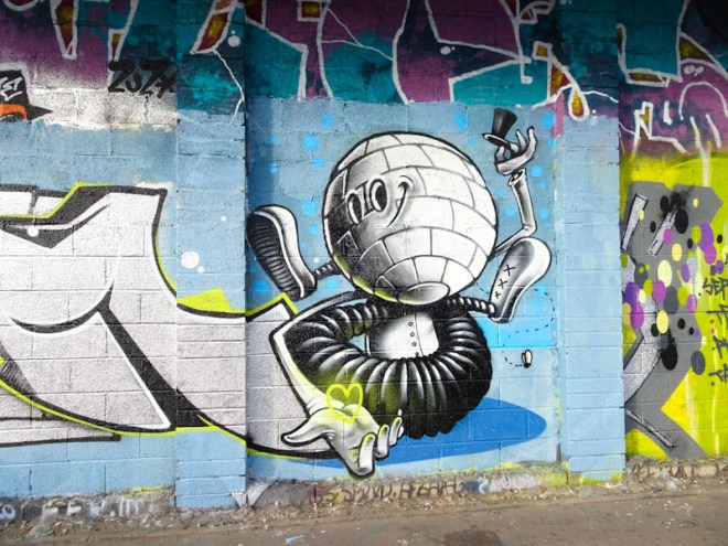
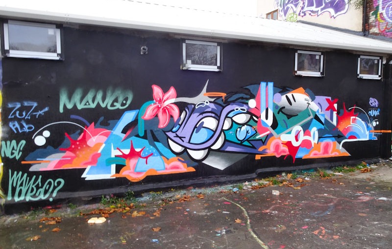
You can never rule out anything in the world of street/graffiti art, and to do so would be to suck the surprise and joy out of it all. I would never have predicted a Flava136/Mudra collaboration, and yet down in the Deaner we have a near-perfect mash-up from these two superb artists.

This is a great example of a blended collaboration where it is difficult to be certain who painted what. There are of course the obvious bits that have all the hallmarks of the individual artists, but the bits in-between… A trained eye can tell them apart, but to most people you’d look at this piece and consider it to be by one artist.
Basically the central monster and smiley face are by Flava136, and the left and right hand elements (which spell out MUDRA (some creative imagination required)) are by Mudra. The whole thing is an absolute gem and I hopt that they will get together again sometime in the future.
Mest is an artist whose writing is improving all the time, not only in quality but also in creativity. Sticking to his standard letter shapes, he gets his variety through his fill designs and colours. I have so many more of his pieces that are not yet published, but posting pieces on Natural Adventures is a very competitive marketplace at the moment. I will get round to publishing more in due course.
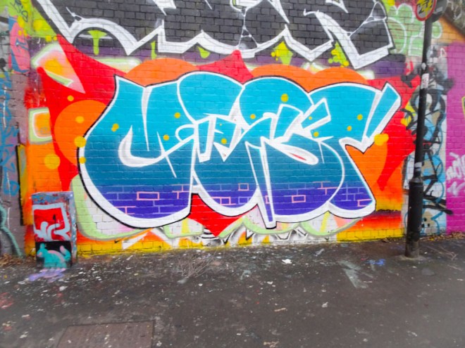
The colour contrasts between the orange background and cool blue letter fills works wonderfully, a real hot and cold battle going on in front of our eyes. Mest has also been playing a little by picking out some of the brick work with pink lines. A sprinkling of little yellow dots rounds the piece off nicely. A fine piece from Mest which gets me ever closer to publishing a gallery of his work… watch this space over the next month or two.
Aah! The familiar shape and style of a Slim Pickings TES plastered big and bold on the Sally Army wall at Dean Lane skate park. Like several other artists in the city, Slim Pickings’ (Tes) work is a driving creative pulse, a regular heartbeat, that creates the foundations of a thriving street art culture in Bristol. Ever present and confident.

This pink on yellow belter was painted over the rather nice portrait by Tao.create, illustrating how ephemeral the work of artists can be, especially in spots like this one. Lovely bubble-gum colours and drips, this is a great piece by Slim Pickings. Most unlike the artist, his pink fill is a little thin in places, and I can only think he was short of paint, because he is well known for his full and solid fills. Nice one.
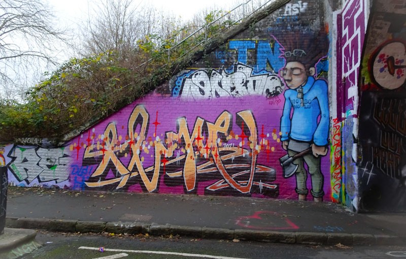
Logoe continues to hit Bristol walls hard, this time with his friend Silent Hobo, to create this lovely collaboration on the entrance to the tunnel in St Werburghs. Their content and styles are so very different, but there is a chemistry there that brings the whole thing together seamlessly.

The writing by Logoe is distinctive with its thin script-like letters and gorgeous fills, decorated with spots and stars along the length. The youth, so brilliantly portrayed by Silent Hobo, is wearing a blue hoodie and sporting big hair and glasses. I am not at all certain what the axe is all about though. So good to see these two combining again.
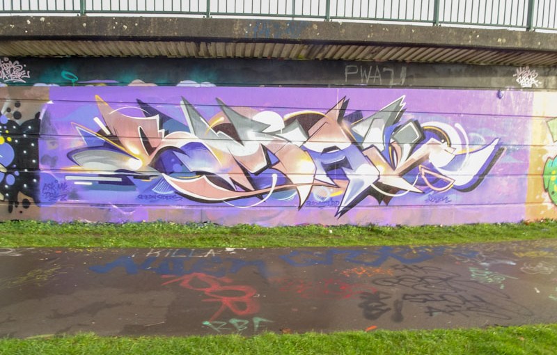
Dibz has been having a bit of a purple patch lately, although his work is always of the highest quality, his productivity can be a little quiet from time to time, but not right now. This is one of several recent pieces that showcase his mastery of wildstyle graffiti writing.
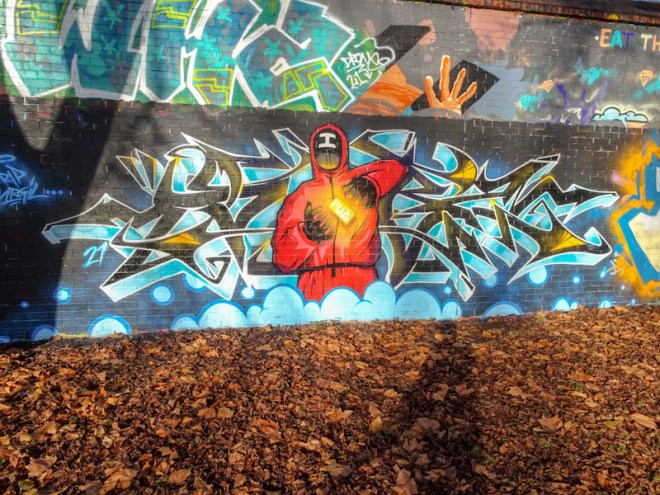
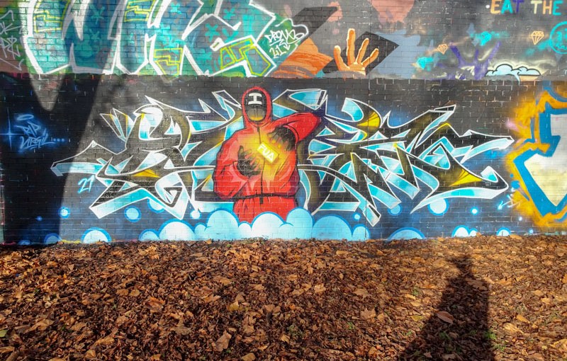
This is the first ‘Squid Game’ piece that I have seen in Bristol, and to be honest I am surprised not to have seen more. The character has an ‘I’ on his mask and a small FUA golden block suspended between his hands and is beautifully crafted. The writing isn’t too bad either. Unfortunately, the curse of tricky lighting at this spot has left me with rather poor photographs, for which I apologise.
I haven’t really left myself enough time to write very much about today’s wonderful piece by Smak. For some this might be a blessing… consider it an early Christmas present.

I have neglected Smak for far too long, and haven’t posted anything by him for months. The reason is simple, there is so much great and new stuff being created out there that the competition for space o Natural Adventures is as high as it has ever been. This is classic Smak wildstyle graffiti writing. Subtle colours, great design and lovely tight artwork. Standards are still high in the Smak camp.