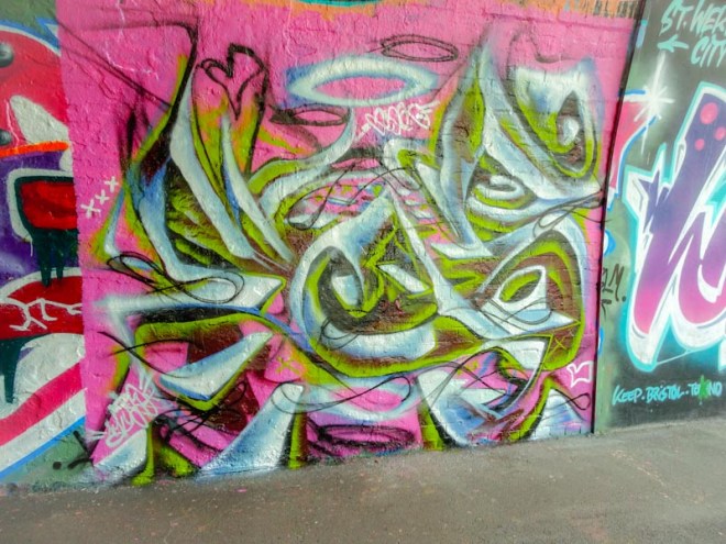
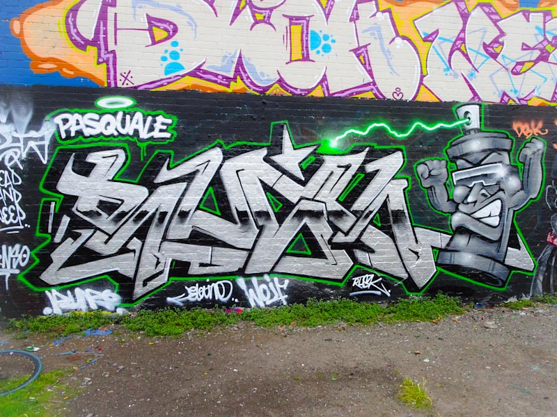
The more I look at this piece from Cort (Padi) the more I like it. On first inspection it all looks a bit untidy, but I don’t know, there is something that really attracts me to it. Cort pretty much always has strong letters that aren’t particularly over-disguised but are designed differently from piece to piece. In this one he has changed the customary CORT for KOORT, which is a playful thing to do and gives him scope for messing about with different letter shapes.
Cort, M32 cycle path, Bristol, May 2020
Painted alongside the multiple skeleton piece by Laic217, Cort’s work acts as a perfect foil to Laic217’s because the style and content is so different. I think it is the red colour contrasting with the grey that works so well for me. A nice piece.
This is the first of several new pieces from Soge, who seems to have been really busy since the lock down restrictions eased. His style is similar to his compatriot Hire’s, but perhaps slightly less jagged.
Soge, Dean Lane, Bristol, May 2020
Soge has knocked it out of the park with this piece. The SOGE writing is incredibly detailed and decorated with stars and bubbles. The background is a perfect colour for the main colours of the piece and the whole thing is very easy on the eye. You can see a little 2020 hidden in the letters too.
Soge, Dean Lane, Bristol, May 2020
Something a bit new, or that I haven’t been aware of before is that Soge has started to include characters with his work, and to the right of this piece is a little Beaver with a speech bubble saying ‘I love furlough’. I’m not sure why the beaver has an axe with a bleeding blade, but it adds a little bit of edge to the cute character. This is a really nice piece from Soge.
I managed to catch this piece literally minutes before it was painted over. The artists were on site having a quick smoke before getting started. I am pleased to have made it in time because even for the high standards expected from Rezwonk, this is an outstanding piece.
Rezwonk, Brunel Way, Bristol, May 2020
Spelling out REZER, the piece is painted using a gorgeous palette of red, orange and yellow tones set on a white and orange background. To describe the fills fully would take way too long, but suffice it to say that there is a lot of craftsmanship involved and they are beautifully done. Linger for a while and study each letter. Magnificent work.
As the lock down restrictions have eased, the street/graffiti artists in Bristol have started to get busy, and Dean Lane in particular has been a destination of choice. This colourful collaboration is from Crem, Nevergiveup and Kity.
Crem, Dean Lane, Bristol, May 2020
First up is Crem and a confession that I don’t really know this artist at all and this is the first Crem post in Natural Adventures, although not the last I am sure. Crem’s letter shapes are unusual and nicely finished and the piece sets the tone for the whole collaboration with its attractive fills.
Nevergiveup, Dean Lane, Bristol, May 2020
No need to introduce the creator of the rabbit in the centre of the piece as he is the most featured artist on Natural Adventures, and even then I have loads of unpublished pieces of his in my archive. I am of course talking about Nevergiveup. This bunny adopts the colour scheme and offers one of the best bunnies I have seen.
Kity, Dean Lane, Bristol, May 2020
Finally we move on to Kity, who like Crem I know absolutely nothing about. It would seem that I need to do a little bit of homework here. What I can’t be sure of is whether these two are new on the scene or whether they have just been off my radar. Probably the latter… it happens a lot. Kity continues the colour scheme to give what is in its entirety a really pleasing collaboration.
Of course you’d expect Rezwonk to be quick out of the blocks once the lock down restrictions eased, I guess it is the clause that allows you to ‘exercise’ for as long as you’d like that has made the difference to street artists being able to paint pieces without stressing about the rules.
Rezwonk, M32 cycle path, Bristol, May 2020
This is a complex REZER design in fairly basic colours, but it has been carried off with real style and panache. With pieces as complex as this, I just can’t get my head around how the artist sees what they are doing – incredible skills really. A high quality Rezwonk burner.
I don’t know this artist’s street name, but I call him Taboo because I use the convention of naming him after the letters he writes. His Instagram account is @forbidden_association which doesn’t tell us much more about him.
Taboo, Dean Lane, Bristol, May 2020
This new piece in Dean Lane is really nicely done and incorporates Tom Cat from Tom and Jerry. The letters, which spell out TABOO, are nicely done and have a chunky heavy look about them which is typical of the artist. If you are looking for a light touch, fine detail and finesse, you are unlikely to find it here, and yet the character element of the piece has a much softer touch. A really nice and rather unusual piece.
Although I somehow inexplicably managed to omit this outstanding piece by Elvs first time round, I think it might well be my favourite of his. Painted in Dean Lane in May 2017, the form and colours come together in something close to perfection.
Elvs, Dean Lane, Bristol, May 2017
In the nicely balanced piece, the artist has used three shades of pink and three shades of blue to give the blended effect of moving from light to dark to light horizontally. Added to that, he has split the piece into vertical thirds swapping the the colours to create a harlequin effect. Clean lines, beautiful fills, incredible details. Tight.
This is something of a rarity, an unpublished piece by Laic217. All I can guess is that May/June 2017 must have been a very, very busy time on Natural Adventures, because I tend to prioritise Laic217 pieces, because he is one of my favourite artists in Bristol and I love to share his work.
Laic217, M32 roundabout, Bristol, May 2017
This piece is typical of his work at that time, featuring some graffiti writing combined with a character. The character is a skull, of course, with a bucket hat, of course and some brickwork glasses… . In my view this is a really classy piece and is beautifully executed and it is with not a small amount of happiness that I am sharing it on Natural Adventures.
I managed to get out yesterday and found a few new pieces around the place, and it would seem that with some social distancing rules being relaxed artists are beginning to slowly return to walls. In the meantime, I still have a few archive pieces lined up for publication, including this fine collaboration fron Dasco and Wiflywin.
Dasco, St Werburghs, Bristol, November 2019
On the left is a nice piece of writing from Dasco. Confident and assured the fills are great and the stripy barcode effect on the 3D lettering has worked well in this instance, which is not always an easy thing to do. Set on an orange brick wall, the piece segues nicely into the wiflywin piece to the right.
Wiflywin, St Werburghs, Bristol, November 2019
Wiflywin continues the writing using a similar colour palette and the barcoded 3D letter shading, but perhaps with just a little less confidence. I am not quite sure what the letters spell out, and I will have to get to know more about the artist.
Dasco and Wiflywin, St Werburghs, Bristol, November 2019
On the right is a smashed up police car and I am uncertain whether one or the other or both artists painted it. Perhaps there was another artist involved, I am not sure, but I rather like it, and it works really well as a ‘character’ bookend to the graffiti writing. I’m not sure why I never posted this in November last year when I first photographed it.
UPDATE – On 30 May I met Wiflywin for the first time and asked him about this, he told me that he painted the police car… problem solved.
Decay rarely disappoints, and this rather modest chrome piece at the M32 roundabout is a very nicely worked DECAY without too much fuss and frills. Sometimes it is really good to see a ‘basic model’ that reminds us of how good some to the technical decoration adopted actually is.
Decay, M32 roundabout, Bristol, September 2019
Of course, the piece has superb 3D shading, beautiful white highlights around the curves and some nice drips too. Chuck , the E character, looks a little bit grumpy to me in this piece, and I have seen him happier. A nice sold piece from Decay.