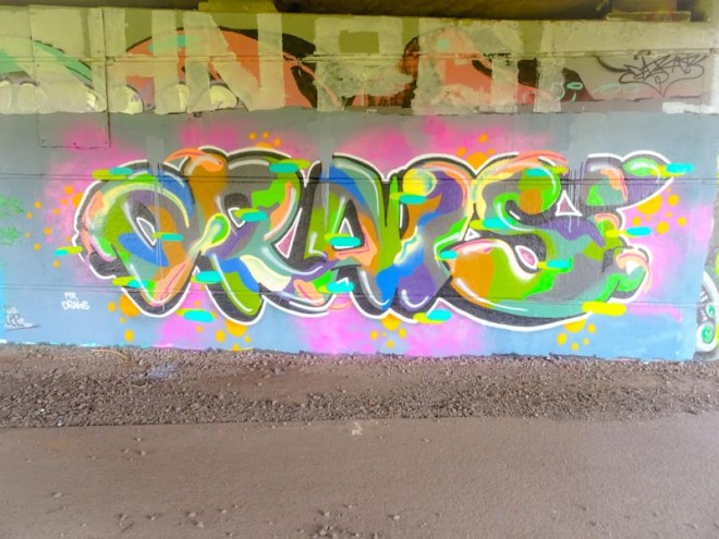
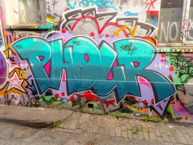
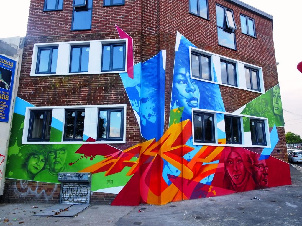
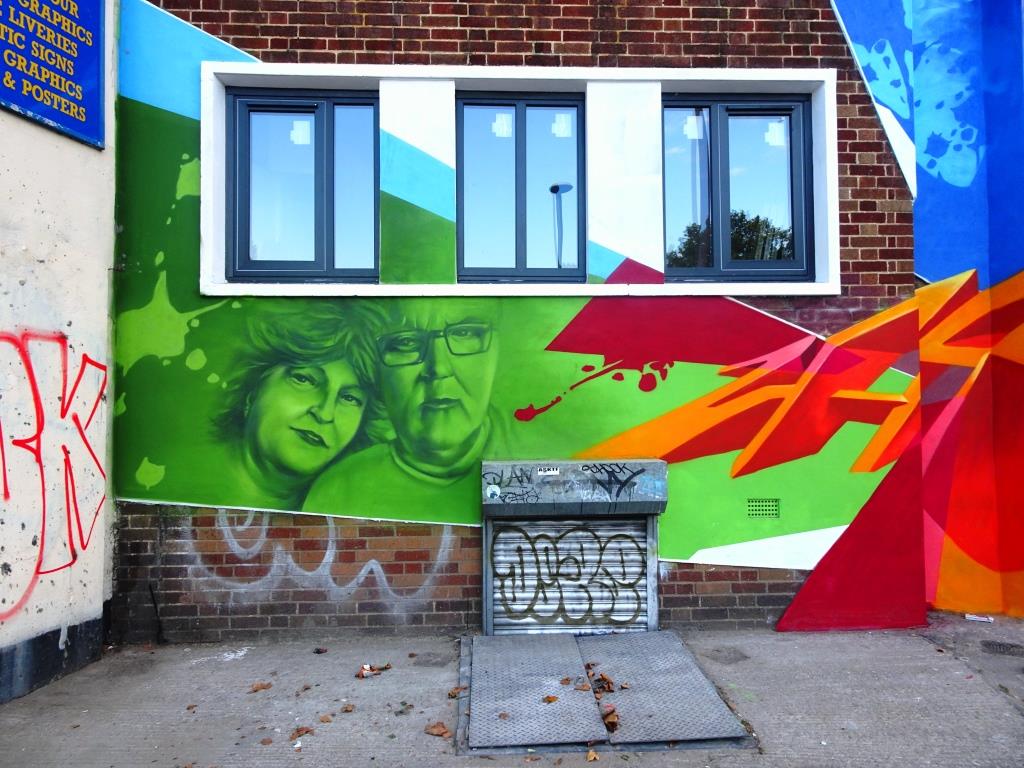
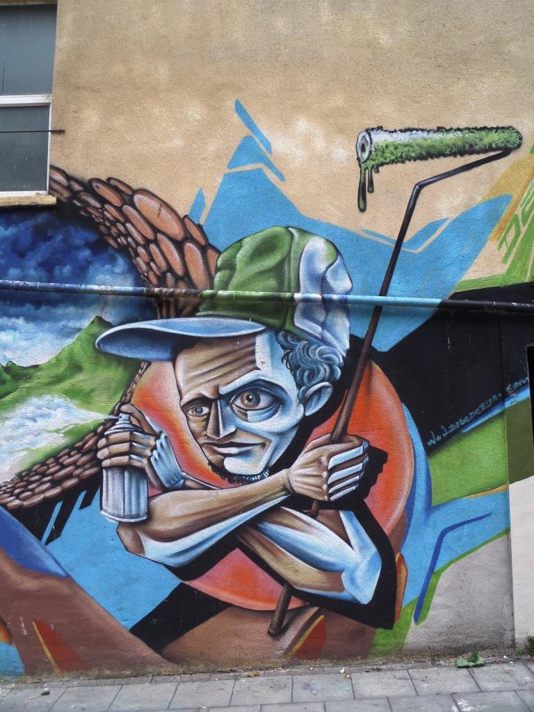
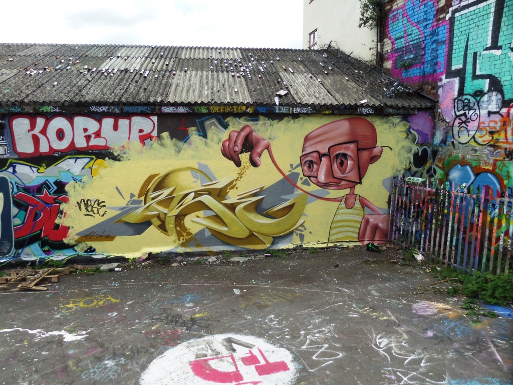
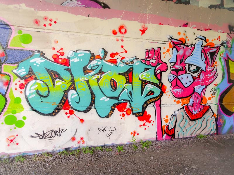
The work of Benjimagnetic is so very distinctive, but as I mentioned before, I find it very tricky to decypher the letters in his writing. The density and compactness of the work with so many intricate lines and patterns make it hard to pick the letters out.
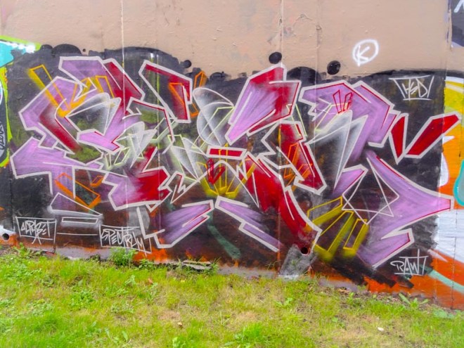
Sometimes with certain artists, your eyes become accustomed to their style and you become better at translating or working out the words, but I have a total fail when it comes to Benjimagnetic. My guess here would be ‘B, X or M, R’. The letters do not matter too much, the colour selection is great and those white-bordered angular shapes, so unique to the artist, are superbly done. A nice piece.