2328. Wilder Street (34)

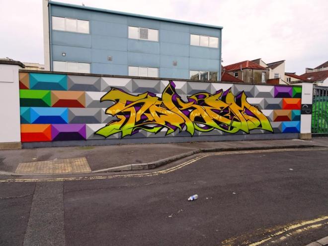
The cream always rises to the top they say and this little collaboration from Inkie and Rowdy was put together for this year’s St Paul’s carnival is right up there. It is high-time this wall was repainted and these two have done a great job.

Inkie and Rowdy, Wilder Street, Bristol, July 2019

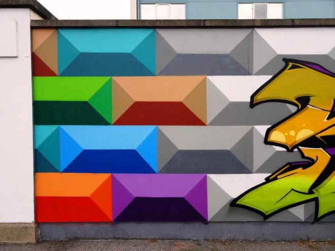
The crocodile across the top is the trademark emblem used by Rowdy and can be found all over the city, although a great number of them have sadly disappeared. The writing from Inkie is actually rather beautiful, and I am guessing needs to be read out with a bit of a West Indian lilt. Fine collaboration.

2327. Devon Road (11)

This is the second piece I have found from relative newcomer, Conrico. In fact I found this one before I came across the diver piece that I posted yesterday. Any artist who recreates Dr Seuss art in any form gets a big (Seuss-like) thumbs up from me.

Conrico, Devon Road, Bristol, July 2019

This writing, bookended by the Lorax and some trufula trees, is nicely done, and the whole piece has an air of calm about it. His style, and I can’t quite pin it down just yet, is a little rough at the edges, and I mean that simply in the sense that it is not crisp and clean like the work of Cheo, for example.

Conrico, Devon Road, Bristol, July 2019

I am really looking forward to seeing what Conrico can do, and like very much what I have seen so far.

2319. Dean Lane skate park (231)

It is the shape and style of the letters that give this artist away, it is of course Cort, but he has recently taken to writing PAD, although here it looks like PIADY. There are many things to admire in this piece, which was painted solo, rather than with his friend Laic217.

Cort, Dean Lane, Bristol, June 2019

The two contrasting backgrounds of pink and blue add interest to the piece and the little details such as the red dots and lines and the gold rings are typical motifs used by the artist and ones that make his work so distinctive. Unusual and full of interest.

2317. L Dub (1)

So I have two people to thank for pointing me in the direction of this out-of the-way graffiti spot in Lawrence Weston, Paul Harrison and DJPerks, and how fitting that when I got there for the first time, one of the first pieces I saw was by DJPerks himself.

DJPerks, L Dub, Bristol, July 2019

I have met DJPerks a couple of times because he, like Paul and me, does the rounds photographing street art and posting it on Instagram.  What I was not quite so clear about, and this is a tribute to his modesty, is that he is an accomplished spray painter too. He has been a bit busy about the place lately and this is a really rather tasty piece.

The writing is good, and the pattern radiating out from a central vanishing point is great. Hats off the DJPerks for this one. What I particularly like is his shout-outs to a whole ton of Bristol artists all around the piece, artists who give him inspiration and encouragement. More to come from DJPerks.

2316. Dean Lane skate park (230)

It is impossible to tire of the beautiful and bold writing of Subtle. This magnificent recent piece in Dean Lane is a perfect example of his writing style that is always so instantly recognisable.

Subtle, Dean Lane, Bristol, July 2019

I like the fact that he has taken time to prepare the wall properly and chosen such a magnificent pink/magentafor the letters which are so cleanly painted. As is often the case with his work he has included just a few little highlights on the letters that lift the whole thing up another level. Subtle consistently turns out these superb pieces, which in this case is anything but subtle.

2314. Dean Lane skate park (229)

Only a couple of weeks ago I posted a piece by this artist, Bandito, from Upfest 2018 and stated that I didn’t know anything about him, well the same applies today. In that post I referenced a recent piece by him, and this is it.

Bandito, Dean Lane, Bristol, April 2019

I am a big fan of tidy, clean and well-executed writing, and this one ticks all my boxes. His three-colour layering works very nicely, and the accent touches such as the stars and the yellow dusting around the outside of the piece are nicely done. I think I’ll need to keep my eyes peeled to see if I can find more from Bandito.

2311. St Werburghs tunnel (87)

It just keeps getting better and better from Decay, and there seems to be a joyful freedom about his work at the moment. This gorgeous piece is just by the entrance to St Werburghs tunnel and has an instant presence or class about it.

Decay, St Werburghs, Bristol, July 2019

The wall is not high and so Decay has had to vertically squeeze his writing into a limited space, creating more regularity to his letter heights than he is used to when he has more space. Perhaps this is why this piece looks rather different from his recent writing pattern. It might also be the great colour selections and fill in his letters. Whatever it is, I think that this is a very nice piece indeed from one of the most productive artists in Bristol this year.

2310. St Werburghs tunnel (86)

I took this picture back in June, and when I last visited St Werburghs tunnel, This piece by Dusk was still there. The more I see of Dusk’s work, the more I am warming to it. I caught up with Oner recently, and we were talking about the pieces in the tunnel, and he told me that the name ‘DUSK’ comes from ‘Don’t Use Skinny Kaps’. A skinny cap is a cap that you use on a spray can that gives a slightly narrower arc of spray and so tighter lines. The more skilled at spray painting you are, the less need for skinny caps. For me, as a learner, skinny caps are essential.

Sunday graff 0002 9 June 2019

What is notable about this piece is that I don’t recall seeing Dusk including a character before – that doesn’t mean he hasn’t, it just means I haven’t seen one. The character is rather fun, and appears to be smoking a reefer, although what would I know?


2307. St Werburghs tunnel (85)

In one of his favourite spots, Fiva (Fiver, Henry Barnes) has painted another of his lovely block capital pieces using the longer version of his name and overpainting it with the word ‘forever!’ in a kind of stone effect.

Fiva, St Werburghs, Bristol, June 2019

This time he has gone for the bevelled edge look to his large letters and included a 3D shadow in green to the left. In teaching myself to spray paint, I used his general style to create the letter H (in my series A-Z) and all was going well, in fact it was looking rather good, until I put a black and white outline around it. So the point is that to get straight outlines requires real skill to avoid wobbles and varying thickness of lines. Fiva has done a great job here with his yellow and black outline. I need to practice a lot.

2306. Waterloo Place (4)

This wall at the back of Sofa Project has played host to some of the tightest street art in Bristol, and it is most pleasing to see that tradition continuing with this new collaboration between Paul Monsters and Soker.

Paul Monsters and Soker, Waterloo Place, Bristol, June 2019

when I spoke to Paul Monsters about it, he was full of compliments for his collaboration partner and explained how Soker had worked the horizontal shade in his writing to match up with Paul’s geometric design with complete ease. Looking at it knowing this adds context and insight into the strength and thoughtfulness of this piece.

Paul Monsters and Soker, Waterloo Place, Bristol, June 2019

The geometric backdrop by Paul Monsters is in my view masterful work and creates a most extraordinary illusion that the wall is made of coloured blocks that have bevelled peaks that jut out, and no matter how hard you look at it it is difficult to see it as flat.

Genuinely, this is one of the most enjoyable collaborations I have seen in quite a while. Classy and diverse.