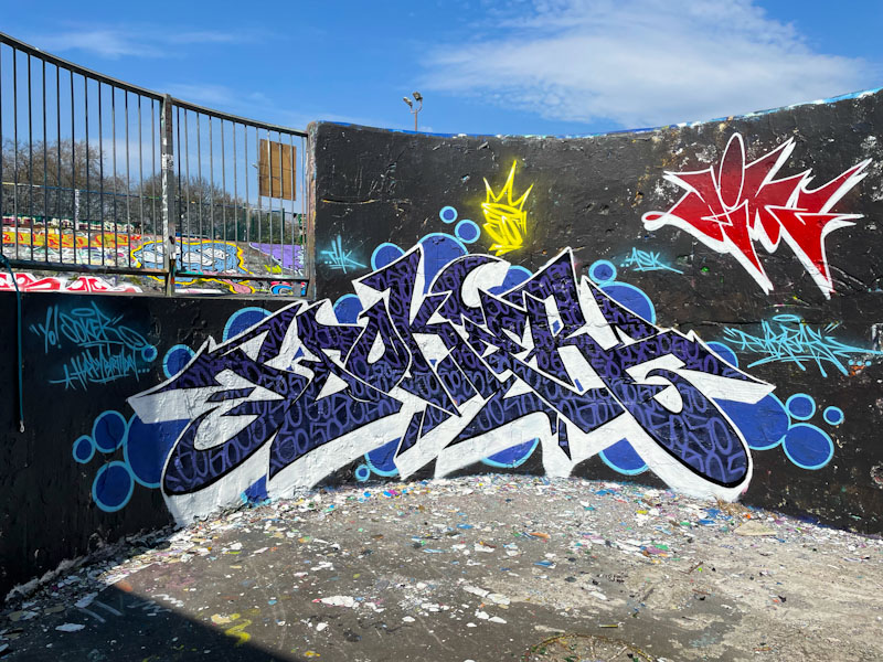
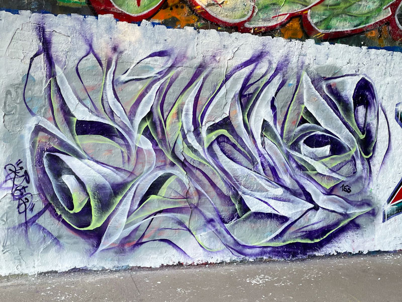
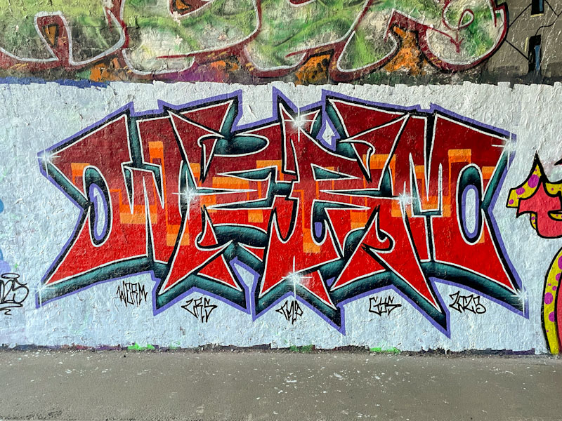
Painted on one of Bristol’s most iconic walls, the curved wall in Dean Lane skate park, this is a birthday tribute piece to Soker by Dibz. Pieces like this have the capacity to confuse, because the letters do not spell the artist’s name, and I have in the past misidentified pieces because of it.
Dibz, Dean Lane, Bristol, April 2025
Dibz really is a master of graffiti writing and is at the top of his game, something he has maintained for such a long time now, without any dip in form. The letters are filled with a solid black fill, and finely written ’50s’ indicating it was Soker’s 50th birthday. Great to see one of Dibz’ small signature tags in red at the top right too. Excellent work, and a fine birthday tribute.
This is an interesting wall at the entrance to St Werburghs tunnel. It is a space that can be filled with one or two or even more pieces, because of its length. There is a bit of a difficulty with the full length pieces, like this beauty from Mr Draws, and that is there is quite a bit of street furniture in the way that makes it a little challenging to photograph.
Mr Draws, St Werburghs, Bristol, April 2025
The spot also suffers from shading on sunny days, so being there at the right time is quite important. On the day I took these pictures, it was dazzlingly bright, indicative of the remarkable spring we are enjoying. Mr Draws has written his joined up letters DRAWS with a very nice horizontal striped fill pattern of magenta, turquoise, blue and yellow, which works remarkably well. The letters are broken up with a shower of ‘leopard’ spots, which offer a really interesting texture to the piece. There are some nice drips too. This is a really good large piece from Mr Draws, no messing.
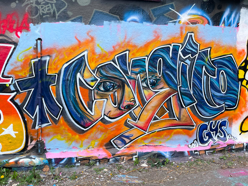
I love this kind of slightly unconventional, not quite anti-style, unconventional graffiti writing, which, although it looks a bit scruffy is actually technically really well thought out, designed and pulled together.
Rozda, Cumberland Basin, Bristol, April 2025
It was painted as part of a large collaboration, with each piece sharing a common background and base colours, but each with its own unique style. I know nothing of Rozda, the artist, so would guess that they were in Bristol as a visitor for this paint jam. I like this a lot.
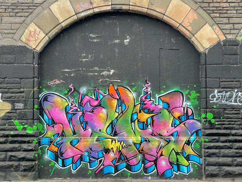
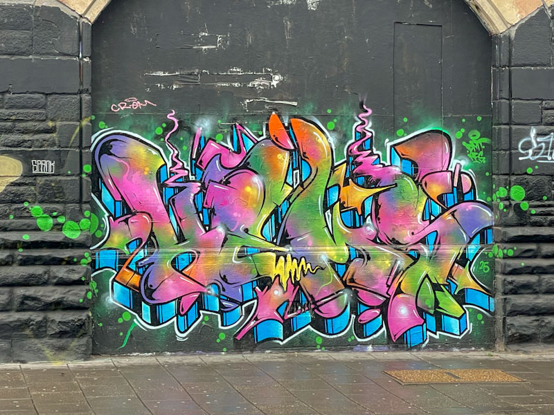
Mr Klue has been on fire this year and has continued to paint his ephemeral pieces in the tunnel on an alarmingly regular basis. In my view, this is a very good thing indeed, because I like his unique style, and watching him paint gives me an appreciation of how deliberate each ‘brush stroke’ is in his pieces. His work may look random, but it is based around the form of the letters KLUE, and the shading and colour patterns are carefully thought through.
Mr Klue, St Werburghs tunnel, Bristol, April 2025
As far as I can make out, Mr Klue paints each piece in a freestyle way, meaning that he doesn’t paint from a black book, but rather from the heart in a well-rehearsed, but improvised way, if that makes sense. The white and lavender colours gives this one a lightness of touch, and the subtle lime green tints on some of the edges, adds depth and rounds things off nicely. So much more to come from Mr Klue.
I have always struggled with artist naming conventions on Natural Adventures. Most artists have a name and retain it as their brand, especially old school artists like Inkie, Nick Walker, Mr Penfold, Banksy, Cheba and so on. Their Instagram accounts reflect their name – easy-peasy.
However, an awful lot of artists, graffiti writers in particular, may write a word, or sign a piece that is totally different from their Instagram name, for example: Jee See (who writes Seismic and whose Instagram is @jee.see_t.daemonic_luke.solo) or Biers (who currently writes WD40 and whose Instagram is @nofrills40). So you can see that naming artists can be a tricky thing – I blame the hacking of social media accounts, which means people are frequently changing their digital account names.
I say all of this because when I first came across Bbygwya (and it took me ages to master the name), this was her then Instagram account, however, she writes variants of the word Flux, and her current Instagram is @livelaugh_luxe. What is a man to do? The name of an artist is important for me, because it forms part of the tagging and sorting on WordPress which allows me to find past posts and images. So generally I use the first name that I came across and stick with it, even if it seems to be the wrong name now. Did any of that make sense?
Bbygwya (Flux), Dean Lane, Bristol, April 2025
This is a real beauty by Bbygwya (Flux or Luxe – see the problem?) in Dean Lane, with plain white letters and a little bit of black detail sitting on top of a fabulous Conrico piece, featured here previously. Somehow, Bbygwya has skilfully blended her piece with Conrico’s, intentionally or otherwise, but the final look is a good one.
Mr Crawls and Mote, East Street, Bristol, April 2025
On my wanderings in the East Street area of Bedminster, looking for Tian Paste ups, I came across this hoarding with a few treats on it. I think that this collaboration was painted last year when Mote and Mr Crawls were in full flow, painting together frequently all over the city.
Mr Crawls, East Street, Bristol, April 2025
To the left, the Mr Crawls character is quite unlike anything I have seen from him before, although his underlying style is unmistakable. The rather strange monster, in great green tones, is perhaps most notable for its psychedelic eyes, and ‘puckered’ upper lip.
Mote, East Street, Bristol, April 2025
Mote is no stranger to painting monsters, and here he has assembled five one-eyed beasts is some of his favoured colours. The chrome background for the collaboration gives me a pretty good date range (a little bit like carbon dating), which they first introduced at the end of 2023. A satisfying find.
When I first started out noticing street art in Bristol, and subsequently writing about it, The Carriageworks was my ‘go to’ spot to find some really classy work. Alas, the gentrification of Stokes Croft, eliminated half of the spot, and what remains is rarely painted. How pleasing it was to see this beauty from Hemper, and a piece adjacent to it by Kid Krishna (posted).
Hemper, The Carriageworks, Bristol, April 2025
It took me a couple of attempts to photograph this piece, because the first time I went there was a van partially covering up the writing, but I photographed it nonetheless just to make sure I had it in the can. These pictures are a much cleaner version and really highlight the magnificent of this extraordinary graffiti writing from Hemper, who has been on a roll this spring (a spring roll, if you like🙂). There is so much colour, beautifully blended, and a perfectly painted contrasting blue and black drop shadow. Another masterpiece of graffiti writing from Hemper.
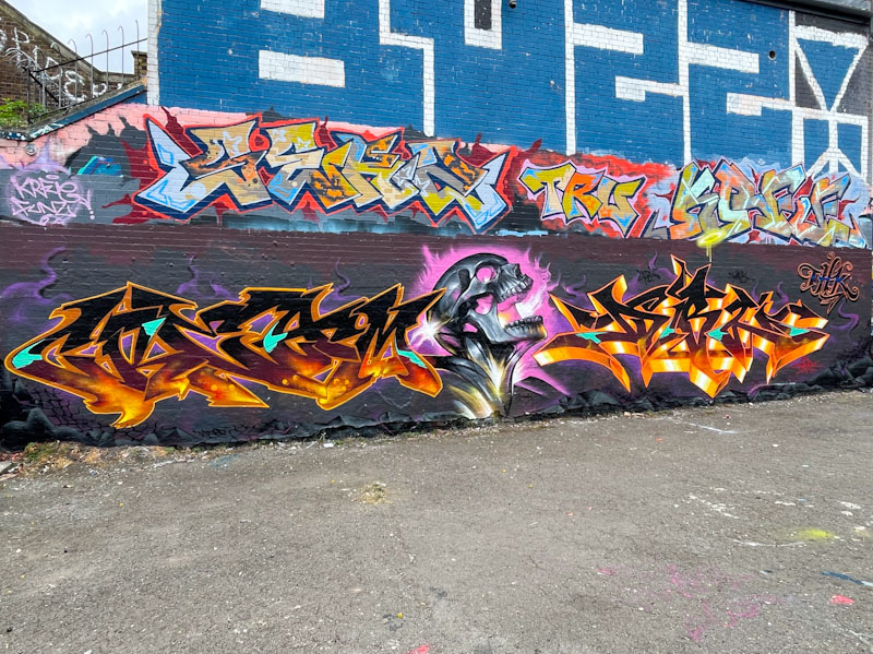
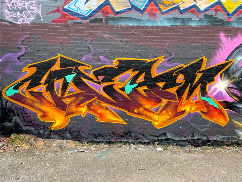
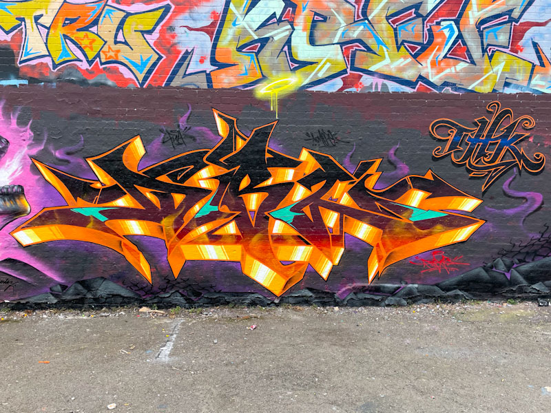
Fade, Jody and Dibz, Dean Lane, Bristol, April 2025
Here we have yet another epic production collaboration from Fade, Jody and Dibz, who have been knocking it out of the park for a couple of years now, creating some breathtaking triptychs from the two writers and the ‘character’ artist.
Fade, Dean Lane, Bristol, April 2025
I watched them for a short while while they painted this piece, and while the two writers were well advanced with their work, Jody’s skull portrait was still some way off. On the left, Fade has produced some gorgeous ‘lava’ letters tinged with some turquoise highlights and some purple smoke plumes. His letters look like CREAM, but I can’t be sure.
Jody, Dean Lane, Bristol, April 2025
The centrepiece is an outstanding screaming skull by Jody. He really is a most talented artist, both in his studio work and his street art. His technique is simply awesome, and he manages to create such depth and texture with the deft strokes of the spray can. Brilliant stuff.
Dibz, Dean Lane, Bristol, April 2025
Dibz, to the right, mirrors the colours of Fade, as is so often the case with these production pieces. The letters spell DIBZ, a little easier than Fade’s to read, and contain the same hot lava look. The triptych as a whole has a searing heat about it, as if the poor soul in the middle is trapped in hell. Outstanding collaboration.
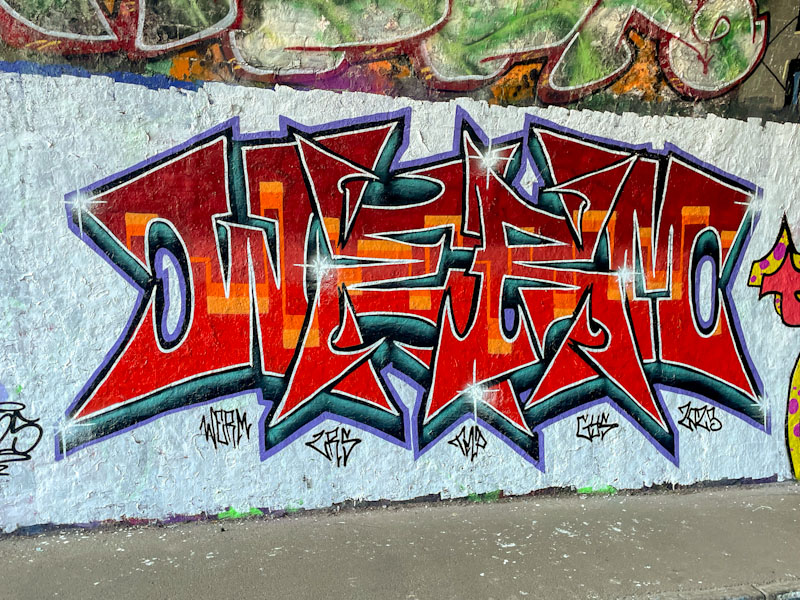
This is a delightfully clean and crisp piece by Werm, whose symmetrical pieces are a well known sight in the various graffiti spots around Bristol. I particularly like this one with its delightful colour scheme, and the boldness of it set on a white background.
Werm, St Werburghs, Bristol, April 2025
It is well worth getting up close and taking a proper look at the letter fills in this piece, the overall colour is a blend of reds from dark to light, and running through the midline is a wonderful continuous orange line… a golden thread through the piece. This is a very attractive piece by Werm, that unfortunately only lasted a short time.
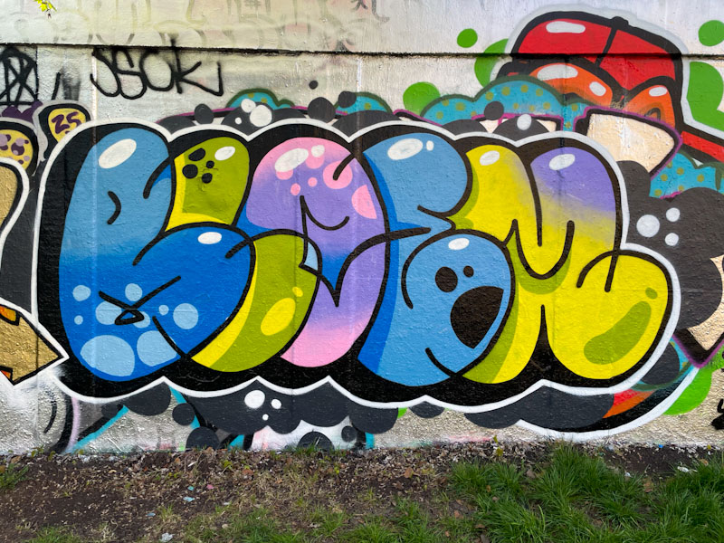
It took me a while to register that this excellent piece of bubble writing was by Bloem, mainly because it is quite unlike anything I have seen her paint before, and showcases her extraordinary talent for graffiti writing as well as her street art pieces and not to mention her jewellery making skills too.
Bloem, M32 roundabout, Bristol, April 2025
In this piece, the letters BLOEM are presented as an overlapping sequence in different colours for each one. There is a lot of study and thought that has gone into this piece. Bubble writing is usually associated with quick throw ups, or ‘throwies’, but this is a clean and tidy piece with some deliberate shadings alongside the letters and white accent spots, to help provide depth. This is an accomplished piece from arising star in the Bristol scene.