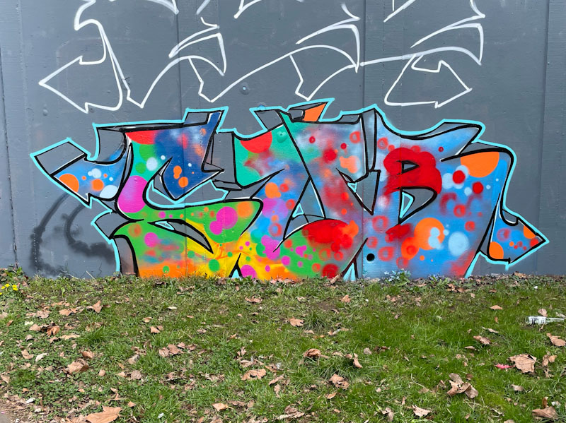
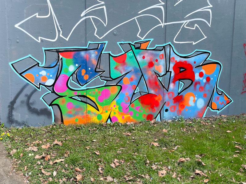
This is something a little different from Sub, who usually likes to go large and tends to be quite conservative with his use of colour. I am guessing that it might have been a bit of a dregs piece, I also think he is rather fond of newly buffed walls, and this one proved irresistible.
Sub, M32 roundabout, Bristol, March 2025
He has stuck to his simple three letter formula, with a deep, in this case unfilled drop shadow, but the obvious part of the piece is the splatter of colour throughout, keeping it lively and joyful. Sub continues to paint a lot and is gradually expanding his technique and scope.
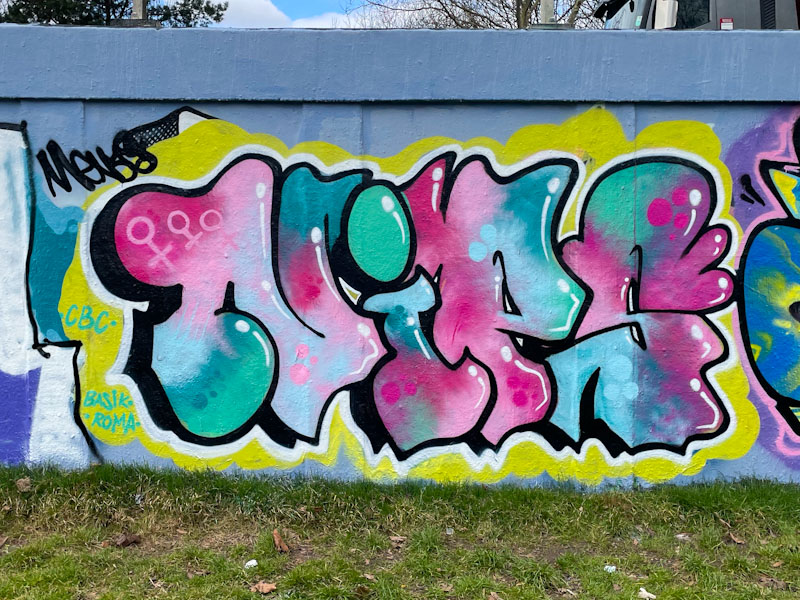
When I come across any pieces by Nips, I know I am I for a fill treat, it is pretty much a sure thing and I like that about her work. This one was painted in quick succession with another, I guess it was a painting weekend or something like that.
Nips, M32 roundabout, Bristol, March 2025
In this piece her customary NIPS letters are filled with a nicely blended palette of blue, turquoise, pink and red and some reversed out spots for a little bit of decoration. The white accent lines do their job well, creating a fine 3D effect. The selection of a yellow background contrasts well with the letters and brings focus to them. A sound piece from Nips.
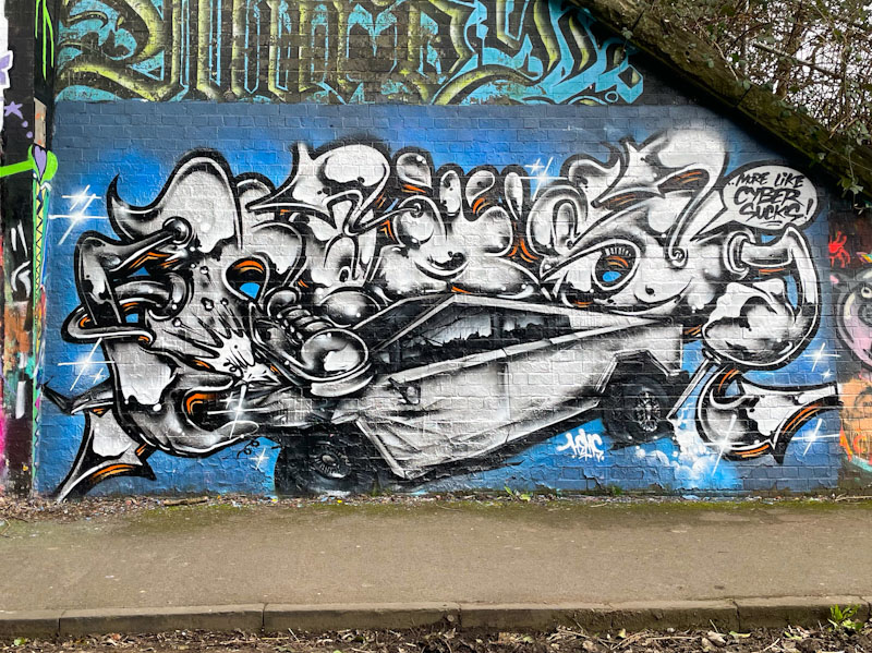
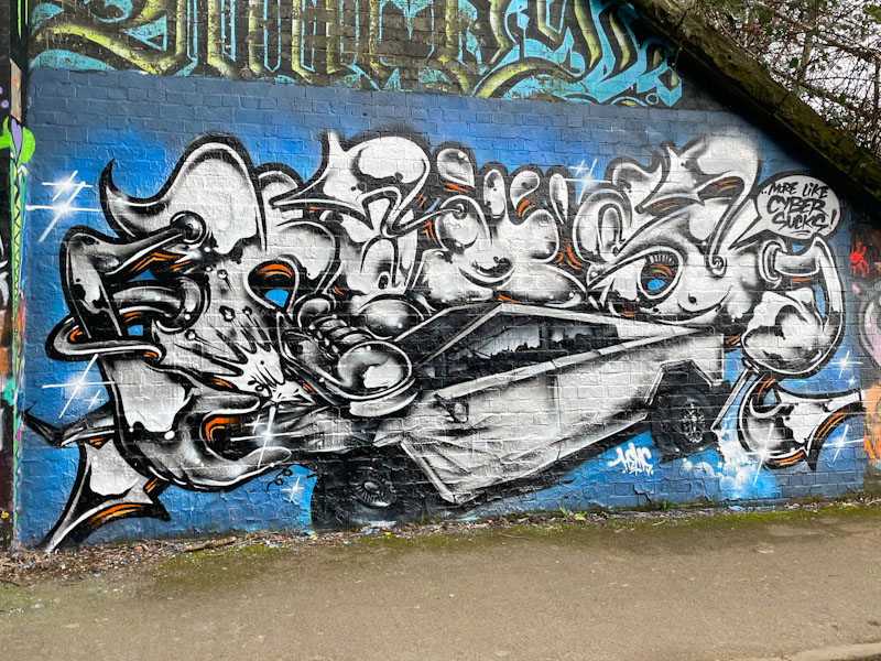
More from the irrepressible Hemper, this time at the farm end of the tunnel. His recent run of form has been quite extraordinary, and I imagine quite liberating for the artist himself. Although he always paints original designs, he has been pushing the boundaries a lot lately.
Hemper, St Werburghs, Bristol, March 2025
This is a chrome piece with brass knobs on, and unusually for Hemper it looks to be rather political or at least a social commentary piece. The chrome letters have anthropomorphic limbs which are crushing and vandalising a Tesla Cybertruck, a sentiment probably shared by many people in the current political climate. I feel that Cybertrucks should be side lined on their ugly appearance, let alone the hideousness of their owner. I am teetering on a bit of a rant, but simply don’t have time, so I will round off the post here. Superb work from Hemper.
Fade, Jody and Dibz, Dean Lane, Bristol, March 2025
After a few posts from a trip to Liverpool, I return to my comfort zone of Bristol with this magnificent production piece from Fade, Jody and Dibz on the long wall at Dean Lane.
Fade, Dean Lane, Bristol, March 2025
The triptych begins with some great writing from fade on the left, where the absence of colour and decoration within the letters demonstrates the artist’s talent in its rawest form. All the artwork is beautifully tight, and he switches up things a little with the black border fading to orange on the right.
Jody, Dean Lane, Bristol, March 2025
In the middle is a superb portrait by Jody – I think the first I have seen this year – which presents a woman in three-quarter profile with loads of interesting light and shade cast across her face in red and blue tones, creating so much depth and interest. So very well painted, and as an example, have a look at the shadow cast under her nose. Brilliant. The hair is sensational too.
Dibz, Dean Lane, Bristol, March 2025
To the right, Dibz continues with the white letters, reflecting those of Fade on the left. This piece from Dibz is pretty much an archetypal work by the maestro and rounds the collaboration off perfectly.
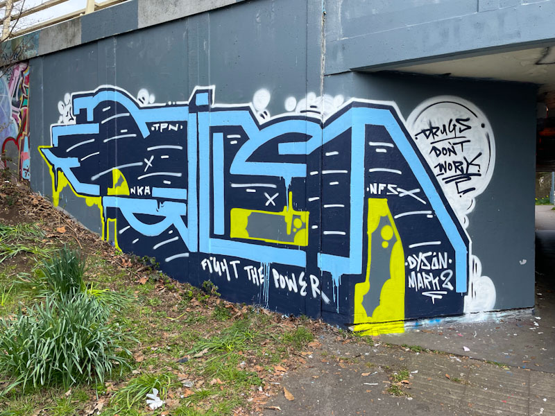
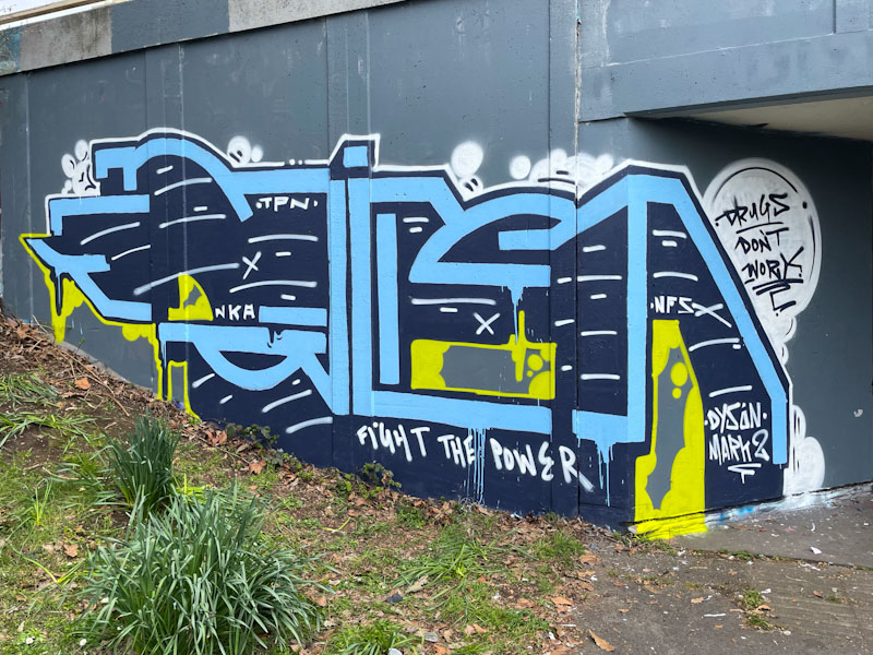
The council, for whatever reason, seem to like buffing the walls of the M32 roundabout with a neutral grey paint. I am not too sure what the purpose is, other than to give people doing community service a civic activity. That the exercise is costly and futile doesn’t really come into the equation. Once buffed, the wall becomes an inviting canvass for street/graffiti artists.
Kid Krishna, M32 roundabout, Bristol, March 2025
Kid Krishna didn’t waste too much time creating this CRIE piece in blue lettering with some yellow splashes. The piece carries a couple of messages: ‘drugs don’t work’ and ‘fight the power’, which suggests the artist is working through a few things, as are we all, at the moment. A nice ‘virgin wall’ piece.
Dirtygypo has returned to the streets with a few pieces this spring, and this is a rather nice one painted in Cumberland Basin. The letters still puzzle me. There are thoughts that they could spell Pilger or Dirty, but I don’t think it is either of these.
Dirtygypo, Cumberland Basin, Bristol, March 2025
The letter forms are consistent with his usual approach, but he has added in some great colours, and the lightening breaks in white really stand out through the piece. The characterisation of the first letter is one of several signatures that aid with identification, but to be honest, his writing is unlike anything by any other artists in Bristol and is easy to identify. It is just those damn letters that perplex me.
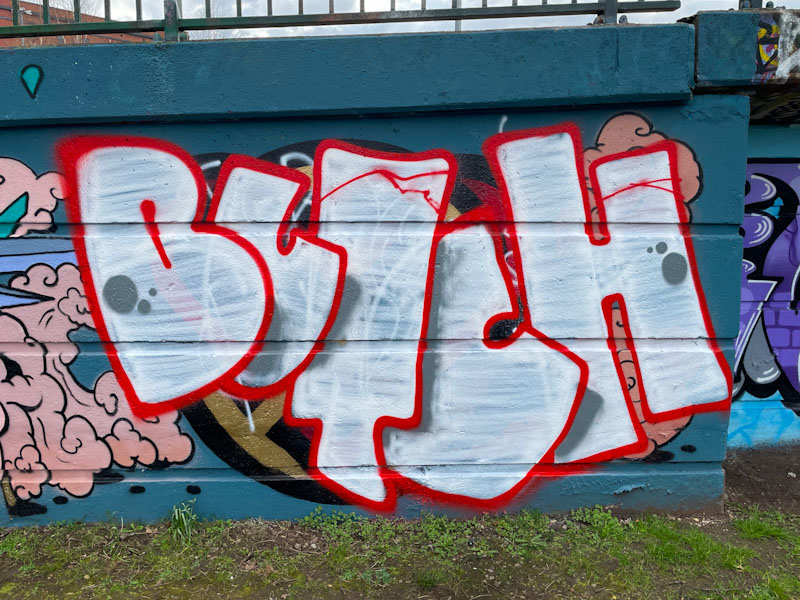
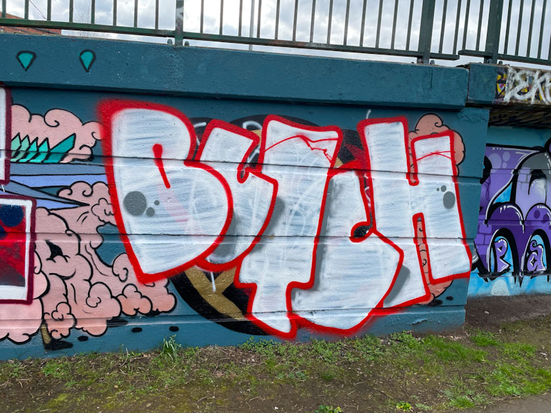
I have to confess that I have a real soft spot for Butch’s graffiti writing. I like the name, I think it lends itself well to the art form, I like his letter shapes and I like his understated presence.
Butch, Cumberland Basin, Bristol, March 2025
Butch has a fairly standard approach to arranging his letters where, going from left to right, each letter overlaps its successor. With the addition of some shadows, this method provides some depth to the piece. This looks like a bit of a quick one, with a white fill that barely does the job of filling. A couple of nice spots round the piece off nicely. More on the way from Butch.
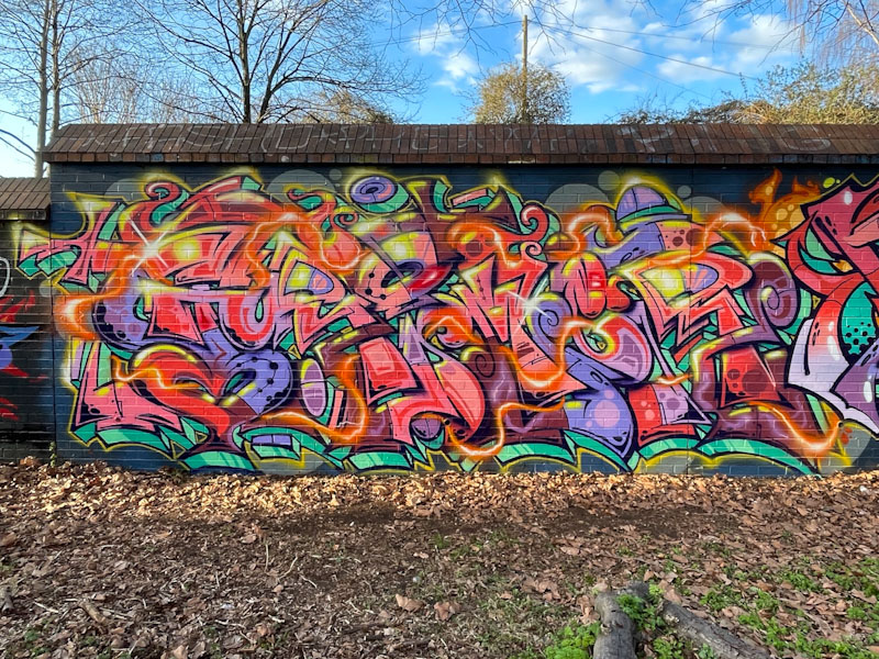
Grimes has pretty much made it to the top of my list of Bristol graffiti writers at the moment, taking into account the frequency of his pieces and the outstanding quality of them. Unlike some graffiti writers, his style remains broadly the same, but he manages to squeeze out every square inch of space on the walls he paints and create the most amazing burst of energy and movement.
Grimes, Sparke Evans Park, Bristol, March 2025
Colour and quality are two words I would use to open my description of this piece. Every element is in its place and finished perfectly. I particularly like the plasma ribbon running through the whole thing. This piece continues Grimes’ run of good form, which shown no signs of letting up.
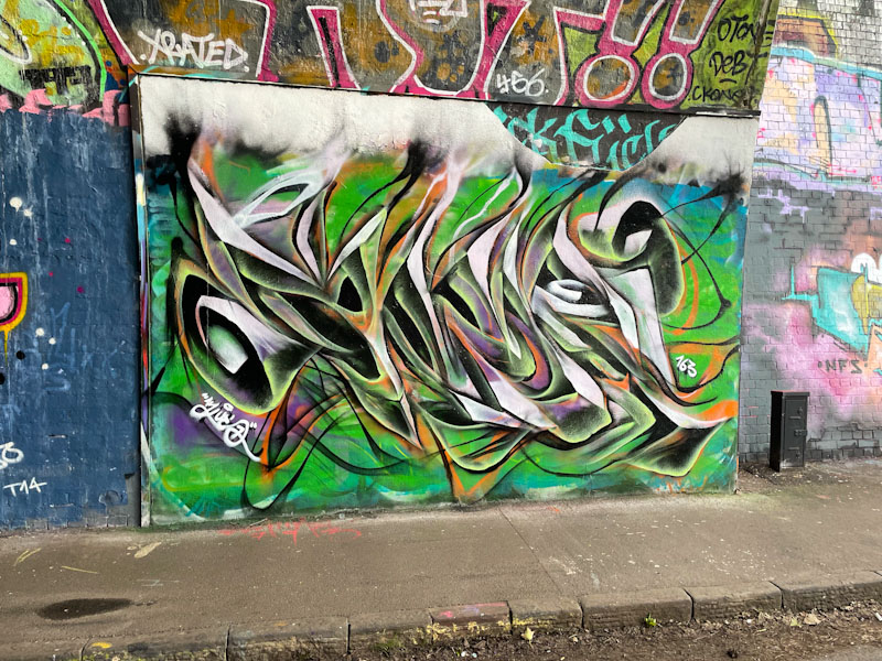
I would say that Mr Klue is the (undisputed) king of St Werburghs tunnel, on a measure of number of pieces painted there. It seems to be the place he enjoys painting most, and it is rare to not be able to find something of his at any one time.
Mr Klue, St Werburghs, Bristol, March 2025
This is a colourful one, as ever spelling out KLUE, which is notable perhaps for the way the wispy tops of the letters bleed into a cloudy mass, which might have been there from a previous piece. The central colours are green and orange, which often work well together, but there are also injections of purple and white. The use of these colours combines to create depth to the piece which is on the cusp of being anamorphic. We can be certain that there will be more to come.