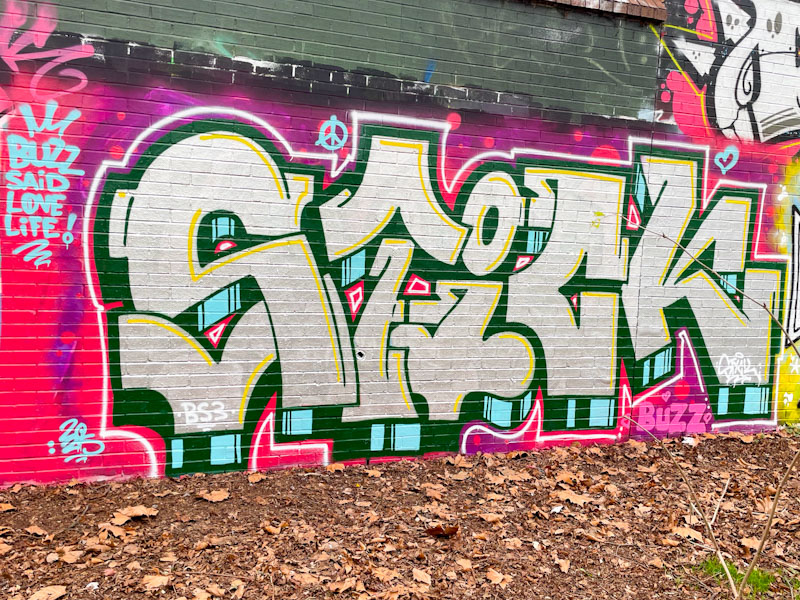
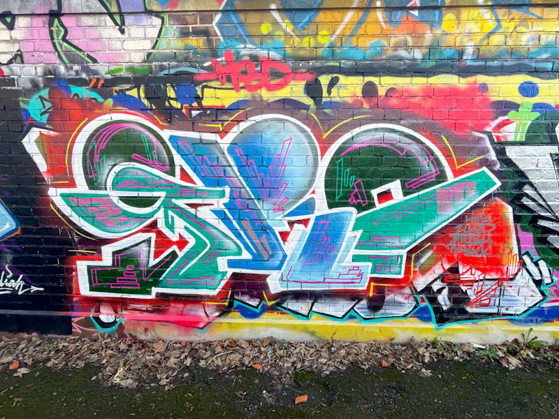
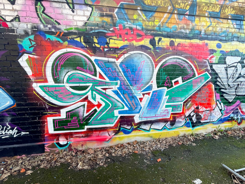
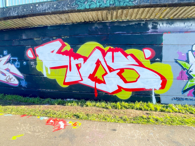
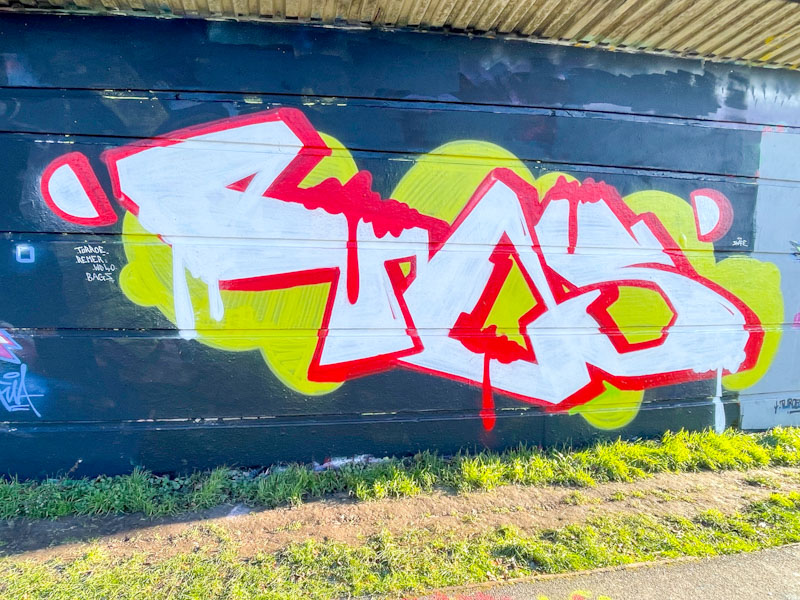
First day skiing in the alps today, so really not much time to write today’s posts. This is a wonderful piece by Solar that got left behind in my archives.
Solar, Cumberland Basin, Bristol, August 2025
The colours are absolutely magnificent and the piece delivered in Solar’s inimitable semi-antistyle fashion. Great work.
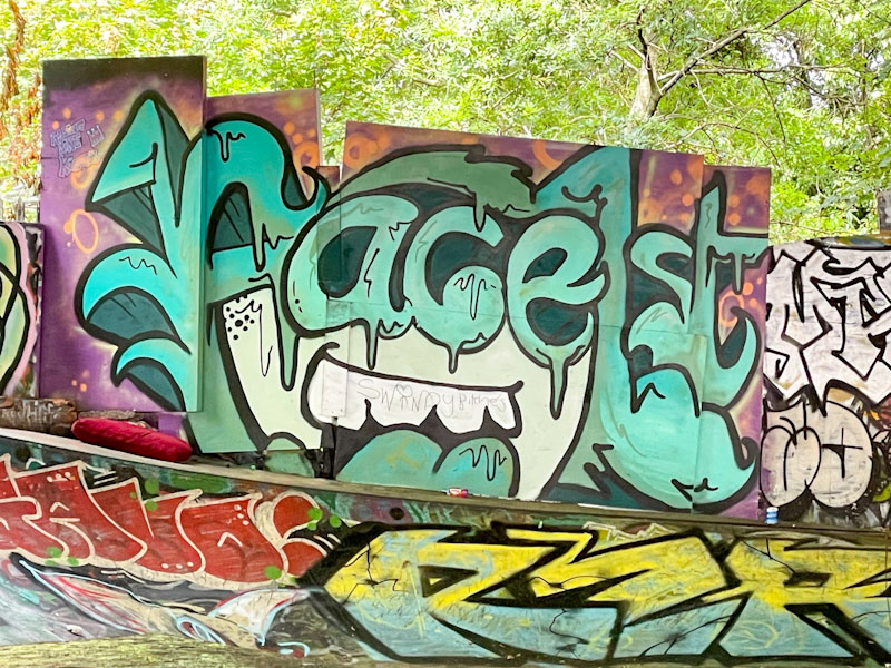
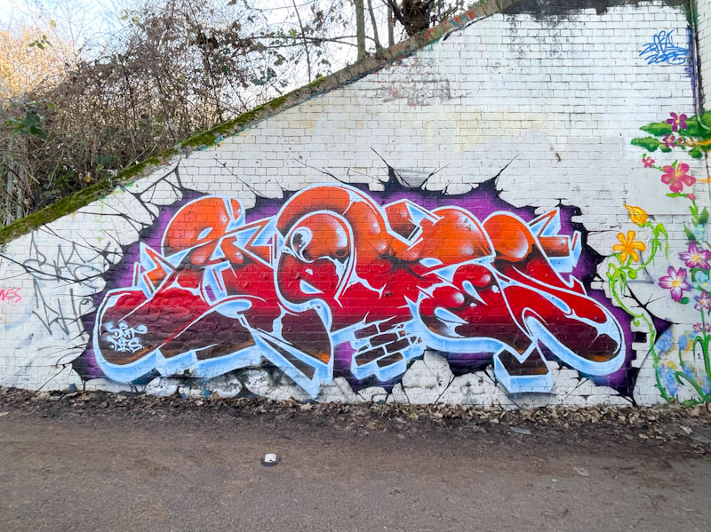
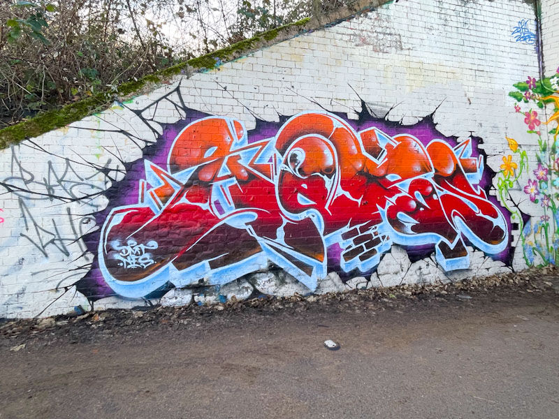
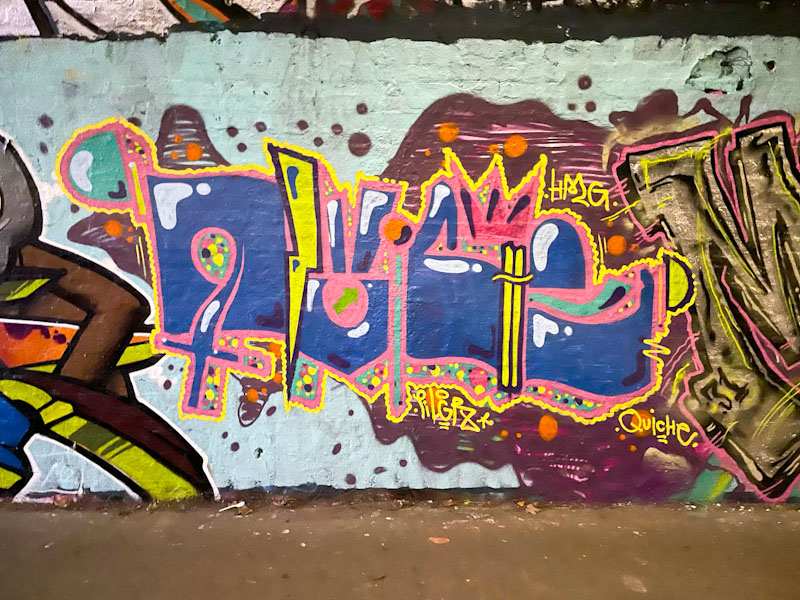
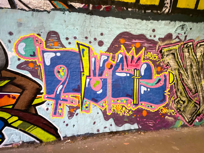
A really quick one today as I head off to the Alps for a week of skiing. I will probably be in the air at the time this scheduled post is published. I remain a firm fan of Face 1st, and more than any other artist, he epitomises my relationship with the Bristol scene. We had a chance to catch up a week or two back while he was painting on the M32 roundabout – a piece I never saw, because it was over painted within a day or so. He really is a lovely man, enjoying life in Herefordshire.
Face 1st, M32 Spot, Bristol, August 2025
This is a classic piece of Face 1st artwork – a smiling girl character with big hair, spelling FACE. The piece was photographed in August last year and has been retrieved from my archives, filling in while January pieces are a little thin on the ground. A lovely combination piece, perfectly matched with the spot.
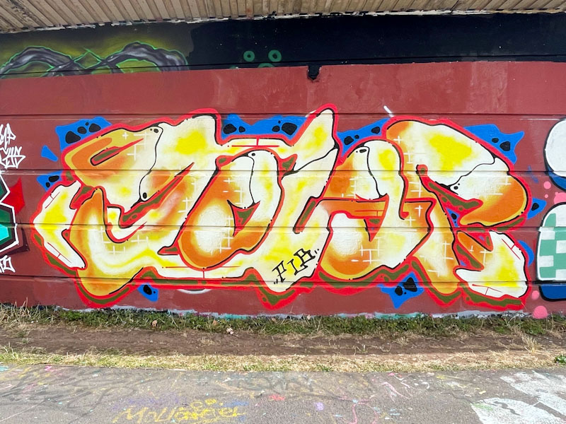
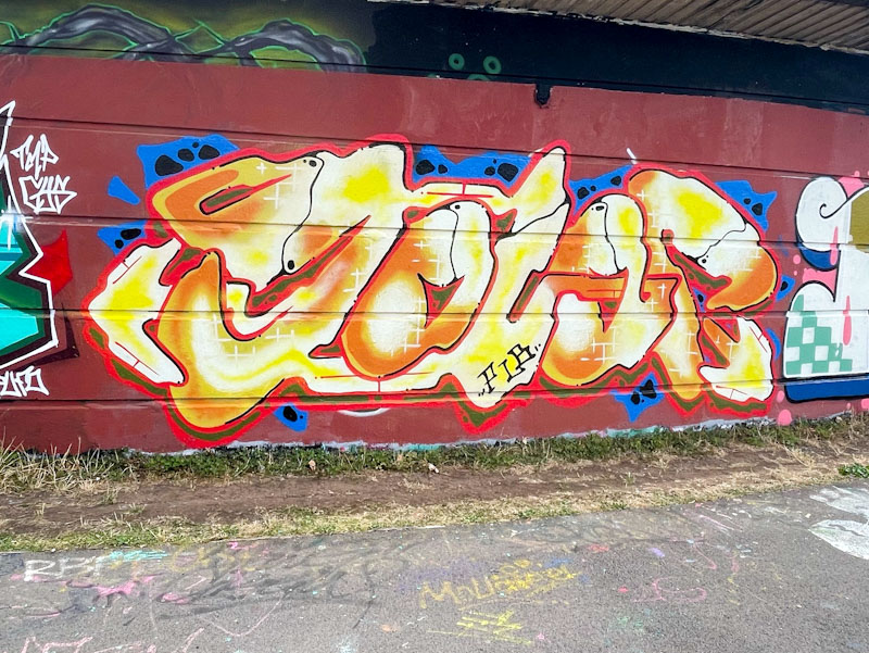
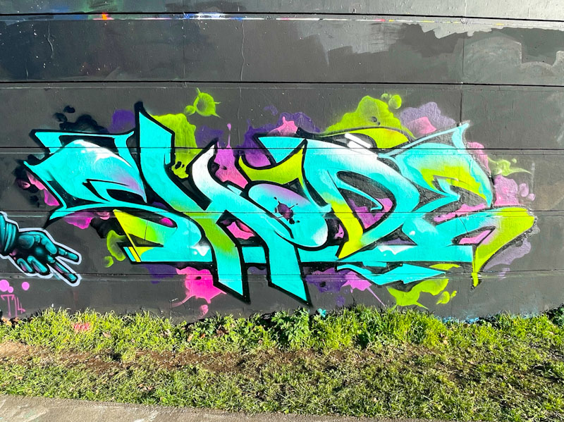
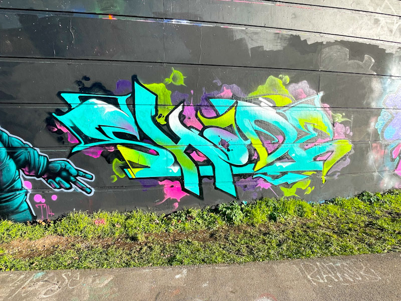
The turnout for Shade One’s birthday paint jam might have been relatively small in numbers, but was of the highest calibre. You know that you are well respected as an artist when Soker turns up and paints you a birthday celebration piece.
Soker, Cumberland Basin, Bristol, January 2026
Soker is simply one of the best graffiti writers around, and although this looks like a relatively ‘quick one’ it still oozes class. The letters spell out shade with beautifully blended fills. The black outline picks out the letters beautifully and the cloudy pink, purple and green bursts around the edge of the letters rounds the piece off perfectly.
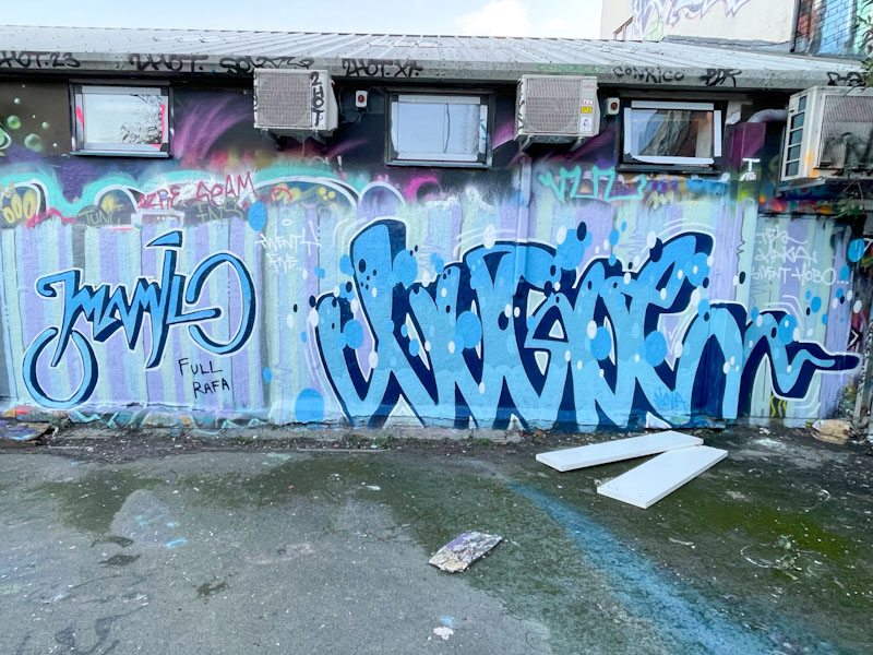
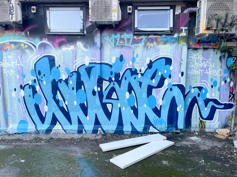
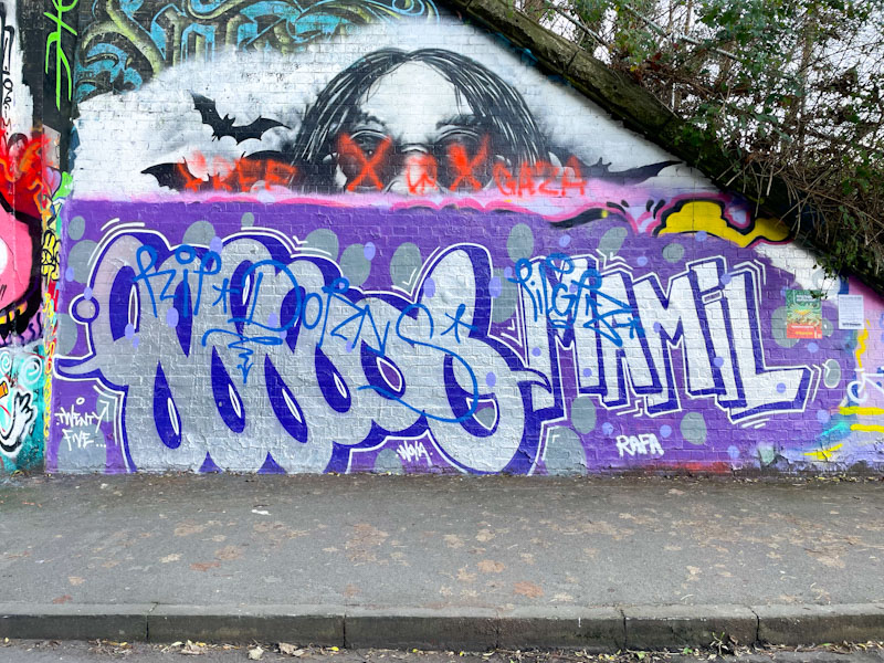
Mamil and Logoe, Dean Lane, Bristol, December 2025
Logoe and Mamil visited Bristol a few weeks back and decorated several spots with their script writing, including this beauty in Dean Lane. Unfortunately, in their enthusiasm, they painted over a tribute piece for Dorns, which upset a few people in the local graffiti community. This wall, however, was up for grabs and the pair did a great job.
Logoe, Dean Lane, Bristol, December 2025
I have been an admirer of Logoe’s work for several years, and he has developed his script writing into a serious art form. Set on a stripy wall, the letters spell out LOGOE as if they were written with joined-up writing on a page, with the addition of a deep drop shadow. His trademark oval spots complete the piece nicely.
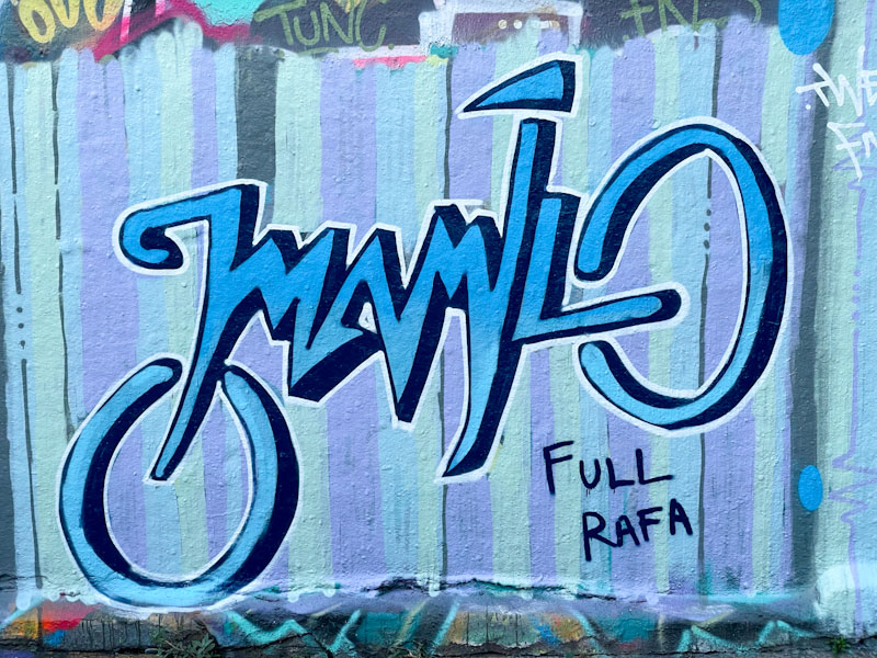
Mamil, Dean Lane, Bristol, December 2025
This trip with Logoe is the first time that I have encountered Mamil, and I have to say I rather like his clean skinny letter style. The two circular forms at each end of his letters add so much to the structure and flow of the piece, without which the writing could be quite ordinary. You might be able to make out the shape of a bicycle, which is a clever way to present your letters. The style is easy on the eye. Great collaboration from the pair.
As I mentioned before, though, two other collaborations that Logoe and Mamil painted on their trip were tagged/dogged before I encountered them. It is a pity that ‘respect wars’ like this break out, but there is little I can do to help, and have to observe as an onlooker. The images below show you what happens if you disrespect a tribute piece…
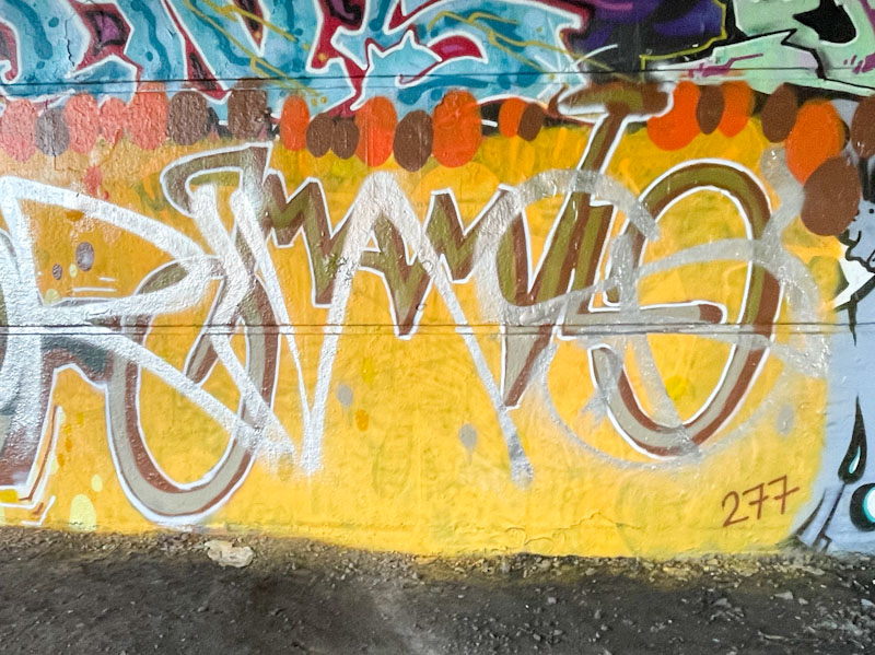
Logoe and Mamil, St Werburghs, Bristol, December 2025
This is a really wonderful, piece by Benjimagnetic tucked away behind the hedge alongside the swimming pool wall. He seems to have had a recent burst of energy this winter and painted a few pieces in quick succession.
Benjimagnetic, Dean Lane, Bristol, January 2026
The colours of the letters GRO (blue, Green and black) work perfectly against the hint of a red background. There are plenty of fine rectangular details in pink and green within the letters themselves, filling the space very nicely. Unusually for a Benjimagnetic piece, the letters are really easy to read, and rather more solid than many of his pieces. Nice work.
Hemper is simply an outstanding graffiti artist verging on genius in my view. He appears to have taken a liking to the tunnel in Boiling Wells Lane, which historically doesn’t get anything like the attention that St Werburghs tunnel receives only a couple of hundred meters away. It is a smaller tunnel and there is no lighting, which might account for the smaller turnover.
Hemper, Boiling Wells Lane, Bristol, January 2026
These gorgeous letters, spelling HEMS, appear to be bursting out from the wall and the purple void beyond. I love the way he has worked cracks into the background and some fallen bricks underneath his letters. The piece is so full of movement and depth – the work of an artist at the top of his game.
Slim Pickings (Tes), Cumberland Basin, Bristol, January 2026
I call this artist Slim Pickings, because that was his Instagram name when I first started writing about his work. Several changes to his Instagram account have followed since then, but I have stuck to the first. Most people refer to him (obviously) as TES.
Slim Pickings (Tes), Cumberland Basin, Bristol, January 2026
There was a time when pretty much all of his pieces followed the same precise shape, with only a variation in colour and accessories. Now it feels like each new piece he paints is different from the last. These TES letters were painted for Shade One’s birthday, I think. While the composition is really nicely worked, the paint looks thin in places, giving it the impression of being a throw-up, but it is much more than that. Nice on from the No Frills writer.
It is a jungle out there, and I have said it many times on Natural Adventures, and it can be hard to follow the protocols and conventions at times. Dirtygypo has painted this small piece over a birthday tribute piece for Minto. During the same visit (I assume) he tagged a piece at the entrance of the tunnel by Logoe and Mamil, who had previously painted over a tribute piece to Dorns under Brunel Way. It is a pity that there is quite a lot of strife around these things, as most artists are good and simply want to paint walls. The ‘rules’ such as they are tend to be interpreted in the interests of those who adopt or ignore them. In my view the rules are ‘there are no rules’.
Dirtygypo, St Werburghs, Bristol, December 2025
I really like Dirtygypo’s writing, and am slowly beginning to get to grips with his letters. The artist gives us a clue with this writing with the word QUICHE in the bottom right. Look carefully at his graffiti writing and you can make out each of the letters. The Q and U are separated by a yellow lightening bolt. The I is a very slender light blue line, the C and E in dark blue sandwich a very slim H. It is all there, but beautifully disguised. A cracking small piece from Dirtygypo.
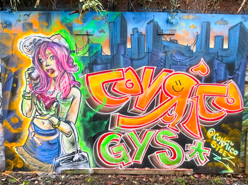
Conrico turns out some incredible work, and has done so, in his unique style, for some years now. Recently he has been going through a purple patch, with an increased vibrancy and storytelling element to his work.
Conrico, BB Gallery, Bristol, December 2025
The combination piece, tucked away on the Bristol to Bath cycle path, features a female street-wise character and some writing set on an urban skyline. There is a wonderful contrast between the bright colourful foreground, and the grey foreboding backdrop. Everything appears to have been painted with brushstrokes, but that is Conrico’s style, and I really like it. I am not sure what the GYS stands for (I believe it to be a crew that includes Daz Cat and others), but I will find out soon enough. Beautiful work from Conrico.
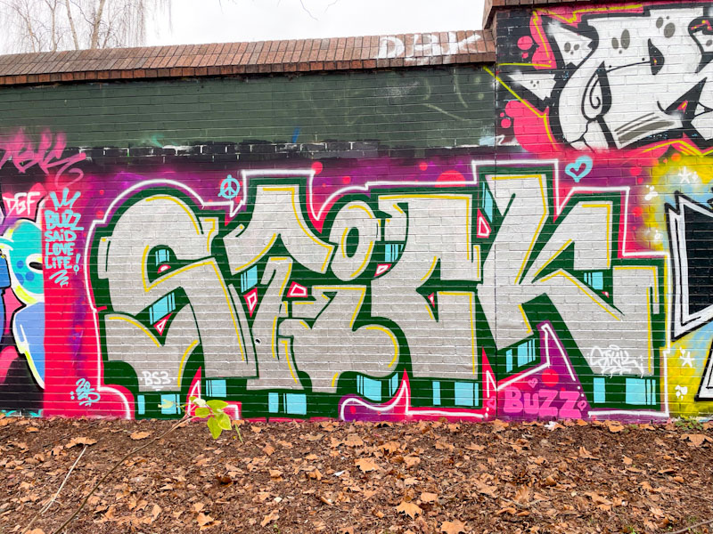
I was told recently that Corupt (my name for him, taken from the word he writes most commonly) is held in very high regard in his native Hungary, and it is easy to see why. His work oozes class and experience and rarely, if ever disappoints.
Corupt, Sparke Evans Park, Bristol, December 2025
These large chrome letters, spelling STICK, although irregular in shape and size, somehow have a uniformity about them that as a whole presents in a way that is very pleasing to the eye. The blue and black striped drop shadow adds ample perspective and a the white thin border, separated by about an inch from the letters is a trademark ingredient of Corupt’s style. Some yellow accent lines to the top and right of each letter shape also improve the overall effect. Very nice work indeed.


 I was told recently that Corupt (my name for him, taken from the word he writes most commonly) is held in very high regard in his native Hungary, and it is easy to see why. His work oozes class and experience and rarely, if ever disappoints.