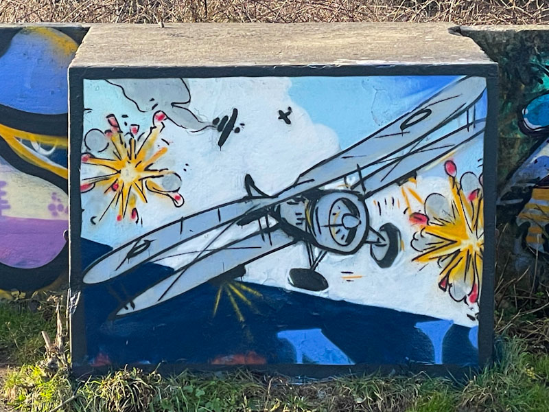
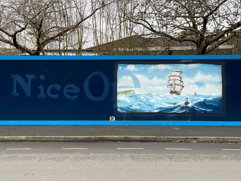
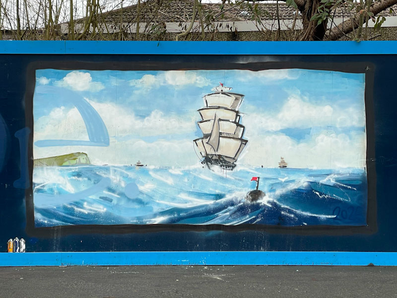
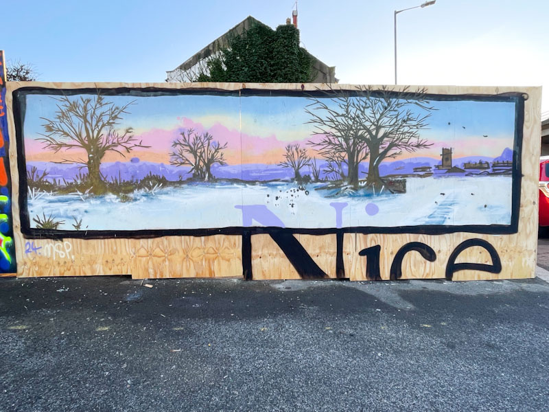
A gallery of outstanding writing, portraits and landscapes by the brilliant Bristol artist Nice One.
All photographs by Scooj



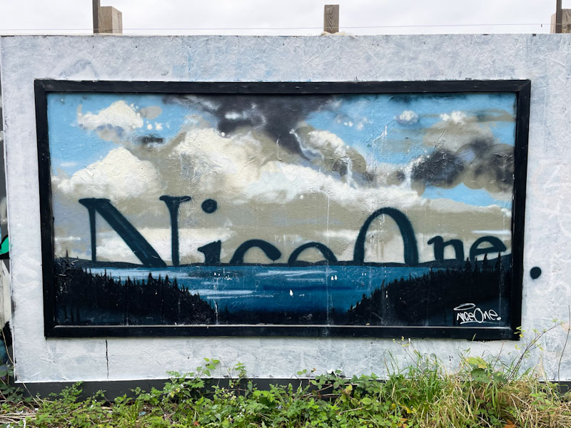
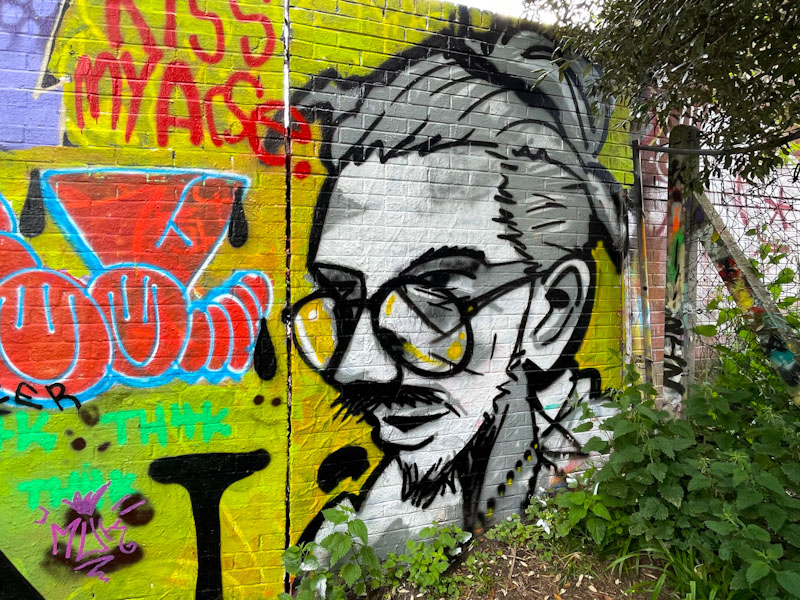

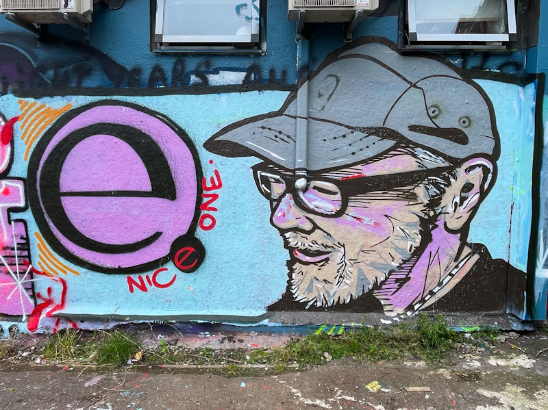
A gallery of outstanding writing, portraits and landscapes by the brilliant Bristol artist Nice One.
All photographs by Scooj

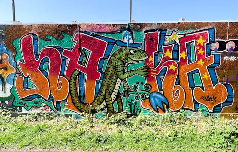
Normally, when Haka paints one of his graffiti writing/character combination pieces, I recognise the character from a children’s picture book. This time Haka has stumped me – I am not familiar with any books containing a lizard, and can’t tell you too much more about it.

Some classic HAKA letters sandwich the lizard, although I note that only the right-hand side has been decorated with stars. I wonder if that is an omission, or whether it is the lizard that has emitted the stars from its claw. The lovely piece was difficult to photograph on such a sunny afternoon, something that has been a constant problem during our glorious spring.
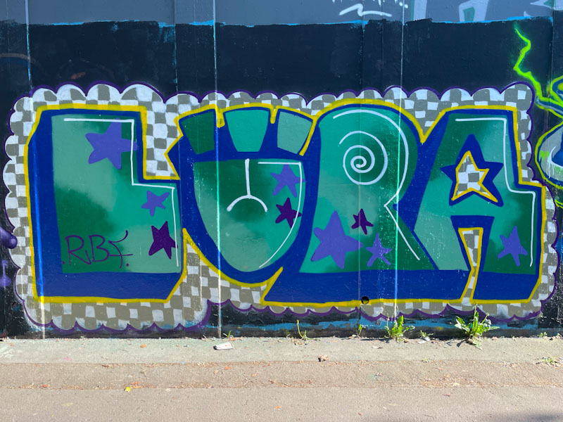
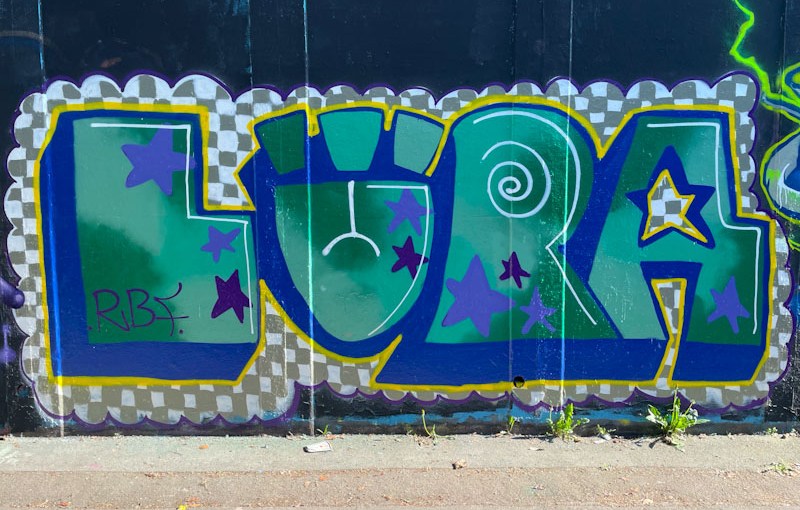
I’ve said it before and I will say it again, there is an authenticity I really like about Lupa’s work. Her modest pieces stick to her general formula, and her letters are unpretentious and fun.
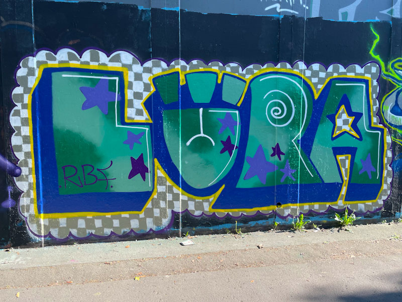
In this piece she has pushed herself to incorporate an intricate grey and white box background pattern which must have taken ages to do. It has worked really well and raise the interest level in the piece considerably. Her letters are nicely filled with a combination of colours that are easy on the eye. A very nice piece of graffiti writing from Lupa.
I have to be a little brief this morning. I am staying with family, and I think breakfast is ready…
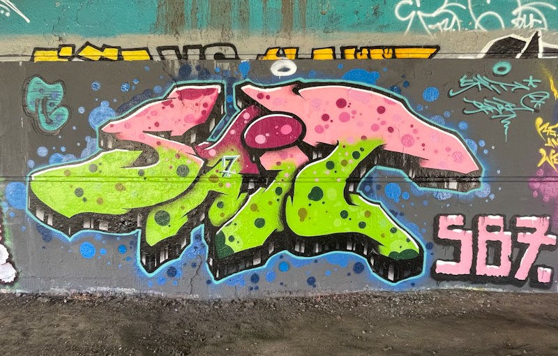
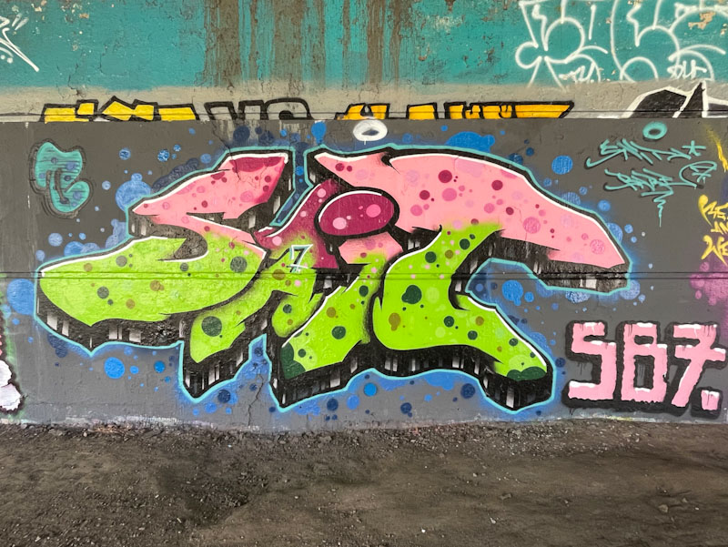
I have noticed that Sait Bare likes to paint in this area by the river, and would guess that he probably lives nearby.

Perhaps the most notable thing about this lovely piece is the colour selection, which reminds me of a stick of rhubarb, and once seen that way, it can’t be unseen. The letters SAIT are nicely filled in the base colours and liberally decorated with colour- matched dots. The whole thing is nicely rounded off with a black and white stripy drop shadow. An attractive piece of graffiti writing.

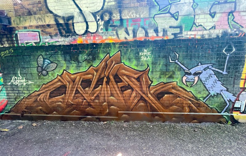
It is a little disappointing that I have missed a couple of pieces by Hire this year, which is a real pity. You have to be quick off the mark in this game, and if you snooze, you lose. However, it does feel like Hire’s pieces, a bit like Kid Crayon’s pieces, tend to get painted over rather quickly. I am not sure if this is deliberate targeting or simply bad luck, I would like to think it is the latter, but whatever the reason, it makes their work feel even more precious.
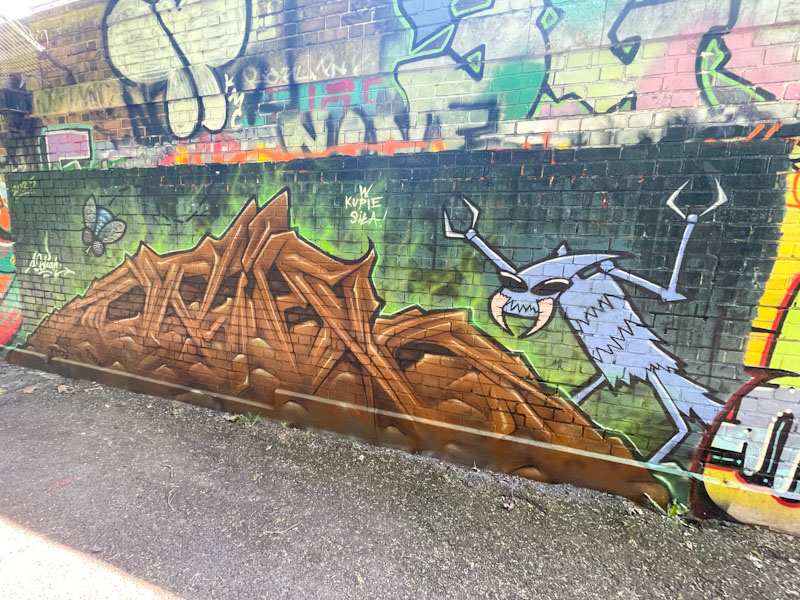
This is a slightly strange piece by Hire, which I think is meant to represent a pile of poo, with some excited insects making the most of it. Certainly it is an unusual composition in brown (why is everyone painting with brown this spring?), spelling out ODIAH, letters which Hire likes to use from time to time. How much better the piece looks with the subtle green glow on the edge of the letters, without which it would all look a little flat. Unusual and interesting work from Hire.
.
Winds of change blowing
charter for sycophancy
to be seen to do
.
by Scooj
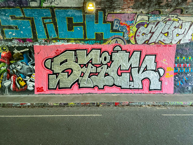
This bold piece by Corupt is in the darkest part of the St Werburghs tunnel, and I had to do a little bit of brightness and colour manipulation to bring out the best in these photographs. The tunnel is a great street art/graffiti spot, especially in wet weather, but the light conditions can make photography very challenging at times.
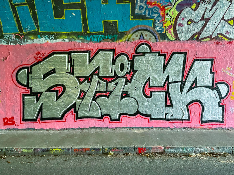
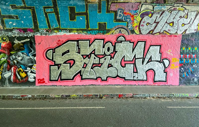
This is a really beautifully presented Chrome piece, spelling out STICK, set on a pink background, with a fine red line outside the thicker black border, a design element that is a bit of a signature of the artist’s work. There is something rather unusual and appealing about his letter style. Great piece if you can actually see it in the gloom.
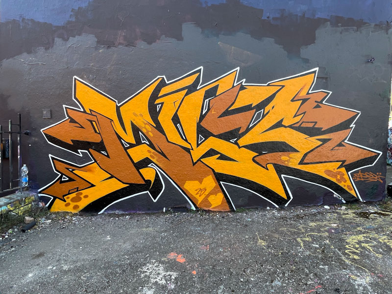
There are a couple of things that are slightly unusual about this piece by Fade. The first is that it is a solo piece and not a collaboration with Dibz and second, it has unfamiliar letters, as it is a tribute to ‘the Mrs’ to use Fade’s words, although I can’t remember her name, and I am struggling to decipher the letters.
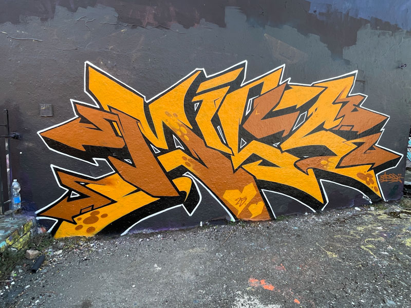
The graffiti writing is flawless, as you would expect, and stands out on the large wall with a black background. There is a little too much brown for my own personal taste, but I have spoken enough about that in recent posts. Really stand out work from Fade
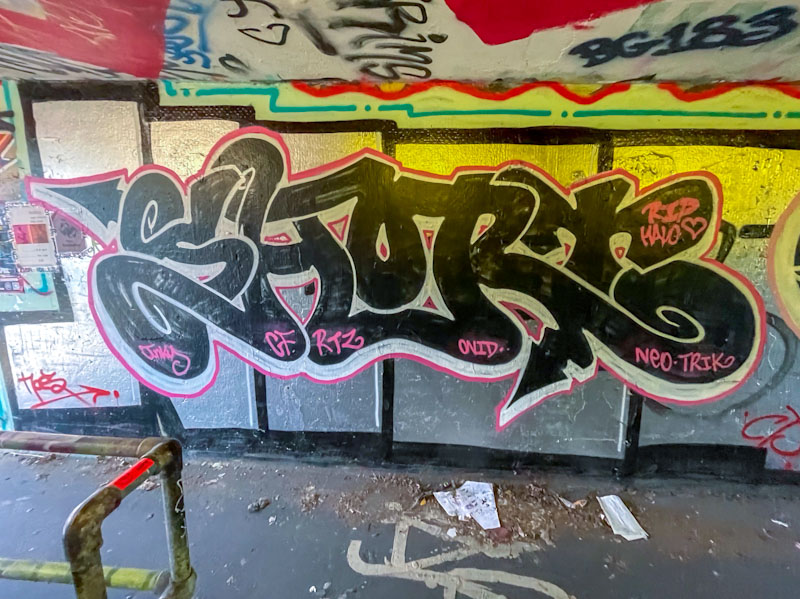
This piece, by Short, is really easy to miss. It is in one of the tunnels under the M32 roundabout where the lighting is poor, and one’s mind is focussed on not being run down by a bicycle or e-scooter rather than stopping to look at the graffiti writing. If photographing such pieces is hazardous, I can’t imagine what it is like to try and paint in such a confined space.

The black, joined-up letters, spelling SHORT are somewhat augmented, deliberately or otherwise, by the background created by a previous artist’s large chrome letters, which creates the perfect backdrop. I am enjoying the way that Short is popping up in different places around the city, and offering us a type of graffiti writing that is a step up from throw ups, and developing all the time.

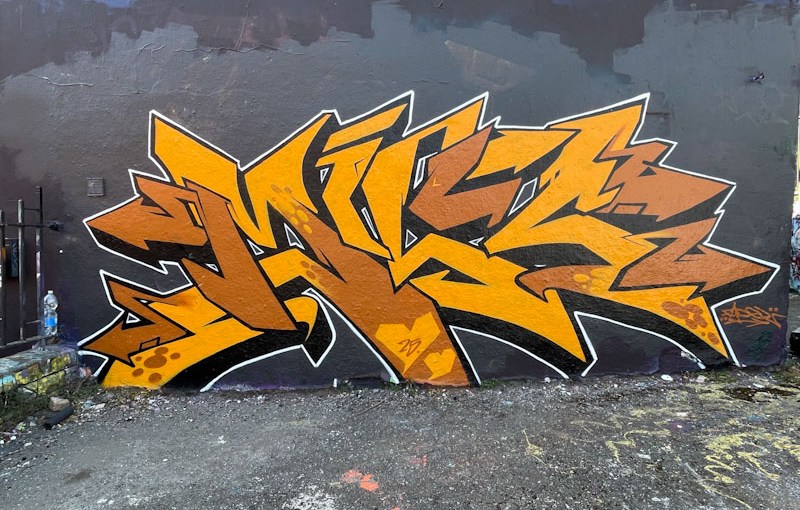
Now, regular readers will know that brown is my least favourite colour when it comes to graffiti writing, and it is a path I am unlikely to deviate from or be persuaded otherwise, so the selection of brown aside… this is a really nice tight piece by Werm.
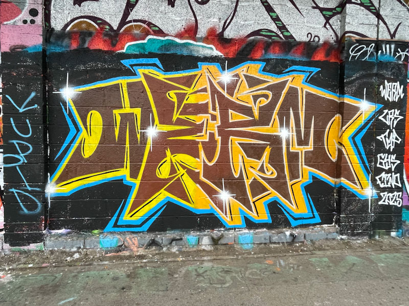
I rather like this letter style, which while keeping up the symmetry theme that Werm enjoys so much, also has something of a feel of Marvel or DC Comics about it, as if it should say ‘blam’ or ‘whack’ or something like that. Definitely a fun piece, well presented. Pity about the colour.