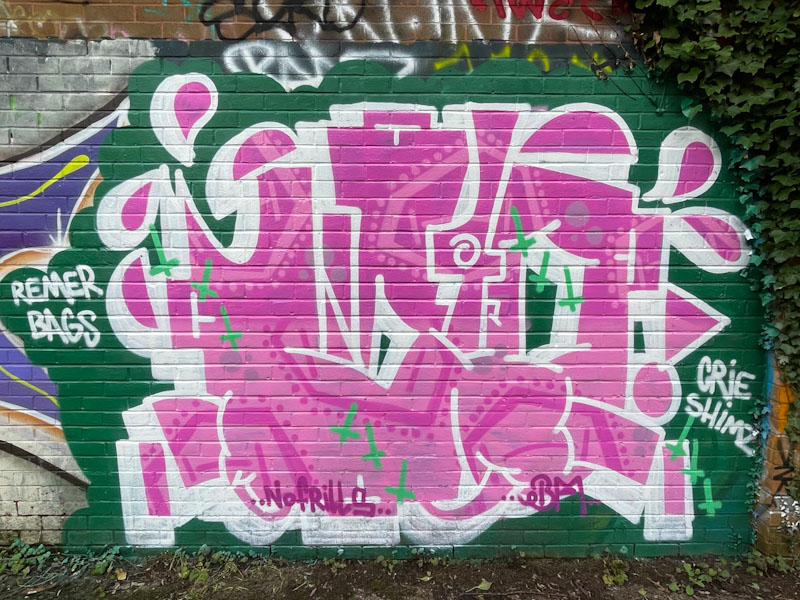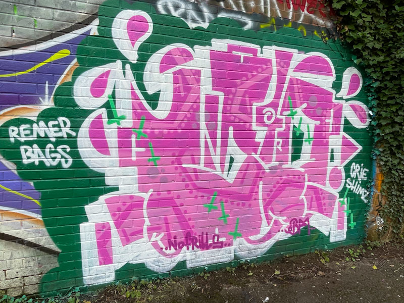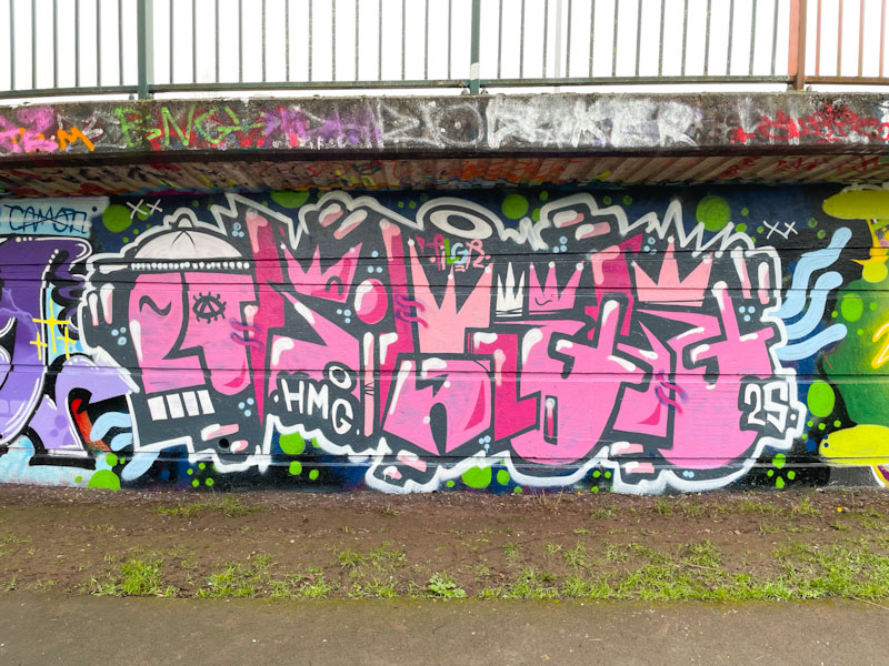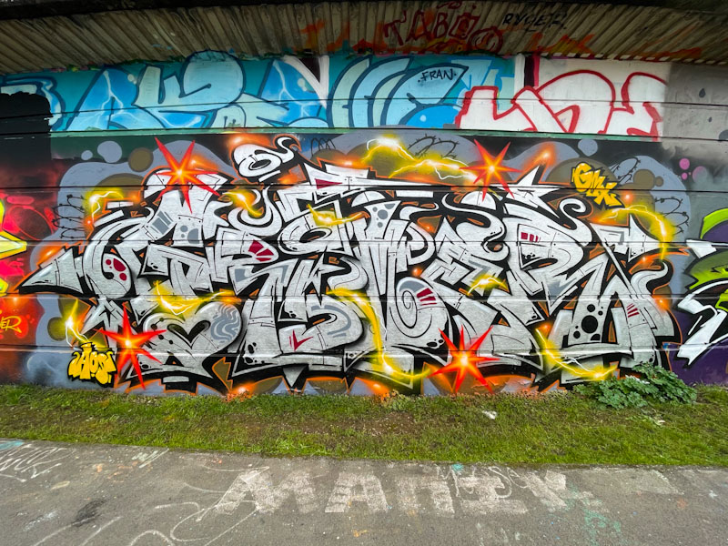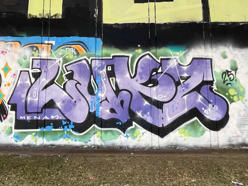
As someone who photographs and writes about street and graffiti art, it can be quite a challenge keeping up with Instagram monikers and even the letters that artists write. Bbygwya, AKA Flux, writes Flux. Luxe and in this instance Lukz and you have to know her style and range of letters to be able to identify her work successfully.
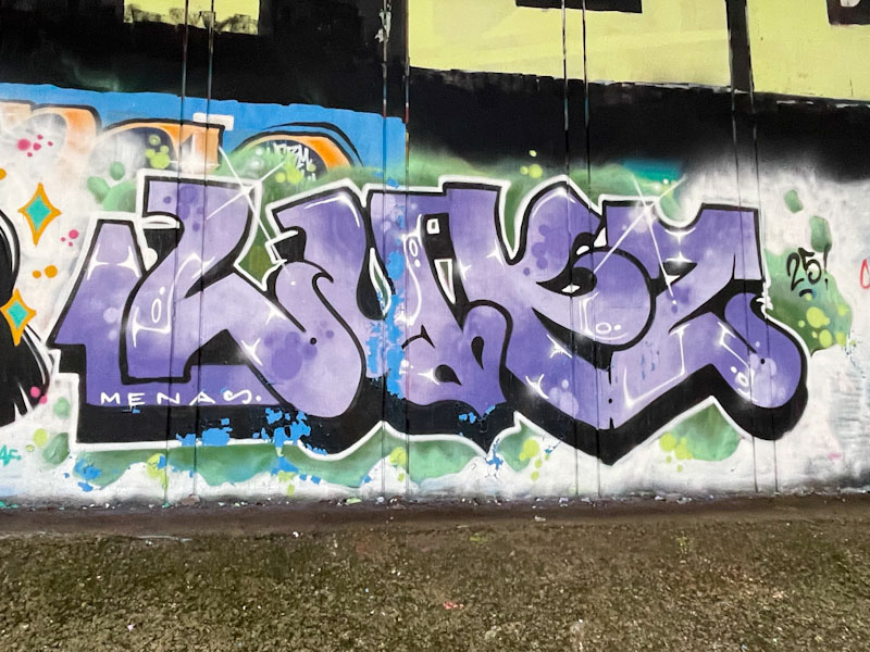
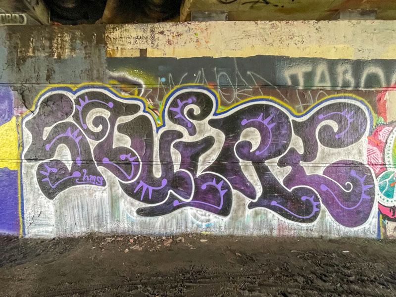
This piece was painted under the M32, alongside the River Frome early this month, and might signal a healthy presence from her and the RBF crew, who have all had a pretty busy January. Her letters have that unruly feel to them, being slightly irregular. The fills are nicely done and capped off with a couple of brilliant starbursts. Like other pieces painted during this session, there is some rain damage, which suggests that it was a wet paint day. There is a nice final touch… the shout out to Mena.