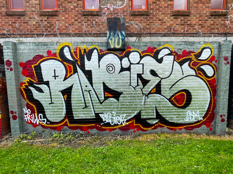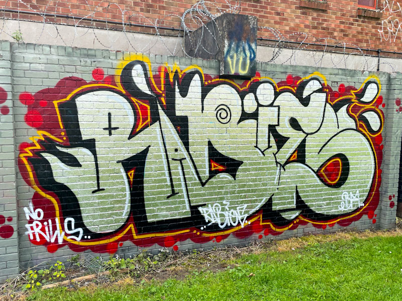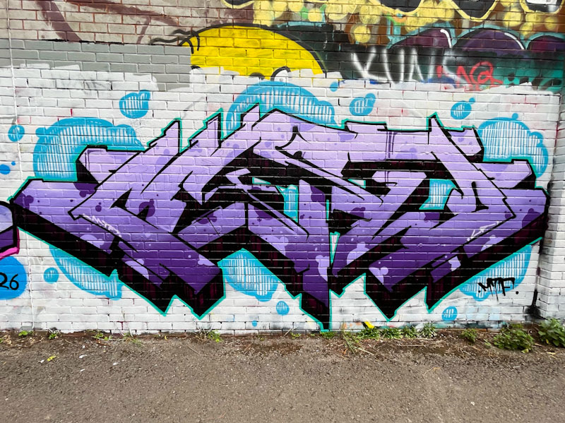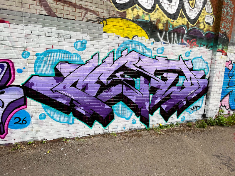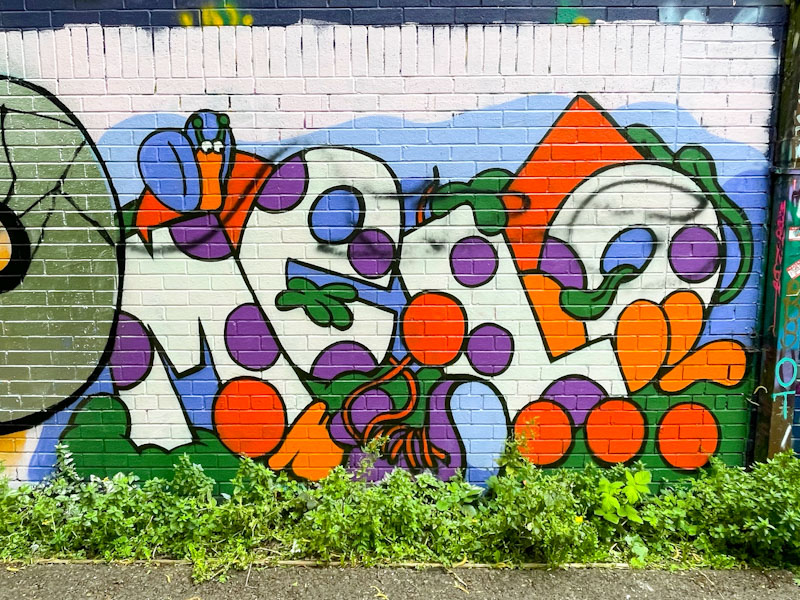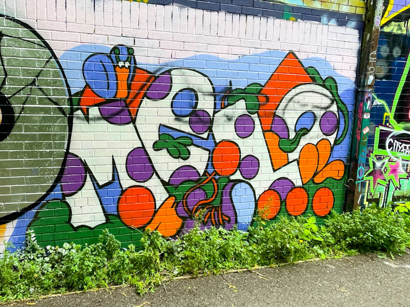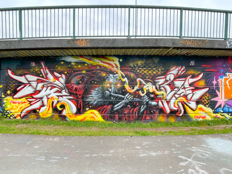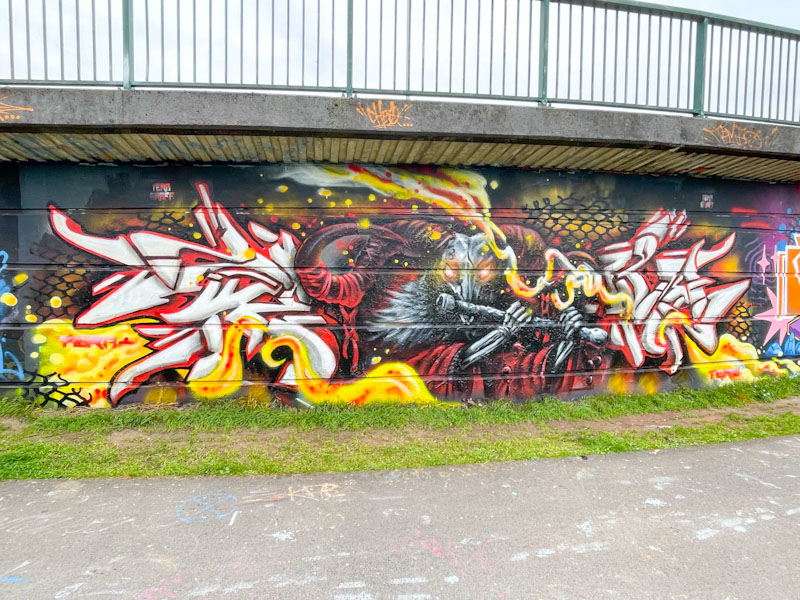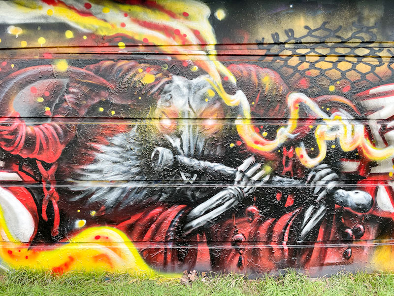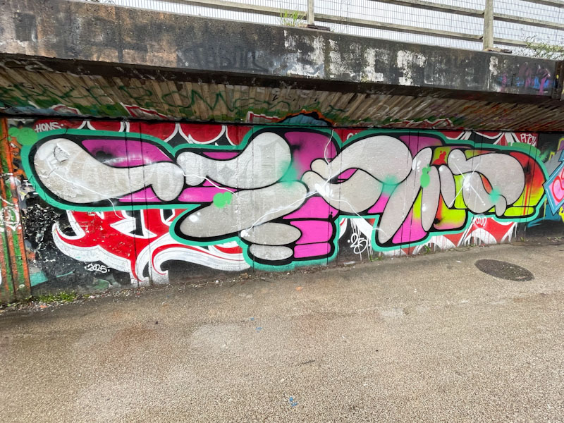
I think that it is fair to say that Sub is an artist who has grown on me over the last couple of years. At first, I considered his letters too large and uninteresting, but to be fair, he has worked really hard and improves from piece to piece. He is developing his fill skills significantly and is now turning out some fine pieces.
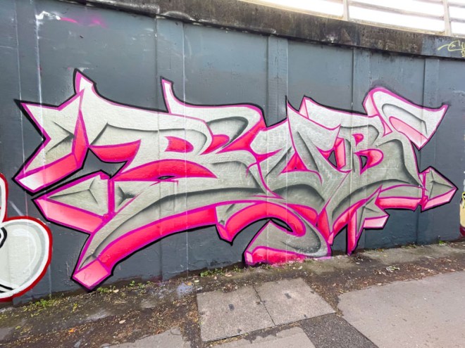
It has been great witnessing this improvement, and here, Sub has elaborated on his letters and worked on a shaded midline running through them. This technique is at the heart of calligraffiti, and I think the Sub, in this piece, has made his first flirtations with the style. So much more to come from Sub.